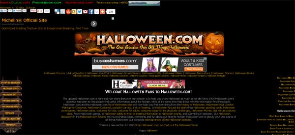
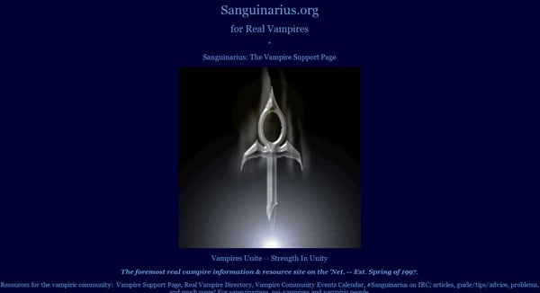
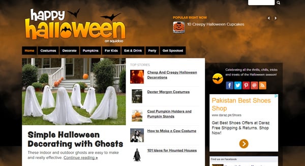
Halloween Website Design Ideas To Give Your Readers a Shock
Halloween brings a lot for all and it is not only about new ideas but about changing the appearance to inspire and to catch the eye. People ought to make the full use of the event and when it comes to business it is also an opportunity that should be making the best out of it. When Halloween arrives people change the appearance of their shops, homes and… websites. It is not to entirely change the concept but it is about adding Halloween templates to designs that were made for a company and give them additives to get into the theme of the Halloween.
Find out more things for Halloween:
- 36 Halloween Print Ads to Scare You
- Websites and Facebook Covers Halloween Customizations
- 100 Halloween Facebook Covers
- 20+ Free Halloween Fonts To Scare Your Website Visitors
- 48 Halloween Freebies
Let’s discuss elements that could be added to web design i.e. logos, banners, icons. With these Halloween website design ideas people will feel that you carry the values of the precious holiday.
Carved Pumpkins
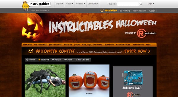
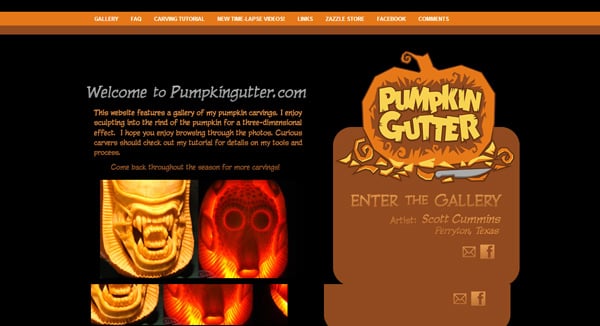
One design that is most common about the Halloween is the Pumpkin. People try to make it as scary as it can be. Pumpkin head is the best way to feature your design according to Halloween. There is nothing more appropriate that could give the sense that your site is designed for Halloween.
Broomsticks
It is another thing that could very easily be used in any design because you can apply it anywhere on web pages. Broomsticks have a large tradition that is followed for years. People like to see stuff that is used by witches in the fantasies. A well crafted witch on the broomstick will make sense and it will give your design the feeling of uniqueness.
Hat Of Witch
The only way to give your design a touch of Halloween is to use Halloween symbols. There is no need to change the design concept. A hat of a witch can easily be used as a decoration elements. It may be used to replace any letter ‘A’ or to hat any of the letters in the design, it is only up to the designer.
Skulls
It is also a tradition to scare and skulls are considered to be good for this reson. It is another element that can give the correct height of believing and could be used without any problems. Skulls can be used to replace any letter as far as it looks good. Some blood shedding from the skull could be the best idea if the designer knows where and how to use it appropriately.
Cobwebs and spiders
If you visit any of the scariest of the places it is for sure that you will find spiders and cobwebs there and if we are talking about ideas that could be used in Halloween web designs then using spiders and their web are a clever idea. It is another thing that could be used conveniently without changing the theme of the design. One can use spiders of any size sitting on any large or hollow letter. These are not the elements that will give a distinctive Halloween look to your site but it is still a good idea if they are used correctly with some other elements.
Spooky Trees
Trees with leaves are a sign of goodness but if leaves are not on them then it is one of the scariest concepts. It gives a certain look. It is another element that could easily be used and a person with a look can tell that the design is changed with respect to Halloween.
Bats
If a design contains bats then the viewer will not think that it is time to watch a Batman movie instead a bat gives a scary look. It happens because bats live in darkness and only darkly is something in this world to get afraid of. They are also easily usable in designs.
Body Parts
Body parts are beautiful unless they are not away from the other body. A site visitor can be scared away with body parts but he will definitely get the idea that it is Halloween.
To celebrate Halloween as a site owner it is necessary to change the face of the brand you are presenting. Halloween website design ideas from above can make your site celebrate the scary holiday with you.


