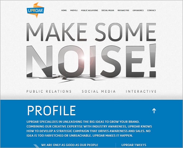
Huge Typography in Web Design
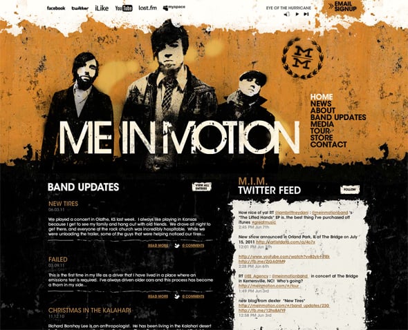
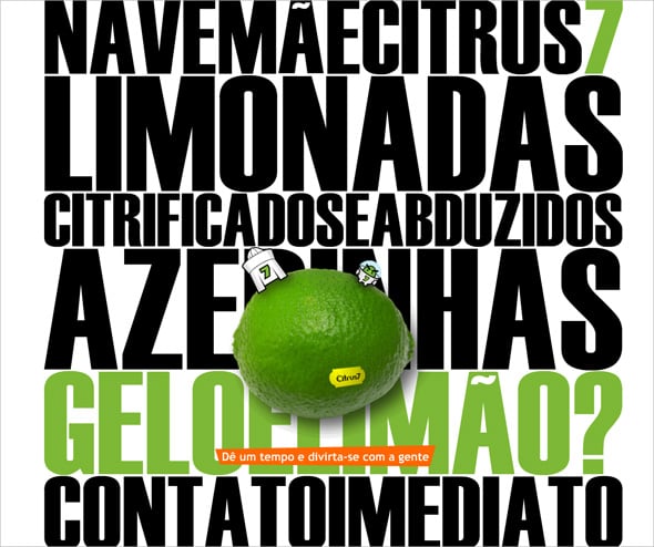
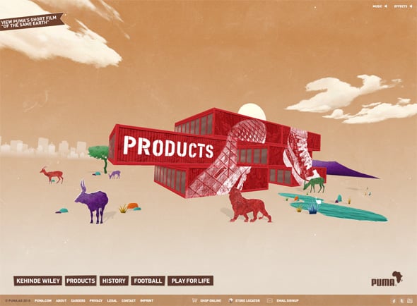
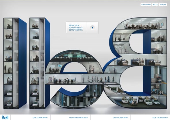
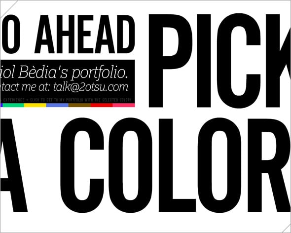
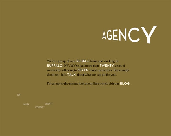
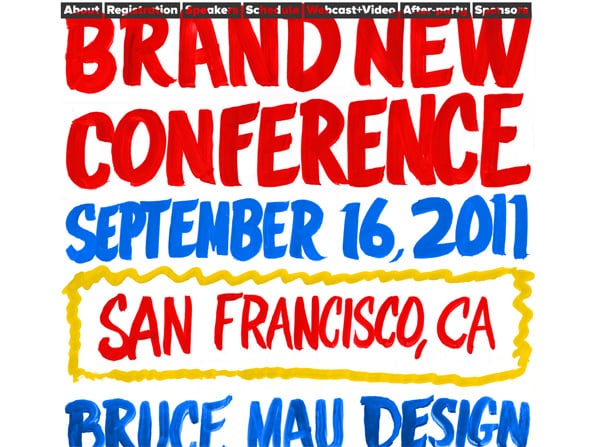
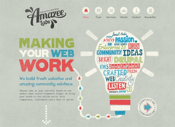
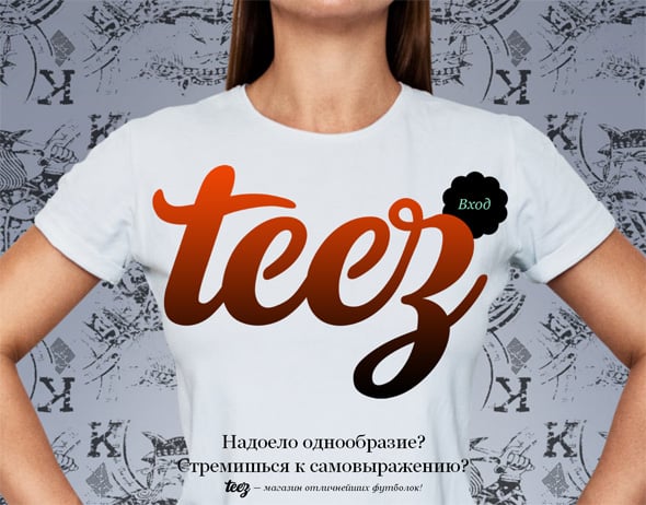
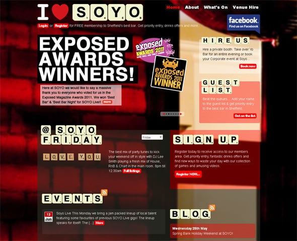
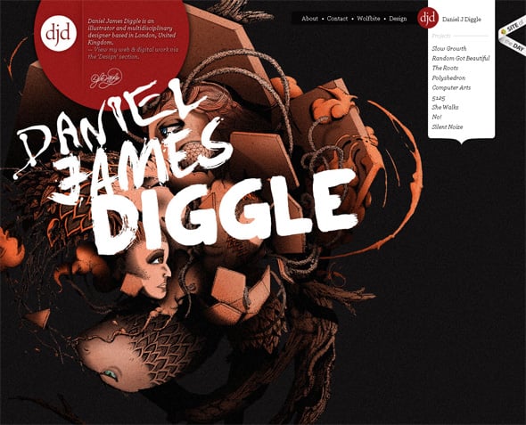
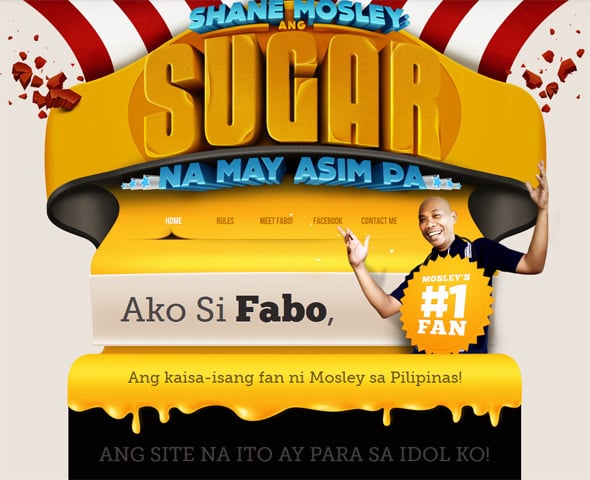
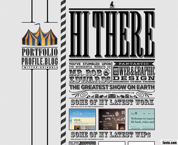
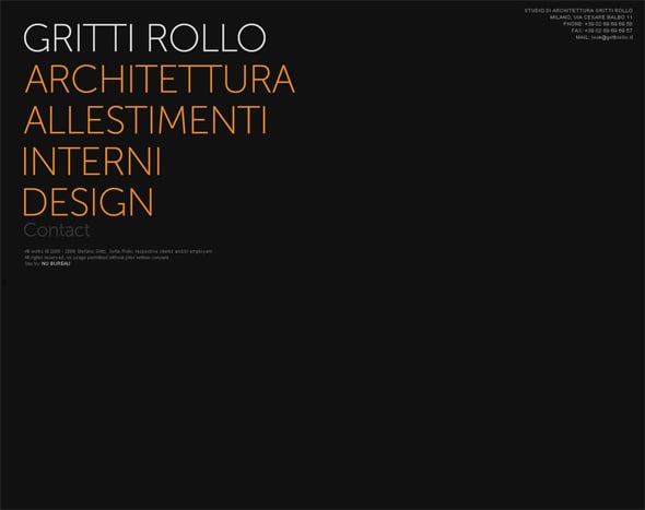
Typography is another way to draw audience’s attention to your website. Lately huge typography became a very popular web design trend and it started being used in corporate and business card websites, photographers’ and designers’ portfolios. Fonts, size, color, typeface – everything does matter when it comes to winning visitors’ favor. And as far as a website is a powerful communication and influential tool, huge typography is used as an eye-catchy design element to promote key ideas of the company and to affect customers’ purchasing decisions.
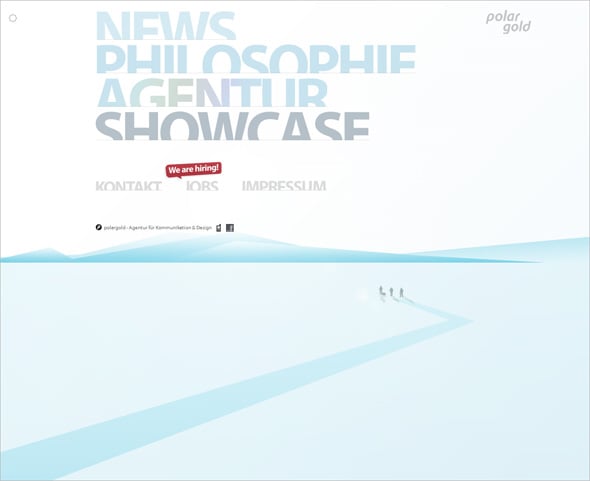
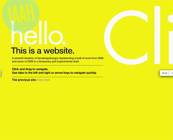
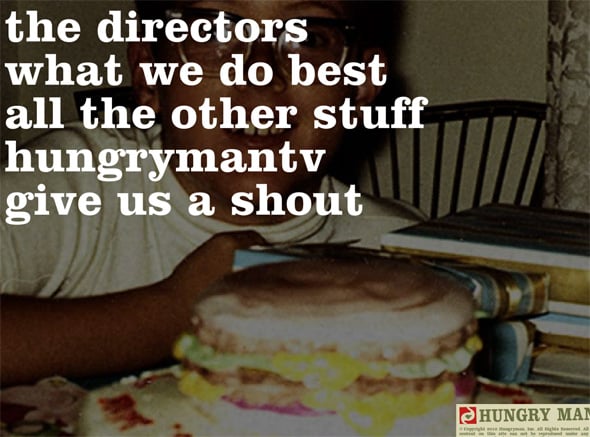
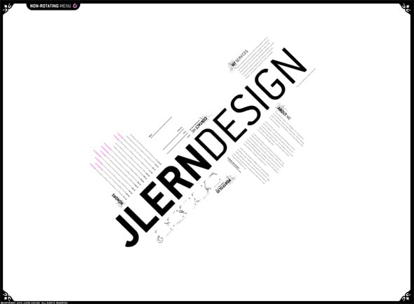
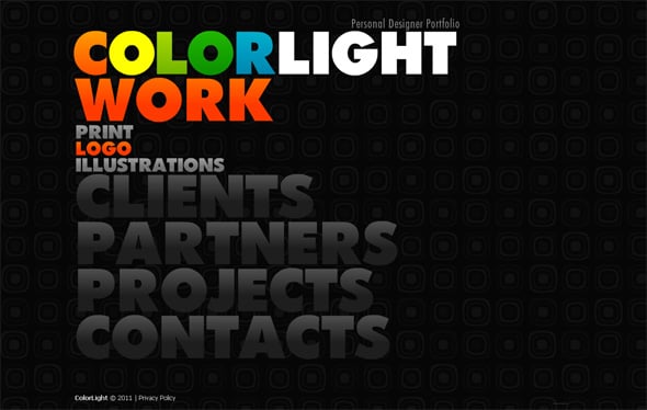
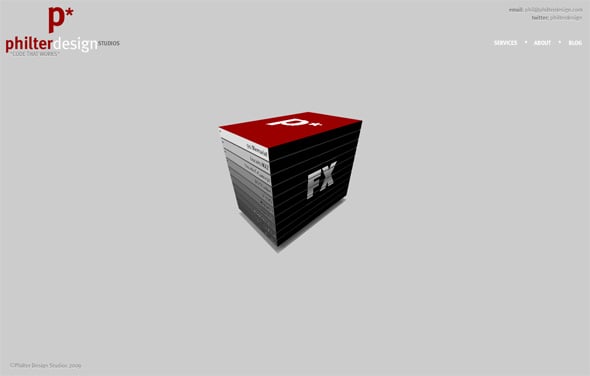
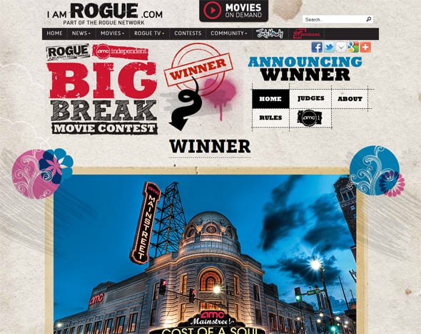
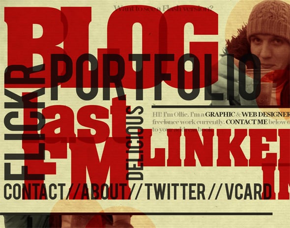
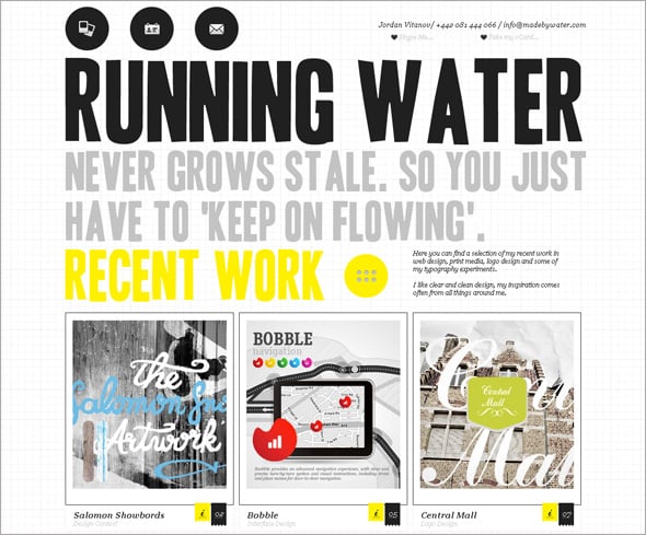
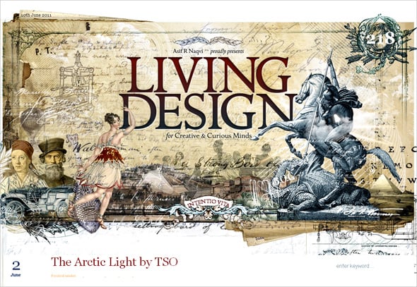
Large fonts are good looking in headers and backgrounds, they fit menus as well as other navigation elements. Huge typography can be a beautiful and noticeable decoration tool or it can be a valid functional element. So today we’d like to inspire you with a collection of Flash and static websites with a huge typography in the public eye. Maybe this showcase will help you in your next web design project.
Huge Typography in Flash Designs
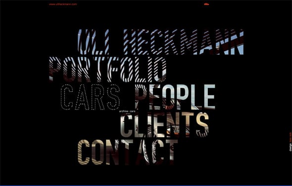
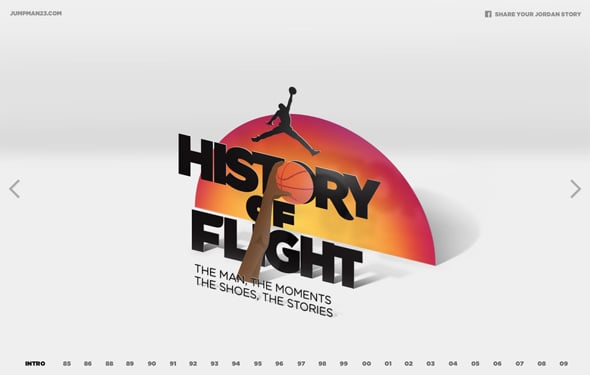
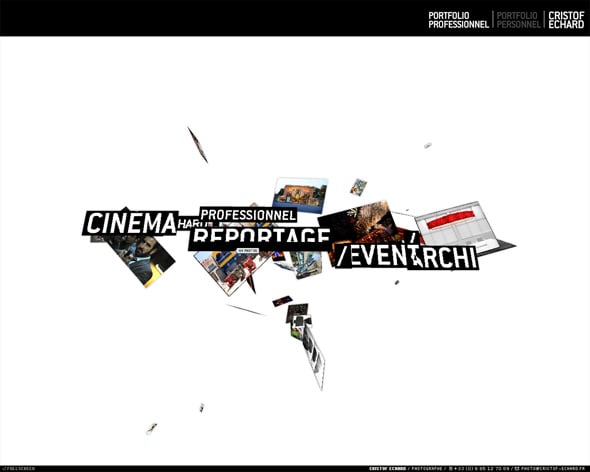
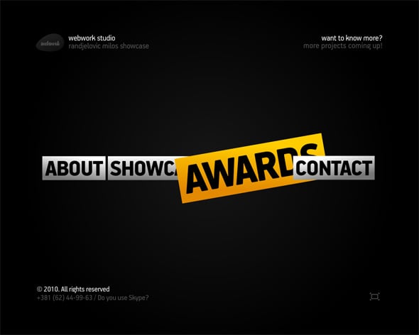
Flash technology provides almost unlimited opportunities in huge typography usage. You are welcome to make your typos look whatever you want and to arrange them with different animation effects. And here you’ll find 20 marvelous examples of using huge typography in Flash web designs.
Huge Typography in Static Designs
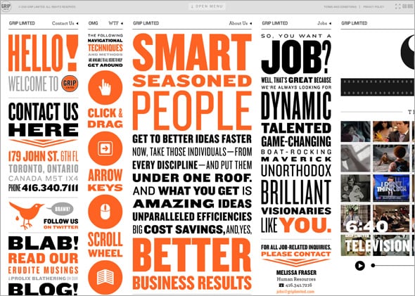
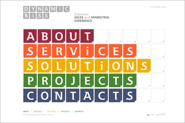
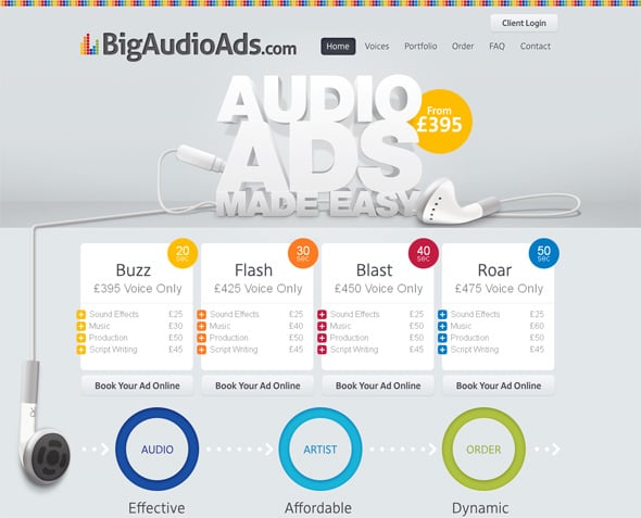
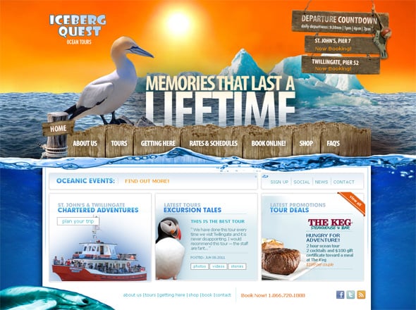
Static websites are also a good platform to try huge and vibrant typography elements in action. They will enrich any kind of designs and add a newness to any website.
If you want to be the first one to know the latest news of MotoTemplates blog just follow us on Twitter and Facebook or subscribe to our RSS feed.


