How Bad UX Kills Your Business – Top 5 Mistakes to Avoid
Web design, like all acts of creation, is a form of art. It has a purpose. And its purpose is to make the experiences of people who visit it pleasant while they make the journey from your home page to possible conversions. But oftentimes, there are missteps in this journey — missteps that you as a designer often overlook but that are clear as day to the people who visit your website or web application. Before long, you start experiencing a higher bounce rate on your web pages and falling conversions. Point it, you could be using your website or web application to sell the best products, but if it delivers bad UX, you might lose visitors.
So, the logical conclusion would be to avoid anything that can ruin this experience. In this post is a list of UX design mistakes that may be compromising it:
Too much content overwhelms visitors
In the book “The Paradox of Choice”, psychologist Barry Shwatrz argues that having more choices actually increases anxiety. It’s why we take so long to, for example, choose a brand of cereal from the several options available in the grocery store. Instead of being a convenience, the experience becomes a burden.
Unfortunately, a lot of designers make the same mistake on their web projects — presenting visitors with an overwhelming amount of information when they land on a page.
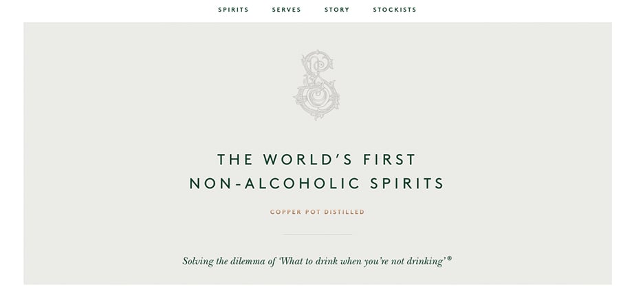
To avoid bad UX in this case, keep the content of your pages limited and relevant to what you want them to know at the moment. To illustrate, consider this landing page from a business that sells non-alcoholic beverages. It tells audiences what to expect from it right off the bat.
Source: Seedlip
Ignoring mobile UX means ignoring mobile audiences
Imagine using your smartphone to look for the nearest bus stop in a foreign country. But the website that you visit isn’t optimized for mobile. The buttons are too small to tap with your thumb, the contact information isn’t linked and the pages take ages to load.
Fact is, people are using their mobile devices to search for information more now than ever before. If your website isn’t optimized for mobile, you lose out on a large user base.
A website that is optimized for mobile should have most, if not every, features that don’t compromise its user experience on hand-held devices. For example, It should load fast, it should be easy for a user’s to fill form fields with one hand and have legible text that doesn’t require them to pinch to zoom to make it out.
To illustrate, consider this web page which has large buttons that are spaced out and linked images that are easy to access for on-the-go mobile users.
Source: hiddenvalley
Poor Choice and Presentation of Typography
Typography plays an important role in setting your website’s theme, tone and message. Even the slightest error sticks out and messes up the look you are trying to portray.
For example, too many different fonts might make the design feel disjointed while using a single font throughout a page might not be as impactful. The type of font you choose also has a part to play. A typeface that loses readability when a web page is scaled to multiple sizes, for example. is a poor choice for a web page.
Keep in mind, your content’s presentation, therefore, is as important as the web page’s design. It should, therefore, be consistent, clean and useful. It should complement the design, rather than oppose it.
You can avoid this bad UX mistake by optimizing your typography for readability and graphical balance. To illustrate, consider how this web page uses different sized fonts to divide the content into readable chunks.
Source: ditto
Unclear Call to Action is a Sign of Bad UX
The basic goal of any website is to produce leads. Call to actions (CTAs) like an “Add to Cart” button or “Sign up” links ensure that you actually make some money from your website. However, placing them inappropriately, not as much or not making them visible enough kills conversions.
A CTA should be placed where your audience can see it. It should suit the design but not blend in. For example, it shouldn’t be invisible to someone looking for a quick way to purchase what you have to offer.
As a solution, consider how this web page that uses a bright pink hue to draw a visitor’s eyes. The message on the CTA buttons also shows them the steps they will take next.
Source: lyft
Ignoring Analytics for Navigation
How do you know if your site’s navigation needs work if you don’t track what visitors do on it? You don’t. If you aren’t getting enough visitors on your pages, it might be that your layout is too confusing or doesn’t have clear paths to where they need to go. But you will never know that if you don’t use analytics tools.
Resources like Google Webmaster Tools show you where visitors are navigating away from your website. This can help you figure out why they are doing so. For example, heat maps may show visitors falling short viewing your entire web page and looking at other things you have to offer as they scroll down. To keep navigation less boring, maybe a fixed navigation menu that moves as visitors scroll through your content would be a better option.
Source: 20.ctpboston
Wrapping Up about Bad UX
To recap, avoid overwhelming visitors with too much information by keeping your content minimal. Optimize your website for mobile to take advantage of a mobile audience. Keep in mind that typographical elements have a huge role to play in your design. Improve your navigation by tracking how visitors generally move through your website. Keep call to actions clear to improve chances for conversions


