Website First Impression Matters – The Importance of a Good Design
Seven seconds, that’s how long it takes for someone to form a definite opinion of who you are upon first meeting. So, if that’s how long it takes someone to form an opinion about you, how long does it take them to form an opinion about web design? Much less. Consumers make up their minds about web pages in just 0.05 seconds.
We live in the age of the endless scroll. It doesn’t matter how hard you try to reach the end. You never will. Your eyes will flicker past a multitude of images, words, and colors on your computer screen, tablet, and phone. So what now? How could you possibly fight the never-ending digital stimulation any person gets on a given day?
Good. Web. Design.
Have you ever stopped for a few seconds longer on one post or ad over the other? Yeah, that’s what we’re gonna talk about – how to make that piece of content something you created. Let’s see how website first impression matters!
Get the Visuals Right

First impressions on the visual level depend on colors, font and text, logo, spacing, symmetry, and more. All of these elements work together to create your visual identity. A brand’s visual identity combines all the above elements that go into creating and defining your brand as unique.
Highly appealing websites are usually simple with a good design that captures the essence of your business and makes a powerful website first impression. It may sound cliche, but trends are popular for a reason. You should always aim to make your website unique, but keep in mind that there may be some industry standards you want to stay in line with. Check out potential competitor websites for ideas, and try to get into the consumer’s head to answer questions like: what do I want to see on the landing page?
Let’s talk about the components that go into building your visual identity, and thus, good web design.
Website First Impression: Colors

One of the first things our eyes can notice is the color scheme of a given website. Is it well organized or off-putting? It’s important to understand the basics of color theory, which complement each other and contrast. And that color combination should first take place within your logo design.
Website First Impression: Logo
Your logo should have a visual appeal and should be featured on your website. The visual appeal will come from your color combination and the simplicity of your design. This doesn’t mean that your logo should be boring – quite the opposite. There are different types of logos, and you should choose the one that best suits your brand.
Think about if you want a logo that includes simple words, an image, or a combination of both. To simplify the process, you can use logo maker services to help you decide which type of logo is best for you. You can also hire a designer to help create your logo with you. It’s important to decide if your logo utilizes any text because it will affect your web design overall.
Website First Impression: Text

Your main goal is to get a user to stay on your website. The visual appeal comes from consistency. If your logo has some text, that’s your starting point. You want to take the fonts featured in your logo and pull them into your web page design. If you have a logo that doesn’t feature any text, you have the freedom to choose 2-3 different but complementary fonts to be used throughout your site. Once you figure out which font will be used in each area of your website, you now need to look at the overall layout.
Spacing and Symmetry
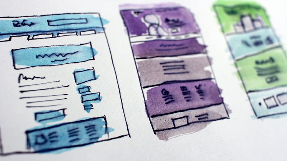
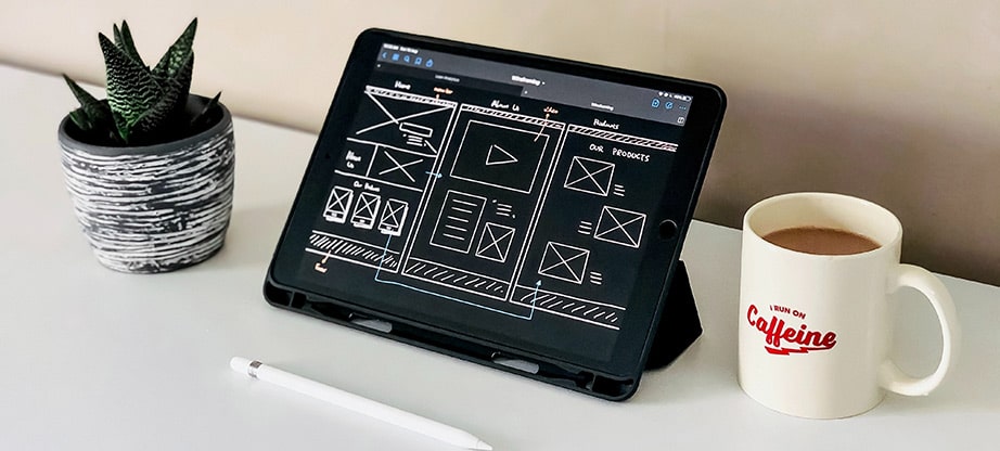
An easy way to get started is to use a website builder. You’ll see layouts that often use boxes and rulers to help you space your content appropriately, which is important for visual appeal.
Another thing to consider is what your business is trying to sell or promote. If your brand is more visual, maybe you’ll adopt a web design that highlights more photos and less text. On the other hand, you may choose a website with more text because that ties in better with your brand identity. Whatever it may be, always keep in mind to space every item to make the site easy to understand and readable. Now that the visual appeal of your website is set, how user-friendly is it?
User-friendliness
Remember that your goal is to convert people who land on your website into customers. You want to make them stay, and the ease of use of your website will help. You only have 0.05 seconds to capture your audience’s attention. If your website confuses a potential customer, they’ll be more inclined to move on to the next one and not give yours the time of day. The interaction with your website will come from the informativity and simplicity of your site. The navigation options on your website will also lend a helping hand.
Menu and Navigation
If you look at almost every website, there is a navigation bar. This is often the first place a potential customer gets information about your brand and what you can offer. It’s important to take the time to define appropriate headings. What someone sees can truly impact if they’ll continue scrolling and exploring the rest of your website. Therefore, your main landing page should be informative yet simplistic and appealing.
Take notes from other brands in your industry. If someone’s doing it right, there’s no shame in looking and taking advice. This being said, find a way to make your website stand out. You want to stay relevant and also make it clear that what you’re offering is unique.
Website First Impressions Matters
We know this is true both in-person and online. However you decide to design your visual brand identity, user-friendliness, and website navigation, it will ultimately define who your brand is to a customer. Good website design can make or break a business. Following these steps is a great place to start building a successful website.


