Website Header Design Inspirations for 2018 – Best Examples
Way back then, a “header” in web design is supposed to help you navigate the website’s different categories. But it’s quite a different game we have right now — a website header design is now inspired to be the soul of a website, it is now a top-sell canvas that helps the visitor to stay and enjoy the site by just looking at it.
Your home page is your “first impression”. People have developed an instinct to discern whether you are trustworthy or just another mediocre site with useless information.
That’s why we shouldn’t miss this chance, we will use your aesthetic ego to sell your brand without changing the uniqueness within. Visitors usually look for something that would answer their needs in just a glance because, at the end of the day, your header can help summarize the value of your site.
Make the most out of your website header design — put yourself in the shoes of a visitor. Imagine what a perfect header would look like for you to stay. It needs to be an eye-candy that’s also easy to use.
If you’re wondering how to win this goal to earn their attention, worry no more! We’re going to talk about the trends in website header design in 2018. We list down 7 of the best header designs that will surely captivate you with its creativity and wit. This will inspire you to create the perfect design for your website to gain attention and followers for your site.
7 Website Header Design Inspirations for 2018
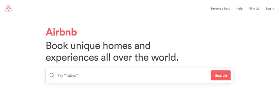
Airbnb
Is your aesthetic on point? This one’s for you! Its minimalist approach is well-optimized for user experience. It’s straight to the point, a design that calls your attention without the added frills. It also has a very good combination of color that won’t give you a headache, since its prime concept is to be simple but refreshing and vibrant. Its simplicity is also beneficial for the visitor’s purpose to navigate your site easier but be careful when it comes to placing your content; your potential customer might not find what they’re looking for and that would be the downfall of your website.
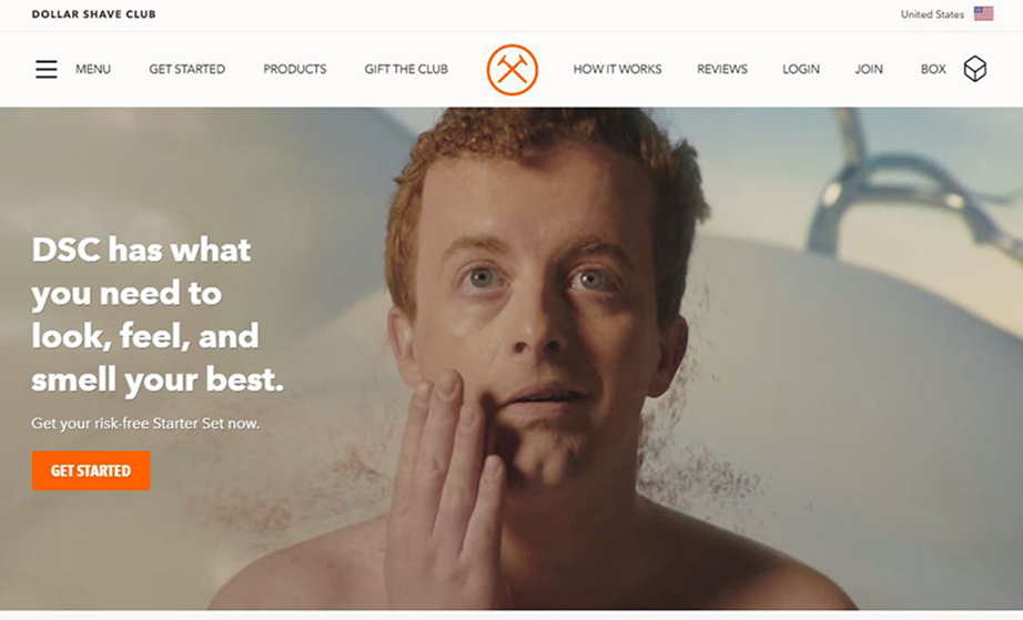
Dollar Shave Club
Are you a big fan of pictures in storybooks when you were a kid? I think this should be the design of your site. Background videos or animations is one of the best ways to attract the visitor’s attention. The good thing about Dollar Shave Club’s header video is its simple and precise message that attracts the audience to explore more of your website. You don’t need to be a videographer or an animator to do this. Amazingly, embedding a video into a website header is way easier compared to what it used to be.
DQuinn
Do you love the arts even before? Be inspired by Daniel Quinn, a designer that owns a professional freelance web design blog. What made it unique is its edgy header graphic. He even used a splash header with a variety of ink and paint effects that made it surreal. It’s a friendly site as well since its navigation links were centralized and aligned at an angle. If you want something odd, go ahead and be inspired by his site.
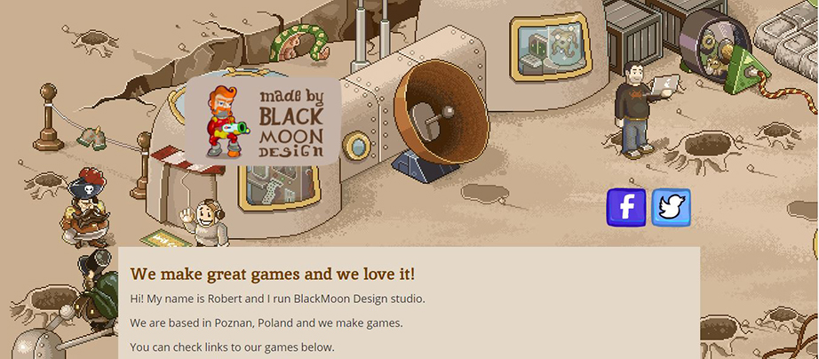
Black Moon Design
Do you love playing games? Did you grow up playing Atari or Gameboy? This is the missing piece of your puzzle! If you’ve been playing arcade games for years now, you will be enlightened with this header. This game developer targeted gamers to imply the two-dimensional world we were missing in real life. Pixelated graphics couldn’t get any better when combined with unique characters and atmospheric elements to boost up your site’s theme. Play with colors and be “old school” with this example for your theme.
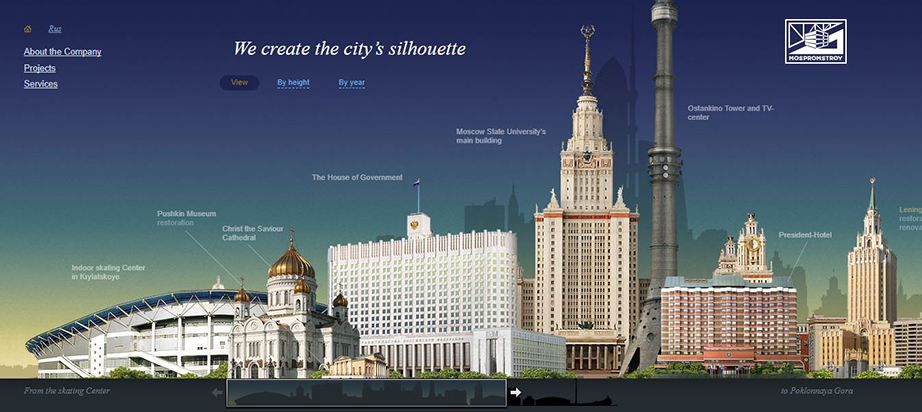
Mospromstroy
Showcasing your past projects to your clients is time-consuming, isn’t it? If you want to save your clients’ time to review it, why don’t you check this one? This Moscow construction company created their header with creativity and brilliant idea. They placed the best photo of their projects in their header to wow their visitors, they even include a slider where the audience could browse through their “portfolio”. This is a clever example of how you could brag what you have to your audience.
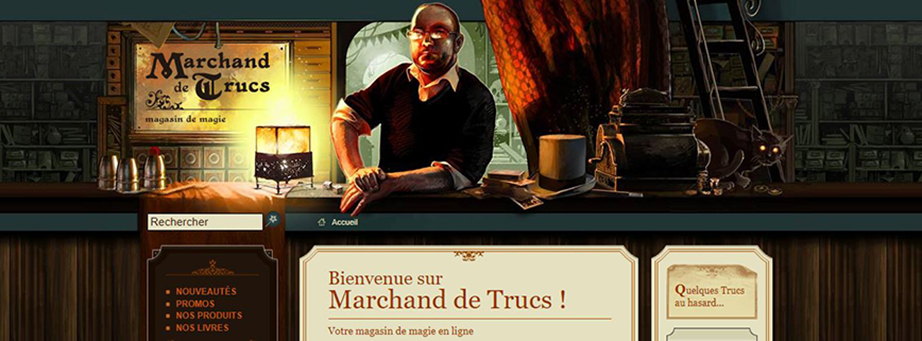
Marchand de Trucs
If you want your website to look mysterious, this is the best fit for you. The set up looks like the front of a hotel and an innkeeper will welcome you in their header. It’s actually brilliant in a way that they played with their design to make it more appealing and interesting for the visitors. Anyone will be mesmerized by the magical theme they worked on to their site. This theme will inspire you to dig deep; what does your website offer? Highlight that in your website.
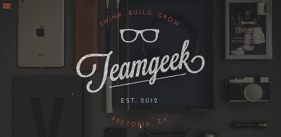
Teamgeek
This is one of the most engaging and uncanny header graphics that you’ll ever encounter. It looks simple and basic but it’s really warm in the eyes you could just stare at it for a while. They used a simple logo but with a combination of retro and modern graphics. The cool part of it is when you hover your mouse over an area, the “sand” is spread out. You can get an odd idea from this site if you’re looking for a unique way to set up your header. You might like the amazing design approach and use a smaller version to give you more minimalistic style in your header.
Website Header Design – Summing up
An amazing website header design should be unique in their own way yet a time saver for everyone — not just an eye-catching display on your site. Thanks to the innovative flow of HTML5 and CSS3, we’ve reached this era of web designing that lets our imagination run wild. Graphic and web designers are given the advantage of our advance trends to have enormous online resources and tools to enhance the idea of a typical header. We hope you garnered all the ideas you needed to your site and make the most out of it!


