

4 Ways to Contrast Elements in Website Images

Contrast in web design is an extremely useful way to distinguish certain elements in website images and set them apart. In simple terms it involves differentiating the visual properties of certain elements so that they stand out. If you use image contrast effectively, you should be able to emphasize and draw attention to specific elements in your website images. To do that however, you first need to understand the different ways in which contrast can be used:
Color Contrast in Web Design
The most common way in which to contrast elements is by using colors. For example a light font on a dark background will contrast and set it apart. Thus, making it stand out and more readable at the same time.
Depending on the color palette of your website images you should be able to find colors that contrast with the background and other elements. Using a complementary or triadic color scheme may be a good place to start and achieve good color contrast.
Shape Contrast in Web Design
Generally there are two types of shapes that exist in images: Geometric and organic. Geometric shapes involve straight lines and edges, whereas organic shapes are curved and smooth.
Setting these shapes against one another can create contrast. For example placing a square box on an otherwise organic image will distinguish it and draw attention to it.
Size Contrast in Web Design
As you can imagine, size is a pretty simple way to use contrast. It simply involves using noticeably larger elements to draw attention from smaller ones. If an element is noticeably larger, it will immediately become a focal point of attention due to its contrast in size.
Conversely the same is also true of small elements, which can be ‘hidden’ or made less noticeable if their size is much smaller than other elements in the image.
Typography Contrast in Web Design
Technically typography is sometimes regarded as a blend between contrast in shape and size, but it is used so frequently in website images that it deserves its own mention. Typically contrast in typography involves the difference between blocky fonts and curved fonts. The same with heavy fonts and light fonts.
Needless to say the overall font size can also be used to create contrast in web design, in the same way it is used in any other elements.
Depending on the image and the element that you’re trying to contrast, you should be able to use one of the methods listed above to draw attention to it. It is worth noting that there are other types of contrast that can be used as well, such as between texture, style, and so on.
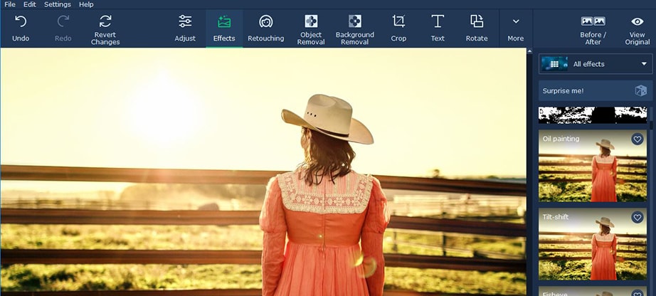
In order to start to use contrast in your images, you should try Movavi Photo Editor for Mac. It is a simple and user-friendly photo editor that will give you a wide range of tools that could help you to use contrast in particular elements. More importantly its intuitive approach will mean that you don’t need any prior experience to use its features.
To be more specific Movavi Photo Editor for Mac users will let you remove unwanted elements, replace the background in images, or even add text elements and customize them. It can also be used to enhance the quality of images by adjusting their color settings, fix any issues, touch up portraits, apply filters and effects, and more.
Already you should be starting to see some of the ways in which Movavi Photo Editor could help you to improve your image contrast. And you can improve the overall use of contrast in web design. That being said the best thing to do is to try its features out firsthand, so that you can experiment with them and see them in action for yourself.