Website Footers: Modern Trends, Tips, Best Examples
When designing a website, even the smallest thing can make a big difference. A website footer is one of those “smallest things” that shouldn’t be ignored. Today more and more web designers tend to pay as much more attention to the website footer as possible. Some years ago most designers and users would tell that this part of a website isn’t that important, because the content at the bottom of the page is not really able to attract a visitor’s attention. But the truth is that many of website footers were simply unattractive and mostly useless because of being ignored by designers.
As the time goes by, a simple line of text at the bottom of the page turned into a multi-functional section where in addition to the copyright and hosting info the visitors can find links to the main website sections as well as social and RSS buttons, unusual design elements, and so on. In modern web design developers say “NO” to standard boring footers.
When designing a footer, it is very important to understand why your website visitors go to the bottom of the page. There are two categories of visitors that go to footers: active users and passive users. The visitors of 1st category go there for more information (necessary links, copyright, CMS, social buttons, and so on); and the visitors of the 2nd category just scroll and scan (so our purpose is to capture their attention).
There are so many information we can include in a website footer, so when designing this important part of your website you should just take into consideration the general concept of the website you are building and the audience.
In this post we tend to cover modern trends in designing footers and give you some ideas you may want to use in your further projects. Also, we are going to mention some aspects that should be kept in mind when designing a footer for your website.
And dozens, dozens of inspiration…
Big and Informative Footers
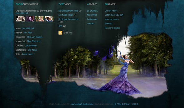
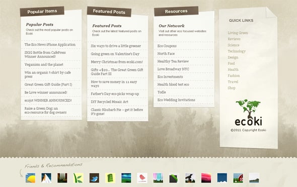
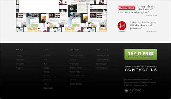
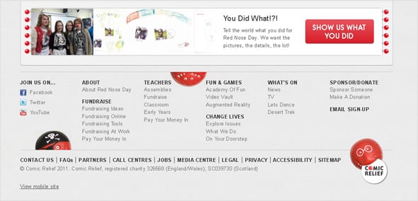
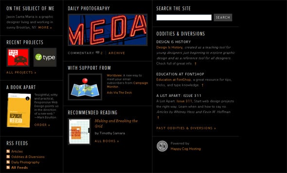
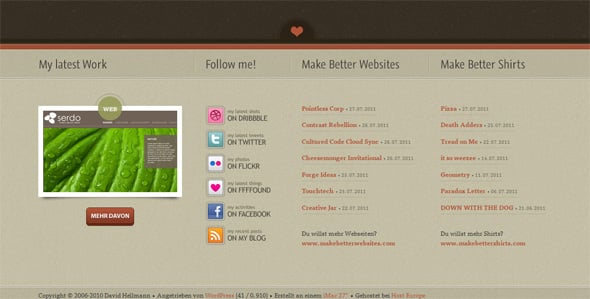
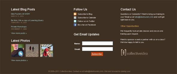
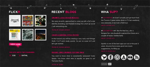
Many designers today think that it’s a shame to neglect a website conclusion putting a couple of links or a single line there. A solid professional website need to have a perfect and impressive footer. A big creative informative footer can attract more visitors and impress them. When designing a big footer, it is a rule to separate the footer from the content by using different colors, etc., but the whole color scheme of the website should be homogeneous (a big footer doesn’t mean a separate, completely different design).
Creative Graphics in Footers
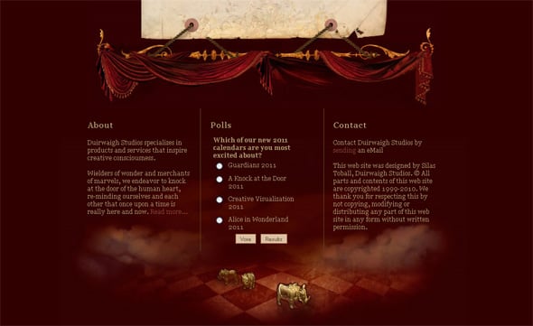
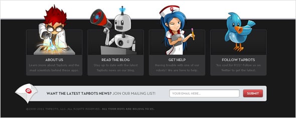
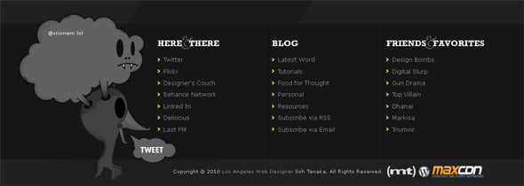
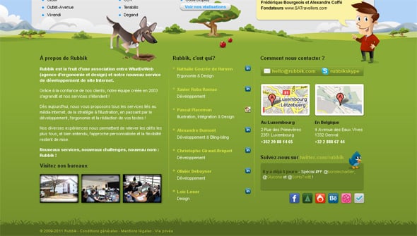
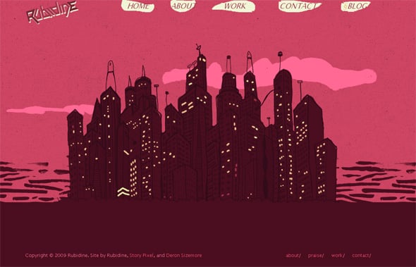
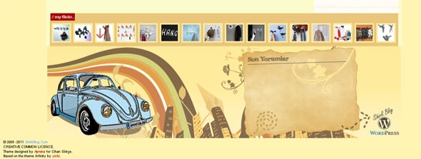
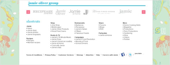
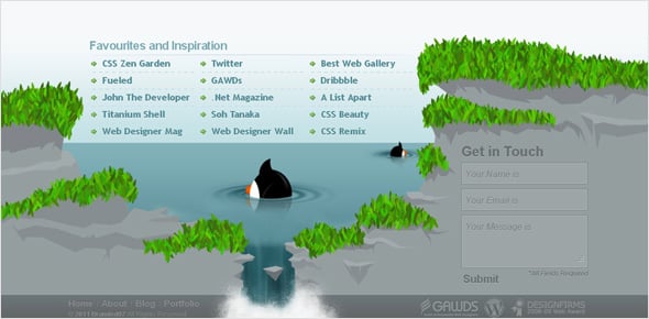
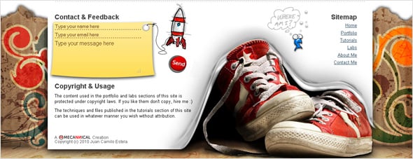
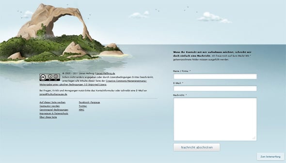
This trend has been around for a while, and it’s discussed by designers quite often. We see footers with interesting graphic elements like funny characters, trees, hand-drawings, ground imitation, etc. Such a design looks interesting and easily attracts the visitors’ attention.
A Sitemap in Footers
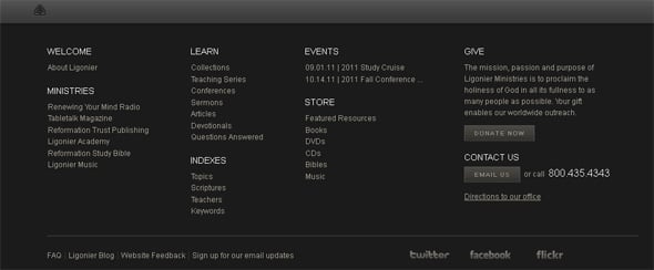
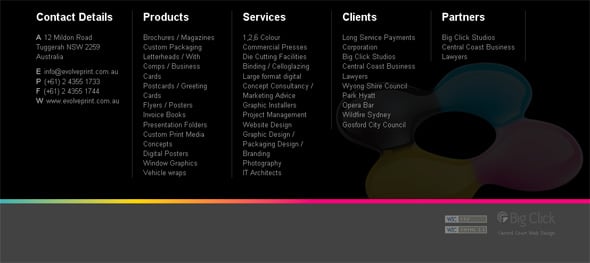
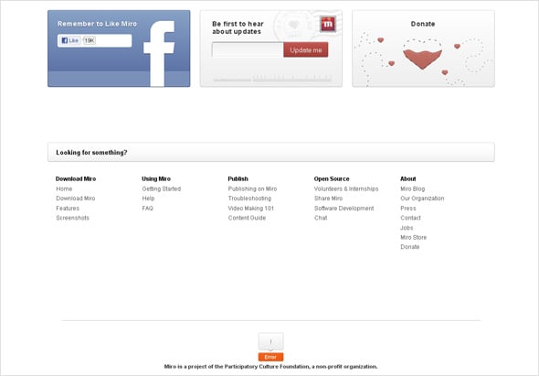
Placing a sitemap in the footer is a very good idea, and has many benefits. It can summarize the website content and can be really useful for easier navigation. A footer with a convenient sitemap attracts visitors’ attention and increases clicks and pages’ views. Besides, you may use your footer to promote pages you need.
A good footer sitemap is well-organized, the links are wisely split into categories with headings, and the navigation is clear and convenient.
Footers with Contact Forms, Newsletter Subscription Forms, etc.
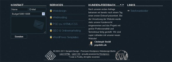
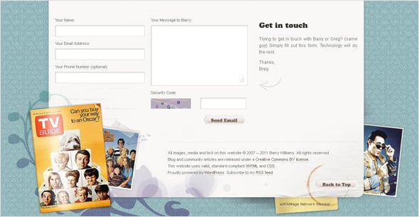
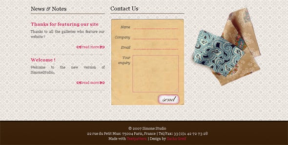
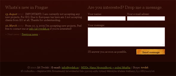
Some designers add a contact form to the website footer so that the visitors can easily contact the owner right from the current page, without going to a separate contact page for that. A simple yet convenient design solution. To include a newsletter subscription, registration or other form in your website footer can also be a successful idea.
Social Buttons in Footers
Social buttons in a footer is also a good idea: the visitors who would like to follow you on socials will easily find the buttons to join your community on Facebook or follow you on Twitter.
As a conclusion, we’ll sum up some aspects that a designer should keep in mind when designing a website footer.
- The footer should reflect the general concept of the design.
- The links should be split into sections with headings and placed in a clear convenient way.
- The content should be readable and usable, and the footer structure should display the info in a clean unique way.
- Use a good typography for headings and readable fonts for content.
- A good style and a catchy clean layout are essential for any footer design.
Please share your thoughts with us in comments.


