Teen Websites to Break All the Barriers
When I just started thinking about this post I was sure that there are myriads of cool teen websites. It’s super great when you’re 15 and it might be reflected in web designs. That’s what I thought before. In practice everything appeared to be more oppressive.
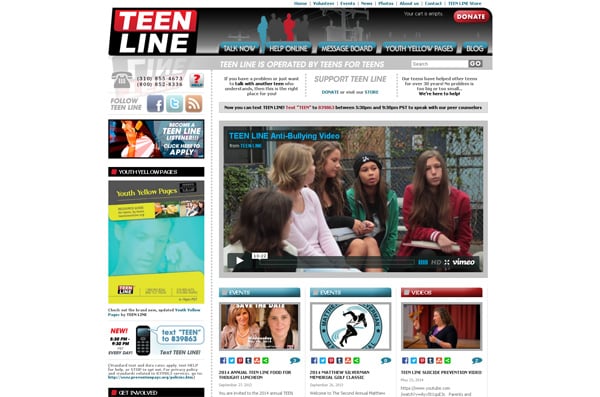
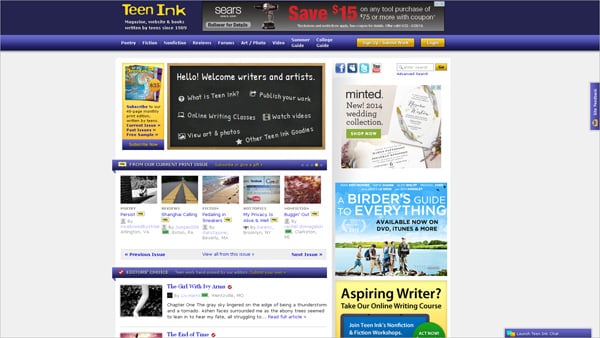
The majority of websites for teenagers doesn’t care about their look. They use old-fashioned designs that a web-savvy person hasn’t seen since the early 90th or so. Of course that is a matter of taste and some may find such websites quite liveable. However, web design is not the same as it was 10 years ago. New trends conquer for getting leading positions and the majority of site owners try to follow them.
We tried to pick out the most common features of teen websites that might be appreciated by young web users. If some points don’t seem convincing for you we’re ready to discuss it. Reply to us via the contact form below the article. And now let’s back to teen websites elements.
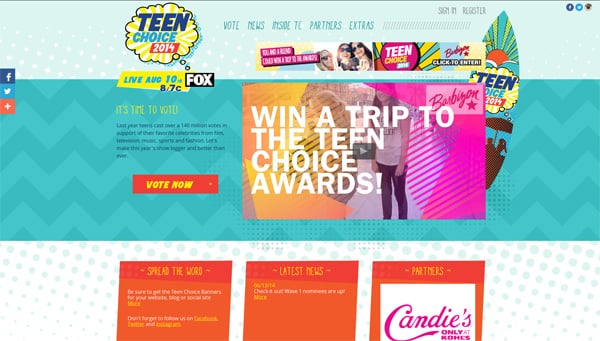
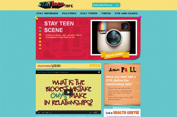
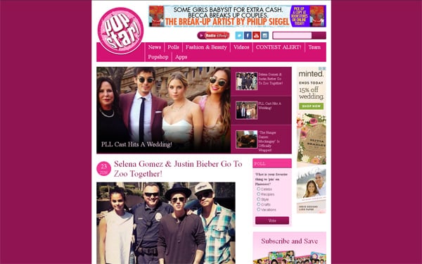
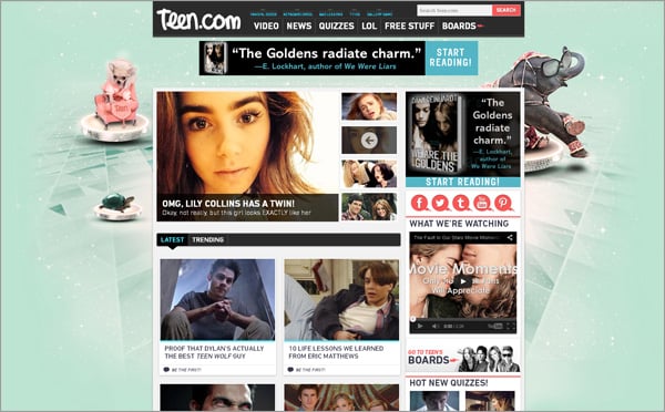
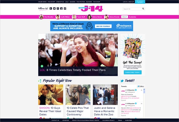
Teenagers are not like dull grown-ups who want everything to be done right. Young boys and girls are always looking for the best things and on this way they like to experiment. Color is the most common thing to play with and teenagers do it with pleasure. Hippie times have gone but the love to bright vivid tones remained.
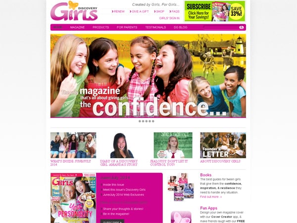
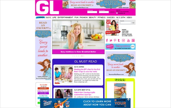
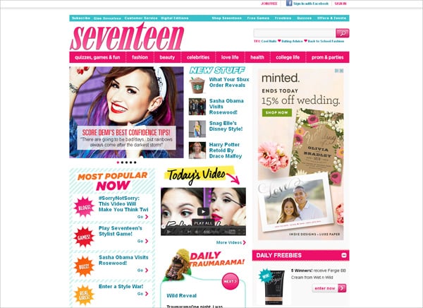
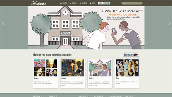
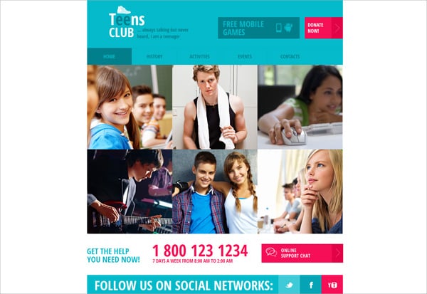
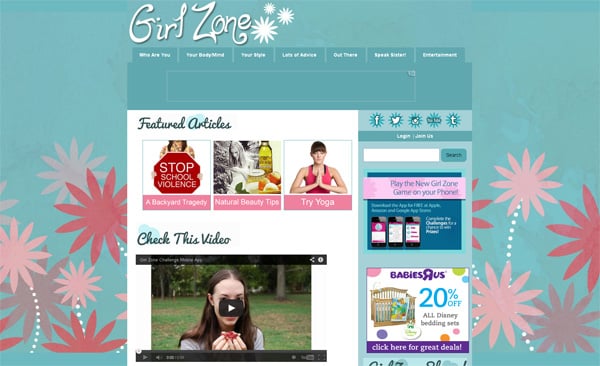
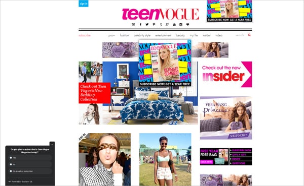
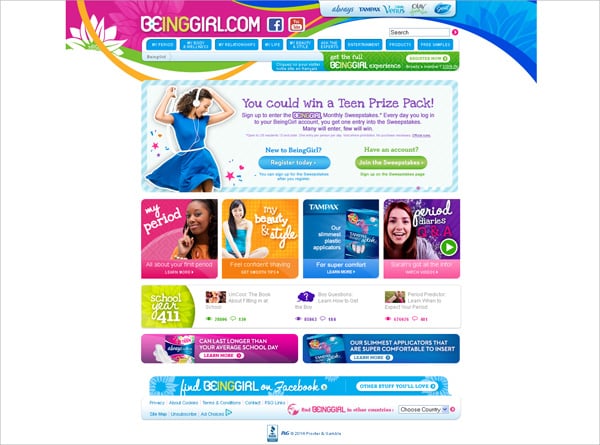
If taking a quick look at the teen websites below you’ll surprisingly see that most of them have fine colorful designs. Pink is considered a girlish color that works well when applied to titles, logos and certain content background sections. When measured well bright pink tone stimulates visitors attention and makes them feel good. If talking about washed pink hues they are more appropriate for pages backgrounds. Such colors are trendy thanks to the popular flat design, so a anyone can try to create a flat-like layout by means of color combinations.
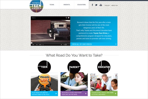
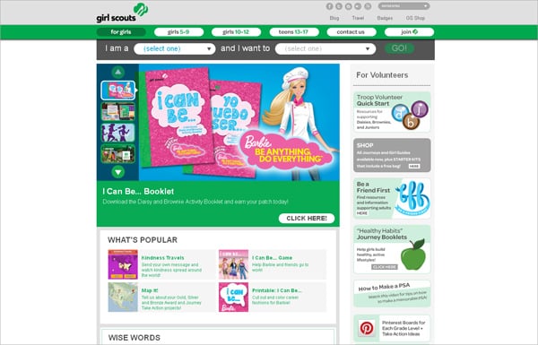
Funky creative typography is also a thing that attracts attention of all site visitors and convinces them to take a closer look at web pages. Original fonts are good for site logos, menu items, and major titles. It’s always better to have plain body text with a few noticeable accents on key phrases.
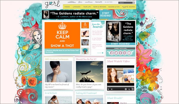
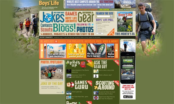
Textures are widely used in teen websites designs. This tool is quite simple but allows to create depth effect and make clear pages eye-catching. Textured content background sections are good when you have white pages background. It brings a kind of metro style into any design.
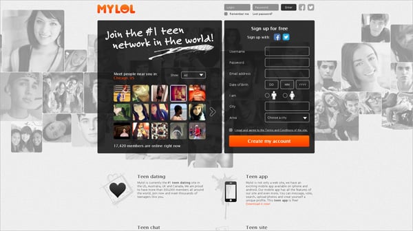
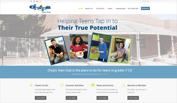
Another feature that has become very popular among web designers is the transparent effect. IT professionals and common users are crazy about it because transparency improves web pages usability. Blurred photos or images with higher opacity level easily suit different color schemes and content structure. They don’t distract users from reading site info.
That were basic features of well-designed teen websites. Now it’s time to observe the most successful examples of youth-oriented designs.


