Doodle Art in Web Design – How it Can Be Applied
Probably every web surfer knows what Doodle is. This fun logo is used by Google to celebrate holidays and all sorts of more or less notable events. It is comical and nobody knows how it will look in a day or two. So millions of people enjoy these changes and willingly keep after them.

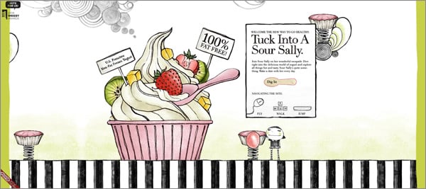
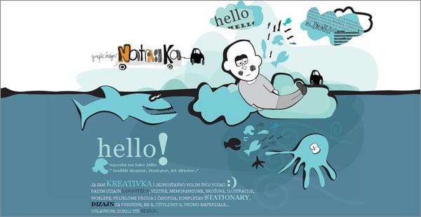
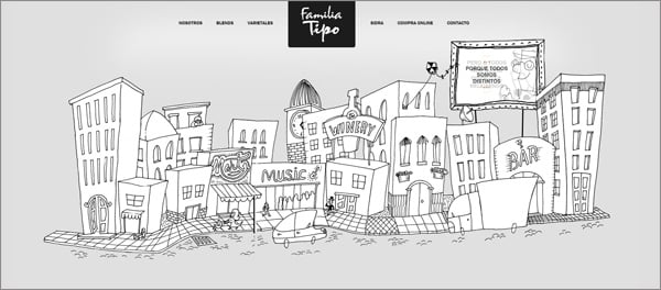
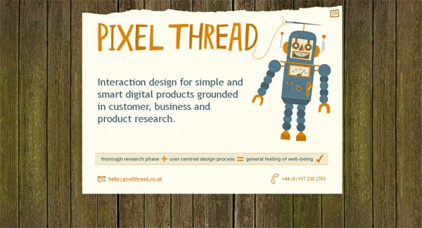
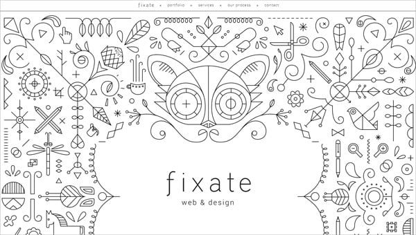
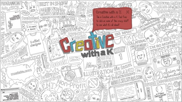
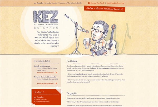
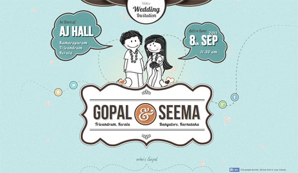
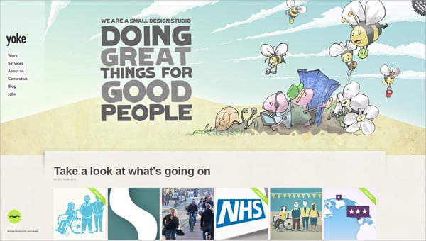
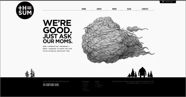
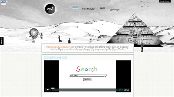
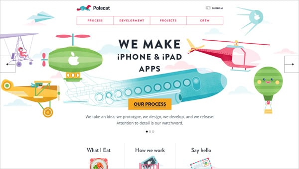
Taking into account the world’s passion for Google Doodles a lot of site owners try to implement this design technique to their resources. When used properly Doodle art in web design looks super great and keeps visitors with wide open eyes. The key problem is in the main style features that are hard to be determined. There are no intrinsic peculiarities that are common for all designs of this kind – there is just feeling of creativity and joy. However, there are a few probable doodling features that may be used in web designs:
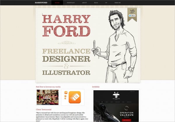
- sketch portraits;
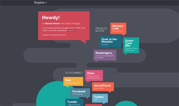
- speech bubbles;
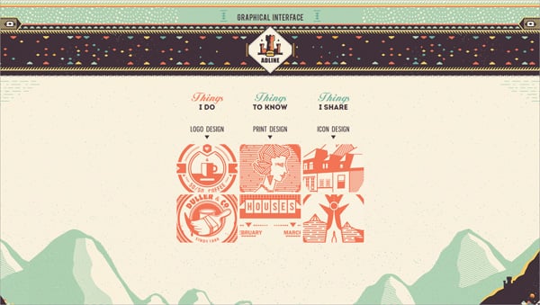
- hand drawings;
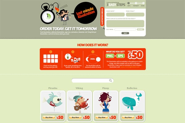
- drawings of unreal comic characters (robots, animals, zombies, landscapes, etc.);
- various font styles and typefaces;
- animation;
- etc.
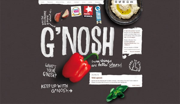
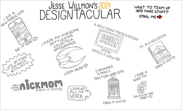
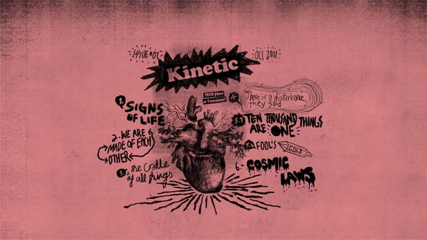
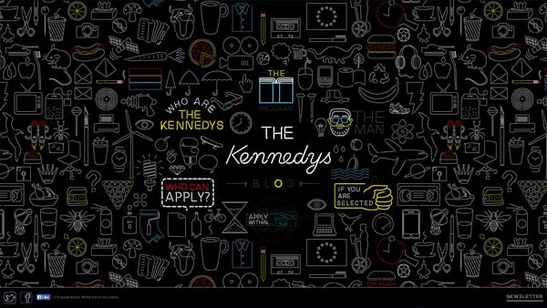
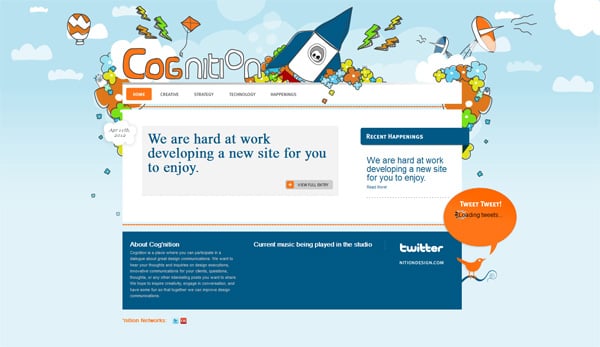
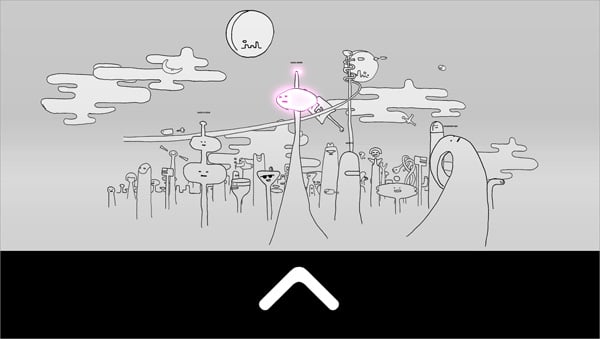
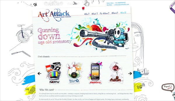
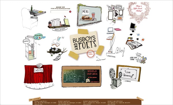
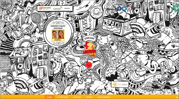
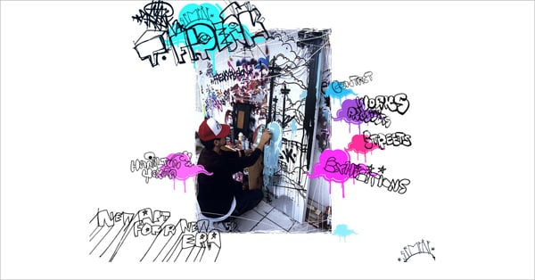
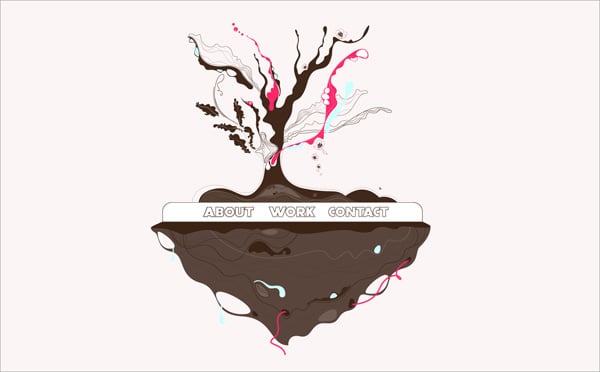
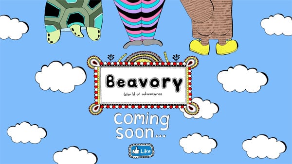
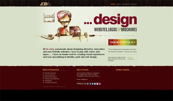
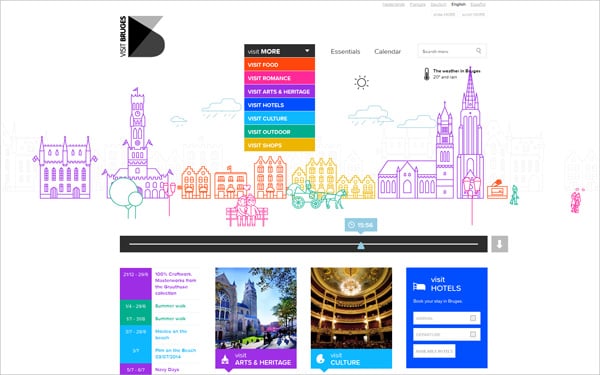
You can complete the previous list with your own ideas. Find out inspiration in Doodles archive or look through the following collection of 36 websites with Doodle art design elements.


