

Fashion Ecommerce Sites Design You Can Learn From

Fashion eCommerce has seen a boom in recent years, and the fashion giants have turned their heads toward eCommerce. This has opened up the doors for many small businesses and lesser-known fashion brands to make a name for themselves in the fashion market. Fashion sales are difficult because you’re not selling a commodity but a living style and art form. This makes the design when you build a fashion website more important than the other eCommerce businesses. The fashion eCommerce sites do not only have to look like the art they’re selling but also involves a mix of ease of the shopping experience, clever copywriting, and easy navigation.
Fashion Ecommerce Sites & Their Popularity
Moreover, fashion eCommerce sites also have to anticipate and rectify user problems. In this article, we’ve shortlisted ten fashion eCommerce website design examples from which every eCommerce website can learn. So let’s dive right into it and explore the journeys of these fashion eCommerce sites. The eCommerce sites are all around us. Are they all successful? No. Most fail. But why? One of the most common reasons is that they do not put user needs above business ideas. A good user interface is one of the key characteristics of any successful eCommerce store, and without caring about this one aspect, you will constantly lose customers. The comfort of users can be ensured thanks to the modern design of the online resource.
The Sirius theme is a vivid example of what a modern and convenient site should look like. Everything here is designed to focus visitors’ attention on your products, not just on sales or promotions. Your online store on mobile devices will look as beautiful as on desktop computers. The design demonstrates the products used, which creates an inspiring picture in users’ heads as they can see the product in action. If you want to create a profitable online store, the Sirius minimal Shopify theme store for dropshipping is a great example of inspiration. Modern fonts, various product browsing options, quick purchases, integrated social networks – use this theme to attract attention and increase your sales.
Good design always means simple navigation, flawless user interface, clear branding, and visual perfection. Sirius proves that creating an eCommerce site that will be simple and concise but warm and attractive is possible. Use high-quality photos, a muted color palette, and graceful design elements such as parallax scrolling to enliven your site. You will also like the subtle but logical placement of the call-to-action buttons. It creates an unobtrusive and convenient way to shop. Want to use the perfect platform for your store? Purchase Sirius to talk about your brand. Your site will look amazing and definitely will not go unnoticed by visitors.
Another representative of perfect eCommerce web design is a Delori Shopify theme. It is a fantastic, modern, trendy, and elegant Instagram-oriented clothing website template. It is best suited for online fashion stores, but you can easily use it to sell womenswear, accessories, bags, shoes, and more. It’s an easy-to-use template that can be easily modified to fit your brand’s needs. You can complement Delori with your corporate identity and make it even better.
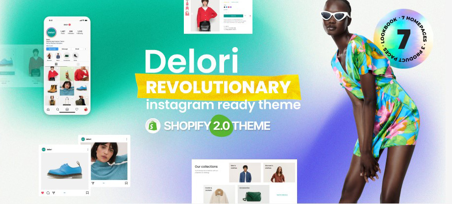
You can easily win over new potential buyers with an enticing and unique full-screen slider. In addition, Delori has everything you need to run an online store: a drop-down menu, a shopping cart, compare product and wishlist, checkout and contact pages, a blog section, and a widget-rich footer. Link your site to all your social media accounts and increase your potential. Start your online clothing store with Delori and bring your idea to life once and for all.
Reformation
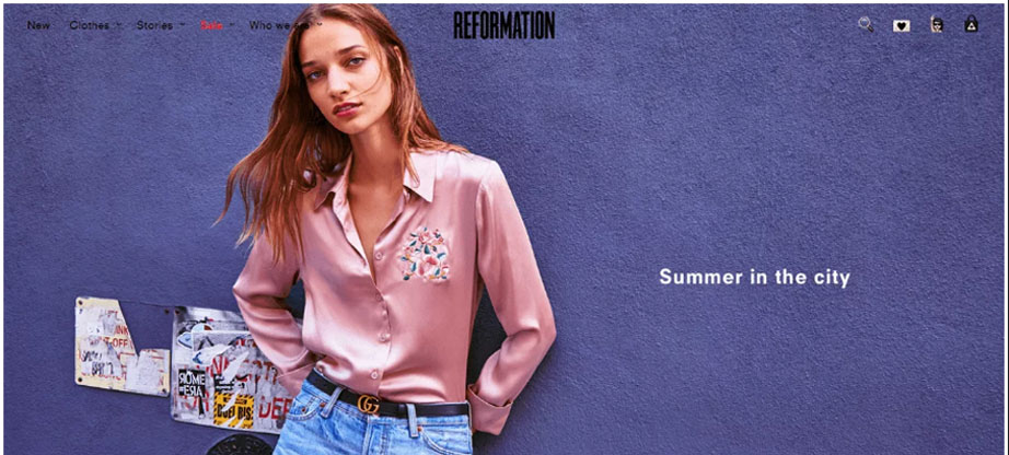
We’ll start with a store with an amazingly eye-pleasing eCommerce web design. Reformation is an all-around fashion store that relies heavily on its amazing copy and marketing techniques. As soon as you enter the website, you are awestruck by the full-width slider background that draws you in. The background image sets the website’s tone and helps get the visitor excited about the store. When it comes to fashion eCommerce sites, grabbing your user’s attention is very important. It would reduce the bounce rates and generally help in the SEO.
The personality of the brand is the unique selling point for Reformation. Reformation has a hip, witty tone set for all of its copywriting, and it grabs the visitor’s interest like nothing else. For example, the tagline “Being Naked is the #1 most sustainable option, we are #2” is amazing.
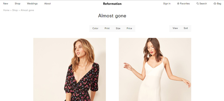
The store uses the psychological element of scarcity by creating a separate category called “Almost Gone,” where there are products that are not left in huge numbers in the stock. Scarcity is an essential part of fashion eCommerce site design and is a driving factor behind generating more sales and increasing revenue.
Lastly, the website has unique product pages and the call to action displayed on the product pages. The product page design is neat. Another interesting approach toward the CTA button is how it sticks around as you scroll down through the product pictures. Right at the bottom of the product page, they display similar products very interestingly. Reformation is definitely one of the fashion eCommerce sites with an amazing eCommerce web design. Other businesses and brands can learn a thing or two from the website.
Sophie and Trey
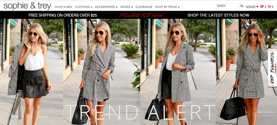
Next on our list is Sophie and Trey. When it comes to fashion web design, they seem to have incorporated all the elements that need to be there on a fashion website. As soon as you open up the website, you see a background collage showcasing the products in an eye-catching way. The owners at Sophie and Trey model their outfits themselves, making the customer feel connected to the brand. The top and main menus are neat, and there is no clutter.
Email marketing is a must-have for an eCommerce store out there, and giving the visitors an option to subscribe to your email is an integral part of any fashion web design. This brand incentivizes the sign-up with a 10% discount. That is a great tactic that can be beneficial in the long run. You have the email of the customer to whom you can market and re-market your products for a long period of time in exchange for a 10% discount, while the customer can benefit from this first-timer discount; it looks like a win-win!
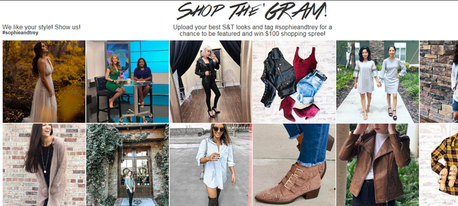
Another key element on their homepage is social integration and proof. They display the customer photos on their home page that are uploaded on Instagram with their hashtag. This is a great way to establish social proof for first-time visitors of the website. another
Another thing to notice is the chat option integrated on the bottom right of the page? ‘LIVE CHAT WITH A STYLIST. This is definitely something that a good fashion shopping website should have. Giving your customers the option to speak to someone with fashion authority and help them with their shopping experience is a great way to gain their trust.
Nasty Gal
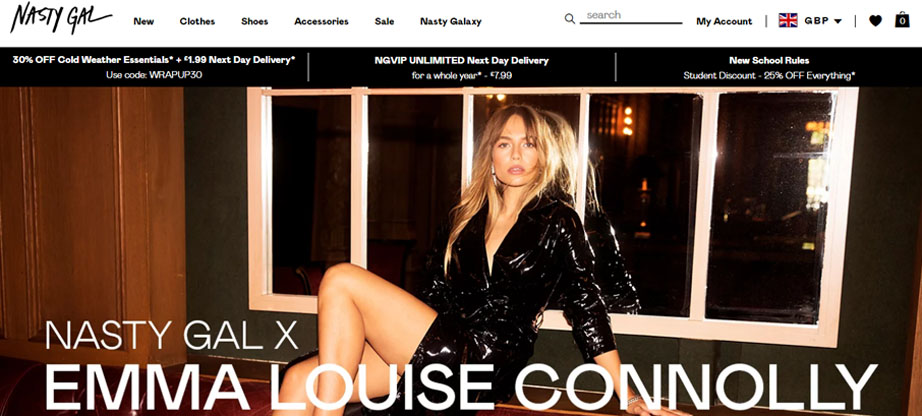
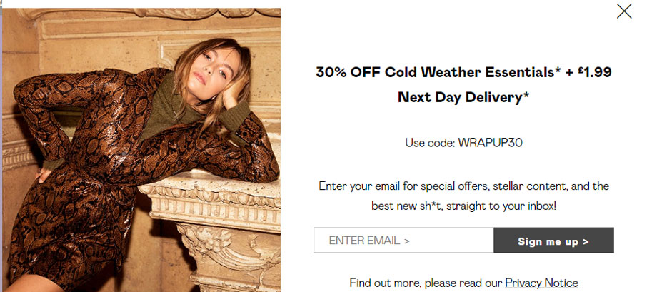
Nasty Gal does everything right and more when it comes to fashion eCommerce site design. It has all the elements that fashion eCommerce sites should have and goes a mile further in terms of design and services. The homepage consists of a neat menu and displays all the right information that a website visitor requires when visiting a website. The delivery times and the discount offers are on display on the website. As discussed earlier, creating your email marketing list is essential for any business, and Nasty Gal offers 30% off on their Cold Weather Essentials by grabbing a customer email.
Another amazing thing that Nasty Gal does is by supporting a charity. A part of the proceeds of the sales goes to the charity MTV Staying Alive Foundation. This establishes social awareness and proof that the brand is not just there to sell but to give something back to the community. The funky design and the bold statements that revolve around building a community make Nasty Gal stand out.
Nasty Gal has amazing product pages. The pages have every single thing that a shopper wants. Product pages are the most important pages when it comes to fashion web design. The product pages of Nasty Gal have everything: amazing product photos, a size guide, a shipping, and return policy, and a hover-to-zoom option.
LOQ
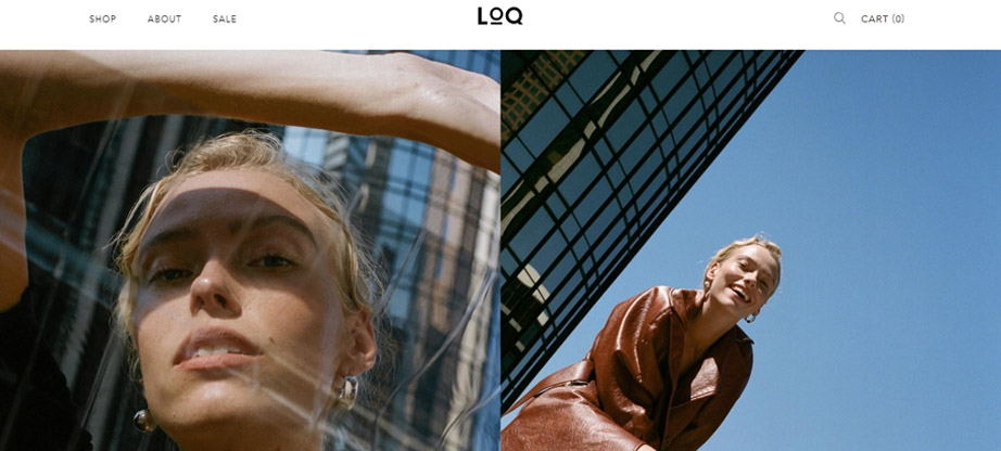
LOQ has one of the most striking homepage designs that we’ve seen for fashion eCommerce sites. The stunning visuals and gorgeous photos arranged aesthetically pleasingly make you want to keep scrolling down until the end of the website. You just want more! The home page design is as minimalistic as it gets and out of the ordinary. When it comes to eCommerce web design, there are no set rules for what to do or not to do. LOQ takes a bold step out of the conventional design and sets the tone for its brand.
LOQ’s product pages are amazing in their own way. Taking a step away from conventional product page design, LOQ displays pictures in a grid. The product pages also include a conversion chart to perfectly fit your sizes. The particular page that we have displayed includes a note to the shoppers to buy a half size up as the shoe is narrow in the shaft. It is a small, normally insignificant detail, but it goes a long way in establishing customer trust.
Chubbies
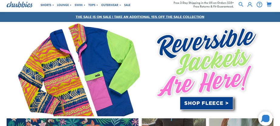
While branding and establishing a brand identity might seem feasible for big giants like Apple or Coca-Cola, branding is everything when it comes to fashion eCommerce sites. You don’t need a million-dollar marketing budget and big-name celebrities to establish your brand identity, and Chubbies does just that! By sending out a clear message right on its homepage, the brand establishes who they are and what they believe in. Witty humor and taglines are a part of who they are.
The entire website is uplifting and embodies its brand spirit. Shopping for swimwear has never been this enjoyable.
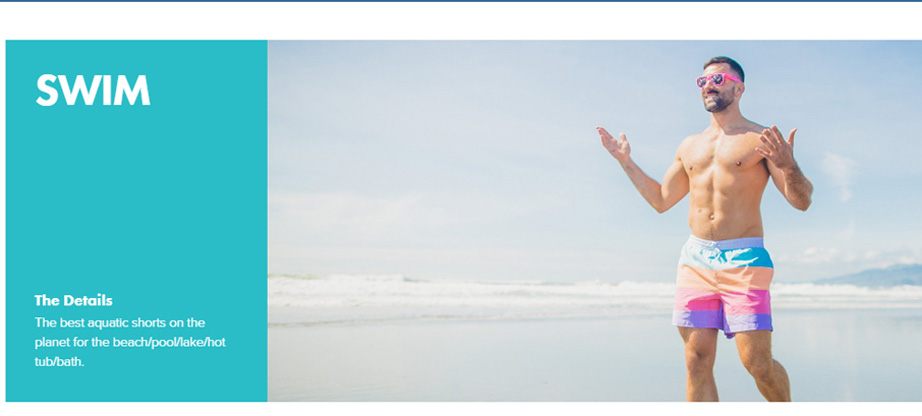
Chubbies has carefully phrased the copies that they use on their website. Along with the words, the pictures that are used on the website cater to their target audience. A younger generation would prioritize enjoying the sunshine at a beach wearing funky colorful swimwear by Chubbies. The brand experience transcends across every page of their website, right down to the product pages and the website footer.
The product pages have all the checkboxes required for eCommerce web design Chubbies does a little extra. They have this witty section just below the product pictures where they talk about the product. Apart from this amazing description, they also provide reviews on the product page, establishing social proof. Chubbies is a fun store that makes your shopping experience enjoyable. That is why it falls on the list of our ten fashion eCommerce site designs that every website can learn from.
Mansur Gavriel
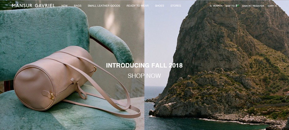
Absolutely ravishing photography! That’s the first thing that comes to your mind when you visit Mansur Gavriel’s website. Photography is essential for any fashion shopping website, and the team at Mansur Gavriel does it the best. The artistry behind the photos and the products is worth including on our list. The shopping page has a minimalist web design, amazing visuals, and amazing photography.
White space is required in an eCommerce web design as it enhances the focus on the product. The website follows a minimalistic theme, and the design is based on that. What really stands out for this website is the cart. There is no excessive information on the cart page. The design is elegant and tidy, and no additional CTA’s are displayed. The brand, right to the end, follow the minimalistic design theme. Establishing a brand identity for fashion eCommerce sites is a difficult task. Still, this website manages to do just that by following the brand identity of the luxury right to the end.
Missguided
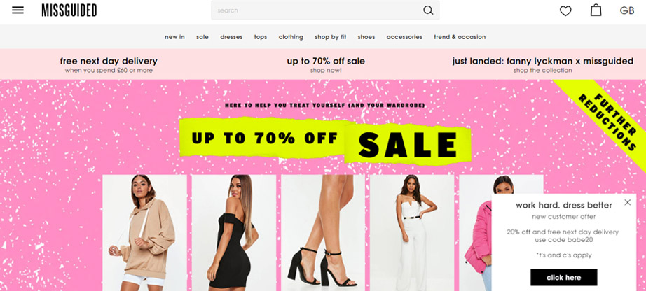
Having a successful eCommerce fashion store involves a mix of a lot of key elements stirred into a perfect blend. Missguided‘s homepage focuses on incentivizing the visitor by offering them discounts and something that customers love the most. FREE DELIVERY! If you notice on the screen above, a CTA button at the bottom right corner further incentivizes the visitor by offering 20% off.
Another thing we love about the Missguided home page is how they have created the subscription box for their visitors. Instead of using the normal boring copy of subscribing now, they have made it interesting for the customer by saying, “Treat your inbox.” This would push the customer towards entering their email as it creates curiosity about what they might receive in their inbox.
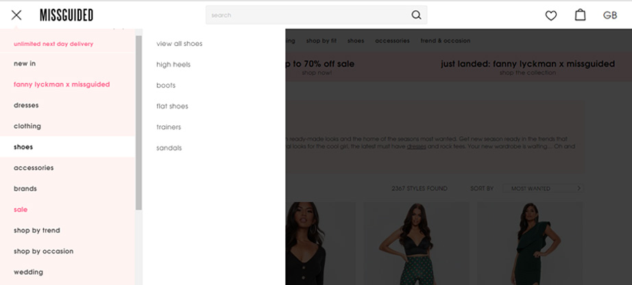
Missguided’s information architecture is amazing. A menu button on the top left of the page creates a drop-down menu if you’re browsing on the desktop. The information and categories are organized manner, and the architecture of this representative of fashion eCommerce sites is amazing.
Lastly, let’s talk about Missguided’s blog and appreciate how amazing it has been done. The fashion eCommerce store does not have a single category blog but has multiple categories included in its blog, including company news. This is a great way to capture multiple types of customers, and through proper analytics, the website can segmentize the customers depending on their interests based on the blog visits. This information is critical and can effectively re-market campaigns to increase the store ROI and revenue.
Bill Blass
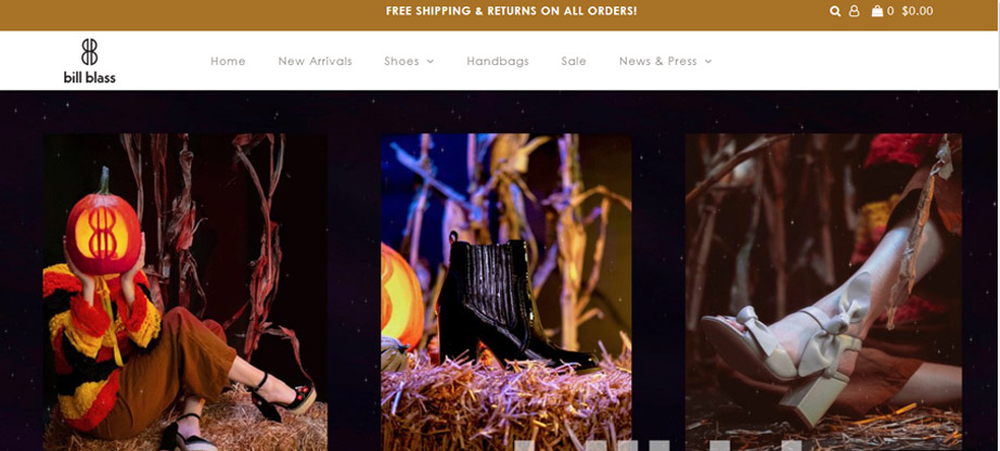
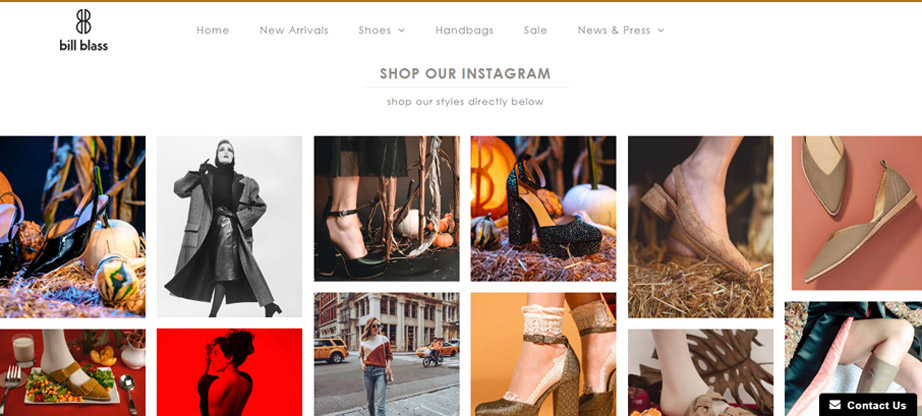
Stunning visuals and design are all you can talk about when you visit Bill Blass. Bill Blass breaks the rules but in the right way. The brand is all about stunning visuals and sleek design. If you scroll down below on their home page, you’d see an option to shop right from their Instagram account.
Establishing social proof and generating sales in one click. “Killing two birds with one stone.” Bill Blass invented the saying. Bill Blass follows the same code of keeping the design minimalistic and neat. There’s enough white space around the website to keep the focus on the products.
The category pages have a good design and include filters for the visitors to find their products. There’s a CTA button at the right corner of the page to get in touch with the website.
What we love about Bill Blass is how their product pages are set up. With amazing pictures and all the necessary information displayed on the product pages, Bill Blass displays pictures of the same product from Instagram right below the product pictures. Adding social proof and making the customer connect to the brand’s social media channels. There are essential social sharing buttons available that give a boost to the SEO of the website through social signals.
Pura Vida
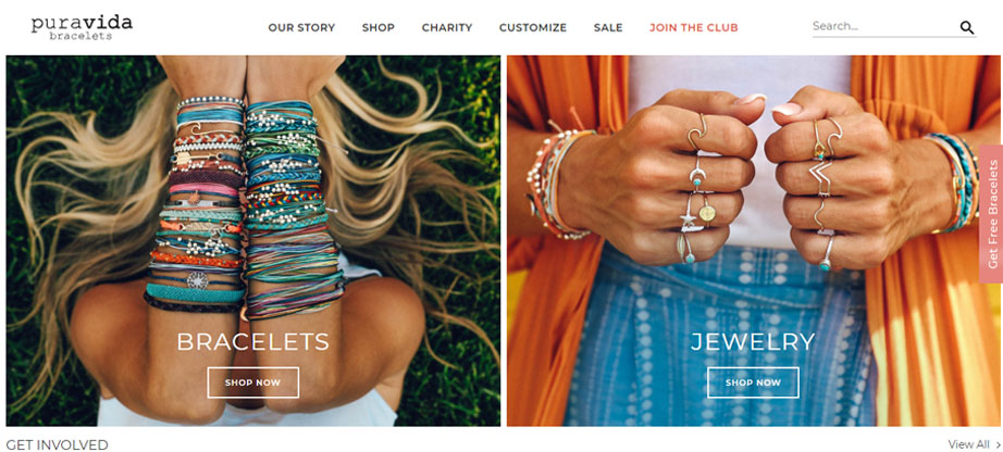
People often prefer buying from brands that give something back to the community. Pura Vida has been making waves in the fashion eCommerce industry by making a charity the focus of its brand. What’s interesting here is their story: The brand revolves around supporting local artisans and then giving away a portion of sales to charities, including US Military, Animal, Cancer, and Environment awareness foundations.
Pura Vida relies heavily on the exclusivity of the designs of its products, and the website displays just that. The product pages stand out the most, including social proof through reviews. Pura Vida also integrates the establishment of social proof by showing recent purchase pop-ups on their website. The charity pages include the products with the charities mentioned in the product.
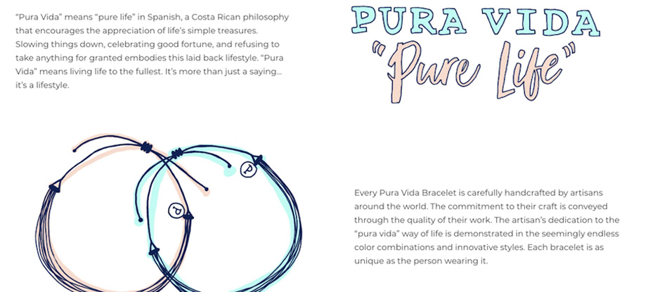
Pura Vida has a fun-filled subscription model that it successfully deploys. The design of the page is amazing and displays fun-filled pictures followed by a clear CTA and options available for the customer. There’s enough information on the page for the customer to decide about their purchase. The customers receive monthly subscription options from the brand, including 3 bracelets.
Pura Vida blog is another thing we’d like to discuss here: The blog design is amazing and fun-filled. There are different categories that users can choose from. Pura Vida incentivizes blog visitors by providing valuable information to them. This includes DIY, aka do-it-yourself.
Acne Studios
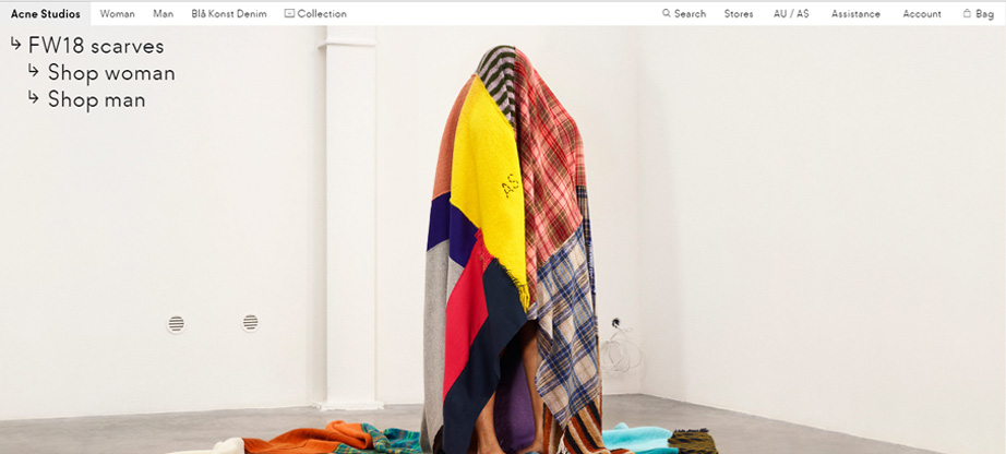
Acne Studios features last on our list but has everything required by a fashion eCommerce site. There’s a hero background, excellent photography, and a focus on the product itself. This is one of the most reliable tactics for a fashion store, and it works great. What we love the most about the Acne Studio website is how its product pages are maintained. They’re neat and stylish. The photography is done just right. As you keep scrolling down, you see further categories and collections. This is something out of the ordinary as usual, the fashion eCommerce sites deploy filters in the product categories.
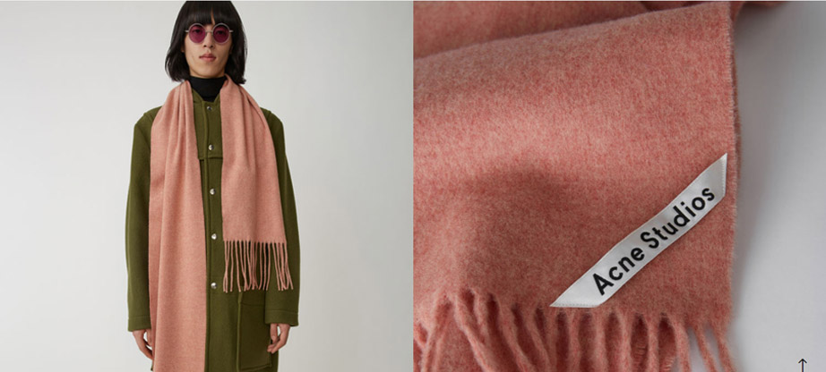
Now let’s talk about the product pages. The product pages follow the same design theme as the rest of the website. They’re neat with amazing photography done. The necessary information required by a customer is displayed on the product pages, and the brand mentions free complimentary shipping on all orders. The size guides are given, and the shipping and return policy is also displayed along with a clear CTA button.
However, the brand displays the product pictures in a uniquely aesthetic way. You have to scroll down to find more pictures of the product, and they’re arranged in an amazing manner. At the end of the product pages, Acne Studios recommends products to visitors. This is a great tactic that established relevance and authority. Especially if the customers are repeat customers, they would like to know what the brand prefers and recommends as the trust has already been established. Shopping is usually an impulse decision, and website visitors can bounce off your sales funnel at any moment.
Wrapping It Up – Fashion Ecommerce Sites
Creating a website about fashion is an important and very responsible task. Web design has gone through a lot of changes over the past few years, from information overload to futuristic 3D graphics and acidic nostalgia for the 80s and 90s. Every year there are more and more trends, and it is now even more difficult to understand them. Surely, it is also difficult for you to determine which trends are relevant today. That is why we suggest using the Mysterio theme – its unique design will help you create a creative and interesting website. Mysterio easily adapts to modern fashion websites and can be used as a landing page or a multi-page site.
We understand how important it is now to create just such a site that will remain relevant for a long time. With Mysterio, you can use the tricks that will keep your site trendy and relevant in the next few years. Modern trends in theme design allow you to not only keep the design relevant. Your site will attract visitors’ attention and inspire trust and desire to interact with the site.
Now it becomes easier to build a buyer’s route, arousing his interest and desire to buy. Practicality is a trend without which a harmonious and visually attractive site will not be able to retain its visitors. Mysterio’s web design meets all the requirements of functionality: it is responsive and contains useful options (online chat, search, and more). You don’t have to follow trends that you don’t like. Creative processing of the template will help you create an attractive site and make the design memorable.
The choice of combinations depends on the idea and direction of the web resource and the talent and vision of the web designer. For amazing results, you can even use the design proposed by the developers. In any case, do not be afraid to experiment and implement your most daring ideas – this will add emotionality to your site and make it more recognizable.
Are you still reading? Great! Now that we’ve shown your 10 fashion eCommerce designs that every website can learn from, what changes would you make to your fashion eCommerce sites? There isn’t a single, definite sure-fire way of getting things done right. As a fashion website owner, one has to keep multiple things in perspective when creating the website design. The design should represent the brand identity. The sales funnel should be easy to navigate through, and the home page designs should be conversion-centric. There are many aspects when creating a fashion website. Let us know in the comments below if you would like to add any other amazingly designed fashion websites, and we would love to include that in our list.