Responsive Web Design Frameworks For Lazy And Savvy Developers
Responsive web design is a thing that every business company wants to have. From day to day the number of devices that people use to browse the web grows and online resources need to correspond to this trend. Moreover, there are several popular browsers and their updates which need to display websites correctly.
Several years ago mobile-friendly web design was a real godsend for all smartphone users, but nowadays people can enter the web from computers, laptops, phones, tablets and even treadmills. As you understand all these gadgets have different screen resolutions and layouts and if a web development company or a freelance developer try to manually adjust website settings for all devices he can go crazy a little bit. But nobody wants to become a crazy web developer :). That’s why savvy geeks try to find some ways to simplify and automate their tasks. And so CSS frameworks for responsive web designs creation were built.
By the way, take a look at Responsive web design infographic which will prove you that the future of the web is… responsive design.
Here we’ve gathered 21 responsive web design frameworks which will help you to build a website for all the devices you can think about. Some of these frameworks are well known for you because you’ve already used them while common websites creation – they are just customized for responsive web design needs. But some frameworks were specially created for adaptive web designs fans. Take a look at the collection and choose something to try! We bet, you’ll be satisfied.
Responsive Web Design Frameworks
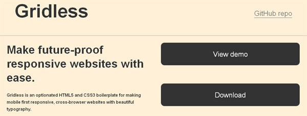
Gridless
This is an open-source HTML5 and CSS3 framework for creating responsive cross-browser websites based on mobile first strategy. Gridness is compatible with FireFox 3.5+, Opera 11+, Chrome 11+, Safari 5+, IE 6+.
Gumby
This nice looking responsive 960grid CSS framework supports all HTML5 elements, uses CSS3 and includes design templates and UI Kit for your convenience.
Now Gumby 2 is available. It’s a free, open-source responsive front-end development framework built with SASS. The grid is a fluid-fixed layout defaulting to the popular 960 grid. It includes Google Webfonts, Entypo icons, modular scale typography and a fully customizable UI kit all built into it’s extensible codebase.
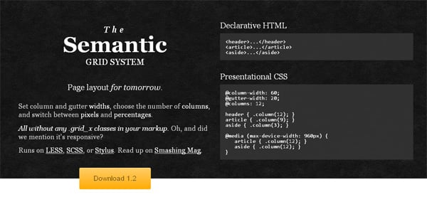
The Semantic Grig System
This is a semantic grid system. This feature marks out the framework among other responsive web design grid systems. Moreover, this CSS grid can be either fixed or fluid. If it sounds too good to be true then you should use it definitely.
Flurid
This is a cross-platform CSS grid which simplifies web developers’ tasks when it comes to presenting content for site visitors.
Foundation
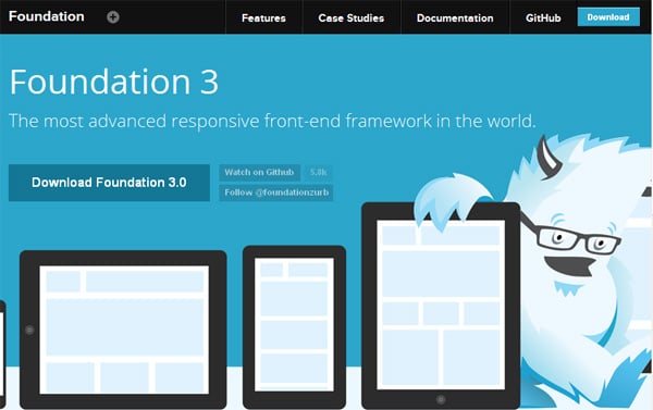
Here is a flexible and rapid responsive front-end framework. Websites built using this framework will work on almost any sized device screens.
Less Framework
It’s a fixed-width adaptive CSS grid system with 4 layouts and 3 sets of typography presets. You can use the framework at your liking in case you don’t forget the licensing requirements.
BlueCSS
BlueCSS is a simple CSS framework which was created to help you to build responsive web designs. It has 4 distinct stages (desktop, laptop, tablet and mobile screens), responsive image functionality and some built-in styles.
Fluid Baseline Grid (FBG)
This framework combines HTML5 and CSS3 tools, so that you can create responsive web designs from 320 px up to 1280 px and greater screen resolutions.
1400 CSS Grid
This adaptive framework perfectly suits 1280 px and smaller screen resolutions. Websites created using this 12-column grid system can easily fluid to the width of any browser window.
Columnal
This CSS grid system works good on all modern browsers. It was created based on the best features of cssgrid.net and 960.gs and now you can enjoy the new framework’s advantages.
Responsive Aeon
This is an easy to use responsive grid system which is based on 12-column layout and is compliant with HTML5. It also includes some jQuery scripts.
Amazium
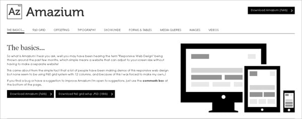
This responsive web design framework allows to create websites which are easy to scale to 1200 px (instead of standard 960 px).
The 1kB CSS Grid
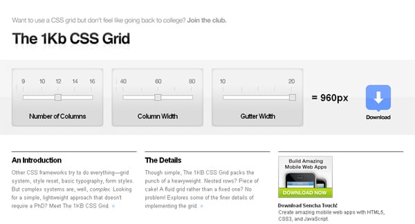
This is a simple solution to arrange grid systems, style resets, basic typography and form styles.
Golden Grid System
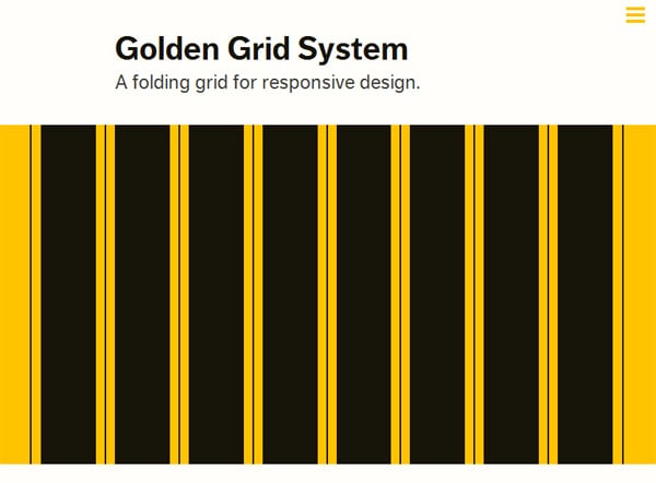
Golden Grid System (GGS) is a folding grid for responsive web designs. It’s based on 4 main features: folding columns, elastic gutters, zoomable baseline grid and Golden Gridlet script.
The Goldilocks Approach
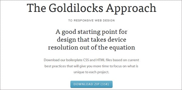
This CSS framework for responsive web designs uses a combination of Ems, Max-Width, Media Queries and Pattern Translations. It contains 2 CSS files with 3 CSS Media Query increments, multi column, narrow column and single column layouts.
Skeleton
Skeleton is a collection of CSS files for developers of responsive IOS-friendly websites.
Bootstrap
Bootstrap framework was created for web developers working with desktop browsers as well as tablet and smartphone ones. It has 12-column responsive grid, javascript plugins, typography, font controls, etc.
320 and Up
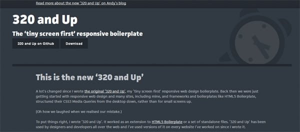
320 and Up contains 5 CSS3 Media Query increments. It’s built with LESS and Sass CSS mixins.
Inuit.CSS
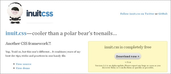
This framework was created to work on tablets’ and phones’ screens. It supports HTML5 elements and includes typographical scale and baseline.
SimpleGrid
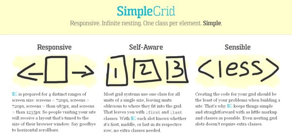
Simplegrid is a one-class-per-element grid system which is just simple. This framework will make you forget about inconvenient horizontal scrollbars.
Susy
Susy is a Natalie Downe’s CSS System-based framework which uses Sass and Compas to improve your web development. It’s easy to be used anywhere, from static sites to Django, Rails, WordPress and more.


