Vertical Navigation Bar Design: Best Examples
When we speak about web design rules, we usually mean some traditions that seem to be unbreakable. Most design professionals and users are also used to seeing a sidebar on the right, a logo in the top left corner or a website menu bar on top of the page. But really catchy and unique designs include elements that break the rules and draw users’ attention.
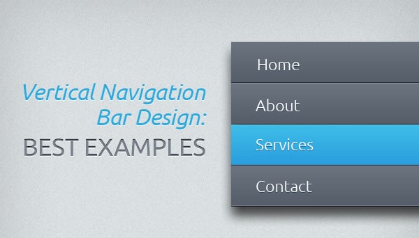
The navigation menu is an essential design element that stays a must-have even for one-page designs. One of the most attention-drawing navigation styles is a vertical navigation bar design. This navigation design pattern is most common in websites with vertical scrolls. It fits well into the structure of this kind of website. However, some researchers claim vertical navigation is not the best pattern for modern websites. Let’s check out the pros and cons of vertical navigation design.
Pros of Vertical Navigation Bar Design
Besides some obvious benefits of vertical navigation bars, like creativity and visual aesthetics, there is one more to be mentioned here. The width of the website is usually fixed while vertically you can elongate it as much as you need. Thus, it’s much easier to fit a new category into a vertical navigation menu then trying to find a place for it in a large horizontal navigation bar.
Wedding Website Template in Pastel Colors
El Bar de Antonio
Cons of Vertical Navigation Bar Design with Solutions
1. It takes too much space. Horizontal navigation bars are usually more narrow and flawless. Vertical menu bars should be wide enough to fit longer words.
Solution: Try to use shorter words or replace them with clear-to-understand icons. It works best for simple menus with a standard set of categories (like Home, About, Contacts etc.).
Well Storied
Beauty Parlor Website Template
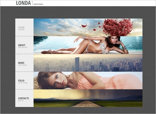
Photo Portfolio Website Template
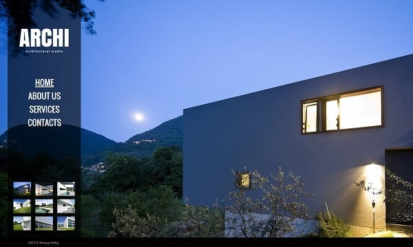
Web Template for Architect Studio
2. It crowds the layout. If your website has a complex information architecture structure, it will be hard to use vertical menu to display multiple sub-categories. In such cases designers usually use fly-out menus that are not so convenient for users.
Solution: Use vertical menu that transforms into a horizontal after an item is clicked. It saves space on the website and pays greatly to UX. Since most people are used to drop-down menus, they will better perceive complex menus as horizontal structures.
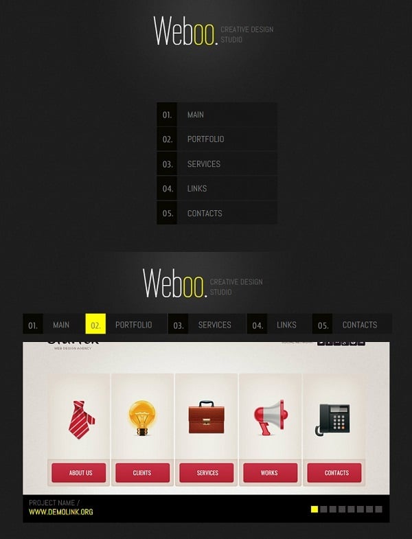
Minimalist Web Template for Design Studio
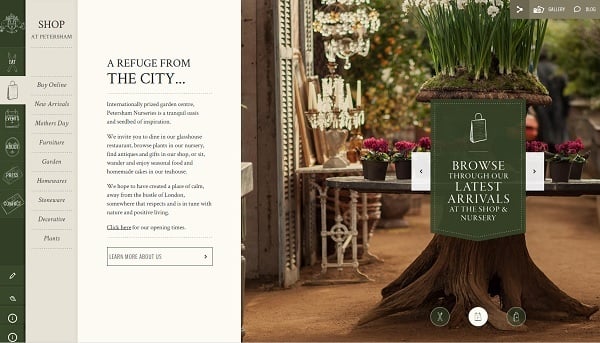
Petersham Nurseries
Olivier G
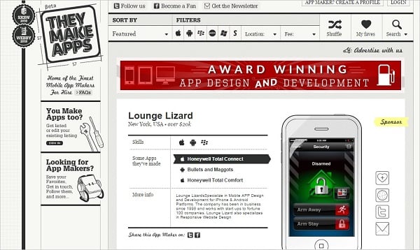
They Make Apps
3. It takes space that converts. According to studies, left side of the screen is the best place to put conversion-focused elements like CTAs. NN/group’s study reveals that left side of the screen takes about 69% of viewing time. Due to traditional reading patterns, left side of the screen is better suited for vital elements that bring conversions.
Solution: Place menu in the center or on the right side of the screen. Due to its unusual placement it will draw attention.
Shukalova
Arent & Pyke
Portfolio Template for Photographers
Interior Design Studio Web Template
Mils and Tom
You can use now-popular Hamburger icon not to crowd your website. It’s easy to hide menu under this well-recognizable icon and call it out when it’s needed. In the mobile and responsive design era such space-saving solution is one of the best.
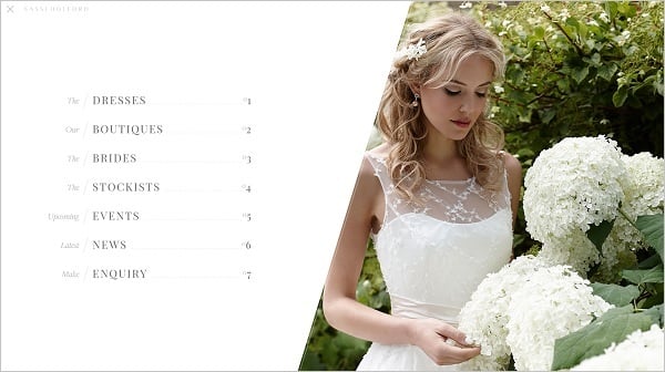
Sassi Holford
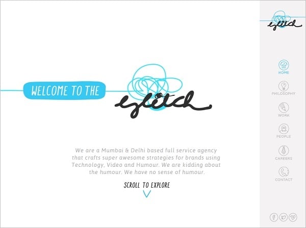
The Glitch
In any case, whether you use a horizontal or vertical navigation pattern, make sure it doesn’t conflicts with the overall design style and stays comfortable to use.


