Best Ways of Using Hero Images in Web Design
What do you imagine when hear the words “Hero image”? Most of younger population people will imagine pictures of Batman, Superman or other graphic novel characters. But for a web design this term has an absolutely different meaning. A trend for the use of huge photos and images on a Home Page emerged in web design during recent years. These photos got the title of “Hero images” and today hardly any cool website design goes without those big pictures in headers or backgrounds.
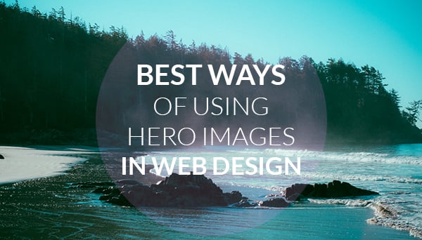
Hero images in web design today are the real heroes. They became so popular thanks to larger screens popularity and higher bandwidth use when bigger size photos can be loaded without any harm for website speed. Additionally, if we remember that most users are more likely to watch videos or see photos than read text, Hero images become great means of traffic and conversion boost.
Use of Hero Images in Web Design
Typically hero images are used for headers or backgrounds. A web designer should keep in mind a few rules for large images use to avoid overwhelming feelings and cluttered layouts. Here are a few pinpoints you should be aware of when using hero images in the header.
Images:
- Think responsive! In our era of mobile technologies using static images as well as other website elements is a suicide. Your design and hero header should look perfect on any screen size;
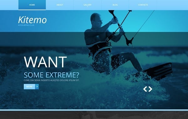
- Try using transparent overlay over a hero image. It will shift visitors’ focus to your message without hiding away an image;
- Don’t use too “busy” photos for hero headers and backgrounds. They will create a messy layout and distract people from your message.
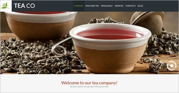
Website Template for Tea Company
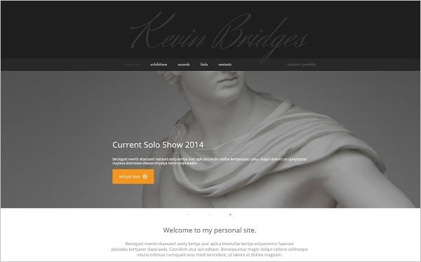
Sculptor Portfolio Web Template
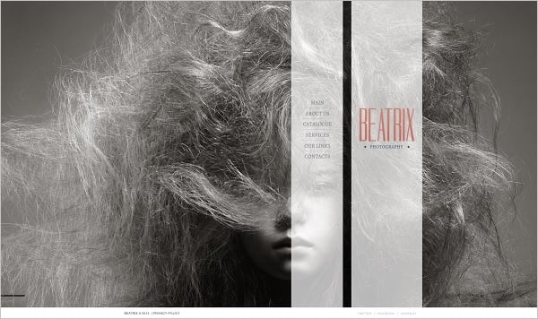
Monochrome Photo Portfolio Website Template
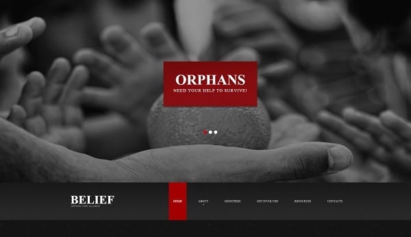
Charity Organization Web Template
Water Sports Website Template
Text:
- Go for bold typography. Large images will grab attention, so you need to use bold fonts to deliver your message to users;
- Large-size font with thinner letters will look trendy on big images and stay readable;
- Don’t overdo with colors when you use large images. If you use bright colorful photos, go for black or white for other elements and text;
- Don’t use big type for a navigation menu or secondary elements like social media or non-title text. Large type for these secondary elements will create a messy picture.
Web Template for Insurance Company
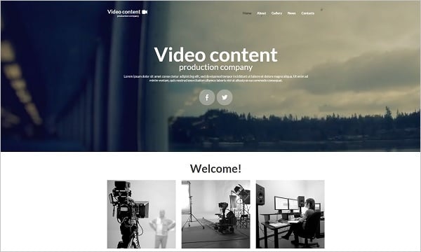
Web Template for Video Production Studio
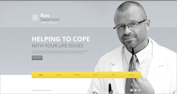
Personal Website Template for Psychologist
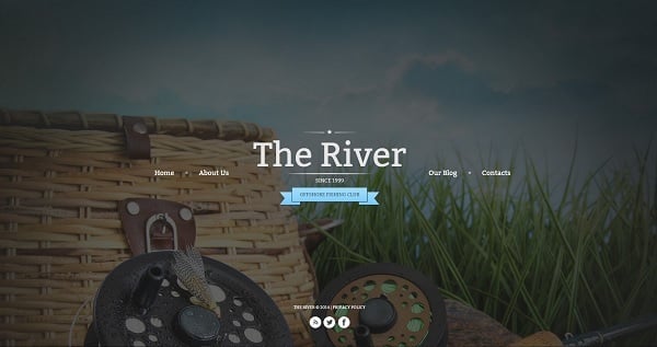
Web Template for Fishing Club
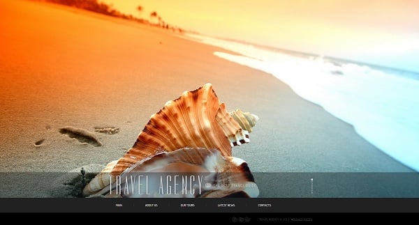
Travel Agency Web Template with Fixed Menu
Elements:
- Try to find the best place for navigation menu within your hero image. Make the navigation bar fixed to allow users easily scroll and click around the page without losing opportunity to navigate to some other place;
- Don’t forget about branding! Place your logo above a hero image, usually – on the top left corner of the page. Try not to use bold colors for logo;
- Use ghost buttons over hero images. This another popular trend today seems to make a perfect combination with huge photos due to its subtlety and lightness;
- Place text, buttons and other design elements in such a way that they don’t cover important parts of the photo like human faces or brand products.
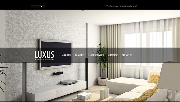
Interior and Furniture Studio Web Template
Web Template for Web Development Studio
Clean Website Template for Entrepreneurs
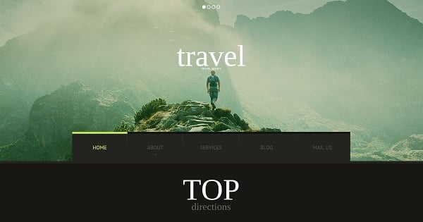
Travel Website Template in Dark Colors
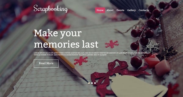
Website Template for Scrapbooking Studio
It seems that the hero images trend will continue in web design at least in 2015. The main reason of using hero images is that they can be applied for many styles, from flat and minimalism to retro and high-tech. Do you consider using some hero images for your website design?


