Is There a Sense of Visual Balance in Web Design?
What is balance? It is the same as harmony. How to distinguish a perfectly balanced composition? It is something with a great look and a touch of similarity. Anything may be balanced: a painting, a music composition, or a website.
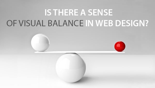
In this article we will talk about balanced websites, actually visual balance in web design. There is no doubt you know what balance means. The very simple example to illustrate the balance principle is to ride a bicycle. When you lack a sense of balance, you fall down – right we are? Our goal is to explain how balance words in web design.
Symmetrical Balance
In case you are trying to add elegant look to your design, you should make a website symmetrical. Symmetrical location of objects to the center axis is the main condition of achieving symmetry. By objects we mean anything you place on your website layout: pics, texts, etc. Some basic rules are to use images of equal size, or create a grid-based text structure.
Mount Barker High School
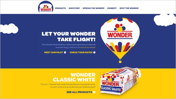
Wonder Bread Balloon
Many websites show centered designs. This approach helps designers to practice in creating of flat design and using white space. Flat design is great because of simplicity, well-structured layout, and white space should definitely make a big part on your website.
Symmetry is thought to be the most harmonious design proportion. Looking at a symmetrical design you feel comfortable and things are easy to understand. But symmetry is both nice and complex.
Users like viewing clean and structured website designs. As more and more this tendency strengthens in the web design world, there appear dozens of tutorials and resources on how to create such design. Users mainly feel fine with the proportioned designs, and you just need to keep visual attractivity in mind.
Asymmetrical Balance
Web and graphic designers tend to use asymmetry a lot, because it adds an unusual touch to casual things. There are many ways to use asymmetry in design, that is why there could be a hundred designs balanced asymmetrically and none of it will repeat the other. The most common use of asymmetrical balance in web design is the composition of a large background image and an object placed far from the center axis.
Biamar
Another variation of asymmetry in web design is the use of unequal objects which are usually featured in the Above the Fold web page section. These objects are arched (any type of curved) lines, text-image combinations, varisized shapes, etc.
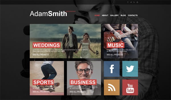
Portfolio Template
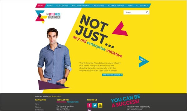
The Enterprise Foundation
It is a common practice to place the main content item somewhere on the left or right on the web page layout. This style of content arrangement is usually welcomed by users, who like original designs. Yet asymmetry is not only about objects’ locations, but it is about their color and shape. And this is even better for experiments.
General feel of web design balance should be preserved with no matter which kind of asymmetry you choose. If you rely on just asymmetrical balance for your website project, you risk to get an disproportional design and that’s all. In this case users will feel nothing but inconvenience.
Sure thing there are designs with strongly disorganized layout. This may be both a risk and a way to reach your target audience. Try to use asymmetrical balance as a means of motivation for users to stay on your site longer.
Horizontal Balance
Horizontal balance is the most widespread on website layouts. When objects of an equal size are placed on one line it facilitates reading and enhances user experience. Taking into account human’s nature to read from left to write this type of visual balance in web design becomes even more beneficial for website owners.
Business Accessories
If your target audience is rather conservative (businessmen, politicians, or other busy professionals), horizontal web design design is for you. This type of balance lacks creativity, and this makes it the most suitable for such type of users. Apply rules of horizontal balance to your website to make it look simple, casual, and professional.
Vertical Balance
Vertical balance means similarity of design objects placed at the top of the web page and its bottom. You can create a balance by compensating large images with white space sections, objects in vivid colors and clean style elements.
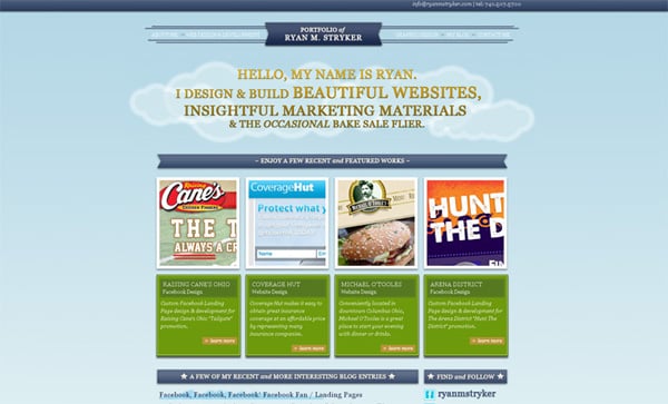
Portfolio by RyanM. Stryker
Paradox Labs
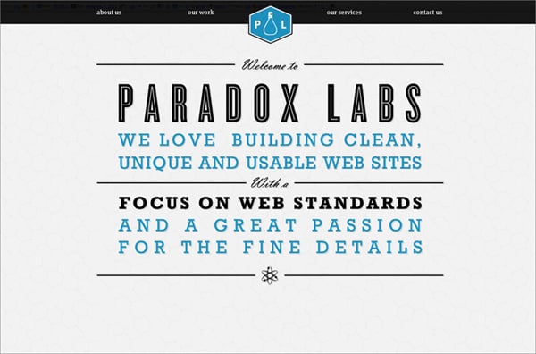
Websites with Header image sliders are the best to showcase vertical visual balance. Also this design technique looks great on content-rich websites with bold typography.
So What Makes a Design Balanced?
Websites are created for users, and your website is truly successful when you can meet all needs and expectations of your audience. What elements help to reach visual balance in web design? Right now we will figure it out.
Colors
Choosing a color palette for your website is a tricky task. A website is visually attractive when you apply 2 or 3 colors, but not a dozen. the more colors you mix the more complicated it is to gain the balance.
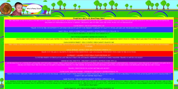
What do you think about this design below? it is an example of how you shouldn’t do – a bunch of too bright and different colors makes this design annoying. Even if the layout structure was perfect, this website wouldn’t have abetter look.
Who Is Penny Juice?
When flat design became a top design trend, many websites were redesigned. Unfortunately many of those sites, as well as newly-designed ones, appeared to be cluttered and disbalanced because of the designers’ attempts to include everything in only one project. Before all, you should use colors which make a harmony. There are hundreds of online color tools that you may use for free: Paletton, Copaso, Adobe Kuler, ColorCodes, CheckMyColors and much more.
White space
One of the simplest and coolest way to add readability to the website, and prioritize specified content or design items is to add white space. This design trick originates from a minimalist design style, and now it is an indispensable part of a good website design.
Business Template
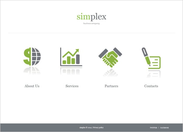
Also, white space is the quickest way to balance content-heavy designs. It allows to make the design pleasing to eyes without sacrificing its functionality and informational aspect.
Photos and Images
A vast amount of webpages load slow and often images cause this. Browsing websites on mobile devices becomes a huge issue for many users as they can’t load huge pics.
All this doesn’t mean that you should avoid using media files on your sites. here the point is that you should balance everything; just optimize your website space well when you embed huge galleries with too many pics on the layout.
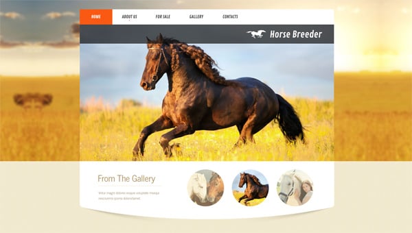
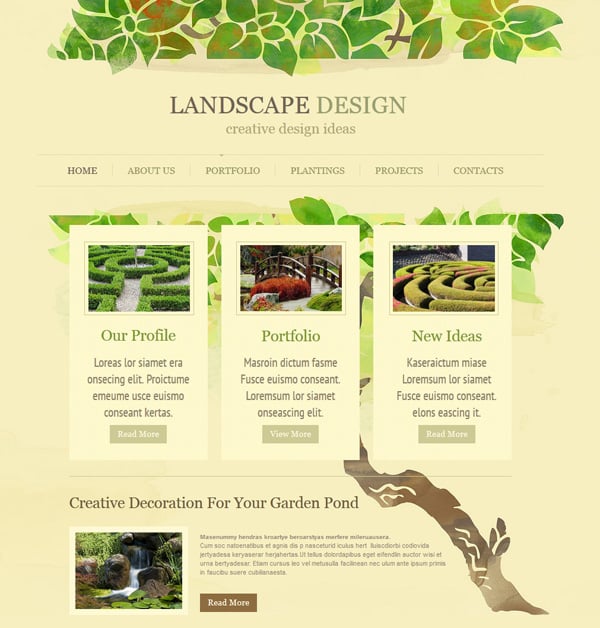
Images are right to the point when you are creating a visual balance in web design, and here you may see a few excellent examples of this:
Horse Breeding Template
Landscape Design Template
Size of Objects
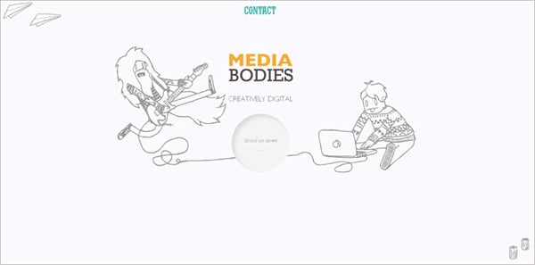
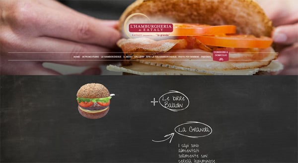
Symmetry and asymmetry of website design is influenced by the objects’ size that you use. If you locate equal elements on one section of the web page you come closer to the perfect symmetrical harmony. Still, if you use shapes of different size but put them wisely on the canvas you achieve asymmetrical balance.
Media Bodies
L’Hamburgheria
Onpage Location
When you start your design with an empty canvas, it seems easy to fill it with objects and create a balanced web design. But when the layout is already filled with numerous blocks, shapes, colors, all of different styles, it seems much more complicated. Every detail on the design matters and how you balance them with one another will have an impact on the general site view. Experiment and try to achieve balance by shifting objects, locating them closer or further from each other and the center line of your design.
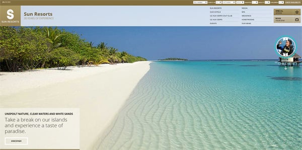
You should remember that the central part of web design takes our first sight when we open a website. All elements located on the sides are secondary.
Sun Resorts
Conclusion
The main web design principle is balance, but how easy we can lose it. Web design balance consists of many components like objects, colors, shapes and their locations. The visual balance concept is something versatile and your individual perception of it may be even better than we explain here. Make experiments, and we don’t doubt that your next website design will be perfectly balanced!


