Symmetry and Asymmetry in Web Design: What Do You Prefer?

One of the main characteristics of a perfect website design is a sense of harmony and balance. Symmetry and asymmetry in web design are widely used to provide the website with a special image. In human mind symmetry is mostly associated with that balance, so most of us consider symmetry to deliver a true beauty. Asymmetry is much more about unbalanced and wiggy creations. But if we look closer, we can notice that symmetry is not always a beauty and asymmetry is not always a mess.
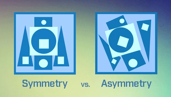
Most natural objects and creations are symmetrical. We are used to see a human face and body as two mirroring parts. However, it’s proven, that left part of the face is not absolutely identical to the right one. In fact, there is no absolute symmetry in Nature. Ideal symmetry is created by a human.
Asymmetry, on the other hand is seen as lack of balance and harmony. But in web design asymmetry is widely used to create a sense of movement, dynamic and to draw attention to particular elements.
Julius Ehrlich
Types of Symmetry:
- Reflection symmetry;
- Rotation symmetry;
- Translation symmetry.
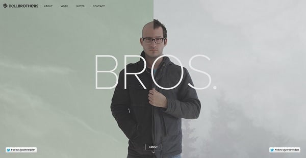
Reflection symmetry is that we are used to see in a human face, when one part is like mirroring the other. The screenshot below represents such symmetry pacing two brothers next to each other symmetrically.
Bell Brothers
Due to the orientation of the mirroring objects we may speak about vertical and horizontal symmetry. Vertical symmetry appears when two objects that are paired may be divided by a vertical line like in the next example.
Flat vs. Realism
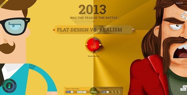
If the line is drawn horizontally we get a horizontal symmetry like in the screenshot below.
Kommigraphics
Vertical and horizontal symmetry may occur together in one design.
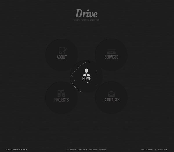
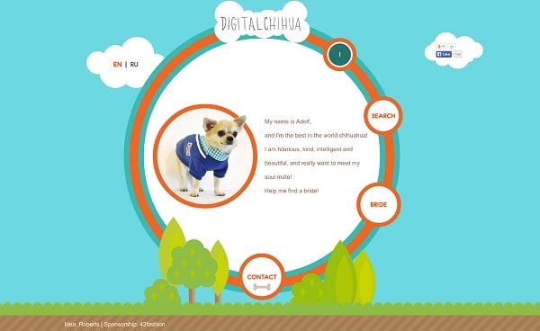
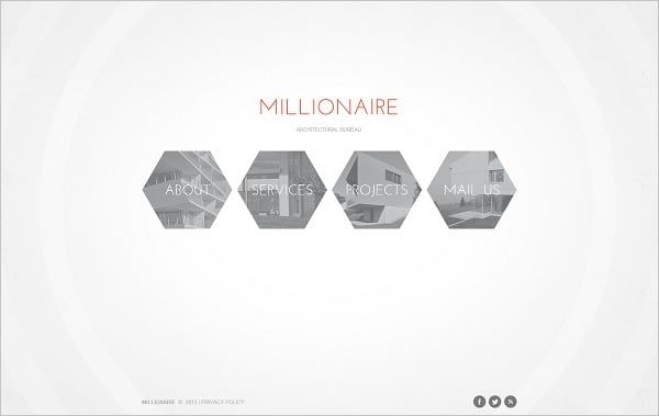
Rotation symmetry can be seen in arrangement of the flower petals that are located around one center. Most websites create such symmetry by placing similar elements around visual center like in the example below.
Digital Chihua
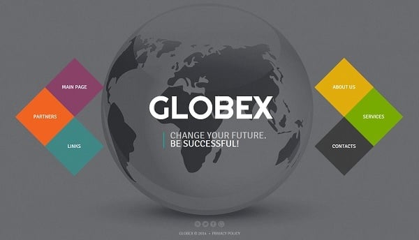
Translation symmetry occurs when objects are relocated in any direction of the space with particular interval, without changing its natural orientation. We can see such symmetry in repeating patterns of wallpapers or in repeating objects of architecture.
The example below shows translation symmetry of the menu elements. The symmetrical arrangement is highlighted with the photo background that depicts the view of the city with a vertical symmetry.

Proper Use of Symmetry and Asymmetry in Web Design
In web design we can meet symmetrical and asymmetrical creations. There is no one and only answer what is better to use for the website layout. It all depends on what impression and image you wish to create.
Symmetry is mostly used to convey an image of stability, elegance and formality. Asymmetry adds dynamics, movement and vibrancy. The fact is that symmetry may get boring very fast while asymmetry may be overwhelming and confusing.
The best practice for web designer is using both – symmetrical layout and asymmetrical accents. Here are a few tips to use:
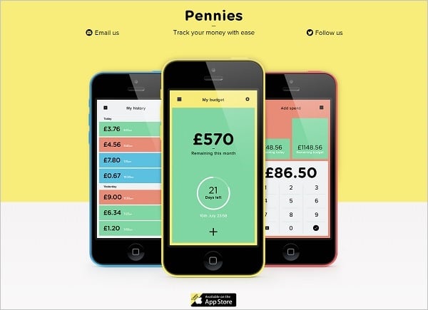
1. Use symmetry to deliver a trusted and neatly organized message. It’s good to use symmetry as an organizing aspect in website layout.
Get Pennies
Website Template with Symmetry in Menu
Translation Symmetry in Web Template
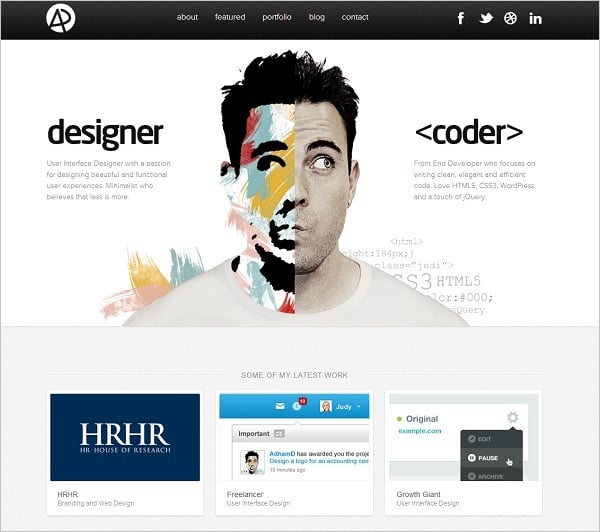
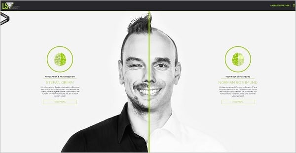
2. Many designers use reflection symmetry to show the dual nature of the website or to highlight two focus areas of the company’s business. Such approach is also often used for websites with two owners when two faces are combined to create one.
Adham Dannaway
Is5
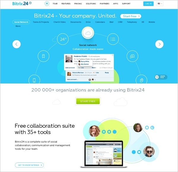
3. Rotation symmetry may be used to convey an image of movement and constant development. In addition, rotation symmetry creates an image of harmony and chic.
Bitrix24
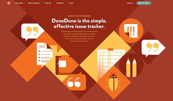
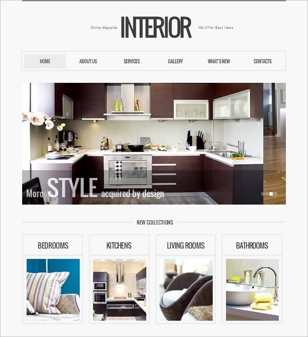
4. Translation symmetry is perfect for a website layout. Most sites that use Metro style tend to implement translation symmetry into their designs. Such kind of symmetry is highly versatile and can be used in combination with asymmetrical accents for unique designs.
Get Done Done
Symmetry in Interior Website Template
5. Using asymmetrical accent in symmetrical designs is the best solution for a good design. Symmetry creates a visually attractive and trustful image while asymmetry adds zest to the overall design and makes the user stay longer with the website. Due to its whimsical nature, asymmetry is much easier to notice and remember. Here are a few more examples of the use of symmetry along with asymmetry in website design.
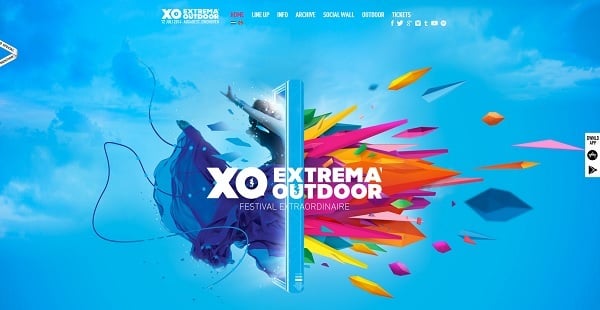
XO Festival
This design perfectly combines symmetrical arrangement of the elements with a vertical frame that visually divides the background. Two parts on both sides of the frame are not identical but together they form a perfect harmony and show the color symmetry.
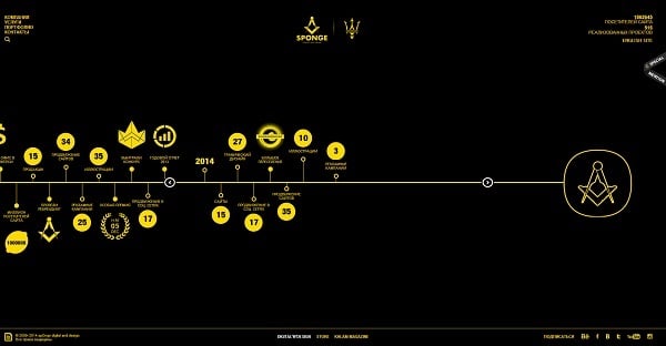
Sponge
Sponge website depicts a horizontal symmetry of the menu elements. Elements on both sides of the horizontal line are arranged in a random manner that prevents this design from being boring.
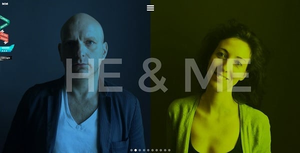
Manuela Misani Love Story
This touching project is created with the use of vertical symmetry. Though pics on two sides are different, the overall theme of each story creates a nice harmony.
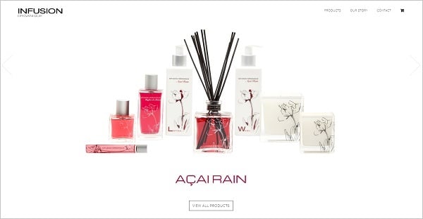
Infusion Organique
In this design vertical symmetry is created with the help of arrangement of the objects. To prevent this composition from becoming boring, the central element contains visual asymmetry. In addition, a delicate animation effect brings asymmetrical twist to the design.
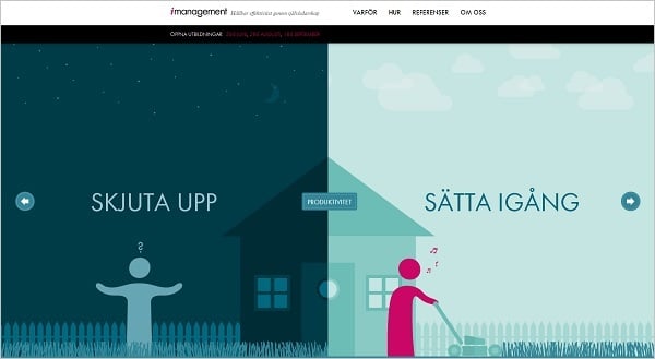
iManagement
Another creative example of the symmetry and asymmetry combination. Symmetrically arranged parts contain contrasting stories.