Rule of Thirds Web Design: Using Layout Secrets
What makes one layout easier to read and more pleasing to the eye than another? It’s not just the quality of the graphics, or even how cool the animation is. You could have all the great images and effects in the world, but if they’re not laid out in a way that the viewer can easily interact with, you won’t retain their interest. That’s where using layout techniques like the Rule of Thirds web design can really make a difference.
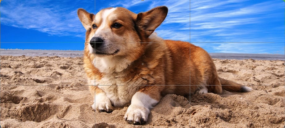
What is the Rule of Thirds?
The Rule of Thirds web design technique is used for creating pleasing aesthetics and balance in images. It basically says that placing items of interest on the “thirds” of an image is more pleasing to the eye than centering or more other symmetrical approaches. These thirds are created by dividing an image (or working space) into nine equal parts, with two equally spaced horizontal lines and two equally spaced vertical lines.
Like so:
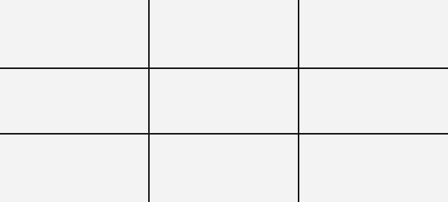
Each line runs along a “third” of the image. Placing your most critical elements on these thirds (and especially where they intersect) will create a pleasing, balanced design. Though most often mentioned in photography (that is why the grid appears every time you use cropping tool in photo editors, like Photoshop or Luminar), the Rule of Thirds is used in everything from films and paintings to websites and posters—just about anything that desires a positive visual impact.
Using the Rule of Thirds Web Design
The Rule of Thirds web design principle is most often used to determine where the most important elements will sit on a page, where the negative space should be, and at what ratio your images should be set. If you’re already working with a grid design, so much the better. The Rule of Thirds will help you choose what dimensions each grid element should have. It can also be a factor in conversion optimization, as the more pleasing the experience for the viewer, the more likely they’ll stick around to actually read your calls to action.
Where to Place Important Elements
One of the first questions in a site layout is where to place your most important elements (i.e. site logo, calls to action, etc.). The answer is generally to place them where the viewer will look first. But where’s that? When using the Rule of Thirds web design, the answer’s pretty simple: on the intersections. Why? Well, the viewer’s eye path is not random—unless otherwise directed it travels a predictable route, starting at the upper left of an image (or website), moving down to the bottom left, moving onto the upper right and then ending at the bottom right. It just so happens that these “sweet spots” of a viewer’s gaze land right on the intersections of the lines in the Rule of Thirds grid. Here’s where the eyes land first:
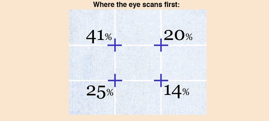
This means that if you place your most important element on or near the upper-left grid point, you’ll be more likely to make sure your viewer sees it first. Here’s an example:

Here, TechValidate chooses to put their important text close to the #1 spot, closely followed by a call to action near the #2 point. Remember, you don’t have to place things exactly on the points—just near them. This is especially true with responsive web design, as different mobile devices will change where things sit.
Determining Negative Space
If you’re opting for a clean, minimalist design, then the Rule of Thirds will not only help determine where to set your images, it can also help you decide where the negative space should be. Negative space is the space around and between the elements of a site, where there is no image, text, or distracting background. It’s a crucial design element for creating a high-readability factor and a pleasing user experience, allowing the mind to better put into context the images it sees.
In the image below, design firm Staak.co.uk chooses a sleek, minimalist design with plenty of negative space and a clear focus on its defining element:
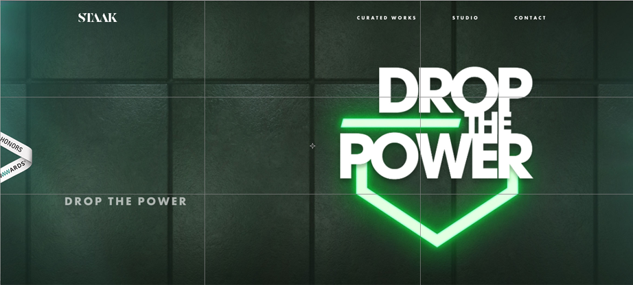
Staak’s design ensures that the viewers’ eyes hit first and linger on their defining element. Remember, the eyes scan predictably when not otherwise directed. Here, they’ve been directed to the right-hand third of the screen. In the lower left-hand sweet spot, they have the link they want users to click on. Contrary, to popular “sweet spot” design, the upper left is negative space, but since Staak directs the eyes clearly to the right, it works just fine.
Here’s another from the Austin Children’s Shelter:
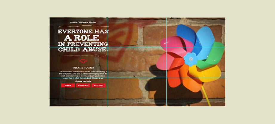
Here, the negative space is in the middle, and the Rule of Thirds is used to guide the placement of the image on the right and the text on the left, with the call to action near the bottom left “sweet spot.”
Here’s another example from the French site UZIK. Notice how the negative space on the right-hand side really draws the eyes to the sweet spot on the left-hand side.
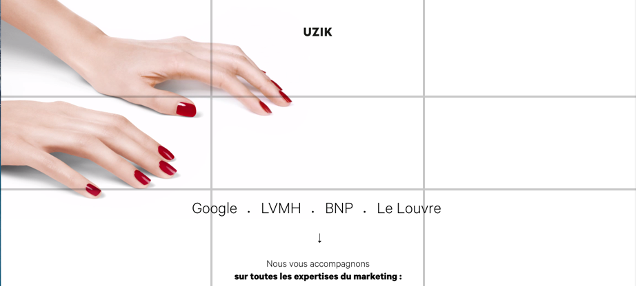
Using the Rule of Thirds to Arrange Your Images
Another main use of the Rule of Thirds web design is determining how to space your images on the screen. Say you have a site that speaks predominantly through its images—how should you space them? Well, the Rule of Thirds would have you place them directly in thirds on the page. Build in Amsterdam, featured below, uses the Rule of Thirds both for their image placement and for their text:

While you don’t need to take the rule quite so literally as this, following it even roughly will help you find the best place to set your images.
The Golden Ratio
While the Rule of Thirds has been around roughly two hundred years, it’s based off an even older design element: The Golden Ratio. The root of countless mysteries, the Golden Ratio is a geometric ratio that has been heralded as a timeless blueprint for beautiful and effective proportionality. Also known as the Golden Mean, the Divine Proportion, the Golden Section, and Phi, the golden ratio is the visual representation of a + b over a = a over b = 1.61803….
First defined by Euclid as a simple matter of geometry around 300 BCE, the golden ratio has had centuries of mathematicians, scientists, philosophers, architects, and even mystics pondering and debating over its ubiquity and appeal. Phi enthusiasts claim the golden ratio has been used in everything from the construction of the Egyptian pyramids to the Mona Lisa, and since the Renaissance many artists have proportioned their work in accordance with the golden ratio, particularly in the form of the “golden rectangle” (a rectangle with a length roughly one and a half times its width).
How does it work in web design? Well, the Golden Ratio applies most strongly to rectangles, and let’s face it—from computer screen to our mobile phones—we live in a world of rectangles. And while the Golden Ratio can be a bit problematic to apply in its entirety to a website (you can’t change the ratio, and therefore you can’t compress or expand it to “make it fit”), it can show you the best places to set your important elements. It can be particularly helpful if your site has a lot of information, providing a guide as to where to place the most important elements.
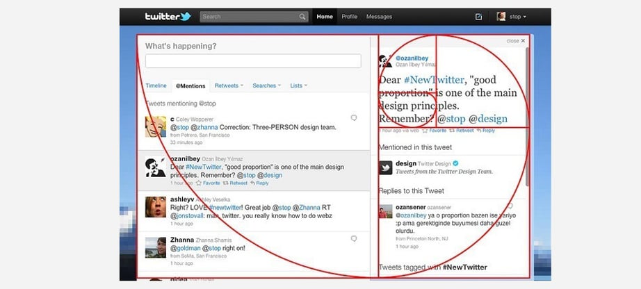
Twitter and National Geographic are two of the bigger names that have used the Golden Ratio in their design.
Summing up Rule of Thirds Web Design Secrets
One thing note, is that you don’t have to use the entire formula of the Golden Ratio at any given point. You could just use sections of it. For example, if you’re wondering at what spacing to place two vertical columns, the Golden Ration has an easy template for that—the first two rectangles/squares.
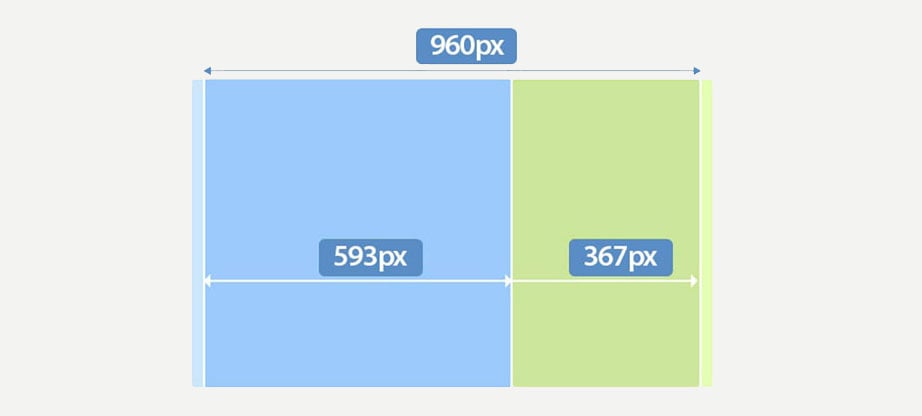
The result is somewhat subtler than using the Rule of Thirds and yet in most cases, more pleasing to the eye. That being said, if using this form seems challenging to you, you can always default to the Rule of Thirds. The proportions will still yield eye-pleasing results. Whichever you choose, both techniques will provide invaluable direction in where to place your design elements for the best user experience. And as we know, a better user experience equals longer staying time and more conversions.

