How to Make a Photo Portfolio Website
So, you’re a photographer. You have a cool camera with awesome lenses, you have your unique style and an audience you are focused on. You have successfully provided much more than one photo shoot and have a network of loyal clients in your city. What next?

With all the opportunities and comfort that social networks can give you in terms of your works promotion, you should definitely make a photo portfolio website or to create a wedding website with a portfolio. It gives you multiple advantages and helps you to put your name before your rivals.
Choosing a Platform for Site
Creating a photo portfolio website today is an easy thing. There are many website builders, content management systems and online platforms that allow creating cool-looking websites, standalone as well as in communities. For example, Defrozo is a cool option for photographers of any level – from novice to professionals.
The main thing in choosing the best website builder for portfolio is finding the right one for your main theme. Some builders or platforms may be perfect for showcasing landscape photography while some are better for presenting wedding or portrait photography. In any case, it’s better to leave coding and designing to professionals and focus on photography.
Make a Photo Portfolio Website Responsive
Responsiveness is one of the key features you should look when choosing a platform for your website. Your portfolio website should be responsive and look well on any screen resolution. Think of layout that will rearrange to fit smaller screens. If you use thumbnails for your photos make sure they are tap-friendly to make it easier to see them on touchscreen devices.
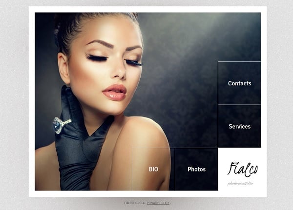
Portfolio Template with Large Navigation Menu
Links, various contact fields and other vital info should be made tap-friendly too. Thus, your site should implement responsive typography that is prominent and easy-to-read on any type of screen.
Don’t Forget about SEO Friendliness
The next thing is SEO. It starts with choosing the right domain name for your website but doesn’t ends with it. Making your photo portfolio website SEO-friendly is essential. The focus still stays on cool and beautiful photos, but SEO relies on words more. You may have the coolest photos in the world on your website, but no one will see them if the website isn’t visible for search engines.
You should carefully check the SEO of your website. The platform you choose should offer you a possibility of creating SEO-friendly URLs, titles and meta tags. Including SEO titles and alts for your photos is also essential.
Chose Its Design and Layout
Minimalist style website template must be the best option for a photographer. This style offers light, uncluttered design that acts as a perfect frame for your photo masterpieces. The background doesn’t necessarily has to be white, but the design does has to include a lot of white space to make your works stand out and draw attention.
Clean-Style Photo Portfolio Web Template
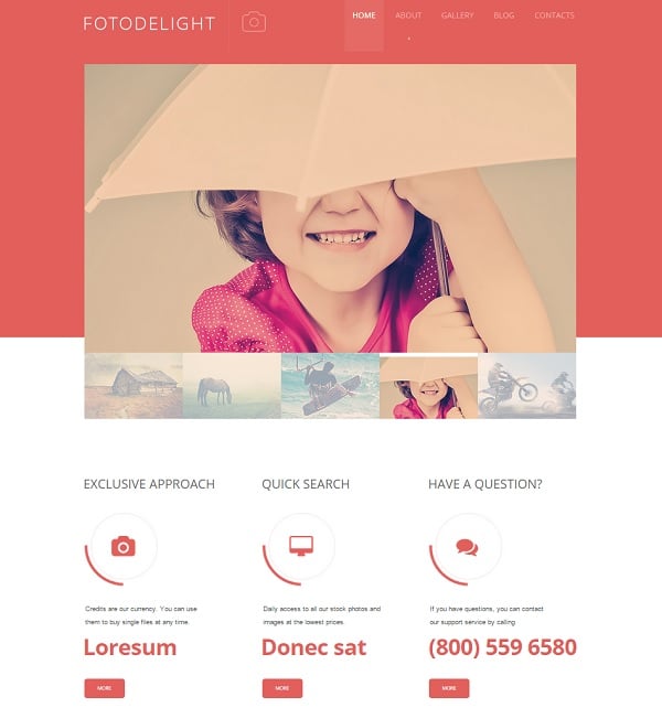
Actually, the choice of design depends on your target audience and the main focus of your photos. Wedding photographers mostly tend to use clean white and golden colors as well as pastel color palette. It helps creating fresh and light look of the site and attract the right audience.
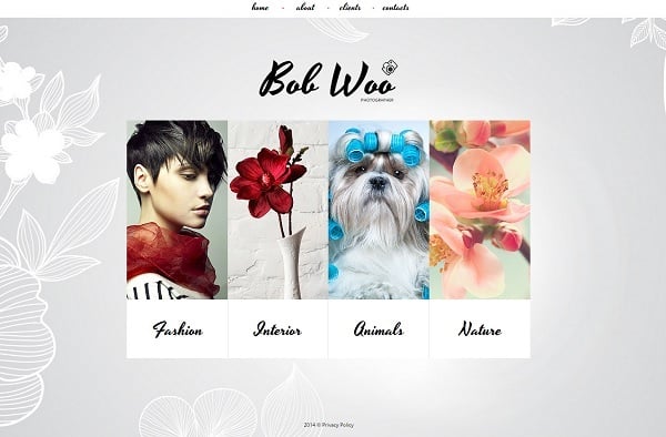
Web Template in Pastel Tones
Contrast between background and photos works better. Thus, landscape, sports or portrait photographers may opt for darker tones to highlight their photos depth and vibrancy. In most cases dark background helps photos to stand out and look more vivid. When designing a dark-toned website it’s often a good idea to add some touch of brightness to the design by adding some vibrant colors to the logo or typography.
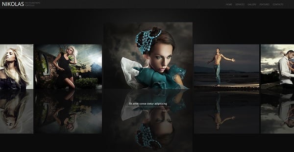
Dark-Toned Portfolio Website Template
Grid layout and a now-trendy Card Design is another great option for photo portfolio website. It focuses on photos and allows presenting them in the most natural and comfortable manner. Don’t forget about additional info or captions you may wish to add to your shoots. Card design makes it easy to do and show this info under each preview.
Photos, Photos, Photos!
Photos are the main elements of a portfolio website. Actually, the entire website is meant to present your photos. Of course, you wish to make your works gloss and attract people’s attention. So, you should follow some rules that will make your website stand out and your photos to look perfect.
Choose the Best. Don’t try to impress your potential clients and visitors with a number of shots. In most cases it’s boring and no one will waste their time looking through the hundreds of mediocre photos. Choose 10-15 the best portfolio works you want to show off to your visitors. These should be really stunning and breathtaking photos that will make users to explore your website more.
Photo Portfolio Web Template with Grid Gallery
Watch out the Quality. Here I mean not only the quality of the photo in terms of its uniqueness and style. You should show only crisp, high-resolution photos of a good size. No one will be interested in looking at 350px by 350px pics and that’s for sure no one will wish to become your client after seeing low-quality images.
Website Template with Large Photos
Here are a few recommendations for you on how to show your best-quality photos:
- Choose a background slider to showcase the photos. It covers a large area of the screen and allows users to see your images in their best look;
- If you opt for a slider, choose the one that allows a user manually controlling the sequence. Thus people get more freedom in watching photos;
- Organize your photos to show the strongest ones at the beginning. Add a few stunning images at the end to leave your users with a great impression they won’t forget;
- High-quality photos usually are heavy and need to be compressed to save loading times. Choose a compression service that lightens photos without harming their quality;
- If you don’t wish your photos to be compressed, you should opt for a good hosting to reduce loading times and save your visitors from waiting for your photos to load.
Portfolio Web Template with Background Slider
Make Navigation Easy
Navigation is essential for a good UX. If the website is hard to use and browse, users will leave it soon. Sometimes even without taking a look at your beautiful photos.
Your portfolio should be comfortable to use. Put navigation bar in a prominent place on the page. Use a slider with thumbnails to allow people choose which photos they want to see in a larger format.
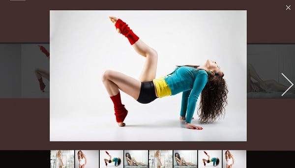
Website Template for Photo Portfolio
And again, your photo gallery should be responsive and easy to browse on smartphone screen with a finger. In such cases scrolling navigation may be better than arrows.
Contact Page is Essential
Anyway, you make a photo portfolio site to attract more potential clients. Thus, you should definitely have contacts included on your website pages. It’s perfect to have a separate Contact Page where you may include a contact form, an address and a phone numbers as well as a map.
Photo Portfolio Website Template
As for any local business it’s perfect to have your phone number on any page of the website. You should make it clickable to smartphone users so they could phone you with on touch. The same is for the email address. People usually contact photographers via email, so it’s vital to have a clear and correct email address on your website.
Website Template in Warm Colors
Contact form is a good possibility to connect your clients and have a feedback on your work. It’s vital for a photography business to have many testimonials as it makes your personality renowned and your work valuable.
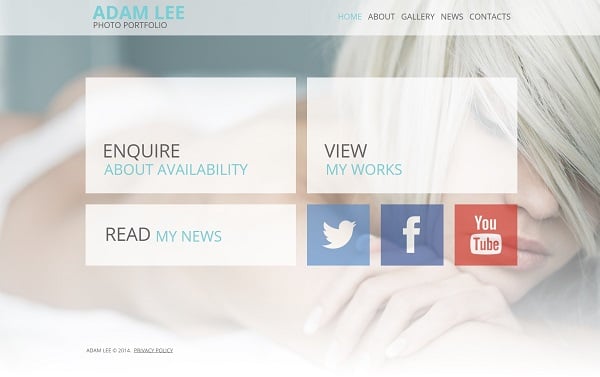
Don’t forget about social media buttons. They allow your clients to share the photos you made for them right from the website without uploading them first.
Portfolio Template with Social Buttons
In any case, you should make your photo portfolio website beautiful and unique. But don’t forget about the user experience and remember that you create your site to show the photos. Make them look the best!


