Avoid 8 Common Design Goofs To Ensure A Better Website
With a plethora of highly-proficient web development tools and frameworks, it’s not hard to design and develop a website, like it used to be earlier. Most of us understand the significance of a website design. It is the face that represents your business; it not only epitomizes your online presence, but it offers a medium to interact with your audiences.

However, it has been observed that there are several exquisitely designed websites, which commit design mistakes. These errors can ruin the visitor’s experience and thus can impact your business. Hence, it is quite imperative to get familiar with these common goofs and avoid them while designing a website for ensuring an absolute user experience.
Without any further ado, let’s have a glimpse over some of the commonly seen web design goofs that must be avoided.
1. A Website Without A Back Button

If you won’t activate the back button on your site, your visitors will either move to some unwanted page or get a new window on their screen. Hence, if you don’t want to annoy your viewers and want them to visit again, you should avoid this mistake and offer them a better user experience.
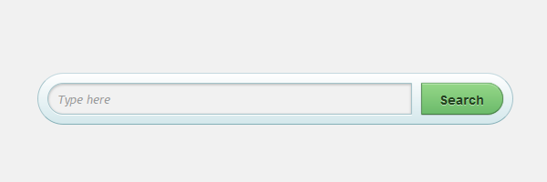
2. Missing Search Box

People often visit a business site or a blogging site in the search of some information. Thus, the role of a search box on a site is quite crucial. It will help the visitors to conveniently search for a desirable information available on your website.
3. Forget the CTA buttons
The CTA (Call to Action) buttons are essential to any website. Since, they help you drag the potential traffic of your website to a certain targeted location, it is imperative to make them eye-catchy and easy-to-navigate. For instance, if your website offers visitors to download some preferred files, the Download button must be easily readable and attractive, if your site sells products online, an appropriate CTA button must be added beautifully on the home page, blog page, product page. When these CTA buttons are designed to catch the visitor’s attention can do wonders.
4. Broken Links

Bad links, extraneous hyperlinks, 404 error, etc., can frustrate your potential traffic and so ruin user experience. Hence, it is extremely important to avoid them. There could be various reasons of getting the broken links on your website. The most important thing is that you must keep a fair check on your site to ensure that it doesn’t annoy your visitor’s with broken links. You may also insert a link at the footer of your site to allow your viewers to report the error to the webmaster, so that it can be rectified at the earliest.
5. Avoid Automatically Playing Music In The Background of The Site
If you think that music can add to your website performance and attract the potential audience with ease, then most probably you are wrong. Different people have different taste in music, thus there is a great probability that the music played on your site will not be liked by everyone and may force them to abandon your site; which you obviously don’t want. Therefore, we recommend you to avoid music and follow a simple, minimalist and trendy web design.
6. Annoying Navigation

This is another aspect of optimal UX. Since, web surfers are often considered as impatient, they won’t like to wait a page to load while navigating to a desired location. Thus, they more often abandon the site and look for a better option without poor navigation and slow page loading time. Hence, make your site stand ahead of your competitors by ensuring a simple and convenient navigation. You can do this by inserting an easy-to-use navigation bar on all the appropriate pages, at the top. It must be easily accessible and visible at a glance.
7. Content, Content and Content
It must be realized that a web design facilitates one to efficiently blend text and other visual elements for enhanced interaction and intuitiveness in the interface. This will ultimately help ensure great UX. On the contrary, if your visitors will get only textual content on your site, it will become really difficult to engage them with the site. You can create a ravishing interface by precisely adding only the crucial information. And, your home page should only boast the excerpt and links of the info available on your site.
8. Doesn’t Allow Sharing With Social Networks
Indubitably, social media has emerged as a great way of promoting a business. Thus, if your website is not featuring social sharing buttons you are not only compromising on your site functionality, but also missing out on a huge group of people. Social media platform like Facebook, Pinterest, Twitter have a formidable fan following. Hence, with a simple button, visitors can effortlessly share the desirable information with their friends. It is recommended to integrate suitable button to offer easy switch for info sharing with social media and driving greater traffic for enhancing businesses.
These are some of the common design goofs that may screw your visitor’s experience and ruin your business, and thus must be ignored while designing a website.

