Transparent Elements in Website Templates Design
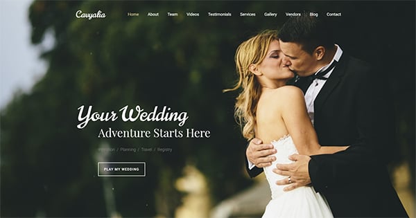
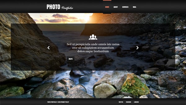
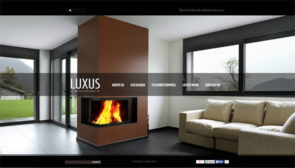
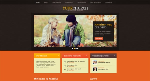
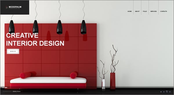
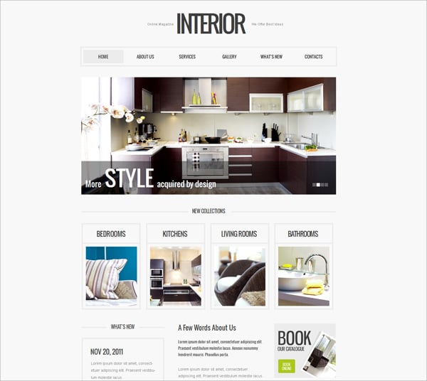
Transparency can help you create really awesome visual effects. It also adds some dynamism to static designs and conveys information rather quickly. This effect is usually used on backgrounds, images, menus, texts, icons, etc.

Quite often websites with transparent elements use PNG images. In this case the background is partly visible under these pictures. It is good for common sites as well as mobile designs because PNG images don’t reduce pages loading time too much.
Another popular object to apply transparent effect to is a content slider. Mainly it is placed at the top of Home pages – above or below the menu toolbar. This feature allows to showcase the most important pictures with brief introductions and descriptions.
There are also a lot of menus that are activated on mouseover. Thus when a customer moves a cursor around the toolbar active tabs are prioritized so it become easier to navigate.
In general the idea of using transparent elements in web designs is in increasing visual attractiveness of web pages and helping people find proper information much easier. This feature is widely used by many web designers, so you can also apply it.
If you’re going to add a transparency/opacity effect to web design objects then you need to know CSS. Some developers do it by the use of opacity or fill CSS3 parameters, others adjust alpha channels of RGB. So if you’re going to make website elements transparent yourself you may need some help. There are several tutorials on using opacity in web design:
- Make Website Elements Partially Transparent
- CSS Image Opacity/Transparency
- Using Transparency (Opacity) in Web Design
- Non-Transparent Elements Inside Transparent Elements
- How to Create Masks of Transparent Elements in Photoshop
You can look through this article for fun as a source of inspiration of using transparent elements in website templates. Both options are fine. So look at them well before you start working with your website.


