A Must Read Before Planning Your Web Design
Web designing has always seen a rapid evolution; particularly during the last few years as broadband internet has been made available to the masses. It may be possible that the current trends of web design as displayed by developers today are very different from that of five years ago. Web design is considered more or less an art form, in which developers use their creative skills to generate websites that have an aesthetic and visual appeal among the viewers. The secret lies not in how colorful a website is, but rather on the way the data is presented in a way that is visually pleasing and convenient for new visitors.

You can also read:
Some tips for optimizing web design are as follows.
Avoid Sleazy Animations
This is perhaps the single biggest put off for most new visitors. A developer may think that blinking text and moving animations will draw in more people, but the truth is radically different. The reality is that most visitors find blinking animations distracting, it’s like expecting someone to read a newspaper while he is being constantly poked on the shoulder. Majority of people do not approve of it. Scrolling text is another blunder which is openly seen on many mainstream websites, text moving at a predetermined speed is difficult to read properly, and many people find it really annoying.
Avoid Pop Up Windows
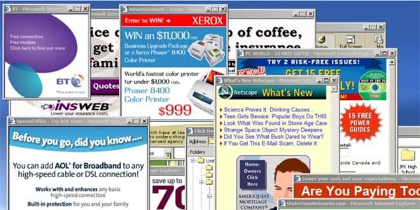
Pop-Ups are an important aspect of advertising on websites, and for an owner they generate revenue. But again, sudden pop ups can be disturbing to readers, so much so that many of them will refrain from bookmarking the website and will likely not visit it again. A simplistic approach can often give great results, which in this case would mean placing ads as small, static images.
Plan your Website
It is always convenient to have a clear and sound understanding of the website’s content and character before entering the development phase. The planning should always be thorough, taking in to account user’s expectation, navigation and page structure. It is essential to give a good amount of thought to the page structure and layout; sketch it on paper if necessary, so you get a picture of what it will look like. A three column layout is the most widely used nowadays owing to its practicality and simplicity, other layouts like side scrolling may appear interesting to the developer, but many viewers will find it disconcerting.
Choose a Decent Color Scheme
Choosing a color scheme requires a more sharpened wit and taste for ergonomics. A highly colorful website may appear good at first, but it will be bewildering to most users. So it is recommended to stick to no more than two or three font and color styles, which are consistent with the website’s content and design pattern. Images should always be crystal clear and related to the content.
Test your Webpage’s Compatibility
It is advisable to run your website on multiple browsers, even the ones out of date since many people visiting your site may not have the latest browser. Same goes for operating systems as well.


