Grid Layout Shock: A New Plugin for WordPress to Create Impressive Layouts
The Masonry JS is a well known plugin that helps to improve the usage of space in a page, but its usage was restricted to the most skilled web designers, until now. Grid Layout Shock is a plugin for WordPress based on the Masonry jquery plugin. And its goal is to create grid layouts, very similar to those in pinterest, in a very easy way.
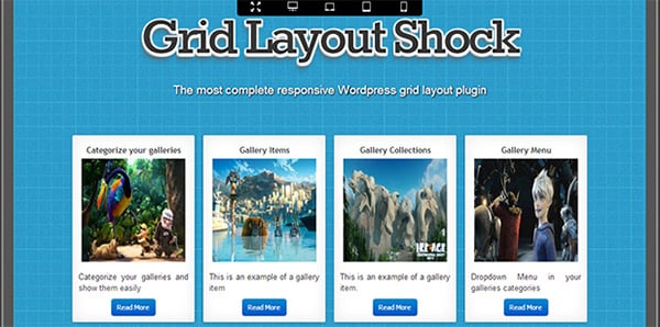
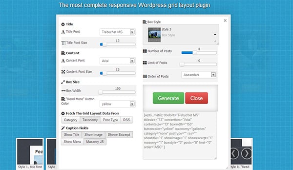
Starting with Grid Layout Shock’s homepage, one can see that it wants to show immediately to the visitor the power of the tool in terms of customizability and responsivity. The page counts with a demo option to create your own grid using a control to change all the available appearance options. Like box style and width, font types, posts per page, (yes, every grid can have several pages,) and many more.
Also, the page has a responsivity menu that can be adjusted to see how the created grid will be shown in different resolutions to ensure that it is, as the badge shows, a responsive/ mobile friendly tool.
Now going to the actual plugin; Installation, as usual with plugins, is fast and simple. And this plugin counts with additional advanced features. The plugin integrates in a deep way with WordPress, allowing to show the posts by categories, taxonomies or custom post types and the ability to show content from sources external to WordPress via RSS, by specifying the RSS url.
The plugin certainly has a lot of features to explore in its premium version. Just as one would expect of the people behind projects like Jquery Slider Shock, the most versatile slider plugin so far; and IconShock, the largest stock of icons in the internet. The free version also is a worthy download too. The plugin in general, is a must download for all pinterest lovers out there who would like to have something similar available in WordPress to revamp their sites.


