Why You Want to Use Whitespace in Web Design
The term Whitespace in web design is usually referred to the blank space around all other design elements (pics, graphics, text, columns, menus etc.). In fact, it doesn’t necessarily has to be of white color. It just doesn’t have any functional elements, buttons, pictures and typography. This white space can provide the website design with many benefits if it’s used properly.

Despite its title, white space can take important part in creating a special ambiance and image of the website. Due to the trend of minimalism the importance of the white space in web design is increasing. Let’s find out the most essential reasons why you want to use more white space in your designs.
White Space Adds Value to the Content
The more blank space surrounds the images, text and logos on the website, the more attention those content elements draw. Leaving enough white space around important elements highlights those elements and helps the user to clearly understand what content is important and go straight to that information.
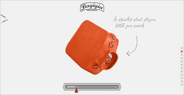
Bagigia
Minky
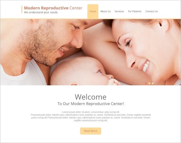
Website Template with White Space
Many luxury brands use a great amount of whitespace around their product images to showcase those products and add value to them. It may even be said: the more white space is used on the website, the more chic and sophisticated it looks.
Tinkering Monkey
Cufflink Suite
Interior Website Template with Whitespace
Moreover, white space may make the site typography stand out. Adding extra spaces between the characters in the headline or navigation menu buttons makes the text more readable and prominent. Surrounding the logo of the website with the space makes it more legible and vibrant.
Wallmob
Space Style Concept
Type Code
In the example below, the wise use of white space and the color of the background helps to highlight the typography. The title abbreviation is placed on a blank space while its expansion appears on a beige background making the logo more attractive and interesting.
SAL
White space also highlights other colors in the design and typography making them more vivid, catchy and attractive.
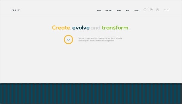
Proiz
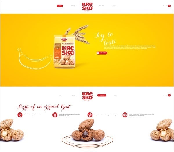
Kresko
Speaking about colors. As we already mentioned, white space hasn’t necessarily to be absolutely white. The whitespace effect may be perfectly created with the help of other colors that are used in the website design.
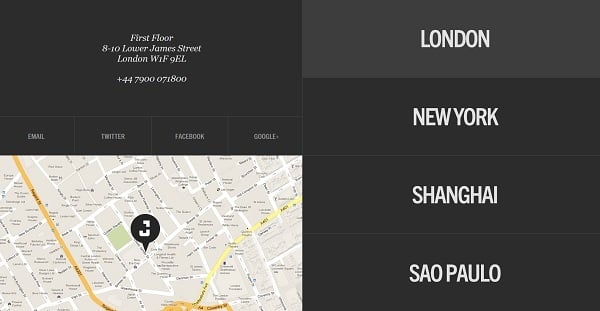
Joint London
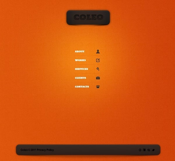
Orange Website Template with White Space
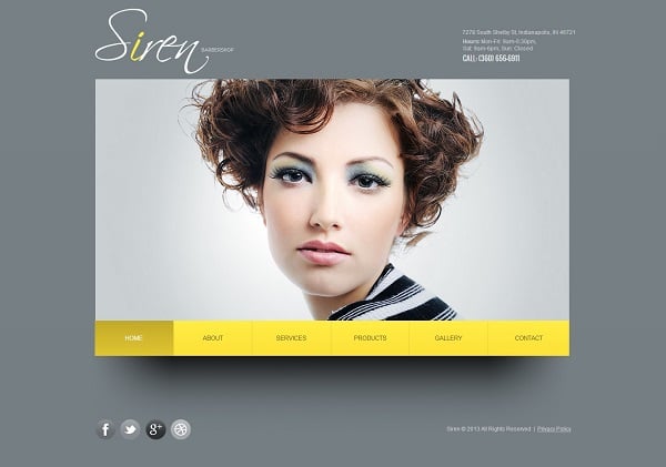
Black-and-White Website Template
Whitespace in Web Design Increases Awareness
Researchers say that adding even a bit of empty space around important elements increases their productivity and raises the conversion rate. It is pure psychology: many various elements distract the user and essential information may be lost among all those funny pics, sparkling logos and bright typography. Adding more white space around call-to-action blocks and contact information will bring visitors straight to you. Many designers tend to make such important blocks bigger and brighter, but adding just a bit extra white space around may create the same effect.
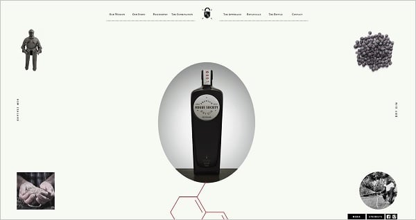
Rogue Society Gin
Steve Jobs Would Never
Balancing the Content is Essential
Wise use of empty space helps adding a proper balance of the entire website design and creating a perfect harmony. Most of the clients believe that good design should be filled with all the information they find essential and thus the white space may often be neglected. Designer should explain to the customer the importance of the empty space and why it has to be added. Let’s take a look at some more examples of the perfect white space use for website design.


