50 Shades of Color: Monochromatic Website Design
One-color website designs and templates are the latest trend in design. Like another trend – minimalist style – monochromatic website design attracts people with its elegance, sophisticated ambience and unobtrusive look.

Monochromatic designs, as it’s obvious from the title, should contain only one color or addition of a few of its lighter and darker tones. However, it’s quite difficult to meet the website created fully in one tone. Black or white typography may be often used there as a color accent to make the website design more vibrant.
Harmony of Color in Monochromatic Website Design
Most of monochromatic designs are based on long-standing black-and-white classics with heavy usage of grey tones. It may seem that black-and-white and monochromatic designs are all based on the same principles, but in fact it’s not that simple. In black-and white designs we can notice a striking contrast between two title colors. Other monochromatic website design examples are rather based on multiple shades of the title color, without clear opposites, and some other color may be used as a color accent, and web design agency ramotion handle this very well. Monochromatic web designs are more about harmony than a contrast that’s why most of them are aimed at creating a calm and relaxing ambience.
* * *
Monochromatic Sepia Website Designs
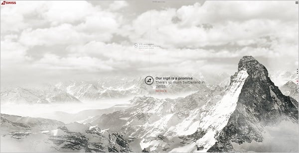
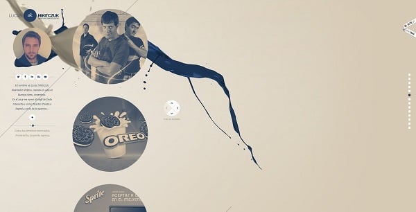
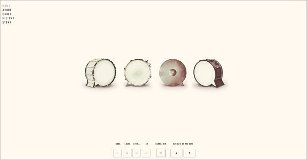
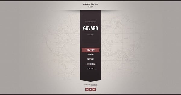
Aside of black-and-white classics sepia is one of the most popular shades in monochromatic designs. This vintage tone creates a retro-style look and adds subtle charms to the website design. Sepia brings calmness and lightness to the design without distracting a visitor.
World-of-Swiss
Lucas Nikitczuk
Dock
Beatbox Academy
Business Monochromatic Website Template
* * *
Monochromatic Brown Website Designs
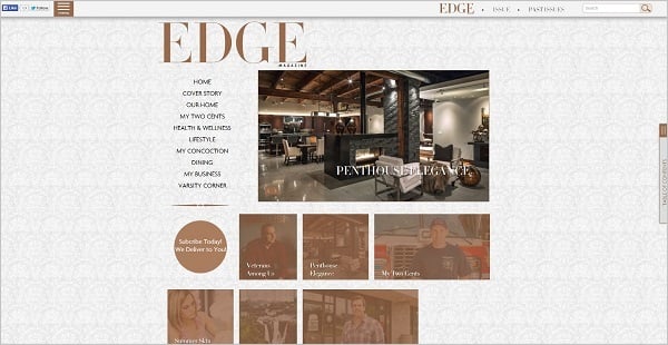
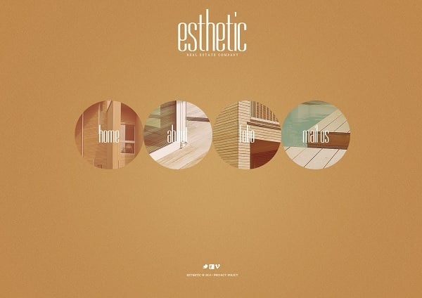
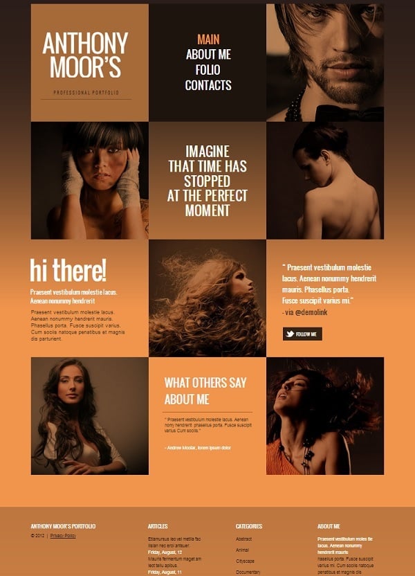
Brown-toned designs stand close to sepia. Earthy colors add warmth and stability to the design without making it too dull or boring. Delicious chocolate and coffee tones of brown color palette are perfect for cooking websites. Those are great shades to create cozy atmosphere and make people want to stay.
Edge Magazine
Brown-Toned Monochromatic Website Template
Lawyer Monochromatic Web Template
Monochromatic Web Template for Real Estate Agency
* * *
Monochromatic Yellow Website Designs
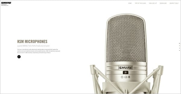
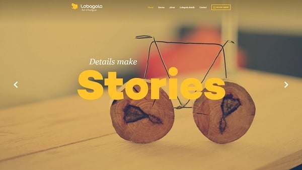
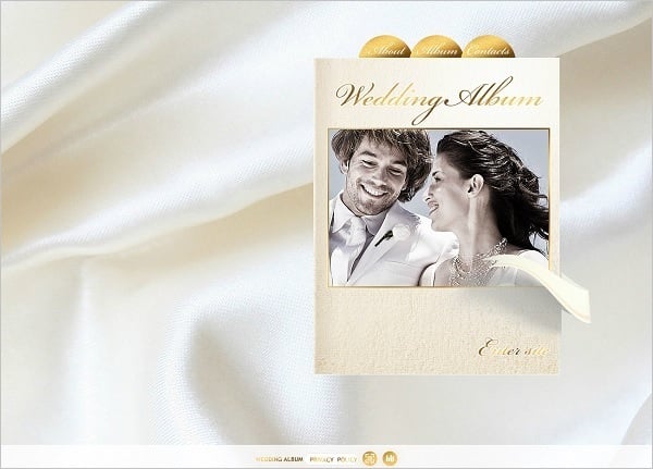
Bright yellow, orange, and golden tones are soft and shiny, they speak about warmth and happiness. Yellow-toned designs make website look washed with sun. It’s a tender and soft picture. Golden tones in monochromatic web designs speak about chic, elitism and wealth.
Hivestorage
Shure Asia
Lobagola
Monochromatic Website Template in Orange
Wedding Album Website Template
* * *
Monochromatic Green Website Designs
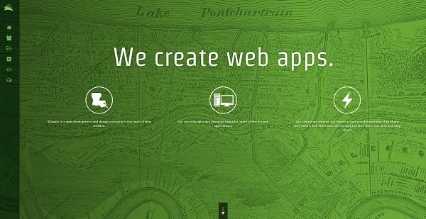
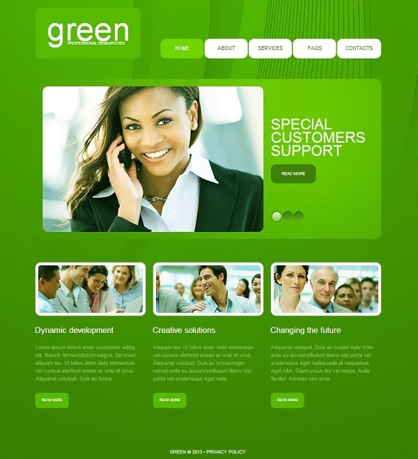
Green is one of the most pleasing colors to the eye. Its soothing effect is greatly used in design. Along with brown and other earthy tones green creates a fresh and energetic look. Green is one of the most variative colors that has shades at warm and cold ends of the spectrum. Warmer brighter greens add vibrancy while cooler cyan shades provide website design with chastity of style.
3coasts
Monochromatic Website Template in Green
* * *
Monochromatic Blue Website Designs
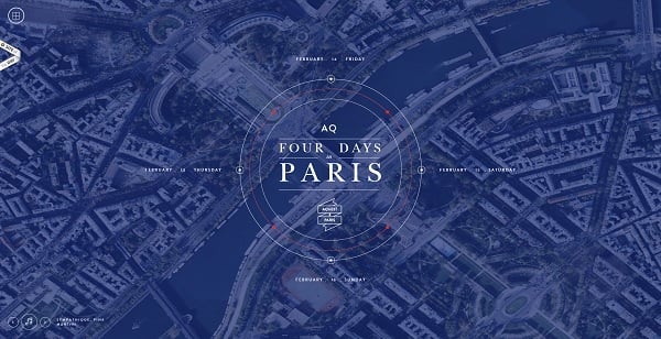
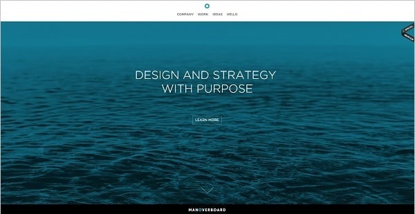
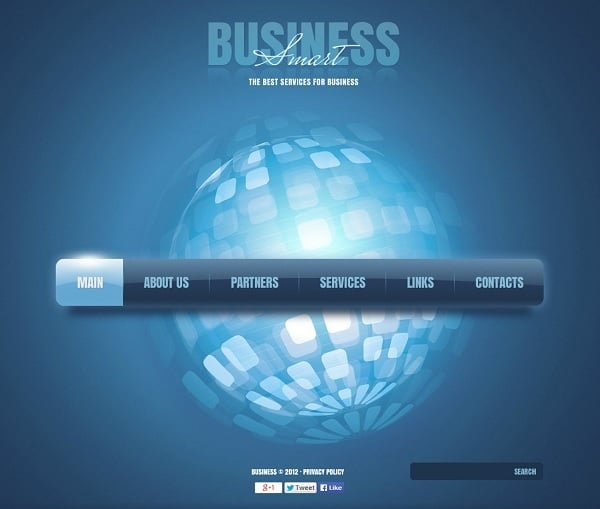
Monochromatic design in blue gives website a delicate and fresh look. It’s a color of water and sky, so designs made in blue are filled with air, fresh breeze and high hopes. Due to its coolness and restraint, blue-toned monochromatic designs are often welcomed by business and consulting companies.
Eleks
Lovedays
Man over Board
Industrial Monochromatic Website Template
Business Monochromatic Website Template
* * *
Monochromatic Red Website Designs
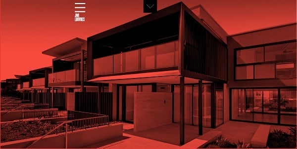
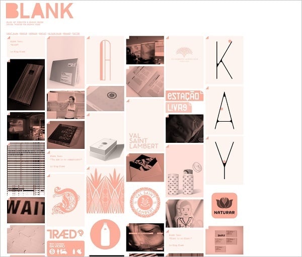
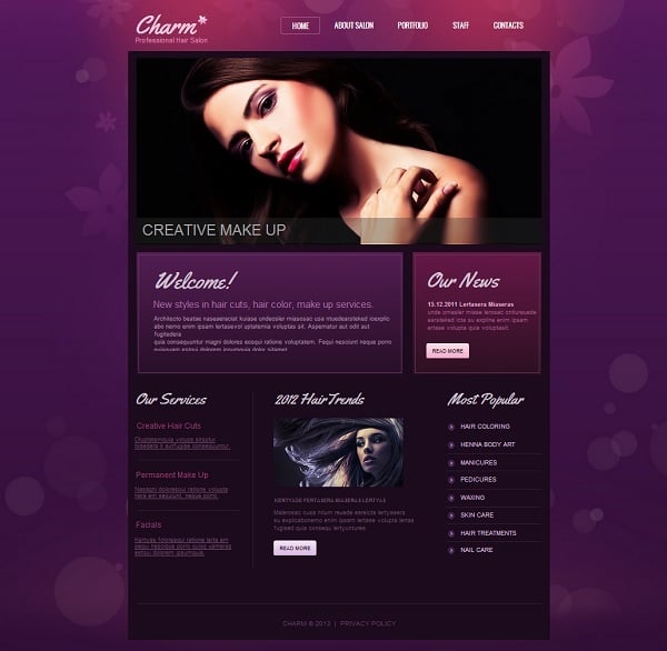
Red and pink tones are rare in monochrome designs for websites. Reds are too aggressive and bold. Using them as the only shades in website design is too dangerous and requires bravery and exquisite taste. However, dull shades of pink may be used as additional tones in sepia or brown designs.
Jwilouvres
Blank
Hair Salon Monochromatic Website Template
As we can see, web design trends shift towards lightness, simplicity and harmony, so minimalist decisions and monochrome designs seem to be welcomed during upcoming years.


