

The Most Annoying Web Design Elements


Every website owner dreams about filling leading positions in Google search results. But not everybody understands that quality and uniqueness of your goods and services is not the guarantee of your successful and profitable activity. If your website is poorly done then you have no chance to win in a strong web market competition.
In fact there is no definition of bad or good design as well as you’ll never know what is good for your business until you try it. But undoubtedly there are some annoying web design elements which you should be very careful with – they can be killing for your business.
So here are some web design features with the worst reputation in the online community. Surely it doesn’t matter that you should avoid all these things but take them into account. And remember that plenty is too dainty.
1. Background Music
Music accompaniment is in the forefront of all top lists of the most annoying web design elements. It is not ok if the first thing you draw your attention to when entering a website is music. If listening to the music is not the main goal of your target audience then let people decide by themselves whether they want to turn sounds on or off.
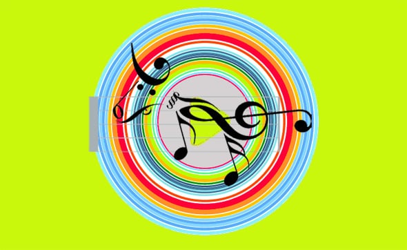
Remember, many people browse the Internet in conditions when loud sounds are inappropriate. Don’t make your website visitors regret about visiting your website because of the accompaniment, give them an option to enable or disable music before entering the site.
2. Popups
Numerous popups always get on visitors’ nerves. One small floating window is ok but when it appears again and again it looks almost deadly. Surely there are website owners which think that messages in popups draw more people’s attention but it’s not true. It is some kind of a banner blindness – you see the text but you don’t read it. Online surfers have already got accustomed to these messages and they don’t expect to find something interesting there. They prefer to close a window and continue their searching on your website or somewhere else.
3. Slow Loading Time.
It is almost an axiom that fast loading websites get more visits, pageviews per visit and a lower bounce rate. However, for many websites faster load time is just a dream. It often concerns Flash websites and those which are impacted with dozens of heavy objects – animated GIFs, floating cursors, twinkling fonts and Flash banners. All this on-page activity needs many resources and the whole site will be loaded slower and slower.
Besides, don’t forget about system errors which appear from time to time. Fix them or they will kill your website.
4. Bad Readability
The next thing which is worth mentioning in this list is a bad readability of your web pages. The list of “great” design ideas which make your website look like a Christmas tree is almost unlimited. For example, gray texts on yellow background will not favor the better perception of the information. Bright watermarks and background images also work badly. And heavily elaborated incomprehensible fonts will never make your visitors applaud you for your creativity. The simpler your site is the more attractive it looks. So when designing the best website ever don’t forget that people look for information firstly and only than for designs (surely all kinds of design projects are the exception to this rule).
There is another feature which doesn’t contribute to the better readability of your content. We’re talking about huge uninterrupted text blocks. For readers who always look through the text before deciding is it worth reading or not, large texts are not interesting. It would be better to break up texts into smaller paragraphs and set off main ideas with colors or different type faces. And theme images will be most welcome
5. Bad Copywriting
Bad copywriting with spelling mistakes doesn’t look either inspiring or trustworthy. People will never trust you if your web pages look like a kaleidoscope of incoherent, slang or excess words and mistakes.
And complex phrasal constructions are also not good for web content. Your messages are always addressed to wide audience so don’t try to look too clever. You know, it is very unpleasant to read a text in which you can understand interjections and conjunctions only.
6. Long Entries
A movie is a great thing for long winter evenings but it is rather annoying on the web when you search for some information but forced to wait for a while. If the entry is meaningful and not long then visitors are more likely to watch it for several times. But it will not be bad to provide an ability to play or skip the video.
7. Complex and Incomprehensible Navigation
How many levels of website navigation do you think is ok? Almost all sites have at least two. But is it enough? Maybe, but some web designers and developers can’t stop even when there are three and four menu levels. It is quite hard to say how far you should go but don’t get obsessed with the details – most people won’t appreciate your efforts.
An absence of a link to the home page from every website page will also hurt you much. People will never look for something for too long if it’s not something extraordinary (and the lost link to your home page can hardly be their cherished dream).
Bad navigation will make your visitors feel lost. People must understand the main topic of your website and how to act on it. That’s why broken links are a taboo. And don’t change the default color of links because it can be confusing.
8. A huge bundle of social Icons
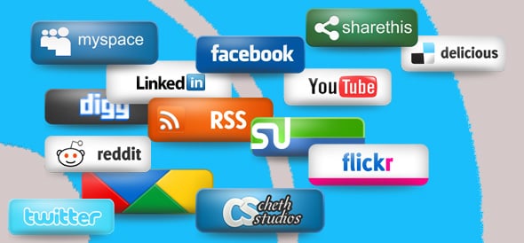
Everybody wants to have a popular website and social media gives a great chance to promote your online projects. So very often when opening a blog with interesting content we observe a huge bundle of social media icons over or under every article. Your visitors will be confused instead of bookmarking and sharing your post. The overuse of small colorful icons will lead to unfortunate results: people will go away without giving their “social” response to you.
9. Captcha
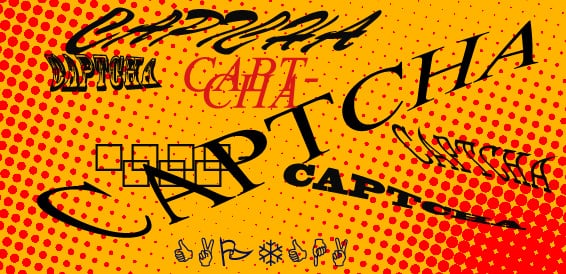
Everyday website owners, marketing gurus and SEO wizards fight for qualified traffic for their websites. However their effort and hard work may be in vain if users are unable to easily fill contact forms. We guess you understand that we’re talking about captchas. Surely CAPTCHA (Completely Automated Public Turing test to tell Computers and Humans Apart) can eliminate a large part of automatic submissions but it can also stop people.
Captchas always take some time and make people complete forms for several times. Surely, website owners can’t do without this “tests” but maybe it can be more easy-to-use and user friendly.
10. Ads Putting Over Buttons and Images
It is not a secret that almost all website owners earn money from their site or blog through advertising. And sometimes there is a lack of free space for banners and payed links on web pages. So what will you do? There are two ways for getting money: to raise prices for ads or optimize your layout. There are many businessman which put ads over buttons and images. It seems like a good idea but, frankly speaking, for most people it is probably annoying.
If visitors come to your site to enjoy beautiful photos then naturally they don’t want to receive adds as an appendix. Moreover it is awkward to foist an irrelative ad on every visitor.
That is all that we wanted to tell you this time. There is no doubt that besides these annoying web design elements there are other things which should be avoid on the web. And if there is some features that make you crazy every time you enter your favorite website please don’t hesitate to complain to us about annoying web design and development blunders. Thanks for your attention!