

How to Choose & Combine Fonts for Any Design

Perfect font combinations are essential for great projects. There are so many types on the web that it’s quite complicated to find proper fonts for your designs, not to mention that you need to combine fonts. Picking the right font is like some secret knowledge that many designers don’t know yet. In this guide, you are going to learn how to choose and combine fonts for your future designs. You’ll get to know the basics of font pairing that allow you to get ideal font combinations every time.
Font Types
Typography is overwhelmed with many fonts, both free and premium. You can get any font in a matter of a click. But the number of fonts exist often makes designers confused. Let’s discuss the basic font types that are available in the modern world.
Serif Fonts
Serif fonts are traditional classy fonts that have a small line attached to the end of the stroke. Times New Roman is a well-known example of a serif font.

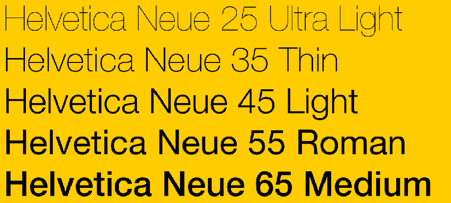
Sans-Serif Fonts
Sans-serif fonts are fonts without serifs, obviously. They look clean and straightforward, that’s why sans-serif fonts are the best option for online text. Most modern websites and blogs use sans-serif fonts. Helvetica is a popular sans-serif font you may know.
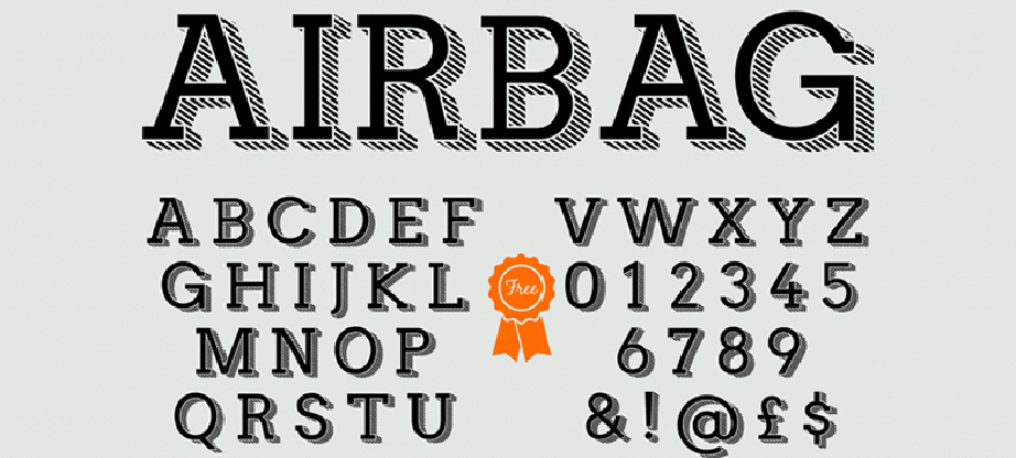
Slab-Serif Fonts
Slab-serif fonts are serif types with bold design and big Serifs. Usually, they are used for titles, tattoos, and other signs that mean to draw attention.
Script Fonts
Script fonts mimic hand-drawn writing, and you may know them as ‘cursive’ fonts. They are elegant, stylish, and beautiful. As a rule, they feature big swashes.
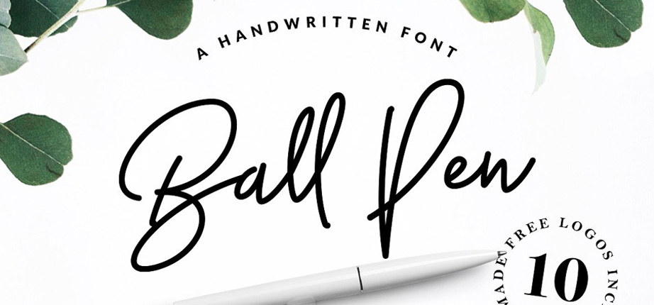
Handwritten Fonts
When it comes to handwritten fonts, they are created by handwriting and turned into fonts. They don’t have a specific structure and organic flow. But the handwritten font is a perfect solution for branding and other designs that need to have some personal touch.
Tips on How to Combine Fonts
Let’s give a closer look at the basics of font combination. You’ll get to know why serif and sans-serif fonts look amazing together, how to keep fonts readable, and why you should not use too many fonts on one page.
1. Combine Serif and Sans Serif Types

One of the best and winning font combination of all time are serif and sans serif types. It’s a safe bet when you lack time.
This font combination is often used on construction websites because it looks simple, professional, and modern. The basic rule of font pairing says that the fonts you combine should have high contrast. Bold serif font with smaller sans-serif is a perfect match.
Serifs and sans-serifs have high contrast by the anatomy of the type. For instance, Garamond serif font will be a perfect combination for Sabon sans-serif.
2. Pair Script and Sans-Serif Fonts

Script and sans-serif fonts can also be a winning combination. The same principle of high contrast works here as well.
When you combine a font with a strong personality, such as any script font, then the second font should be minimalist and clean just like any sans-serif: pair a distinct font and some neutral one.
3. Think About the Message You Convey

Remember about the context of your design. Knowing who your target audience is vital in choosing the right font. Think who is going to read your text, what you want to say, and what emotion you want them to feel.
Most beginner designers make the same mistake: they don’t understand what the purpose of the text. If you need to create a business card for a corporate manager, obviously hand-lettering font is not the best choice. In this case, your design should look minimalist and professional, so serif and sans-serif fonts will be the best solution.
And the opposite situation with business cards for a photographer: here you can use any unique, custom, and hand-drawn fonts to show the personality and creativity of a photographer.
4. Keep Fonts Readable

Keep the fonts readable – this is the first rule of choosing and combining fonts. Decorative and attractive font with many swashes should not distract your viewers from the message you need to convey.
When you need to place a piece of text in a small space, you can adjust the size, caps, spacing, and height to keep it readable.
5. Don’t Pair Similar Types

There are many fonts similar to each other on the web. When you combine similar fonts, they look almost the same and don’t create high contrast. Don’t pick fonts with similar spacing, weight, height, and style, since it could be confusing for a user.
However, rules exist so that you can break them. Fonts from one font family create the best combinations but use different sizes to create a sharp contrast.
6. Don’t Use Too Many Fonts

It’s quite challenging to find perfect font combination. But don’t overthink it. Use two, maximum of three fonts per page. Keep your design clean and straightforward; leave some negative space.
Even with two fonts, you can create numerous combinations: make the font regular, bold, italic, or bold italic. This way you’ll avoid clutter and keep your design clean.
7. Avoid Mixing Different Moods

As you know, every font has its character and mood. Don’t combine fonts collections that are just not meant to be together. For example, Milkshake font can’t be paired with Nexa Rust Slab. Because Milkshake is a playful, script font with elegant style, but Nexa is a rough, grunge, high-contrast typeface.
Nexa is the best match for vintage designs, but Milkshake is a handwritten font perfect for business cards, logos, and product packaging.
Over to You
I hope after reading this guide, it will be much easier for you to combine fonts. Remember about creating high contrast, types of fonts, and keep it simple. Stay tuned! More new articles are on the way.