

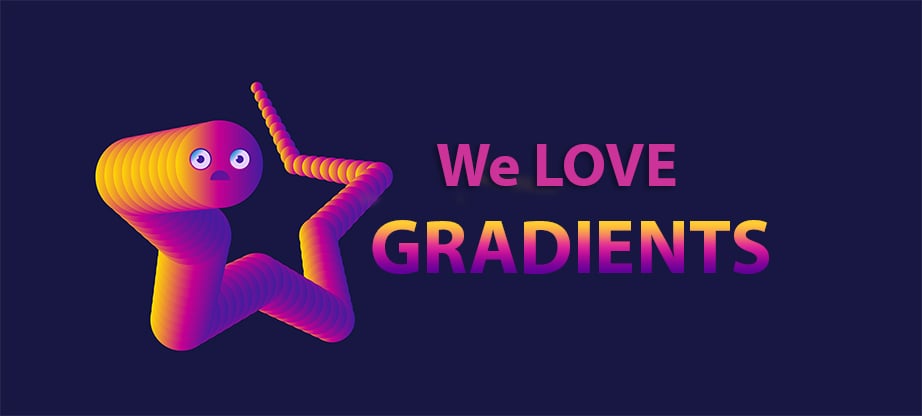
Web Gradients in 2018 – 10 Reasons to Love and Use Them on Your Site

After a long time of minimal styles and use of non-colors for websites, the time for web gradients to make their long-expected comeback is here. There’s no chance to look at a website and not find a faded color, gradient or such a related effect. It is believed that this practice increases user engagement and, in general, make the website a lot more appealing to the public.
If you’re a web designer and aren’t using web gradients yet, perhaps it is a good idea to rethink that approach and you can fin some help in the 10 reasons below. Pay attention as this can actually change the way users perceive the website you design and modify engagement altogether.
Background Creates Appeal
A gradient can help a lot with creating interest and is also helping you lead the users through the design of the entire website. The human eye will focus on the colored area and if you combine the gradients in a smart way, the different shades will help change focus as scrolling down the screen. Besides that, you can use gradients as a design tool that sparks and intrigues users. Even though there are a lot of ways to use gradients, one of the most-used options is to use it as a background with other elements layered on it.
Create a Focal Point Through Lettering
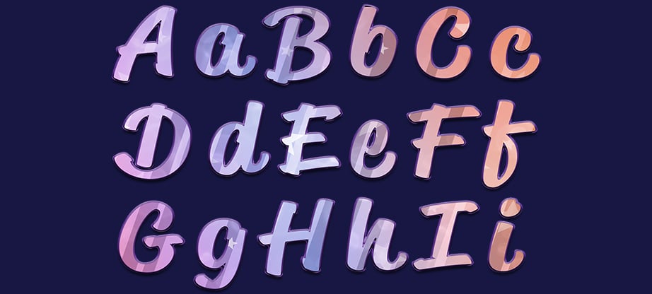
If in the above point you saw how to use gradient shading as a background, learn that you can use them just as well in the foreground. If you use web gradients to color the lettering, the text can receive a whole new dimension with more highlight and focused attention. Of course, you need to choose between one or the other since you can’t use gradients in the background and in the lettering as well and you must always keep in mind that a clear contrast must be kept to increase readability.
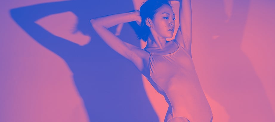
Using an Overlay Can Really Spice a Bland Image
When thinking of ways to increase interest on an image that might come across a little bland, using a gradient overlay can make a simple scene pop-up more and be more visible on the website. Overlays that are based on overlays can also assist with establishing a brand and a voice, tone and personality of a certain website. Of course, muted colors are saying a totally different thing than bright colors. You need to be careful though, since this technique is pretty often used and you don’t want the resulting website to be just another fish in the sea.
Web Gradients Can Help Move the Eye
With the use of the right gradient, you can actually move the eye of the user through a more complex design and create intent at the same time. It’s already known fact that most users read the information on a site in an F-shaped pattern so if you use a different gradient color css in the key points of this F, you will be able to redirect their attention a bit towards what you find more important.
Gradients Can Create a Memorable View
Branding is relating for quite some time now on using different gradients and contrasts to create an image or a memorable view. If you get the color combination right, it can help a lot towards making the brand more visible and easier to remember. If you create the gradient with this purpose in mind, you will be able to establish a visual connection that helps making the brand more memorable.
Emphasize Colors Through Gradients
You can easily use gradients went the brand colors can be easily paired and, as established above, it can land a great helping hand establishing the brand’s image. You should focus on incorporating a same style gradient for multiple uses. For example, you can link the gradients on the website, with the ones used for social media promotion and campaign adds as well. It’s a method used by brands for several years now and gradient shading has proven to be quite effective.
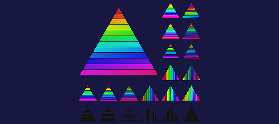
Gradient Shading is Easy to Generate
When you think about using a gradient it’s very easy to generate one from scratch by just selecting three colors and then a shape to coordinate the places where gradients start, stop or overlap. You must keep in mind that, when applied to a shape, web gradients have to be directional as in they need to have a starting and an ending point. So far, everything is easy and quite intuitive, however, picking the colors for the needed gradient can be the most challenging task of all. In all cases, play with different colors until you get the result you want. If you need a bit of inspiration regarding gradient color CSS, you can always use helpful websites such as WebGradients or Gradient Buttons.
Color Fades Will Get You a More Natural Feeling
Even though this might already feel intuitive, gradients often contain colors that that feel natural. Think of a big field of grass, you won’t have the same green all over the place but you will be able to identify gradients as well. A good example is to try and recreate the colors of a sunset or anything that can also be found in the world around us .
If You Don’t Have a Visual that Dominates, Create Art
When you manage to find a good gradient, it can create visual interest all by itself and also come close to art. Also, it will help increase presence and create a brand identity. Changing colors can easily stand as a design element and if you find the right way to combine them, you will help users associate feeling with the visual content.
They’re on Trend
It may seem that this point is already covered in the previous headers, however, it can not be overstated that it’s a very healthy trend among web designers to use web gradients for all the right reasons. Even though the trend of wev gradients use might fall out of trend, it never takes to long for them to be back on track.