5 Design Features that Make Ecommerce Mobile Apps Successful
Since 2015, e-commerce shopping has seen a rather dramatic change. When once people used to wait to get home and log onto their laptops to browse endlessly for their required products and services, now all of this is done anytime from pretty much anywhere, through the use of mobile devices! This switch came with the constant advancement of mobile technologies. Smartphones don’t only let people stay connected with their loved ones, they also open doors for online shopping, even if they have a smoking break or decide to take a short trip to the bathroom. Of course, marketers quickly saw this and used it to their advantage. This is the reason why you will notice that all big and even most small businesses have their own ecommerce mobile app. These applications let people very conveniently shop for pretty much anything they want and have it delivered right at their doorstep, be it of their home, workplace or even some restaurant they may be attending dinner at.
Stats show that more than 45% of online shopping is done through mobile usage. According to data collected, more than 85% of consumers prefer using mobile technology for their e-commerce shopping needs. This clearly shows that the numbers will continue to increase as more and more people switch to shopping from e-commerce apps. But before you rush to have your own ecommerce mobile app created, you need to know that certain things are more attractive to customers.
Ecommerce Mobile Apps Design Features
Here you will find 5 must-have design features that will make your sales go up the roof. Read on to find out more.

1. Interactive Yet Easy to Maneuver Ecommerce Mobile App Design
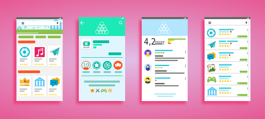
A cluttered or haphazard mobile app is every e-commerce shopper’s worst dream. Nobody has the time or the inclination to spend hours on trying to understand precisely how your business app works. Keep the interface and navigation simple. Your business app needs to be such that from the minute users sign in, they are hooked. It should be good to look at and very easy to maneuver through.
Keep the menu positioned consistently in the same manner throughout the app. Don’t forget that the size of the screen is ‘kind of restricted’ and people will need their finger to move around. So the navigation system should be such that it benefits all kinds of shoppers. The easier your app is to use, the more people will want to come back and use it.
2. Sorting and Categorization

If everything is scattered around the mobile app, customers will get confused and resentful quickly. Make sure your mobile e-commerce app has a responsive design that fits any screen size no matter what the resolutions and allows everyone to use the app comfortably.
Sort and categorize your products in such a way that consumers can find whatever they need within a few seconds. Make your app as customized to the needs of your target audience as possible. This will create a strong bond between you and your clientele.
3. Simple Loading Cart and Payment Methods
Loading the cart should be as easy as clicking one single button. Some mobile ecommerce apps make the whole process difficult and time-consuming. First, the customer has to register, then give out personal details about themselves, where they live and their bank details. After that, there are even more questions. This irritates everyone. Avoid it. Keep the registration processes simple, add to cart option easy and payment method quick.

Make sure you let the customer choose whether they want to pay with their credit/debit card or if they want to pay when the goods are delivered at home. These options let the customers feel they are in control and they are more likely to come back to your app to shop again!
4. Distinguished ‘Add to Cart’ Button
Most app developers or business managers forget that you need to remind the shopper again and again how they should buy more than they came for. That is the reason why there are shelves upon shelves of various goods in superstores, so people end up buying things they may not even particularly want or need.
The same kind of ideology works with an e-commerce website. If you keep showing your visitors the ‘add to cart’ button everywhere they go, they will end up buying more, and your sales will go sky high. If there are too many steps in between liking a product and purchasing it, consumers are going to run away to competitor apps. So let the customers see they can ‘buy now’ whatever page they may be on.
5. Push Notifications for Ecommerce Mobile App
These are your best friends when it comes to increasing sales through your ecommerce mobile app. If you click open some favorite mobile apps, you will notice that there are Push Notifications present in the list of features. These notifications allow the consumer to take action immediately, the action that you want them to take, that is, purchase. This mainly comes in handy when you have special sale or discounts going on, or there is the launch of some new product, or exclusive offers are taking place.
The features mentioned above will only honestly work when your target market knows that you have a mobile e-commerce app. So spread the word quickly. The best way is to leave a download option on your main e-commerce website. Email marketing can also help in letting the masses know your mobile app is ready and waiting for people to come and shop.
Ecommerce Mobile App Final Words
Remember one more thing, the apps need to remain updated at all times. If your app is outdated or does not meet the needs of your consumers, then chances of them coming back to use it ever again are pretty much over. So pay attention to your app, keep it simple, engaging and fun. You will see a visible difference in your profits within no time. Good luck!

