Build a Clean Website Design – Examples, Tips and Templates
Clearness is considered to be a good feature of everything. It perfectly works for web design as well.
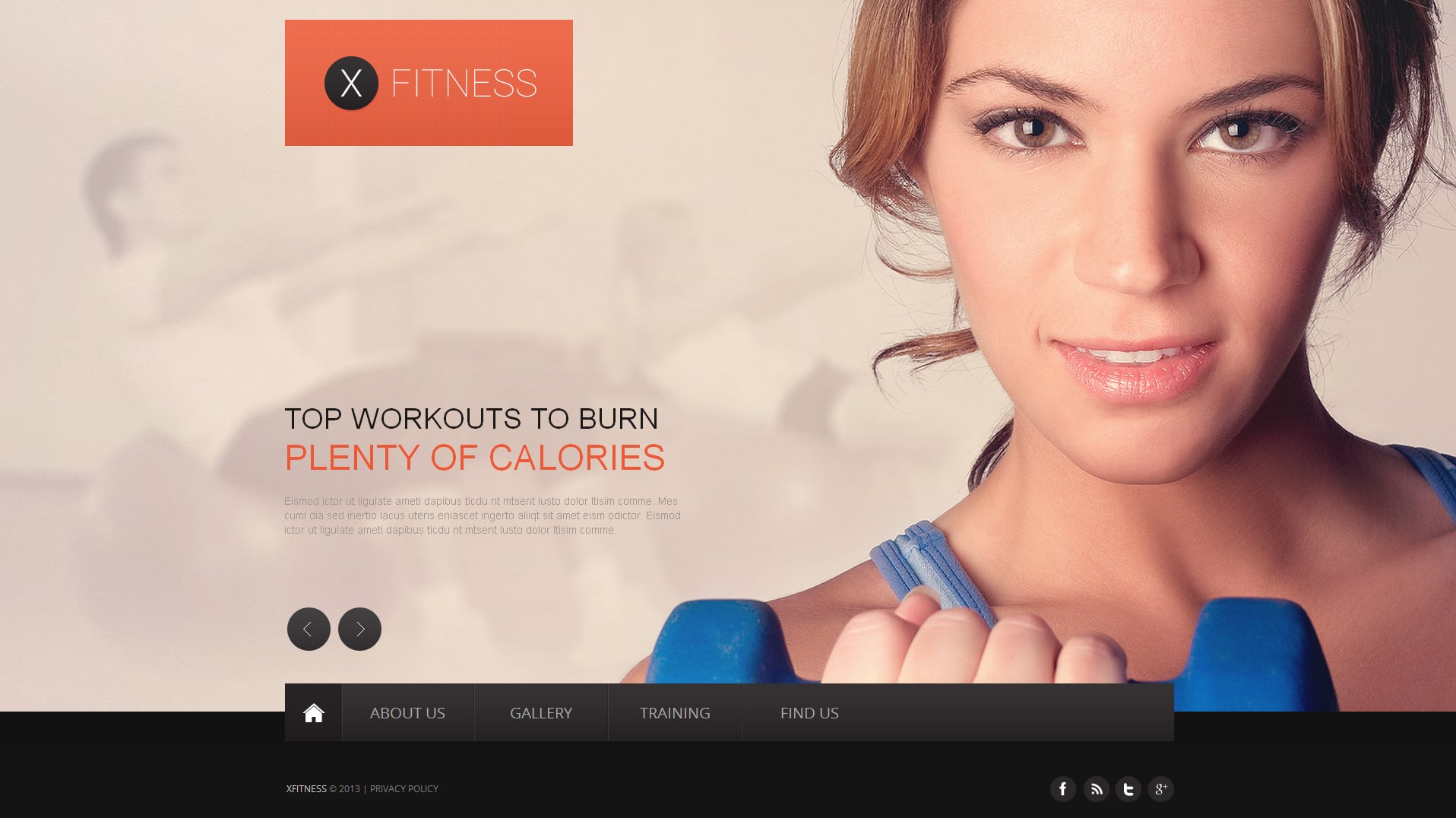
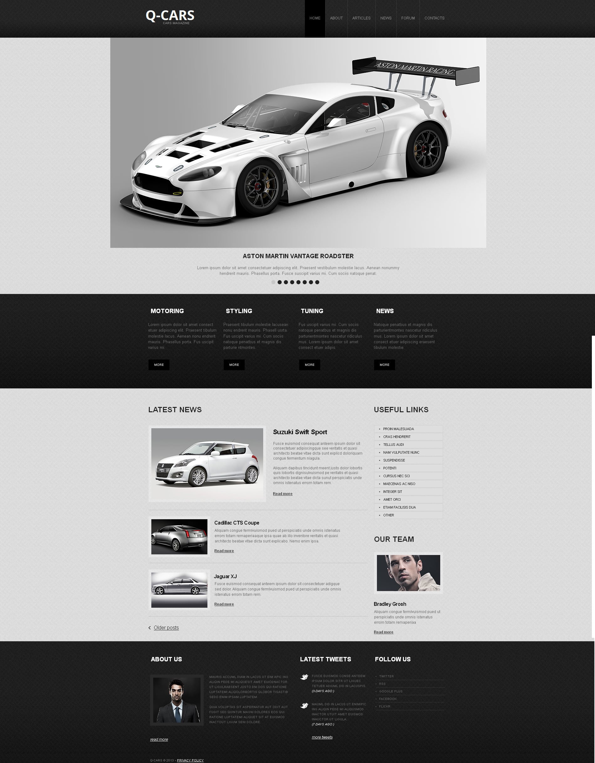
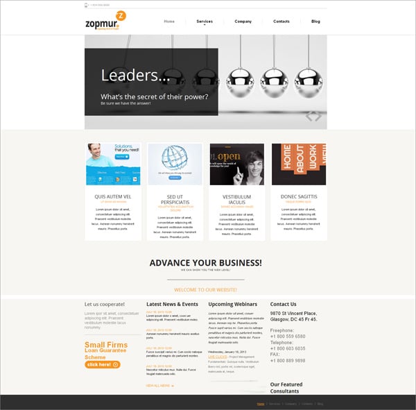
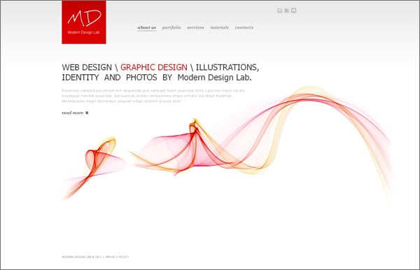
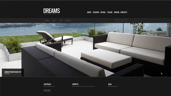
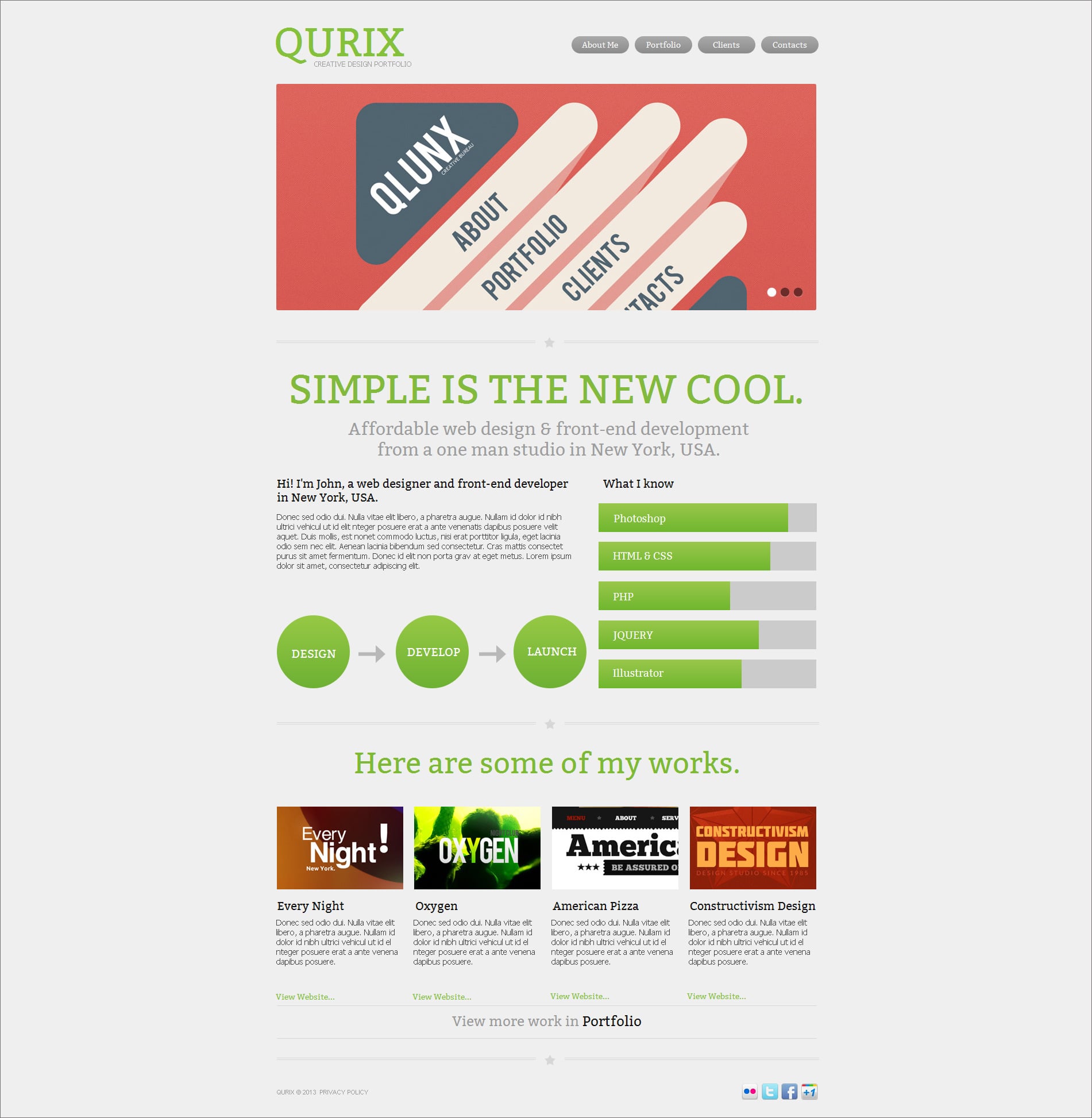
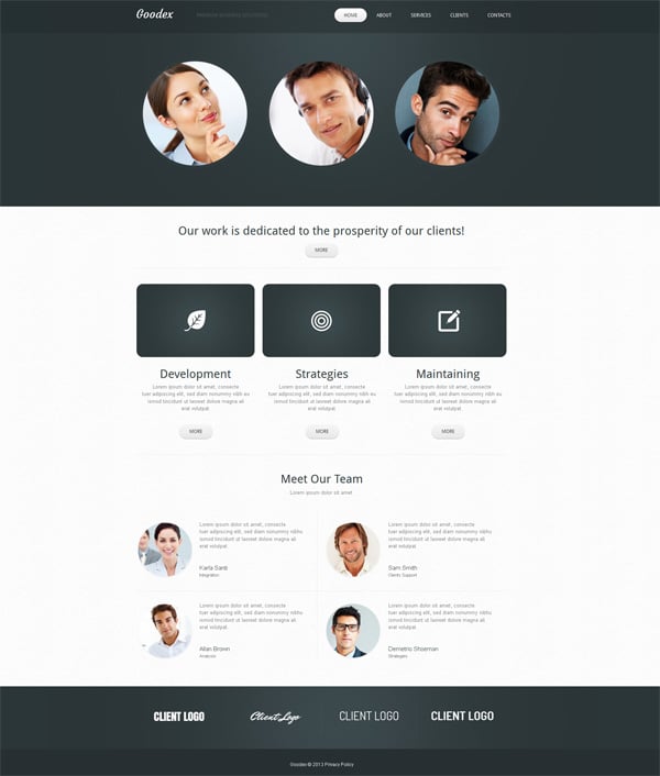
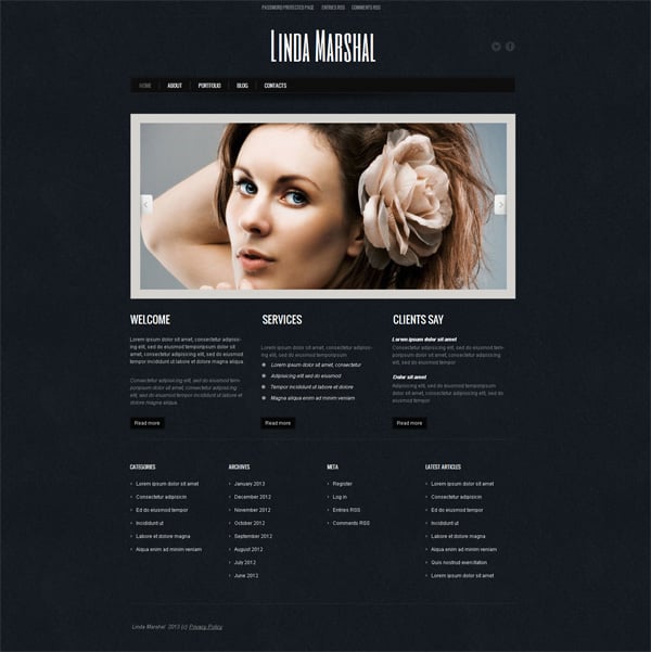
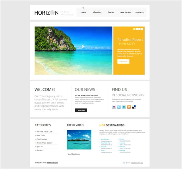
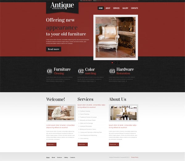
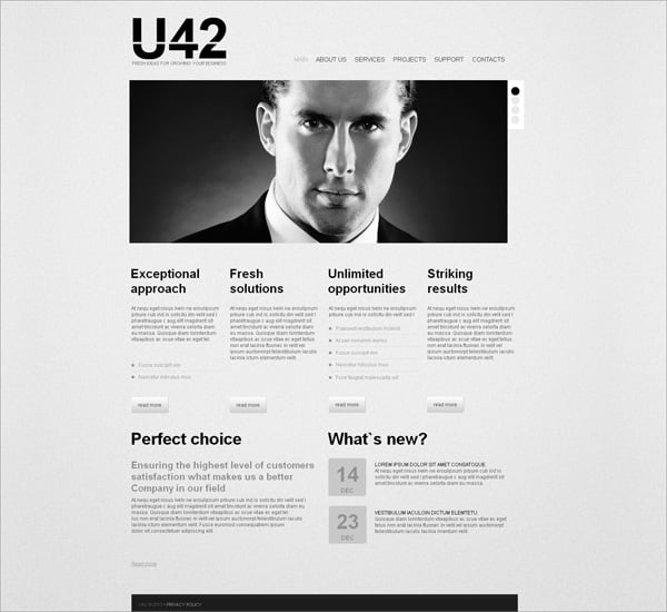
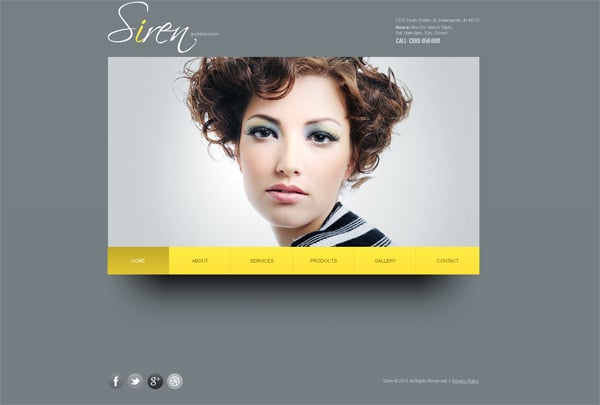
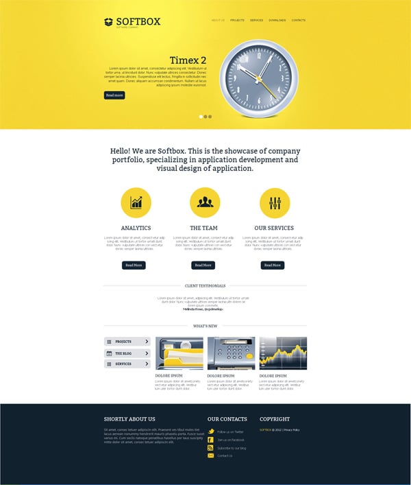
Clean website design makes strong accents on the content part of projects instead of their layouts and structure (although they do remain very much visually attractive). Everything seems to be in its exact place and that’s why such websites are welcomed by web users, designers and site owners.
If you want to have a clean website you may need to know more about this trendy style. So here we have main tips on how to design a clean website that will help you be unique and original.
Layout
It doesn’t matter whether you use a clean web template or create a website from scratch – either way you should control the layout structure. When building a site yourself use the layout grid systems to organize texts, images, banners and other elements into columns and rows. This way your web pages will look neatly and well ordered. There are many different grid frameworks available on the web and it can be quite difficult to choose the right one. To stay up to date we would recommend you to use a responsive grid framework. You can go with the most popular systems like Twitter Bootstrap or ZURB Foundation or choose a lighter solution such as 960 Grid System. If you want to have a wider choice of responsive grid layouts here on DesignWebKit we have a lot of them reviewed.
When the site has not so much content to display it will be rather easy to remove minor texts and pictures out of sight. However if you plan to create a rich content resource it will be hard to keep up the clean style design requirements.
[th_ft count=”4″ title=”Pick a Design for Your New Website!” cat=”” type=”63″ keyword=””]
Graphics, Textures and Patterns
Every designer has a set of favorite actions and design elements (textures, gradients, hues, shapes, etc.) that he is good at. He holds on to these things in almost every project and in most cases it works great… BUT that is not a good practice with clean website design. Here you should better control your rich imagination and stay simple, clear and minimalistic.
And obviously clean web design is not compatible with a chunk of cluttered images, patterns, textures and gradients. That’s where you need to wisely review your website’s mockup and delete excessive elements.
On this stage you should remember that letting go doesn’t mean giving up. After creating that clean website design you’ll find yourself a more experienced and professional designer.
Navigation
Once you decide to create a clean website you have to forget about complex impressive navigation methods because it’s probably the main part of the entire website and it needs simplicity. This type of web design is inclined to communicate with site visitors instead of impressing them.
Vertical or horizontal navigation, tabbed and drop-down panels, clickable or hover menus work good in clean and minimalist designs. All of them can clean up the layout as well as make it more usable and attractive..
When entering any website people are expecting to see laconic and simple names on menu bars. So you shouldn’t confuse them with fancy titles. In clean designs everything needs to be as simple and understandable as possible.
Website Colors
Clean website design is associated with unobtrusive color schemes. A lot of designers prefer to work with 2 colors. Sometimes they choose the third one to make pure yet visible accents.
Neutral colors run this show. Mat black, white, gray and pastel hues are considered to be the most usable. They are so good because they don’t limit viewers’ imagination. A lot of bright colors can take the whole site down.
These color combinations are good when you need to accentuate on the content whether it is text or picture. Unobtrusive colors create perfect background for stronger key elements such as call-to-actions, buttons, portfolios, etc.
Typography
Typography will help you visualize information clearly and efficiently especially if there is no place for photos and images. You can vary the influence of every single word and paragraph on readers by changing size, color or type face of your texts.
Professional designers and marketers recommend to use 1- 2 fonts in one design to get natural appearance. When using more fonts you can make pages look heavy and destroy the entire clean design.
When you use an appropriately chosen typography it can replace heavy graphics. Make sure that you use right spacing between lines and letters to make content more readable and pleasant to the eye. Though you should adjust CSS properties.
Whitespace
You need to be consistent when choosing a clean design for your website. You need to find a way to allow your website to breath. That’s where the whitespacing comes in. A lot of white space ensures that all the objects are well places and visible.
However there is a risk of trying too hard at applying whitespace. In this case you may end up getting an unattractive design – page elements will have a lost expression. Site visitors won’t understand the basic logic of web pages and will basically have a bad experience using your website.
Wisely used whitespace can make a significant difference to the appearance of your website. It helps to quickly scan texts and graphics as well as leads people further down web pages.
Icons
If you want to have a good looking clean website you need to use appropriate icons that will match general design. Almost all of them are created in black and white or gray colors. These color schemes complete the minimalist look of the design since they don’t contrast with website’s background.
You can spend some time and create your own original icons. However, it will be much easier to use ready made solutions from the web that are both free and paid. Here we have some free clean icon sets for you.
Minimal Social Media Icons Pack (22 Icons)
Free Wireframe Toolbar Icons (304 Icons)
Picol Icons
108 Mono Icons
All these minimalist icons can be customized depending on your design. It means that you can easily add more color or new effects if needed.
We hope you still want to make your site look clean and simple. Don’t worry, you don’t need to follow all the the tips from the above exactly – choose those ones that you feel will catch the eye of your potential client. We have some clean website templates that can shorten the site creation process or at least serve as good examples to follow. You can get them for your own website as free 30-day trial is available.


