40 Retro Websites with a Spirit of Nostalgia
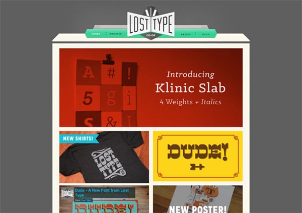
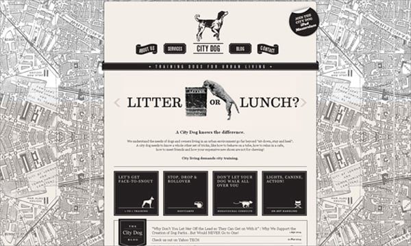
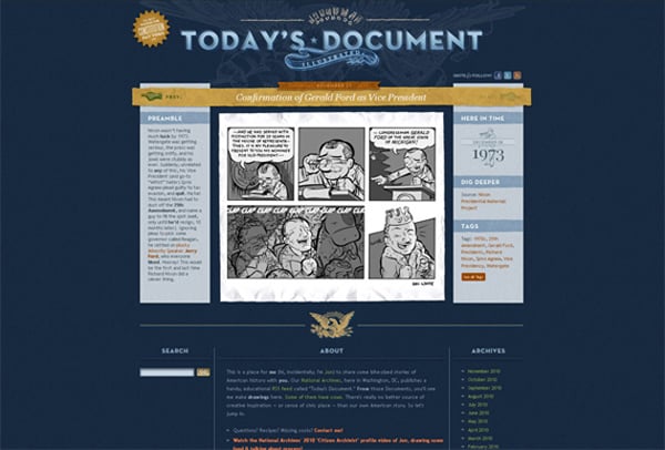
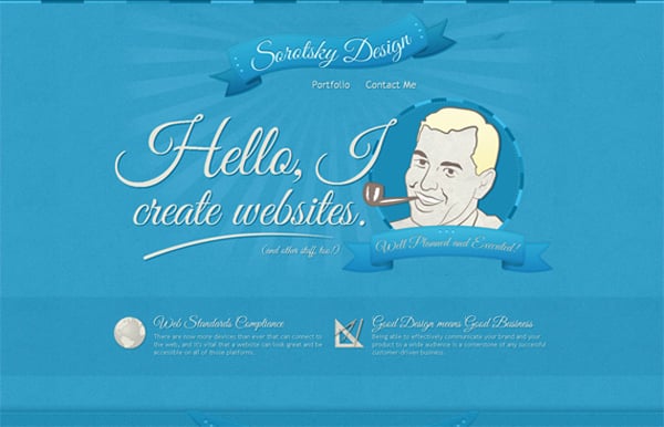
Retro style applies to 1910 – 1950 years. Some people claim that this term is longer valid and that retro goes on till the late 80-s, others are sure that the late 80-s are about those vintage years. But either way, both vintage and retro techniques are quite similar and can easily supplement each other. So if you see an ‘old school’ website you can be pretty sure that it’s made with a respect to the 20th century. Those were strongly emotional times and those feelings were reflected in design.

Here you’ll find some distinctive features of retro web design. They clearly identify this style and you can choose a few elements for your own site.
- vintage photos;
- hand-drawn images;
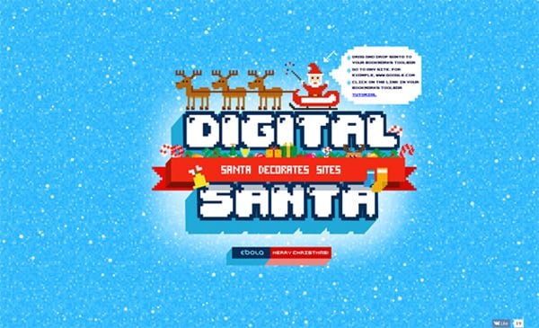
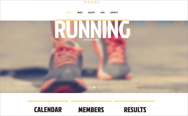
- graphics with pixelation effect;
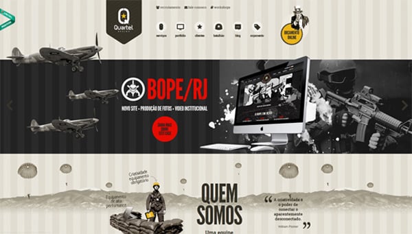
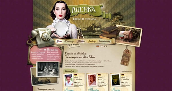
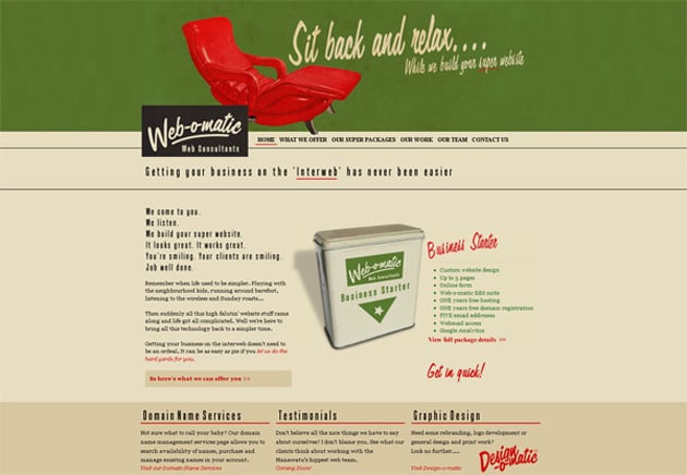
- graphic elements from the past (retro cars, cell phones, photo cameras, etc.);
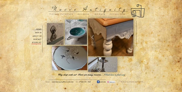
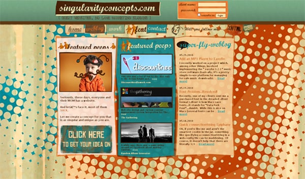
- image or ‘paper effect’ backgrounds;
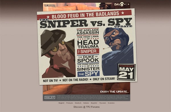
- newspaper style layout;
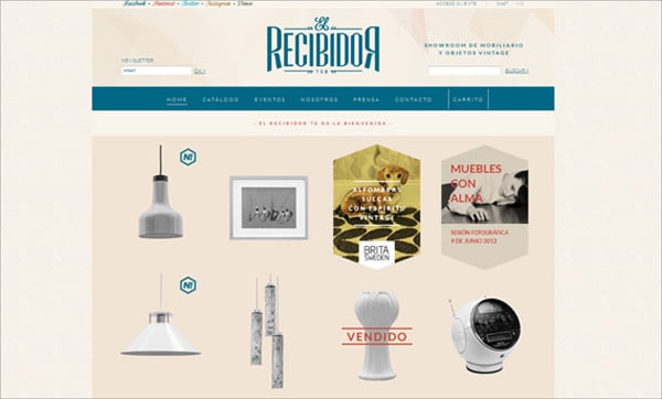
- washed out colors (pastel, brown, beige);
- calligraphic fonts;
- sexy pin-up girls;
Below you can see examples of how 2 or 3 of the elements can be combined together. It will help you choose proper elements to bring a retro vibe into your own project. However, please make sure you don’t use too many retro UI objects at once.
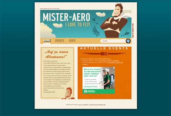
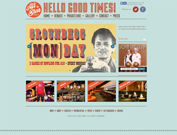
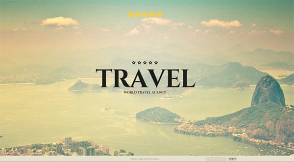
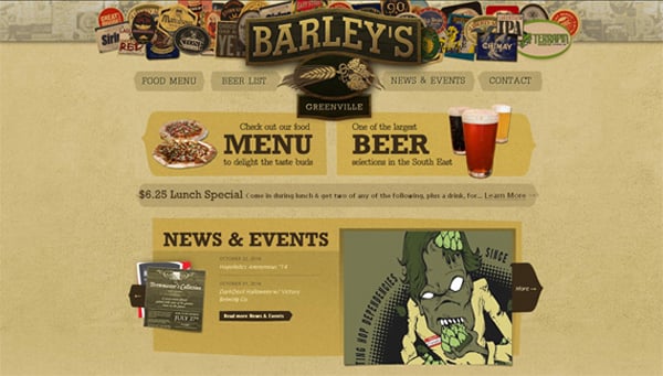
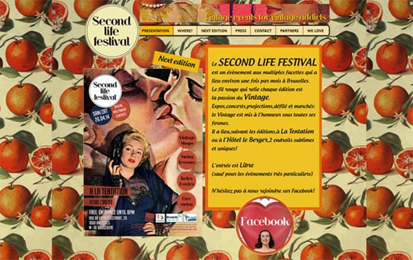
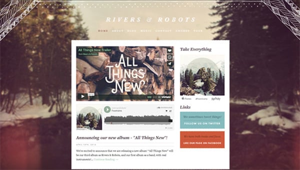
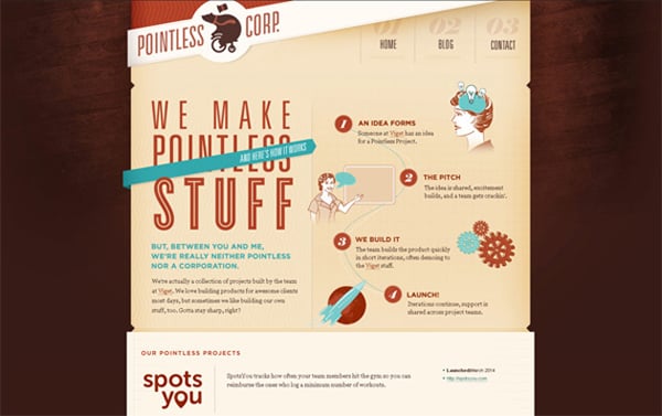
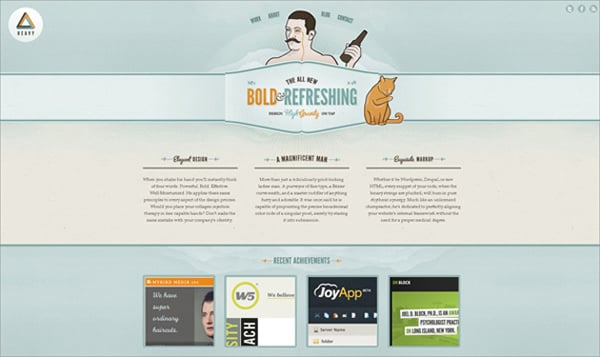
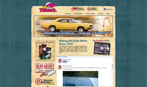
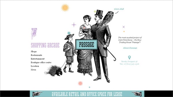
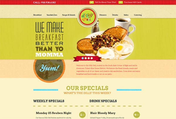
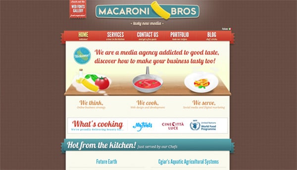
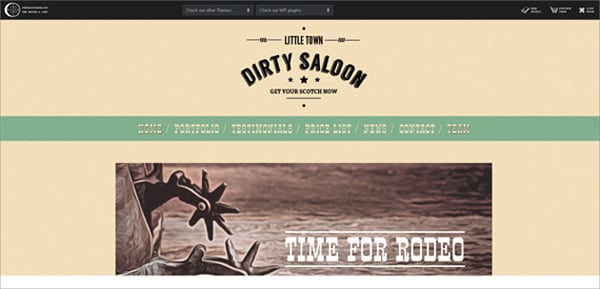
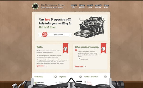
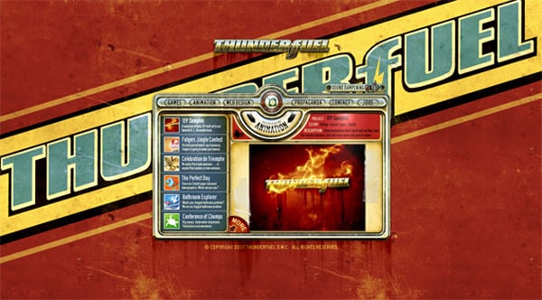
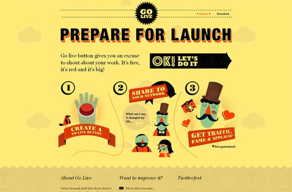
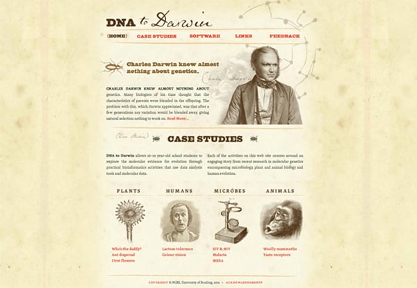
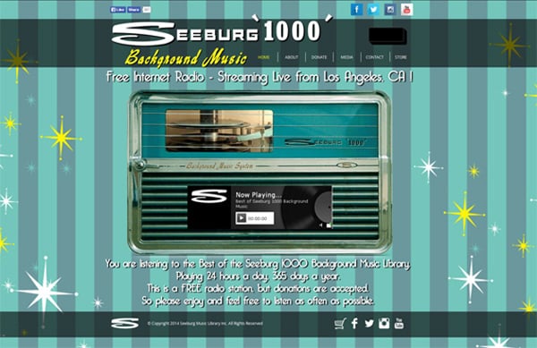
So below we’ve collected 40 retro websites inspired by past times. Use them for inspiration to create your own projects.
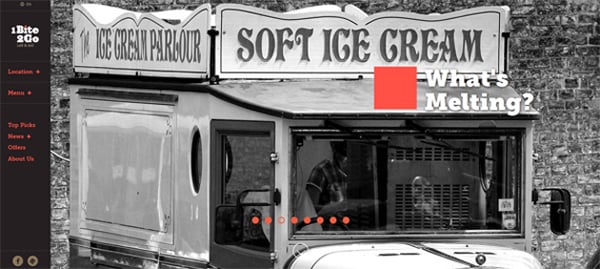
Vintage Ice Cream Van
[th_ft count=”4″ title=”Pick a Design for Your New Website!” cat=”” type=”63″ keyword=””]


