

The Ugliest Website Colors: 7 Combinations To Avoid

Pink and green fit for a queen
Brown and blue will never do
Blue and green should never be seen,
except with something in between

Let’s say you’ve decided to launch a terrific promotion campaign for your business on the web. First, you have bought one of business & services WordPress themes and now all you need is to customize it efficiently to your needs. Template Monster provides you with great tools, various color palette generators, useful widgets and handy admin panel and now you are ready to interfere with the color scheme and the website colors. Definitely, this is the first thing to do to make your site stand out in a row and differ from the similar ones. However, you should remember some important things about website color output not to spoil everything. Since dealing with website colors is a kind of combinatory challenge, there are some ugliest website colors output to avoid. We are here to give you some important tips to follow.
Why should color be so important? Well, for a number of reasons. Not only the color has an emotional impact on a viewer, it can fit with your website’s intended message or, on the opposite, conflict with it. Moreover, it tells an awful lot about the website owner, including his tastes, and also announces if the owner or designer is aware of color theory and basic principles of applying it.
Since the most important thing to bear in mind is your reader’s comfort, you should consider color-blind people’s needs. Why should you do that? It’s obvious: over 8% of your male clients are likely to be color blind, while females are much less likely, but still it’s possible. So let’s look closer which color combinations to avoid in any website color output, not just from aesthetical point of view, but bearing in mind your practical business aspirations.
-
-
Red and Green Conflict
-

As the saying goes “Red and green should never be seen, except upon an Irish Queen”. It’s not only because a form of color blindness makes it hard to distinguish between these two colors. It really might hurt anyone’s eyes when you place red text on a green background and it’s too difficult to read. Moreover, the colors have opposite psychological effect: red means “no” and green means “yes”. So seeing both colors together create a kind of conflict in mind.
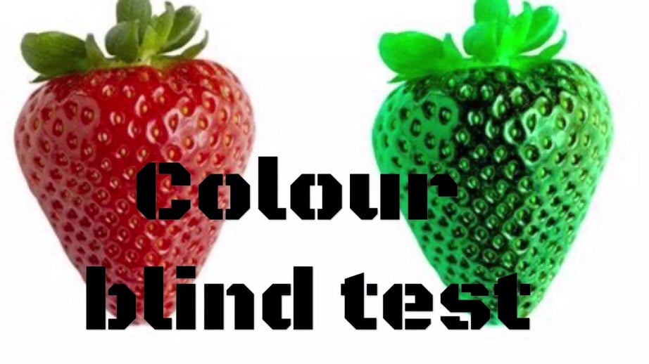
However, it’s still possible to create really interesting and eye-catching designs from green and red colors, if you mix them up with white, gray and black or add texture. The other way to avoid ugliness is to use tints and shades.
-
-
Light Green and Yellow Dullness
-
These two colors are too close together, and such a color combination is too difficult to read if it is used in a text or headings. Being put together, the colors aren’t contrastive enough to raise interest to your website color output and it might seem pretty boring. If you need to create easily readable designs, just avoid combining these two colors and don’t use them as a background. Another reason to avoid this combination is connected with the fact that it is especially hard on colorblind people and looks just monochromatic grey to them, which is not particularly appealing. The way to deal with this situation is to use two colors from opposite sides of the color wheel to add some contrast.
-
-
Red and Yellow Raving
-

According to traditional saying “red and yellow catch a fellow”. Indeed, these two colors are really eye-catching and vibrant. Being used separately, these primary colors can contribute to the emotion and mood of the web design. Although both colors are from the warm palette and are compatible well enough, when you combine them, they are bound to tire and irritate your reader’s eyes. They may seem even aggressive and bold, causing too much excitement, especially when they are neon and intensive.
So don’t overdo with bright colors not to cause a headache in your visitors to the site. Definitely, there is a way to calm the effect of this combination. You can reduce their brightness or add a hue. Another way is to separate them with neutral colors – black, white, grey, brown and beige. However, most appropriate use of red and yellow in website layout is call to action buttons or alert messages.
-
-
Blue and Red Fight
-

There are many situations when blue and red color combinations work great together, but not for the texts and backgrounds. Both colors are so strong that they clash terribly and it’s unsettling to the eyes. Mixing bright blues and reds is a terrible practice that happens every time you combine colors across the warm/cool boundary. The thing is the difference and interaction between the color wavelengths that might result in fatigue and discomfort. It could work out much better if the logo was placed on the white background for instance.
-
-
Blue and Green in Website Color Output
-

Clashing blue and green “should never be seen except in a washing machine”… Although these colors can work well together in another context, this combination brings up the color-blindness issue again. They look exactly as same shades of grey to people with this problem. Moreover, most people would accept that this header doesn’t look fantastic using blue and green. But what if these are the colors of your brand? In this case, you can just use texture in addition to color or split them with some other neutral color.
-
-
Black Background and Hurting Bright Tones
-

Black is often too overpowering and strong color that makes other tones look too bright. Even if the text color isn’t really so vivid, on computer and mobile phone screens it will have different color and the design will look unexpectedly bad. You should definitely avoid bright tones (red, blue, green, pink and purple) on a black background in the website color output. It looks aggressively and considerably reduces readability of your posts.
-
-
Unsettling Blue and Purple
-
Consider this high bad combination for color-blind users during design, particularly when dealing with the user interface, maps, graphs, visualizations and so on. Red-green color deficiency makes people see these particularly two colors as very similar shades of blue. Moreover, this combination doesn’t look especially attractive to people without any perception problems.
As you can see, you should choose color carefully to serve a purpose. Definitely, there are many bold ways to announce your website but in the case of website colors output, it’s better not to run to extremes. The most advantageous approach is bearing minimalism, legibility and your potential users in mind. Make sure you don’t offer a frustrating experience to color-blind people and try to avoid the pitfalls we have mentioned here. Use color correctly, and your site will feel more natural, attractive and user-friendly!