Dos and Don’ts of Internet Casino Review Website: A Case Study
Gambling has been popular since humans started to be humans and it still thrives nowadays. The trend is that gambling is now increasingly appealing to the online audience. Thousands of internet casino websites are popping out with the ambition to conquer the online market. However, the question is how successful they are, and what, in general, makes an online casino successful. Today, you’re going to learn the dos and don’ts of online casino website in an Internet casino review website case study.
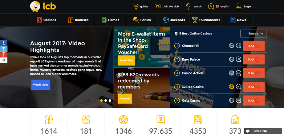
There are pretty many articles that say how to make an online casino website or what most common web design mistakes are. However, such articles often fail to get into detail and give more hands-on advice on how to eliminate the common mistakes that are tanking your online casino website. That’s why, this article analyzes the good and bad strategies of online casino website design by inspecting a single internet casino review website, and it’s doing this in depth. So, meet lcb (a.k.a. Latest Casino Bonuses):
First Impression: Think of What’s Above The Fold
The term ‘above the fold’ refers to the part of a page that’s visible right after website guests open it. What’s above the fold on your homepage is tremendously important as this is what the first impression consists of. If you check out the image above one more time, you’ll see that the lcb Internet casino review website fails to make a good first impression as it’s above the fold part is overloaded with content and different background imagery that makes the overall impression even more blurred.
What can be done about this? Make sure the opening part of your online casino website makes a strong statement. For this, use a full-width opening image, slider or video-background. Moreover, limit header elements to site logo and top navigation. You can additionally go for social buttons and basic contact details. This should suffice in the majority of cases.
Do Not Overcrowd Your Homepage With Content
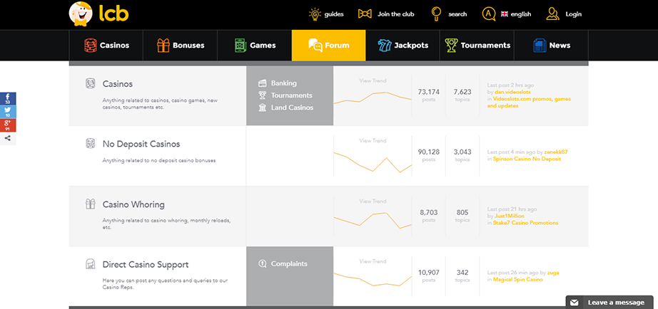
No doubt, your internet casino website homepage should have a storytelling design. However, this doesn’t meet that you should cram all the content of your website into it in case your site guests don’t get to other pages. Latest Casino Bonuses website has multiple multicolored homepage sections, each of which is divided into multiple columns that don’t have dividers in between. This makes content hardly identifiable and perceivable.
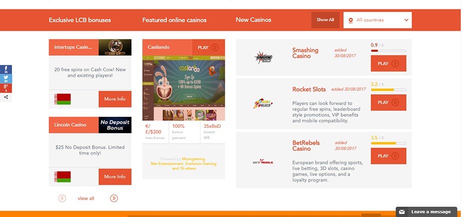
To ensure that your homepage is not a labyrinth made of ‘very important’ information, make sure that you stick to a clear and simple homepage layout, separate homepage sections one from another using dividers and different colors and use large captions that explain what each homepage section is about.
Mind Readability of the Content
As with every other website, it’s important that you don’t make users run for glasses to be able to read your content. This applies to ALL the text on your website. lcb Internet casino review website makes a pretty smart font choice going for highly-legible sans serif Montserrat Regular font. However, it fails to take decent care of text/background contrast. Light gray on white, yellow on white – not the best color combinations for users’ eyes. If you’re not hiding some information from your visitors, make sure every word on your website is legible with a naked eye.
Read this article to learn more about typography mistakes to avoid.
Make Sure You Have Trust Signals
lcb Internet casino review website does a good job showing partner sites and awards in the footer of their website. It also contains links to such necessary e-documents as a disclaimer, terms&conditions, and privacy policy. Moreover, lcb does a good job in terms of social integration as social sharing buttons are stuck-up to the right and social buttons are present on the homepage, as well as in website footer.
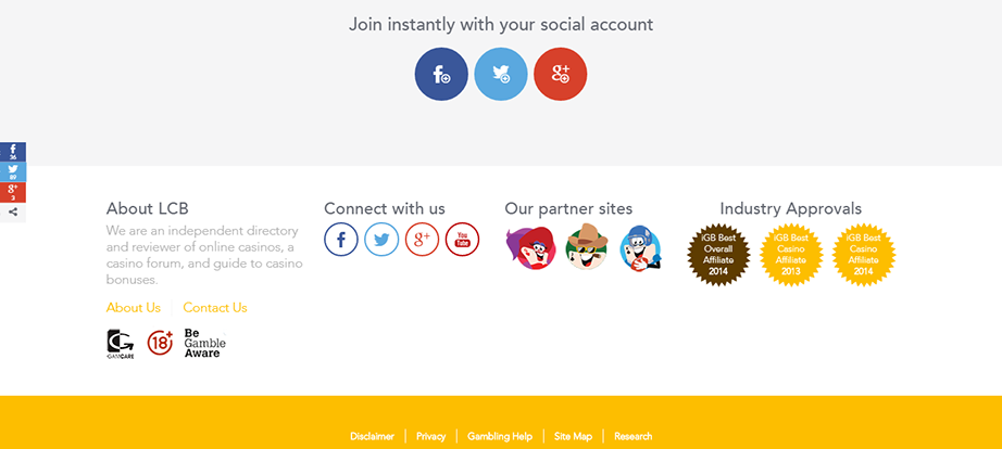
On the other hand, lcb website doesn’t have a Contacts section/page with their contact details. Keep in mind that your site users shouldn’t be hunting for your e-mail or phone number; such information should always remain at visitors’ fingertips. Moreover, the site lacks a contact form, which is pretty important for getting in touch in case any questions appear.
Keep An Eye on How Your Website Displays in a Browser Window
This one is among the basics that are out there for many years. However, some website owners still forget about it. Site name and favicon are the elements that let users identify the browser tab with your website and come back to it when needed. It takes something like 5 minutes to set them up. lcb Internet casino review website does have a nice favicon. However, there is something wrong with the site name. On the homepage, it says ‘1349 Casino Reviews with…’ With what? You’ll have to hover the site title to learn.
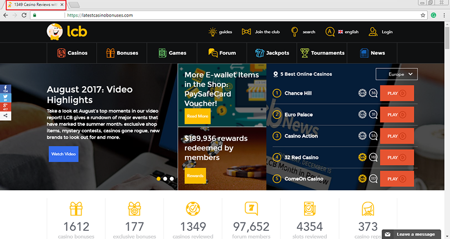
When customizing your website, make sure you take care of these external elements in the first place. Keep in mind that your site name should fit the tab. Go for a logo-inspired favicon to boost website identification.
Wrapping Up: Lessons of an Internet Casino Review Website
To design a roaring Internet casino website, you should make sure that it forges a strong first impression. Moreover, it should have a well-structured homepage, embraces readable typography and includes all the needed trust signals. Going in depth with casino functionality is great, but don’t forget about such basics as site name a favicon, social buttons, contact form, etc. If you manage to address both the basics and casino-related functionality, you’ll end up with a website that hits a jackpot of online success for you.
If you want to create an online casino website within a short period of time, check out these gambling website templates that come with a visual editor for streamlined website customization experience.
Do you have any questions or comments? Feel free to share them in the Comments section below.
Stay tuned!


