Top Dental Website Templates for Your Medical Center
The medical industry is the field that (hopefully) can make us feel better, healthier, and, thus – happier. Happiness is closely associated with smiles and laughter. And a perfect smile can’t be imagined without healthy and beautiful teeth.

A dentist’s office is one of those places that cause fear and anxiety for most people. Children and even adults usually avoid visiting the dentist until it’s an extreme emergency. It’s high time to ruin stereotypes about dentistry and create a welcoming attitude to this medical sphere. A dental website is one of those means that should help specialists to create a friendly atmosphere and help their clients to overcome their fears.
Dental website templates usually carry most characteristics of other medical websites. However, that are some peculiarities that should be implemented to all medical website templates related to dental services. Here are a set of tips that should help dental specials to create a nice-looking and engaging website for your office.
1. Choose a User-Friendly Design
Most dental websites include color schemes popular for many medical websites. This color palette includes, in general white, green, and blue. The choice of these colors for such websites is easy to explain.
White and blue colors are tightly connected with people’s comprehension of medical institutions and doctors. White color is a symbol of purity and cleanliness. That’s why hospitals’ interior, furniture, and bedclothes are primarily white. Doctors usually wear white scrubs, which shows their clothes are crystal clear and have no potential dangers to the patient’s health.
Metro-Style Website Template for Dentists
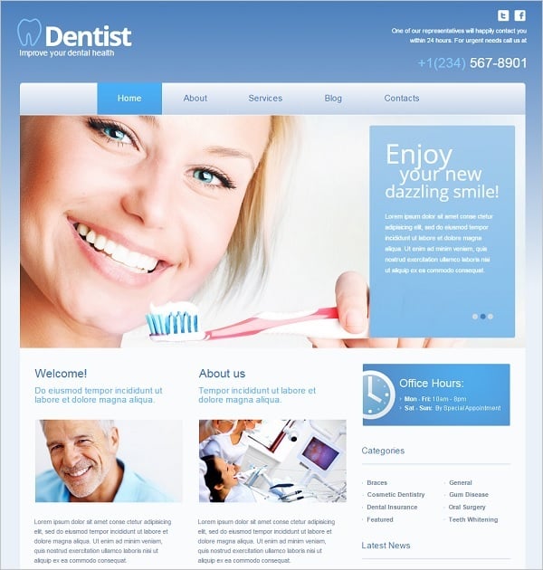
Blue is a color of calmness and trust. Light tones of blue help create a friendly and soothing ambiance which is especially important for dental websites. Blue is also a color of water which also may have a calming effect on dentist patients. Again, water is usually associated with purity and freshness. It’s a good reason to use this symbolism in dental website design crafted with a robust dental website builder.
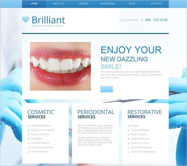
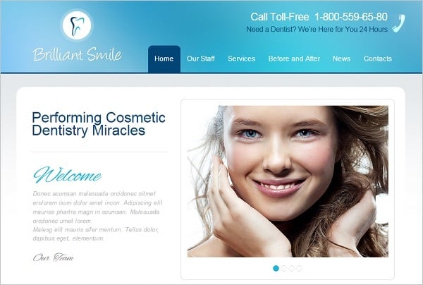
Blue-Toned Dental Website Template
Minimalist Dental Website Template
If we speak about the overall style of a dental website, we must admit that minimalist style is the best choice. Minimalist doctor website design makes a great use of white background what allows using other colors as accents for call-to-action elements. Minimalist design allows making great use of white space that helps highlighting your website key elements.
2. Focus on Home Page Content
Home page is the main place people land on your website. So it’s the main and, possibly, the last opportunity for you to make an impression. Carefully choose the content for a Home Page to make people stay with your website.
Include nice and attractive images. For dentist’s website this may be photos of happy smiling clients. In such a way you create a user-friendly atmosphere on a website and build trustful relationships for potential customers. Home Page should also include info about your services. You don’t have to write a lot about yourself and your business. People that come to your website don’t want to read about you. They need to get full info on how you can solve their issues. Thus, you should explain them what services you offer and why they should choose you.
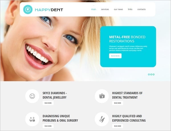
Website Template for Dental Clinic
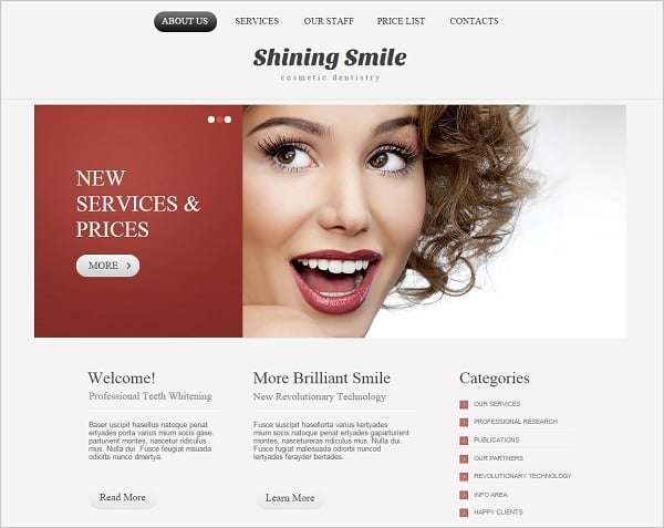
Dentistry Website Template with Red Accents
Including a warm and attractive video about your services that describes the overall atmosphere in your office may also be helpful for building trust in your services.
3. Choose Dental Website Templates with a Blog
Using a blog on your website helps you to get a few benefits. Firstly, it attracts people to your website and helps earning their trust. People start perceiving you as an expert in this field and often return to your website to get some advice. Later these loyal virtual clients may become your clients in real life.
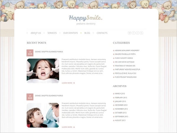
Dental Website Template with Blog
The other reason of running a blog is its benefits for SEO. Include quality info in your articles, set relevant keywords for your posts , refresh your content on a regular basis and your website will climb higher in SERP.
4. Don’t Forget about SEO
As I mentioned earlier, blog is beneficial for SEO. But you should pay careful attention to other SEO practices to make your dental website easy to find on the Web.
Keywords are vital but they are not enough to make your website visible in organic search. You should properly implement keywords in the content, H1, H2 titles, Alt tags for images etc. Most dental clinics are local businesses, thus you should pay careful attention to local SEO peculiarities. In this article you will find some cool tips about search engine optimization for local business websites.
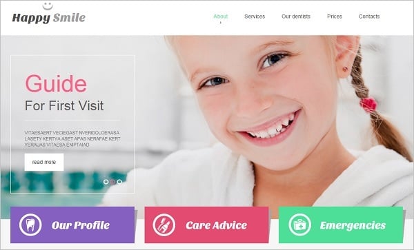
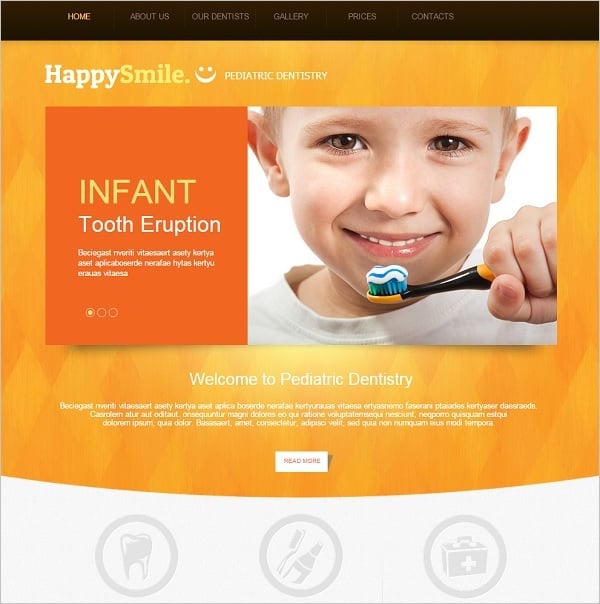
Pediatric Dentistry Website Template
Don’t forget to check out your website loading speed because it may also affect your ranking in search page results. People are impatient and they won’t spend more than three to five seconds waiting for a website to load. Here are a few tools and recommendations for you on how to make your website faster.
5. Include Your Contacts on a Home Page
Potential clients should get your contact info without researching the website. The best of offering them this data is arranging it on a Home page. The top right corner is that best place for putting there your phone number.
Light-Colored Dental Website Template
Website Template for Dentists
Phone number should be large enough to be noticed and clickable. This makes it easy to call you for mobile devices users. Don’t include a phone number as a picture, it doesn’t pays to the UX.
6. Put User-Friendly Contact Form
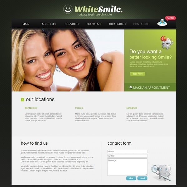
Contact form is vital for any business website as it offers a quick and easy connection to a service provider. Contact form bears another handy function for dental website. It allows potential customers to make an appointment with a specialist even late at night.
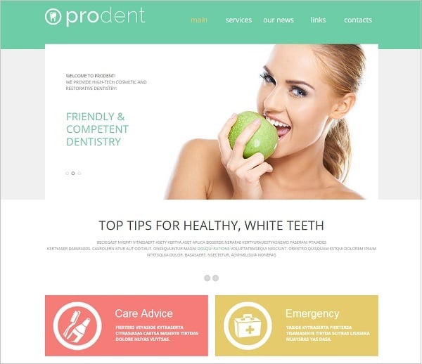
Green-Toned Dentist Website Template
The contact form allows users to ask questions without having to phone you. By the way, you can always arrange and guide your users to a particular FAQ page where you will answer the most widespread problems and give general advice about dental care.
7. Add Users Testimonials to the Website
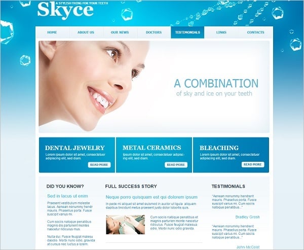
People are more inclined to believe other users than adverts. Thus, testimonials will be great proof of your services’ quality.
Fresh-Looking Dental Website Template
You may arrange testimonials section on a Home page or a Contacts Page to make them more prominent to your visitors.
Following these tips should ensure you will make your dental practice’s online presence more visible. Try to apply the most useful recommendations to your website and be closer to your customers.


