6 Tips to Create an Effective Call to Action Button
If you are stuck because in the process of creating your one and only website you have reached that stage in which you will have to design a call to action button, then you should totally have a look at the following suggestions. The paragraphs that are to come will show you exactly what you must do in order to complete this task without too many struggles. So, if you believe that you need some help, then go ahead and discover the mysteries behind an effective call to action button.
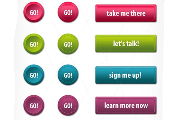
Anyway, before enumerating the steps you must take, let’s talk about the main function of the call to action. Even a less experienced designer would know, just from the title that something like this would invite users to do something. Now, this action that your visitors must take could mean anything you like: book a table, subscribe, add an item to their shopping cart, find out more, and the list may continue. Therefore, your call to action button could invite your visitors to do anything you want, as long as it is related to the nature of your website.
1. Language is important

When you will create the text of these elements it is important to be aware of its importance. As a result, you should focus and do your best, in order to come up with a clear text that will let the users know what action they must take. Moreover, if you want your button to be effective, you will have to remember to keep things as simple and as emphatic as possible. This action must be taken urgently and therefore it would be preferable if your buttons would have a text that would read something like “Try it now” or “Sign up now”. So, be brief, use a large, bold font, choose a beautiful color and use a language that all your visitors will understand. This way, at least as far as this aspect is concerned, you will be on the right track.
2. Additional details

This step is available only for a few buttons, such as “download now” or “free trial”. In these cases, it is advisable to provide extra information on your call to action, in order to let people know some valuable things. For instance, people might be interested in knowing how long your trial will be available; or what is the size of the file they are downloading. Well, then you will have to include this line, however without forgetting that your call to action is more important. In order to show this difference, you should pick a bolder font and a more vivid color for the text that will invite your users to do something. At the same time, the text containing the additional details shouldn’t be very visible. And, last but not least, remember to add something like this, only if it could enhance the user experience.
3. Size and color

The reason why I chose to talk about these two elements in the same paragraph is due to the fact that these are co-dependent. First of all, the web designer should choose the ideal size of his or her call to action. Regarding this aspect, one should avoid choosing an extra-large button, because this will harm the entire design. At the same time, a small button will lose itself in the multitude of the other items. So, you will have to find a balance between these two, in order not to ruin your work, but at the same time to allow your visitors to see your buttons. As for the color, it really depends on the size. This means that if you have picked something big, then the color shouldn’t be very prominent. Also, if you have decided to go for something smaller, then the color should be brighter, in order to make your button perceptible.
4. Insert images
If you want your buttons to be even more visible then it will help a lot if you added some icons or images on them. Apart from adding a beautiful touch to your piece of work, imagery will also make the message clearer. Therefore, as far as this point goes, you must make sure that your icons and images will bring some light, instead of confusing your audience.
5. Set your priorities
There are some cases in which web designers create more than one call to action. Well, if this is your case too, then you will definitely have to prioritize. First of all, you will have to decide which button is the most important. Then, using size and color, you will have to show the difference between these elements. It goes without saying that the prominent one should be larger, in order to put emphasis on it. But, let’s say that you do not want to use size as the difference maker element. Well, in this case, you should rely on colors, and you should pick something brighter for the button that you want your users to take a special interest in.
6. Place your buttons
Now that you know what your buttons require in order to be observed by your users, you must learn where to place these, as well. You could try to put your call to actions in the middle or on the left side below your content text. At the same time, you could inspire from other websites. For instance, you could follow the example of eBay and place your buttons at the top of every product page.
To conclude, the suggestions mentioned above will help you deal with your call to actions, even if your buttons are inviting people to sign up, to learn more, to freely try something, to download or to add to cart. To be more precise, it seems that there is a solution to your issues, no matter what your requirements might be. So, if you are really determined to create an effective button you will definitely be successful in your action.
[th_ft count=”4″ title=”Pick a Design for Your New Website!” cat=”” type=”36″ keyword=””]

