The Importance of Visual Consistency in Good UI Design
A simple, clean and visually consistent website gives web users a feel of comfort and control. A viewer always wants to see soothing and consistent design, as it becomes easy for them to understand the desired message of a site. Therefore, many designers consider visual elements while designing a user-friendly website.

But, before getting into this topic, we need to understand the meaning of visually consistent website? And, why it is important for creating a good UI design?
Well, a visually consistent website refers to a harmonious use of the visual design elements such as color, text, sizes, styles and layout in all pages of a site. This is important because consistency makes websites easier to use as visitors don’t have to learn new tricks when they visit your site.
In this blog post, we will learn why visual consistency plays a significant role in obtaining new web users as well as engaging targeted users at maximum.
Website Should Have a Familiar Design
There is no doubt that our decision-making ability is highly affected by visual senses, and everything we see leaves an unspoken effect on our subconscious mind. So, if we look familiar with the well-managed structure, we tend to like them. Now being a designer, you just need to study your target users and develop pages based on the available information.
In fact, the Google found that the simpler, professional and familiar websites influence visitors to stay on a particular site. It is considered that a simple and user-friendly design always induces users, as compared to complicated designs.
The viewer’s decision is affected by the visual design such as: symmetry, hierarchy, fonts and line spacing. In a website, the familiarity of design elements is crucial because extremely different layouts, typography, colors and icons between different pages can confuse a visitor.
On the other side, the visual consistency with the friendliness of tones, typography, color schemes and visuals on different web pages creates a sense of reliability and stability that also helps the user to navigate your site freely.
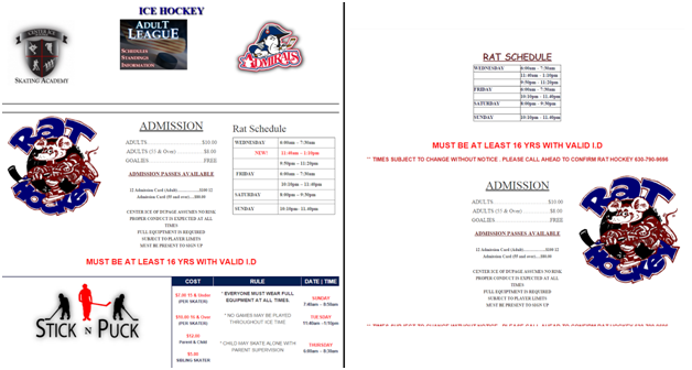
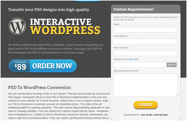
Example of Two Dissimilar Web Pages from Same Website:

Instinctive Learnability
Sometimes, it happens when you see something new, but you feel like you have used it before. That instinctive learnability is a shortcut to creating a direct connection with your new users, so don’t neglect it, especially in web design.
Web users are learning new systems and techniques, so they welcome an interface that they can understand instantly and with little more effort. Visual consistency plays a crucial role in this.
Consistency with external websites, especially the use of UI patterns shows elements that users already know how to use from other websites, even if they never been on a website before. In fact, you can appraise patterns like the “search” button, a right facing triangle “Play” button. These elaborate visually how to use the features without having to clarify, or the user having to learn something new.
Meanwhile, internal consistency restricts users from having to learn new functions. To an addition, a user gets frustrated when he sees the same element on your site that is used differently in different pages of a site.
Search bar:
![]()
Pause, Fast Forward & Volume Buttons:
![]()
Maintaining a Visual Flow
A simple, user-friendly and visually consistent website allows users to navigate the site freely, without any frustration. Some web designers apply these principles to develop a properly designed visual flow.
In fact, experienced web designers know how to influence their user’s visual flow through eye-pattern strategies, different colors, varying sizes and other techniques. An objective of a visual flow is to build a harmony and consistency to all the on-screen UI elements.
Commonly, the white text looks appealing against the black background and color of animation. This breaking of internal consistency adequately delivers the message to the targeted users, as it is clearly visible to the eyes. Similarly, using forms or other user engaging elements on the right side of the screen that too above the fold to insist users to get engage as soon as they land on the page.

First Impression is the Last Impression
According to the Google, a visitor takes about 50 milliseconds to judge your website. They consider the visual interactions the strongest interactions as it builds a decision- making ability among web users.
Well, there are many elements including the visual design that influences users to take a decision about your site. You can also use different design techniques to make your site user-friendly, but at the end visual consistency is the most important aspect as it can leave the first and the last impression on your visitor’s mind.
Conclusion
While designing a website, you should gather information about your targeted users, their behavioral pattern to obtain a good understanding of their flavors. Define your design elements, fonts, and page structure and action elements based on your research. Make sure you develop a design which is unique in nature but gives a familiar vibe for your users. Always use same design structure, fonts, spaces and image patterns on all pages. Until it’s not a landing page for specific purpose, don’t try to change the flow of your visual aspects and strictly maintain consistency.
This post was meant to outline few basic psychological facts about web page design while talking about the consistency in structure and visual elements and I certainly hope that I touched all the important aspects and was helpful in one way or another.

