Minimalism In Web Design: What Is That And What’s It For?
Less is more… No I don’t want to start my article with this catchy but still trite expression. You know, 7 of 10 articles about minimalism in web design use this phrase (as usually for sub-titles).
Let’s better start with a story of why this topic impressed me so much just these days.
You probably know that every December each self-respecting web design blog considers it to be its duty to forecast wed design trends of the next year. Minimalist web design is a constant member of these lists for several years. But, I have never noted it until now. For me facts and statistic show the real situation. And in this case Google Insighs vote for ‘minimalist web design’ being a real trend.

But I’ve seen this graph much later. At the beginning I searched for responsive web design frameworks and noted that almost all the websites are created in minimalist style. Nobody will argue that responsive web design is more then popular on the web. That’s why it’s so interesting to know that the majority of responsive web design developers prefer minimalist style. This simple discovery inspired me to write this post.
So if you’re going to learn more about minimalist web design then be ready to dig in search engine results. Roundups of minimalist web designs take leading positions, so if you want to get more specified data you should look through several SERPs…
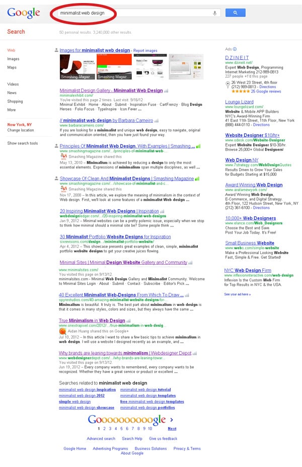
Or you can read the minimalist web design guides I’ve already searched for you:
- Creating Minimalist Designs Makes You A Better Designer. This post is written in quite simple language, so that everybody can understand what minimalism in web design really is. I guess it can be a good article to start from.
- Less is more: Fundamentals of Minimalist Web Design written by Curt Ziegle, a web designer with 10 years experience in web design. That’s a must have reading for every web designer.
- Essential Principles for Creating Minimalist Web Design. This article mixes the history of minimalist web design with its advantages and a few basic principles.
- Minimalism in Web Design. This post can teach you “how to invite the user on your page and make him not want to leave it fast” when you create a minimalist web design.
- True Minimalism in Web Design . That’s another worth reading guide written by 13 years experienced web designer Pedro Irusta. The article is well structured and illustrated with author-drawing mockups.
- The 4-Point Minimalist Guide To Web Design. Tips you’ll find in this post differs a little bit from those you’ve already read, so I want you to know them.
- Understanding the Theory of Minimalism in Web Design. A good article of Anders Ross – a co-founder of iShift and a web designer. He describes benefits that minimalist website design can give you.
If you didn’t neglect previous articles then you don’t need minimalism theory basics being repeated. That’s why I want to give you some reasons why minimalism is a constant trend in web design. Probably it will incline you to try some minimalist design.
Some Reasons Minimalist Web Design Is In Charge
- Minimalism is an Apple’s style. Steve Jobs was an addict of perfect simplicity and even after his death the entire world continues to venerate this trend. I think till Apple is a pace-maker, minimalist style is a key trend in web design as well as general design.
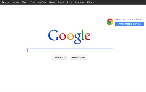
- The majority of minimalist web designs have white color backgrounds. It’s a color of medicine and clearness. In a childhood moms told us to wash hands and from that time we know that clearness is good and dirty blobs are bad. Consciously or not, being adults we continue to follow this rule.
- Minimalist design requires lower costs. However, the statement is quite disputable. I like to compare minimalist web design with house repairing. Imagine that you have to furnish a room with a few elements, so that it looks comfortable and cosy. That’s not an easy task as you can think at the beginning – almost every time your room will look incomplete. It’s a real art to make something really awesome using a limited number of elements.
- Minimalist designs always look neatly and even sterile. Habe you attended calligraphy classes? In these lessons every blot seems to become a kind of a deadly sin. We are taught to write and act carefully and this skill becomes a rule for the entire life.
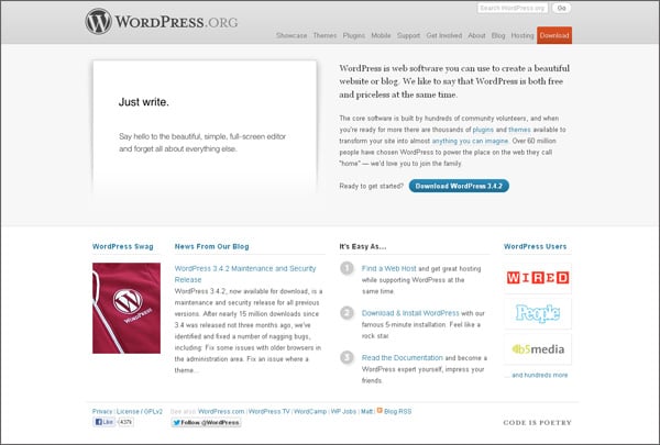
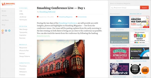
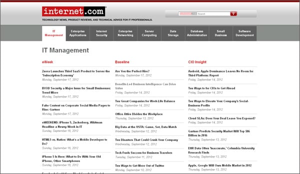
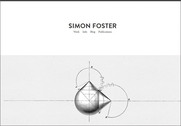
- Top web companies/designers have minimalist style websites. Haven’t you ever noticed that?
Apple

WordPress
SmashingMagazine
Internet
Simon Foster
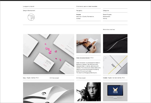
Lundgren + Lindqvist
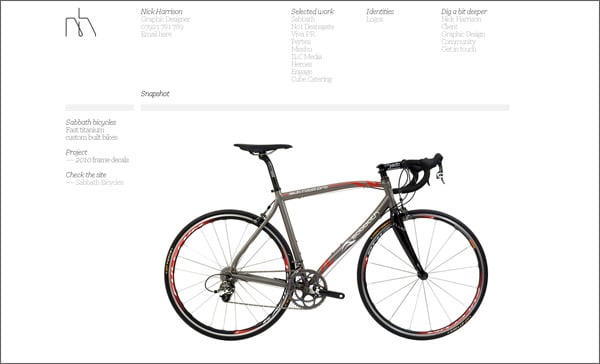
Nick Harrison
CRW

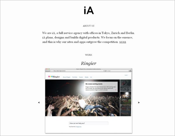
IA
It seems that it’s all I wanted to accentuate your attention to. Now you’re well versed in minimalist web design and taking into account everything you’ve read above you can decide whether you like it or not.
Now I have to say good buy to all of you. I’ll be glad to chat with you in comments field below, so if some statements of my article look strange to you then you’re welcome to say well-founded remarks.

