Improve Website Conversion Rate by Simplifying Your Web Design
Would you like to improve website conversion rate? Or let’s ask another way: would you like to get more purchases from your site? It sounds great, yeh?
There are several techniques to improve your site conversions by simplifying its design. We’ll show you what to do.
What Website Conversion Rate Is
Let’s start with understanding what website conversion rate really is.
This metric reflects the ratio of buyers to site visitors. It means if your site is visited by 3 000 people during a month and gets 50 purchases then it’s super great because your conversion rate is 50/3000 = 1.7 %. However, this measure doesn’t depend on your traffic. It can happen that trying to get more site visitors you’ll reduce conversion rate. For example if you find new accidental visitors but the number of purchases is the same.
Your conversion rate is greatly impacted by your web design, so you need to keep an eye on that. Even if your competitors gain a success with some new layout it doesn’t mean your clients will also appreciate it. Be careful because even minor changes in web design can cause higher or lower conversion rates.
1. Keep Your Forms Short and Clear
This solution seems to be more simple than it really is. For a lot of people it’s hard to delete sections they worked on for hours. It’s a psychological problem but you should cope with it.
Let’s start with the number of fields in a contact form or at the checkout that a user needs to fill. Do you really need detailed information about your customers? If you’re going to contact them back on the phone then a phone number is a must have thing. But if this field is on your website just because everybody does it – cut it off with no regrets.
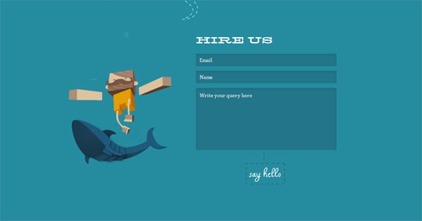
Here you can see the simplest contact form that looks nice and doesn’t prevent visitors from using it.
It is not a secret that the look and usability of a shopping cart can rise up or down your website. It’s extremely important to simplify your shopping cart to stimulate sales. There are several steps that will benefit you:
- Don’t display a shopping cart every time a user adds new items. Save it up until he goes to the shopping cart voluntarily.
- Don’t ask people to fill in the same fields again and again. Let the system remember users data for future purchases.
- Use clear colors and readable fonts. It is especially important for sites that apply flat design. Its washed colors and thin lines can be too simple to motivate site visitors to action.
- Display how much money the shopper saves with every item and sum up it. It won’t overload the design but stimulate visitors to spend more money.
- Apply in-line validation to point out incorrect answers and missing fields. Most people won’t abandon a purchase if getting clear explanations on how to fix the mistakes.
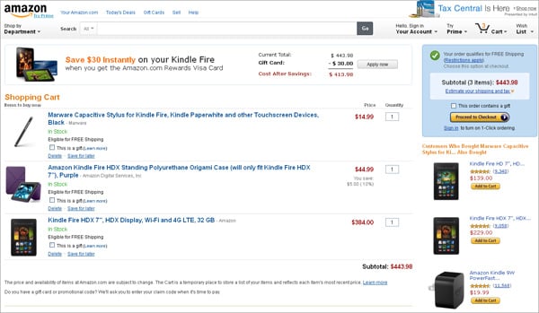
Let’s take a look at how the Amazon shopping cart looks.Here a buyer can get a $30 discount if applying a gift card. It’s also possible to complete a shopping cart even being logged off.
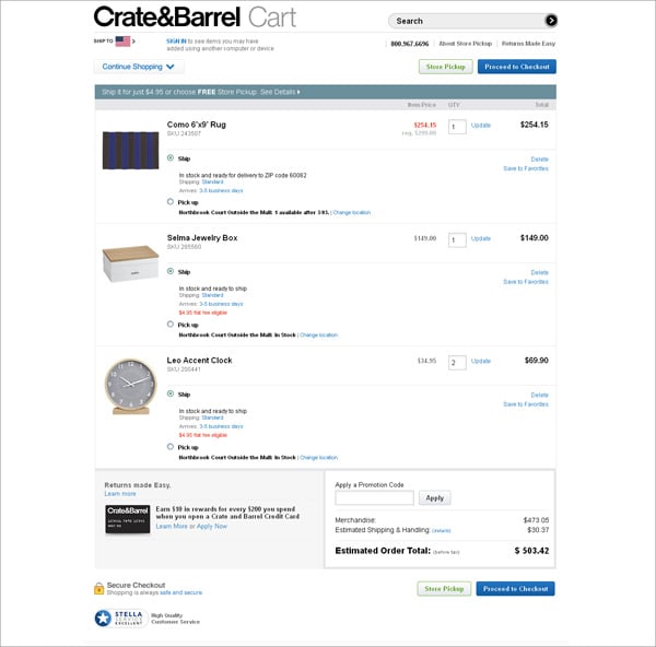
Here is another well-done shopping cart by Crate and Barrel. It is designed in soft colors just like the entire website. Discounted prices are set off in red and shipping details are also displayed there. Belong the fields of the shopping cart users can see a trustmark that proves the excellence of the store services.
2. Minimize the Number of Call to Actions per Page
Sometimes it happens that when trying to improve usability site owners add too many call to action. Visitors become dazzled by these buttons and links or they are confused about different instructions given at a time.
Another widely spread fault is a usage of wrong wordings. It applies to online stores that sell several products or services. Users can be confused by a ‘Buy Now’ button because they may not be sure they are ready to purchase or maybe they want to order more goods. When they see an ‘Add to Cart’ button people know that they are not forced to buy a thing. They can look for more products and then go back to a shopping cart.
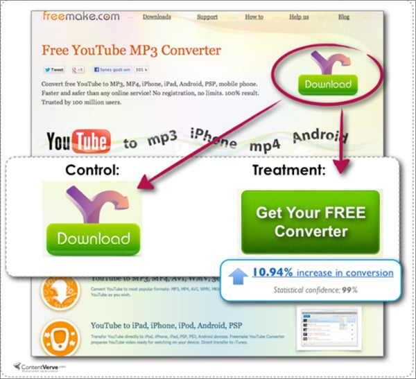
To stay clear with call to actions try to use different colors, gradients, shapes, sizes and fonts to find out the most effective solutions
3. Avoid Annoying Animation
This tip is important for both online stores and common websites. A lot of words are said about flashy elements in web design and still there are people who add them to their sites. Gone are those times when people clicked blinking links. Now web surfers are tired with annoying animation. They will more likely abandon it and find another site. In this case your conversion rate will go lower.
Human factor is not the only reason to stop using annoying animation. It slows down web pages and this is a serious complaint for people all over the web. So if you want to keep the download fast you have to reduce the usage of heavy elements.
If you’re going to sell something on your website you’d better disable all irrelevant attention grabbers and do your best to carefully guide visitors to a purchase.
Conclusion
There is no guarantied way that will take you to a higher conversion. Also there are no magical rites to help all site owners gain a success. However, if you carefully test design elements you can significantly improve website conversion rate. Testing will help you figure out whether your website is good or bad for the audience. Doing it regularly you’ll see how even a small change can impact users behavior and how to help people buy more good products from you.


