How Many Fonts Does a Designer Really Need?
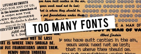
Have you ever thought about how many fonts you really need and really use on a given project? Maybe 2 fonts will be enough or 100-200 fonts is not a limit for you? This subject is quite disputable in web design. It seems there is no definite facts-based answer, but today we’ll try to summarize pieces of information around the topic that some experienced designers have shared with us..
It is considered that designers have hundreds of fonts on their computers, but they don’t really use over 80% or even more of them. Usually designers choose several favorite fonts, then learn everything about them and use them in all of their designs. It’s a kind of a signature move for them. However, all fonts have different styles which make the creation process more fun and eye-catchy.
Nowadays a regular web designer feels like a young lady coming to a sale in the shopping mall. It is hard to stop yourself when you enter a free fonts website. Hundreds of original fonts are just a mouse click away from you – all of them can be easily downloaded and used in seconds from now. The worst thing is that most of these “cool” free fonts will never be used. But they will overload and hinder your computer as well as interfere a proper font search within graphic editor menus.
Do Type Fonts Matter?
A lot of people consider typography to be a foundation of web design. 95% of online information is displayed in a text form. Those who say that nice graphics rule the web are mistaken. Don’t get us wrong – today web is more visual that it has ever been before. The thing is that text and fonts still do matter. And in the days of severe visual overuse, fonts also matter more than ever. Take into account that most of the popular pics and memes include texts. Very often the same image has different titles that make it more funny.
Grumpy Cat
Success Kid
19990’s Problem
Do you think it’s about funny pics only? Let’s take a look at design studio websites. Perhaps these are more convincing examples.
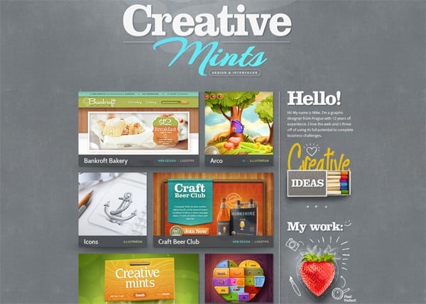
Creative Mints
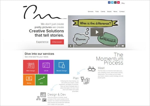
TheCreativeMomentum
Vento
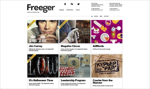
Freeger
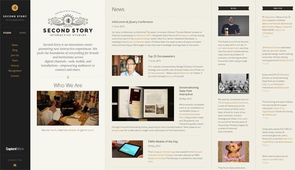
Second Story
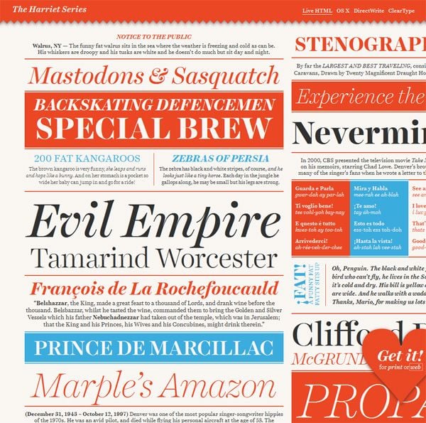
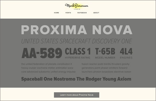
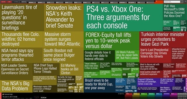
In fact there are a lot of successful web designs that don’t use photos at all – they do just fine using the texts only. This idea looks a little bit crazy, but a thoughtful use of different fonts makes the designs below very original and attractive.
The Harriet Series
Mark Simonson Studio
Republic2
NewsMap
And the last reason (in fact, it’s just a guesswork): Facebook limits text usage in the ads that appear in users’ News Feeds. The text limit is 20% of the image real estate! For someone the number seems to be wrongfully reduced by Facebook because a suitable phrase wrote with a nice font on a catchy image is the best thing for every social media network. They say that it makes the content more engaging and doesn’t allow advertisers to abuse the image form of the content. Maybe it’s really so. But maybe a well arranged text is also a powerful tool to be used by the professional designers and marketers…
How Many Fonts Should a Designer Use?
As you probably understand there is no rule of thumb to follow when choosing fonts for web projects. It’s always up to you and your designer instinct. Just remember that the more fonts you choose the harder it becomes to create a harmonious and clean design. Professional web designers say that a lot of fonts in one design look unprofessional and it’s hard to argue with them because it’s true.
This is how a bad fonts combination can break your web design. Prepare yourself!
Vision Quest
Mr Bottles
LingsCars
We didn’t mean to offend the owners of these websites, but come on – all these designs look so weird! But as long as you are interested in web design trends you probably won’t create websites that shock viewers minds.
In general designers have up to 6 favorite fonts that they know well and like to use. But even these fonts should never be used in one project.
Designers don’t limit the number of fonts in advance, but 1 – 2 of them always look more natural than other combinations. One font for the main text and one for titles and highlights. It’s one of the best things you can make for your design. However some professionals consider that this “rule of two” will work better as a “rule or three”: one font for the main text, one – for titles and one – for menus. All three fonts have to differ from each by something other than the size, color or typeface.
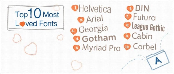
Tomas Laurinavicius with the help from Piktochart carried out the research to find out what fonts web designers prefer to use. These fonts are those that are highly appreciated by millions of designers. So here are some results:
As a conclusion I’d like to say that the limited number of fonts used on a website doesn’t mean it looks well. You can use as much fonts as you want in case you can arrange them in a natural way.
If you’re not sure which fonts will work better for your project, type “font combination” in the search bar of Google, Yahoo, Bing, etc. This way you’ll find a lot of successful font combinations to use when making a website. Good luck with your designs and please share your opinion on fonts in the comments section of our blog!


