Fonts that Kill Designs – Typography Mistakes to Avoid
If there’s one resource web designers have in abundance, it is fonts. We have more fonts available to us than any other designing resource. And just as their majestic amount wasn’t enough, most of them are absolutely free. No wonder beginning designers get bamboozled when it comes to selecting appropriate fonts for their designs.
Confusion never leads to achievement. So today we’ll eradicate the confusion and identify some of the common typography mistakes designers make in the font selection process. In the second part of the article, we will go through the methodology of selecting fonts.
The Basics
Typography Mistake #1: Not Knowing the Terminology
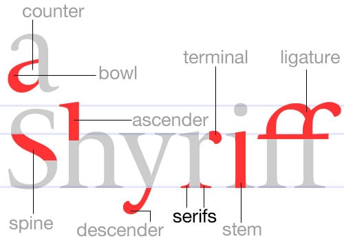
The skill of choosing the right font at the right place depends on the knowledge of typography you have. You need this knowledge to discern a great font from an ordinary font. Of course, you don’t have to go deep but understanding the basics of typography is essential for every designer in the business, whether you design websites of graphics.
Adobe has done a good job compiling essential typography terms that all designers should know. I recommend you check out that list.
Typography Mistake #2: Forgetting about Coherence and Unity
You must have heard it before, but let’s recap: the very first rule of typography is to create concord and contrast and avoid conflict.
- Concord. Concordance in fonts is mostly mild or formal. Usually, what happens is that you use one font only. You change the font size, weight (bold, light), and styles (italics, standard) but you don’t shift from one font to another. Concordance is mainly used for large informative blocks of text on the web.
- Contrast. Contrast works on the famous rule of science, opposites attract. In contrast, you mix fonts that complement each other. The oldest trick in the book to create contrast is to use a serif font with a sans serif font (there’s a lot more to creating contrast, we’ll get to that in a bit). The use of contrast is typically high in print media.
- Conflict. In simple words, conflict occurs when you use two different fonts that are similar to each other. For instance, Times New Roman and Georgia are both serif fonts and visually quite similar, but of course, not exactly the same. If you use them both in a design, it won’t impress anyone.
Even if you do find fonts that go well with each other, things can still go wrong due to a lack of coherence and unity. Creating coherence between fonts requires you to use the same colors and effects on the title as well as the taglines.
Here’s an example.

You can see the first tagline (from the creators of Planet Earth) matches with the title (LIFE); even though there’s a big difference in point size, font color and weight are almost identical. The same goes for phase two of the design. Tagline (Sunday, March 21, 8 PM) matches the title (Discovery Channel). Even the line down under synchronizes beautifully with the rest of the design. That’s coherence. That’s what you need to learn.
Mind you, this is not a typography-based poster. This is just a design that uses fonts in a proper manner.
Typography Mistake #3: Not Paying Attention to Kerning
If you think hotshot software like Adobe Illustrator or Photoshop will take care of possible kerning issues… think again!
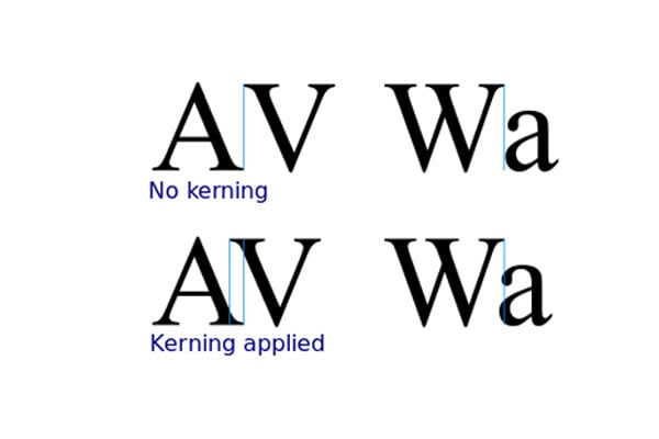
All good designers manually kern text. Graphic designers use Alt (options key on MAC) + Arrow Keys to kern text. Web designers use tools like kern.js to control kerning on web text.
Typography Mistake #4: Inappropriate Use of Fonts
Each font has its own characteristics. Some are uniquely stylish, while others are regularly useful. Your job is to find a balance between the two. Also, your job is to use the right font in the right place. A good font used in the wrong place leads to a design disaster. Let’s see this example:
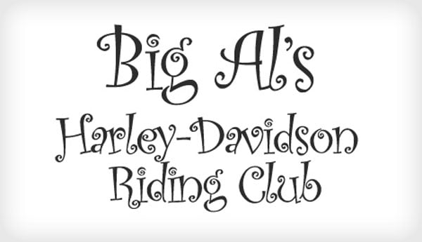
Seriously? This is the font they chose?? This font could be excellent for aunt Martha’s knitting club, but Harley Davidson riding club… seriously?
Selecting the right font for the job
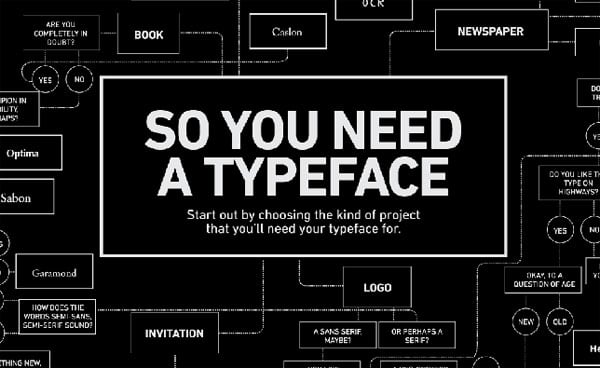
The bad news is that there is no formula for choosing the correct font for a particular place. But the good news is that you don’t really need a formula. Just commonsense is enough. One guy who has that common sense (not to mention the incredible amount of design experience) is Julian Hansen. He designed an excellent infographic/flowchart to make the selection process of a typeface easy. Below is the thumbnail, be sure to click it.
Common Font Types
There are plenty of classifications for fonts. I’m describing the most essential ones here; these are the ones you absolutely need to be familiar with to do well in fonts. For a full list of classifications, please check out Typedia’s type classifications.
Old Style Fonts
Sometimes referred to as ‘Venetian’, old-style fonts consist of calligraphy-styled typefaces. These are the typefaces of the pre-renaissance period. In such fonts, the stroke size varies; you get thick and thin ligatures in the same letter.
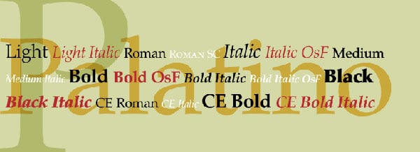
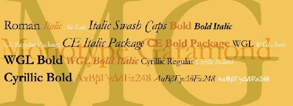
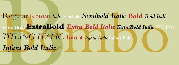
Old-style fonts work great when trying to create a vintage, classic or traditional effect. There are some examples of old style fonts.
Palatino
Garamond
Bembo
Modern Fonts
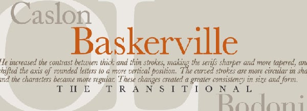
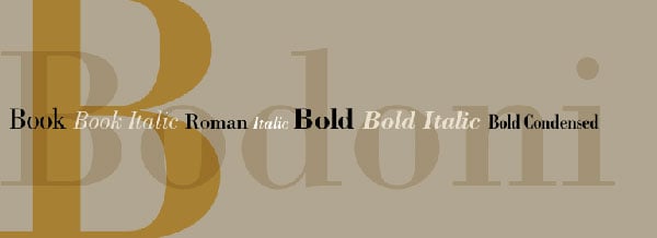
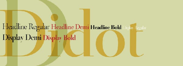
As the name suggests, these are the typefaces of the post-renaissance period. Actually, modern fonts include two subcategories, transitional (17th to 18th century) and modern (late 18th century to 21st century). When readability and simplicity became more important than style and calligraphy, the shift from the old style to modern took place. Designers focused on geometric shapes and patterned design to create the letterforms of the future.
Modern fonts are bold and dynamic. However, they might seem a little… Spice less.
Baskerville (transitional period font)
Bodoni
Didot
Geometric Fonts
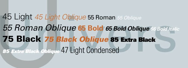
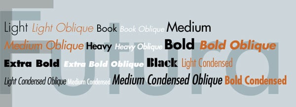
All geometric fonts are sans-serif fonts. That is because these fonts (as the name goes) are based on strict geometric forms. Serifs cannot be accommodated here.
These fonts are usually designed on the “less is more” principle and work fittingly with minimalist designs.
These are the most modern, readable, and user-friendly fonts out there. But they can also seem boring and impersonal, so use them cautiously.
Univers
Futura
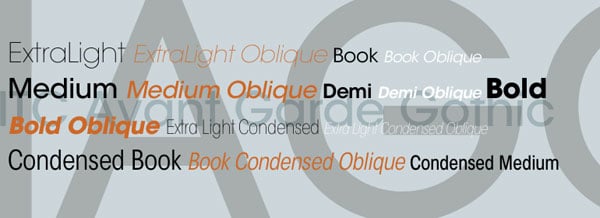
Avant Garde
Humanist Fonts
These sans serif fonts are derived from handwriting, i.e., humans. Geometric fonts focus totally on the mechanical style of typefaces, but humanists focus on details. Of course, these details come at a cost. These fonts compromise a little bit on consistency. In humanist fonts, stroke size varies, so they look classy and personal.
Humanist fonts contain the blend of human touch and modern geometrically correct aesthetics.
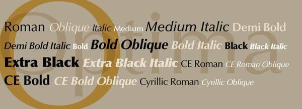
Optima
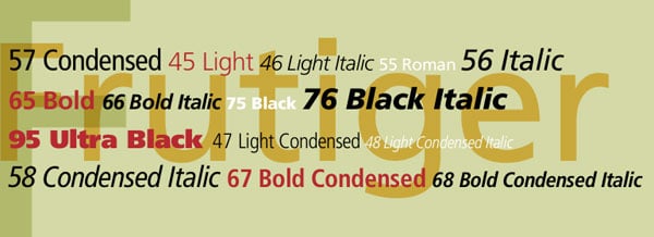
Frutiger
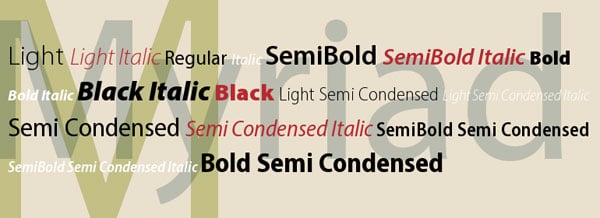
Myriad
Slab Serifs Fonts
Slab Serifs are pretty much like humanist fonts but they contain serif feet. The use of these fonts is a little tricky. They can be sophisticated, and they can be rugged. They can be handsome, and they can be gawky.
To be honest, Slab Serifs have such a vast variety that they shouldn’t even be categorized as one type of font, but they are categorized this way since they are distinct from their serif shoes.
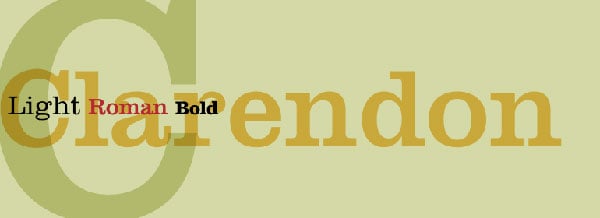
Clarendon
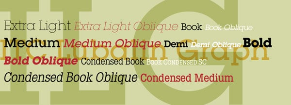
Lubalin Graph
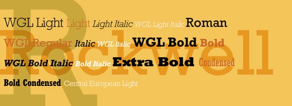
Rockwell
Cross Match
Do you need to mix and match fonts? How much? And why?? Sometimes, questions like these don’t have a one precise fits-at-all-places kind of answer, but let’s try to decode the mystery.
Do you need to pair up fonts? Sometimes, it’s an excellent way to add spice to any design. For instance, a Chinese restaurant’s menu card would lack something important if it doesn’t have the restaurant’s name written in a font like Chinese Takeaway.
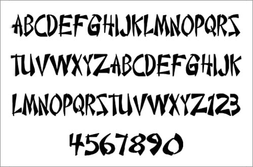
Of course, you can’t put the price list and names of the dishes in such a font. For them you would use a font that is easily readable and looks sophisticated.
Marrying the fonts
Pairing up fonts is a good idea for print media in particular and all kinds of media in general. You choose one font for headings and one for text. These fonts have to work like a couple in a marriage. One should complement the other.
You have to be aware of the characteristics of both fonts, they must contrast to create good results: a bit like a good marriage. In a healthy marital life, if one person is a good speaker, the other should be a good listener. Only then they will complement each other. Fonts should complement in the same manner. If the font for headings is bold and full of impact, the font for content should be easy on the eyes. If the font for headings is serif, the content should be written in sans font.
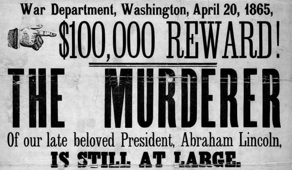
Usually, coupling fonts works the best, but sometimes, two are just not enough:
In principle, you should not make any variations with fonts… or do it a whole lot. This ‘wanted’ poster above is an example of a lot of variation.
Even if you are willing to take the risk and go for a lot of variations, note it that not all fonts look good on large amounts. For instance, horror fonts or cursive tattoo fonts look amazing when used sparingly. Use them without restraint, and all hell breaks loose.
Using Fonts in Print Media
Print media allows you to do more than you can on the web. And that’s why it is better to work in font combinations. Mind you, consistency is the most important factor, but while maintaining that, you should try to make font combinations because you can!
Combinations are great, but you should also have some safe-exits. If you ever get stuck (and that will happen), you should have a way out. My favorite sans rescue fonts are: Myriad, Akzidenz Grotesk and Interstate. In serifs: Mercury and Perpetua.
The easiest combination is using condensed serif fonts for headings, because they grab attention. Sans fonts are good for content. Be aware that condensed serif rule doesn’t apply on brochures or leaflets, but it applies on posters, billboards, newspaper headlines, etc. etc. etc.
Before moving on to next section, I wanted to say that some traditional newspapers still use serif fonts for content. That’s not a good practice and you should not follow them. They are doing it out of plain traditionalism, you should rather go for readability.
Using Fonts in Web
I’m strictly against making combos on web. You have to code more, you have to check multiple fonts on cross-browser testing, the site takes more time loading… none of that is an advantage. But if there’s a pressing need and you have to have a combo, I suggest stay within google fonts library. An example combo can be Droid sans and Droid serif.
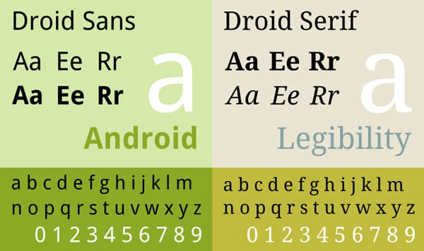
On web, maintaining readability is a little difficult compared to print media. Screen reading is not as easy as reading on paper.
Probably that’s the reason UK government set the following guidelines in Illustrated Handbook for Web Management Teams: “Use only clear, commonly used fonts. Avoid the use of small text. Users should have the ability to scale fonts.”
UK government does not use serif fonts on its websites. And nor does many news websites. This is done for enhancing readability and page load time.
Another thing designers always keep in mind is that body text must always be on flat background; preferably, black text on white background (as you are seeing here on DesignWebKit).
Using only one font, on flat background… sounds like a very restrictive way of designing, doesn’t it? Actually it is not! 90% of the times you can create wonders just by varying weights and sizes. Here’s an example:
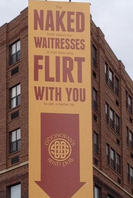
In this advertisement, the (nearly) invisible text is written in 300 weight value, and rest of everything is in weight value of 700. (you know CSS, right?)
Make sure that your body font has good kerning because kern.js and such jQuery plugins don’t really help on body text. So when you choose a font, make sure to check out kerning.
Conclusion
Today we only talked about using fonts. If you feel you have a thing for letters, words, fonts and typography, you should think about making typography your specialty. A good typographer is always in demand.
We have talked about many principles and rules of using fonts. They all work but to tell you the truth, you are allowed to break the rules. In fact, you are encouraged to break the rules.
Designing is like playing the piano. First you learn the rules, but once you get a grasp over the instrument, you should forget the rules and play straight from your heart. You should treat typography in the say way.
What would happen if you break these typography rules… well, there’s only one way to find out!
All the best!

