Emotional Design: How to Make Things Work Better
Have you ever thought why people like a particular thing, but not another one? The philosophy of emotional design was created in order to understand the human vision of the world of things and its reflection in design.
Donald Norman, the author of the book “Emotional Design: Why we love (or Hate) Everyday Things” presents his work in the sphere of emotions. In order to understand the issue better take a look at this video “The three ways that good design makes you happy”.
In the early 1990s two Japanese researchers conducted a range of tests with interfaces for ATM. All the ATMs were absolutely identical in the number of buttons, operations and functionality. Some of the buttons were arranged attractively, but the other ones were unattractive. It was a surprise for the researchers when they figured out that Japanese users liked ATMs with nice buttons more than the others.
Emotional design philosophy emerged in the early 1960s. This idea was defined by Japanese Professor Mitsuo Nagamachi, who proposed to transform emotional feelings into the specific properties of the product. In the early 90’s, this approach was applied to the Japanese car Mazda MX-5 Miata.

Source flickr.com.
For the first time developers focused on the feelings that appeared when a man is sitting in a car: does he like how the motor sounds? does he like driving? is he satisfied with a car? They focused on feelings, but not technical features. The success was overwhelming. This model of a car has even entered the Guinness Book of Records as the best selling car in this class. This approach was called Kansei Engineering and it was used successfully by many companies around the world.
In the modern world of high technologies and Internet it’s difficult to impress users. When they have an options to choose, they will choose the most attractive product. So, you should think what emotions your product causes. Donald Norman, a cognitive psychologist I’ve mentioned above, said that there are three main levels of perception of the emotional design: visceral, behavioral and reflective levels.
Visceral Level
On the visceral level we make all the decisions in the subconscious. It means that you know at once whether you like a product or not, it’s your first impression. Of course, you can be pleased by good sounds, colors, smells, and all the things that arouse positive feelings. At the same time nobody likes sudden loud sounds, flashy colors and skipping letters in the text. You’ll immediately close a page with such a kind of unattractive elements.
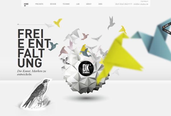
This amazing single page website with clean design and parallax effect causes just good emotions.
Behavioral Level
There are many actions that you have learned once and then do them unconsciously within the life time. Such kind of actions as walking, driving, playing the guitar can be included to the category of unconscious things. You can use this level as your benefit. For example, some companies designed a product in such a way. Each time people use a product they do it automatically. Then the company can say something like, “We understand you like no other”.
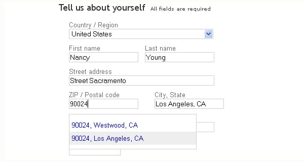
When you sign in on ebay.com after filling in a zip code your city and state fills in automatically. You do a usual action, but save time and enjoy the efficiency of the process.
Reflective Level
In the third level you realize what you do, see and feel. To my mind, this is the most interesting level that gives great opportunities for both a designer and a user. On this level knowledge about perception is already being used by marketers and advertisers. Many leading companies have been selling not the products, but the emotions for a long time, for example “Apple sells self confidence”.
Understanding of human desires can help to create a product that would be best of the best. For example, give your site a face. We all remember a Clip from Microsoft Word that used to help us to correct mistakes. So, it’s more pleasant to communicate with a person, not the electronic devise. Even if you understand that it’s not real. There is a Twitter iPhone application called Feathers that gives a chance to create a good user experience. While you type a tweet, a cute bird starts to fill with the blue color in accidence with the number of characters. The bird turns red if you exceed 140 characters to indicate the error.

Let’s stop on the details that are not obvious like mimics or humor.
Mimics
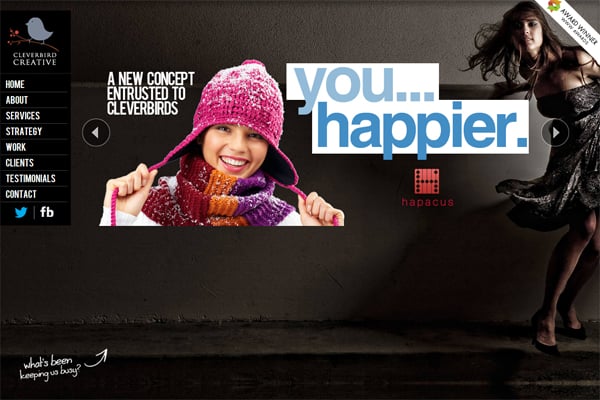
People who enjoy the company repeate mimics of each other. When the person that you like smiles, of course, you will smile back. It may work on websites as well. Take a look at the home page of this site:
One more good example.

Attention to Details
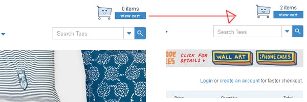
Small things that are not noticed at first can impress the user even more than obvious ones. For example, take a look at the cart on the online store Threadless. It’s sad when it’s empty, but a cart smiles once you add a few goods there.
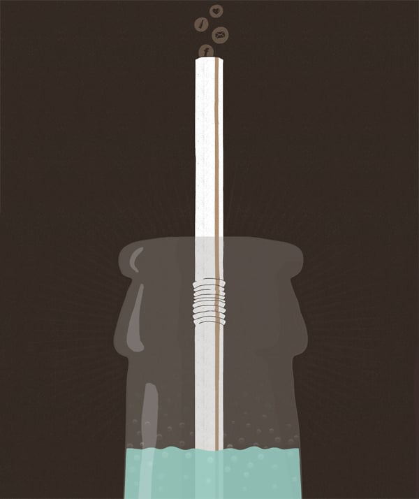
There is also a simple, but memorable design of the website of Jan Ploch with a bottle that turns empty when you scroll down.
Humor
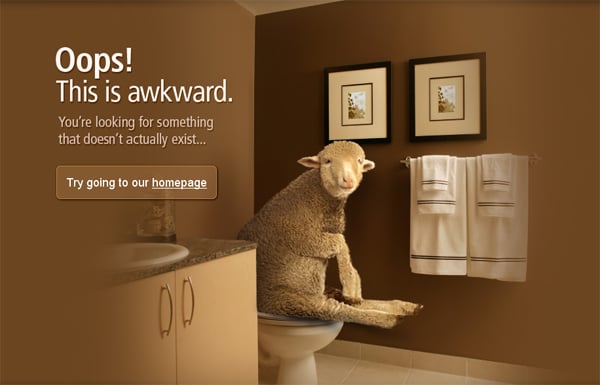
Also favourite services can make you smile. Things that make you smile are unforgettable. A perfect example is 404 page of the Apartmenthomeliving website. It says, “Oops. This is awkward! You are looking for something that doesn’t actually exist”. As you roll over the mouse on the toilet a sheep appears there.
Conclusion
Studying the psychology of your target audience, deep understanding of their actions, motivations and emotions, will allow you to design a good interface. The website or app that will bring you more conversions and sales rather than the usual template “for one and all”. Try to stay unique and unusual. Remember that you create a product for people, so do your job with great love. It’s the main secret of truly great design.
Don’t hesitate to share your thoughts or just say, “hello” in the comment section below.

