Color Combinations from Hell – Death Sentence for Your Designs
To design effective websites, you need to know basic color theory rules. These rules can save you from crucial mistakes, but today we’d like to draw your attention to those errors made by someone else.

People are visual, so when they see a poorly designed website, they just run away. They won’t look for your Buy Now or Sign Up buttons because somebody with a more user-friendly website is waiting for them somewhere on the web. You have a lot of competitors, so don’t reduce your chances of generating conversions. For instance, when you create an online class or a webinar, think well of the structure and design or address professionals in the sphere who will make it visually correct and attractive, like Webinar Care.
Most of the bad web design examples from this post were created long ago. Nobody cares about their redesign, and they just exist. Meanwhile, there are relatively new websites designed by some “professionals” who appear to have eyes at the back of their heads. Of course, some designs below are hands-down ugly, some are better – still, they could have been made with a more insightful colors approach. It’s very strange to see these sites because nowadays, most people have unlimited access to the web to learn everything (and the color theory too).
So after analyzing some fatal color combinations of the worst web designs, we concluded that we have to warn you against using these combinations, especially if you are involved in the web design industry as eCommerce web designer.
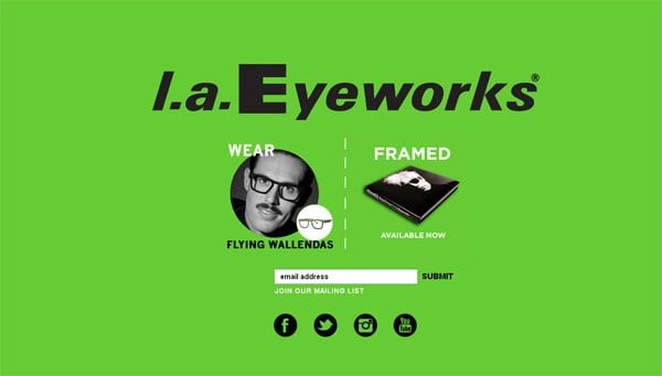
Shades of Green, White, and Yellow on a Green Background
Green is a fantastic color that indicates balance and harmony. But when you place it as a page background, you risk creating a creepy design. That might sound harsh, but a few people can create a nice-looking website with green as a background, and nobody can do it well if this background is supplemented with green, yellow, or white text without padding.
Green and yellow are placed too close to each other on the color spectrum, which causes yellow to melt into the background. It makes the entire design look inaccurate. Moreover, yellow and white texts are almost unreadable when they are placed on a green background.
l.a. Eyeworks
Light Objects on a Light Background
To get more site visitors involved, you need to make buttons and calls to action more visible and texts more readable. People shouldn’t think about what’s been written there on your pages – they expect clarity. That’s where contrast is needed. According to experts from Thesishelpers.com, the most important elements should stand out so that people understand what you want from them and what they can get from you in return. If your website suffers from this issue, considering a website rebranding that focuses on improving contrast and text readability could be a beneficial approach.
Look at the screenshots of websites that combine colors that are too light. The overall look of these pages is dull: all elements blend, and texts are almost impossible to read.
Bierzto.pl
We understand that it can be hard to find true colors combination, especially when you are a beginner. So if there is a need, you can find a suitable palette using one of the following color checking tools. All of them are free.
- Color Contrast Checker
- Color Contrast Check
- Luminosity Contrast Ratio
- Vischeck
- Check My Colours
- Accessibility Color Wheel
Too Bright Color Combinations
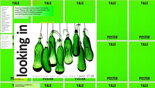
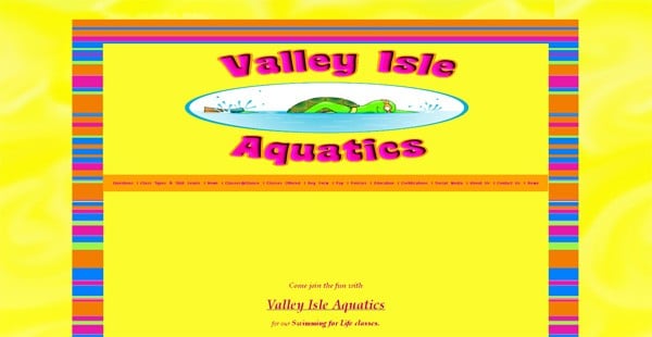
When choosing colors that are too bright, your website will suck! It can still look bad whether you use 2, 3, or 10 colors. For sure vivid tones grab people’s attention. They work well when creating buttons, menus, or other essential layout elements, but when the entire website is designed with one or several neon tones – that’s just a regular tastelessness. Moreover, when people see a lot of colorful boxes and texts, they don’t know which one to click, so all your calls to action are useless.
Yale
Valley Isle Aquatics
Accept Jesus
Bright Textured Website Backgrounds with Colored Texts
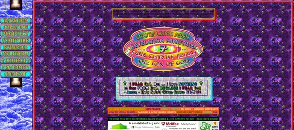
The background is something that makes your web pages more attractive and design elements more noticeable. It shouldn’t distract visitors’ attention from the on-page information. However, some designers do everything the wrong way. They choose the most vivid and neon color mixes and supplement them with colored texts. Ultimately, the website looks like an absolute nightmare, with unreadable texts and spooky images that irritate people.
If you want a textured background, try not placing text and images directly on it. Use some shapes with high opacity to block everything underneath. However, avoiding such extremes as highly textured backgrounds would be better.
Constellation Seven
Cloud 9 Walker
Colorado Ranger
Water Equipment Technology
Vibrant Tones on a Black Background
Black is an intense color that inverts other tones and makes them look too bright, even if they are not so vivid. People are used to mixing black with any color without a doubt because it always goes well. However, computer screens and mobile phone displays have different color rendering, and it can happen that your design will look unexpectedly bad.
You should be careful using bright tones (red, blue, green, purple, pink) on a pitch-black background. It creates an aggressive look whether you add text or images. Neon colors shine too strongly and complicate texts’ readability.
Pengun
Graham Masterton
The Rent Is Too Damn High
Stereo and Alarm
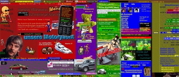
Too Many Colors in One Design
You probably know that too much of anything is wrong. It’s especially important in color theory. Too many colors are not just bad looking – they annoy and irritate potential customers. It even happens that rainbow-colored web pages are decorated with blinking and sparkling elements. Some designers think it might be impressive, and it is so! However, people are too impressed and want to close the weird window/tab right after they enter it.
Web designers from all over the world conclude that it’s better to make designs with only 3 colors. For any kind of business-related design, such as customized checks, a decent color combination is an absolute necessity these days. Especially in the case of checks, it’s mandatory to use the best printer for checks so that the color combination turns out to be pleasant when printed. It’s hard to argue with this statement after viewing the bad web design examples below.
Ingenfeld
Bavarian Brathaus
Blue Background with Any Colors
Bright blue is the wrong background color. It doesn’t matter which colors you choose for texts and other page elements – blue will still be too strong for them. It makes all texts look badly readable, and eyes quickly get tired of it.
There is also a psychological reason not to use too much bright blue: BSOD screens have blue backgrounds. Nobody likes viewing them unexpectedly because it usually means that your computer has crashed and needs your help. Blue websites can be associated with Operation System crashes, so people will try to avoid them.














Wonderful story, reckoned we could combine some unrelated data, nonetheless definitely worth taking a appear, whoa did one particular understand about Mid East has got a lot more problems also.