7 Golden Tips To Enhance The Look And Feel Of User Interface Designs
Being a designer, your first wish might be to make any website appealing for the end-users and the next to make that full functional. However, it usually happens that focusing too much on functionality lets you lose the basic interface design. Interface is of prime importance for the end users, so it should be attention grabbing and interesting. The interface not made that way will repel the new readership and the old audience.
In the lines below, you will come to know the useful tips to create successful user interface.
1. Make The Design Personalized
Do consider the likes and preferences of the users while creating an interface. Know what your audience want. You can get help from the sites that hold polls for such purpose. If users want organic and lively interface, you will have to design accordingly.
2. Make The Design Systemized
After deciding about the website elements to make your website standing apart from the crowd, it’s time to unify them to create a consistent website with different applications. The information presented at the website should be in a consistent manner to appeal to the targeted audiences. The main objective is to provide the end users with great ease so that they could make a favourable deal over there.
3. Consider the typography
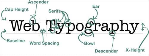
Typography is usually overlooked when a designer thinks about the user experience, that shouldn’t happen in actual. Work over establishing the system of typefaces, weights, as well as styles in which you want to use them. Proper and prior planning will help you to go smoothly with the typography of your website.
4. Navigational And Content Icons
For any kind of website, icons are a must, as they arouse the interest of the users and give the website a brand image along with making any web page live. Whether it’s body copy or the navigation, icons work well. Better to interrelate the similar icons to create sets because it will add more interest to the page. Even small icons add value to a web page by breaking up the text blocks and alluring the site visitors.
5. Content And Images Should Have Good Balance
Many web designers use more text and fewer images to keep the web page engaging for the end users. It’s not easy to create top quality illustration, but there are many resources to get help.
Other than just the content being displayed, there should be come space for the users to breathe.
6. Navigation Should Be Consistent
The most important thing is to keep the users engaged at a website and web designer should consider this factor throughout the designing process. If the site visitors are made annoyed with the navigation of the site, the site will lose the prospects. The clickable areas should be made easy to identify and social media icons should be placed prominently.
7. Keep The Designing Elements Simple
Even for a complicated website, there should be enough white space for the site visitors to breathe. There should be less confusion and careful organization of the design elements to leave a lasting impression over the site users. For an ecommerce website, you can make the product detail page simpler. Make use of different background colours to keep the sections clear.
Simplicity is the way to keep the user interface appealing for the site visitors and to win over more conversions.
Regardless of the website style, the most significant thing is to focus the user-centred look and feel and enhanced user experience of the site. A website where users are considered even during the designing phase, receives good response in terms of traffic and the conversions.


