10 Web Design Trends 2018 with Inspiring Examples
The trends in design touched the mobile gadgets. Only in the past year, the frequency of viewing sites using mobile devices has surpassed the use of laptops and computers. Recently, the appearance of the adaptive version of the resource was limited – there were no vivid elements that added weight to the pages, various full-format banners, and triggers due to the limited size of the displays. Today, smartphones and tablets have become highly intelligent. The performance of the gadget and the size of the diagonal of its screen allow you to include in the design of the site absolutely any tools. So, for developers, there are more opportunities. This influenced the web design trends 2018.
Web Design Trends 2018: Let’s Go!
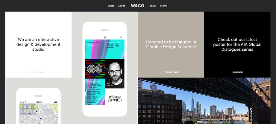
Non-standard Arrangement of Blocks
Start to structure the information using the polygonal mesh method, chaotically placing blocks throughout the page. This solution creates a new turn in terms of aesthetics – it warms the user’s interest and allows you not to go beyond the corporate style of the company.
However, in order to use this method of block placement, it is necessary to consider the structure of the site carefully. Do not forget that we read from left to right, therefore, all the most important information should be on the left side.
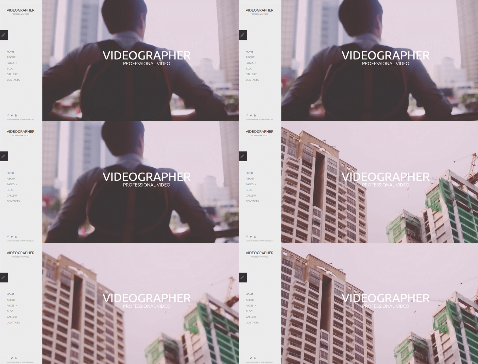
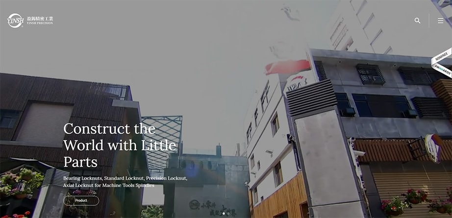
Full-screen Video
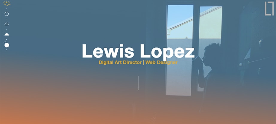
First, background videos make the site design unusual, modern, which increases the visitor’s involvement and leads the project to greater efficiency. Secondly, videos can become not the worst story about the company. In this case, the user does not need to scroll the page down to find the information that interests him. By the way, the video can be an excellent addition to the flat design. Use it as a screensaver, and it will complement the design with a cool image chip. Gadget performance and technical optimization capabilities once again returned the video as the main background in the system. And this means that they can again take the leading position in the design development in 2018.
Geometric Shapes and Patterns
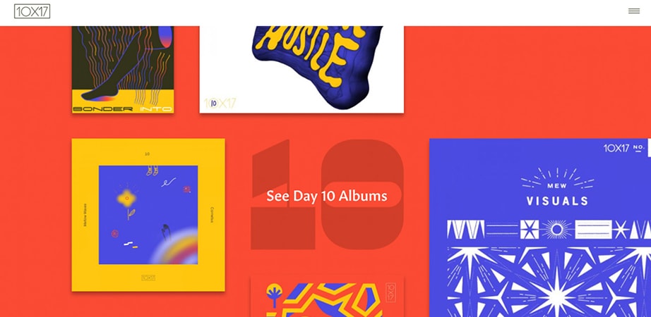
This trend is relatively fresh. Mixing different geometric shapes can give excellent results. The correct selection of patterns and shapes will help to create a complete and attractive composition, which is very much appreciated by the web user. Despite the fact that 2D technology is gradually losing ground, yielding to 3D, such techniques can significantly refresh the concept of design, making it modern and very interesting.
Cinemagraphs: Fresh Trends in Web Design 2018
Cinemagraphs are the modern static illustrations with partial animations. It is quite a new and fresh solution, which must be used to develop a trendy website design. Judge for yourself how much they add spiciness to the appearance of the web page, revealing the purpose of the site and the essence of the proposal itself, which carries the project.
Gif Images (animation)
If cinematography is something new in the field of design, then the animation is a classic. A classic, as you know, never goes out of fashion. Gif maximally grabs attention and allows without long eloquent descriptions to let the user understand what the company offers.
Translucent Buttons
Web design in 2018 goes into minimalism. You can see a large amount of white background, and the use of fairly common color combinations: black and white, white and gray. Therefore, a fresh solution next year will be the use of translucent buttons. Such buttons perfectly perform their function of lidogeneration, but at the same time they look very original and do not overload the site.
3D Images
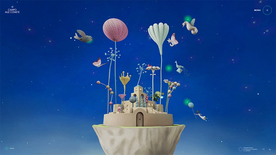
Design with 3D images a priori is considered fashionable. Three-dimensional technologies are used everywhere and actively influence the styles of web design trends 2018. Considering the trends of augmented and virtual reality, 3D graphics will surely get even more jolt next year.
Colors in Web Design 2018
Do you want to stand out among your competitors? Bright colors of the web design templates will help you! They significantly “increase” the attendance of the site when using flat design. For the convenience of choosing trendy colors, you can use the Google palette.
Gradient
So far, it is an actual solution in terms of color for website design – the use of a gradient color transition. It is a simple tool which gives an excellent result. The background of the page, executed in a gradient, creates an impression of freshness and uniqueness.
Unique Fonts
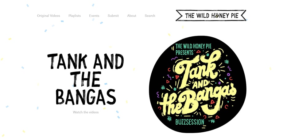
Agree, it would not be entirely appropriate to develop a unique, interesting, selling and bright design. The use of the common fonts significantly worsens the appearance of the site. Fonts greatly affect the perception of information and draw the attention of the reader to the site. By the way, the use of unique fonts will “pull out” the overall appearance of the page, if its design is rather modest.
Have anything to add to our list of web design trends 2018? You’re welcome to suggest your predictions in the comments section!


