The Inner Structure of Infographics: How to Create, Important Tips and Free Tools
Every day Internet users read a lot of data, look through news-websites and blogs, which are really overwhelmed with up to date information. It’s hard to remember everything important and keep in mind all facts we’ve learned during a day, sometimes some really valuable content is missed. So, how to convey effectively the main message to the readers and how to make them draw attention to your post? As human beings remember better the visual representation of information, than the whole sheet of complete text, the answer is much simpler you might think. Infographic is the best method to present a rich amount of data, explain quickly your main thoughts and show clearly a research. Any word won’t slip from the audience, all significant data will be showcased on the eye-catching graphics.
As a visual content helps to demonstrate efficiently engaging graphic data and helps to motivate readers to plunge into the text to find out more, infographics have to be the major part of your content business.
Do you want to have more visits, backlinks and more views of your website? Let’s start 🙂
The First Step: make your graphic representation captivating and easily understandable
To achieve that just follow these influential tips:
The Second Step: choose the appearance of an infographic
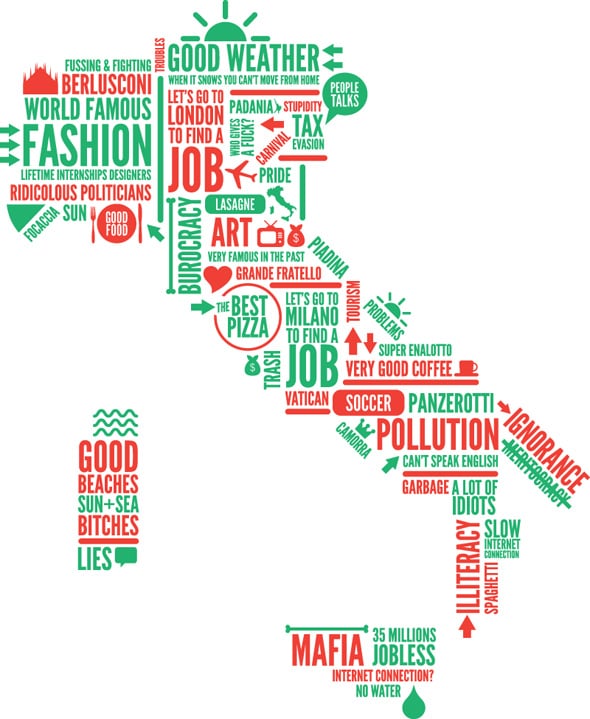
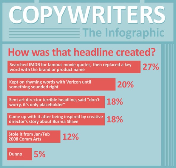
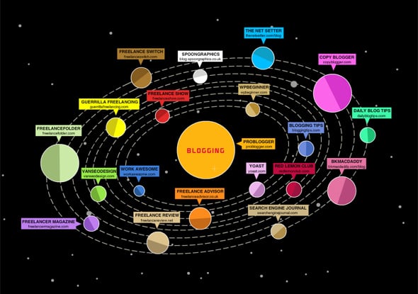
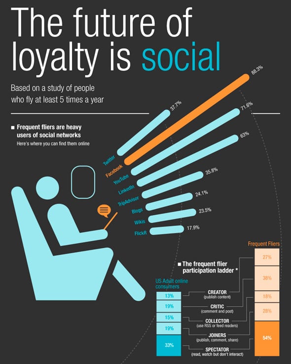
It can be in different style formats, such as:
Source: Thegeorgereport.com
Source: Sugarrae.com/
Source: Simpliflying.com
You can create an infographic in one style or combine several designs, but remember that it’s better to keep the image simple and not to put much in one graphic. Keep the harmony between the text and figures, choose colorful, large and so called “talking” pictures, so viewers will be able to focus on the essential stuff.
The Third step: pick the right software to create an Infographic
If you have design skill you can draw infpgraphics yourselves, but if you need some assistance you can utilize various helpful resources and tools:
Visual.ly enables to create and share infographics using all kinds of data and doesn’t require any design knowledge and experience. This cool tool features thousands of beautiful options, so you’ll by far find what you need and create robust and user-friendly informational graphic. Just visit Visual.ly Labs and build stunning data visualization in minutes.
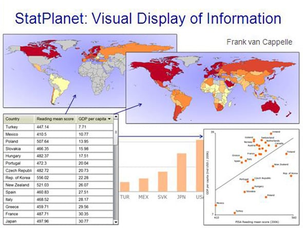
Stat Planet allows infigraphics addict to create interactive maps established on different facts, such as: Facebook, education, commerce, health care and much more. It can be utilized within you browser or freely downloaded. Do you want to make striking visualizations from simple Flash maps to advanced informational graphics? Just try Stat Planet.
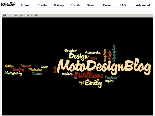
If playing with words and letters is your passion Wordle is a great tool for generating “word clouds” from the text. Paste any paragraph you want and create your own content cloud. But keep an eye on the time, the process of formation is so engaging and fascinating that will fully absorb you 🙂 As you see, we have also experimented a little 🙂
Many Eyes IBM Research tool allows users to create a visualization in easy three steps. Choose the data that you would like to present, then select the visualization method and after that customize and publish an outcome. You can use the existing data sets or upload your own information. The gold of this tool is that you are able to create everything you want, from a World map to a diagram of selling ice-cream.
Tableau Public tool has an intuitive drag and drop interface and doesn’t require any programming experience, it’s skillful and really easy to use. In order to get your statistics you just need to import your data into the desktop Windows applications and handle various charts, graphs, diagrams until you find the visualization that fits you perfectly. When you’ll be satisfied with the result just save your viz to the Web. Now you can embed your graphic picture in your website or blog.
We are sure that these helpful tools will surely come in handy if you are a fan of infographics or they are the part of your life!
The Last Click
For those who prefer tutorials, we’ve collected some cool educational stuff. Enjoy:


