Graphic Design Trends [2023] – How to Incorporate Them Into Your Branding
There are so many ways to keep up with graphic design trends, such as bold typography, 3D and immersive design, sustainability-focused design, and minimalism, which are expected to gain traction by 2023. Consider incorporating the following trends into your branding:
- Color Palettes, choose trendy colors for a modern look or make a statement with bold, contrasting hues.
- Typography, use eye-catching fonts that reflect your company’s message and personality.
- Illustrations should include one-of-a-kind and creative representations relevant to your company’s values and effectively communicate your message.
Use high-quality images that correspond with your brand’s visual identity and messaging, whether by chance, lifestyle photography, or more ornamented, editorial images.
Working with a skilled graphic designer can help you develop a consistent visual identity that is your brand’s values and appeals to your target market. To get the most out of your branding materials, make sure they all have a similar look and feel.
Introduction
In the fast-paced world of graphic design, staying on top of the latest trends is essential for creating a compelling visual identity that resonates with your target audience. There are so many ways to keep up with graphic design trends. As we move into 2023, several new graphic design trends are emerging, including innovative uses of color palettes, typography, illustrations, and photography.
One of the most significant trends in color palettes for 2023 is the use of bold and striking color combinations. Brands are starting to play around with unconventional color schemes, like monochromatic palettes that contain many variations of the same color and striking color contrasts. This trend reflects a desire among consumers for visual excitement and experimentation and can help brands stand out in a crowded marketplace.
Another significant trend in graphic design for 2023 is the use of typography to create bold and attention-grabbing designs. Brands are increasingly using oversized, expressive typography to communicate their message in a more impactful way. This trend is a departure from the traditional use of typography as a supporting element and highlights the power of typography as a standalone design element.
In the realm of illustration, the trend for 2023 is toward a more personal and individualized approach. Brands are incorporating more hand-drawn and organic illustrations into their branding, emphasizing the uniqueness and authenticity of their message. This trend reflects growing consumer demand for brands that prioritize authenticity and transparency and can help foster a stronger emotional connection with consumers.
Finally, in photography, the trend for 2023 is toward a more immersive and interactive approach. Brands use 360-degree photography and augmented reality to create more immersive and engaging experiences for their audiences. This trend reflects a desire among consumers for more interactive and participatory experiences and can help brands build stronger relationships with their target audience.
Overall, the graphic design trends as followed by the best graphic design services for 2023 are focusing on creating more engaging, impactful, and personalized branding experiences. Incorporating these trends into your branding strategy can help your brand stay relevant and resonate with your audience, helping you achieve your business objectives and stand out in a crowded marketplace.
2023 Graphic Design Trends
The following are the graphic design trends to look out for in 2023:
Image Source: Egor Kosmachev
1. Color Palettes
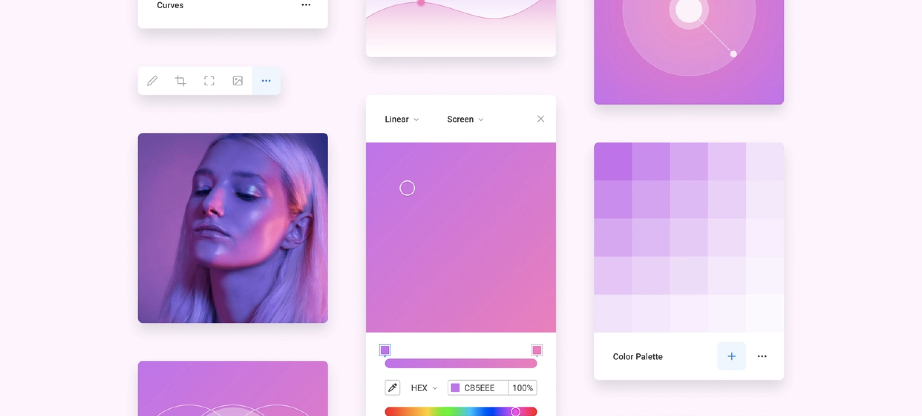
Color palettes are part of graphic design and can be used to create a brand’s visual identity. Trends like gradients, monochromatic designs, and bold color combinations should still support the brand’s mission and core values. Logo makers and design templates can save time and money, but collaborating with a graphic designer can provide a more tailored and creative approach. A graphic designer can help select colors that best align with the brand values, create custom color gradients, and provide guidance on the psychology of color.
Bold and Bright Colors
Color palettes that are strong and brilliant are an excellent method to build a visually distinctive and memorable brand identity. Bold and bright colors are attention-grabbing and can convey a sense of excitement, energy, and playfulness. These vibrant colors are perfect for brands that attract younger clients or those looking to stand out in a crowded market.
When using a solid color scheme, it’s crucial to pick hues that work well together and establish a unified visual identity. For example, pairing a bright orange with a deep navy blue can create a sense of vibrancy and balance. Similarly, combining a bold red with a muted gray can create a striking contrast that draws the eye.
Bright and bold colors can be overwhelming in contexts, such as on a website with text. In these cases, it may be best to use bold colors sparingly or to combine them with more muted tones. Some bright colors may be difficult for those with color vision deficiencies to distinguish. Ensure that your color palette is accessible to all users by using color contrast tools to test the readability of text and graphics.
Using bold and bright colors in your palette can help your brand stand out and make a strong visual impact. By choosing complementary colors, considering context, and ensuring accessibility, you can create a cohesive visual identity that resonates with your target audience.
Neon Colors
Neon colors are popular for color palettes in the 2023 graphic design trends. Neon colors are highly vibrant and can create a sense of energy, excitement, and playfulness. They are ideal for brands targeting younger audiences or those looking to make a bold statement in a crowded marketplace.
To ensure that your color scheme is usable by everyone, test the readability of text and graphics using color contrast tools. Pairing a bright neon pink with a deep navy blue, for example, can create a striking contrast while maintaining balance. Combining a bold neon green with a soft gray can make sense of vibrancy and balance.
Neon colors can be overwhelming in contexts, such as on a website with text. In these cases, it may be best to use neon colors sparingly or to combine them with more muted tones.
Another important consideration when using neon colors is their impact on accessibility. Bright colors can be difficult for some users, such as those with color vision deficiencies, to distinguish. Use tools to test the contrast between your neon colors and other elements in your design to ensure readability.
Finally, consider printing costs when using neon colors. Neon inks are typically more expensive than traditional inks, and not all printers can handle neon colors.
Monochromatic Colors
Monochromatic color schemes use different shades and tones of a single color, creating a sense of harmony and unity. These color schemes can be used successfully in design contexts and produce a sophisticated and elegant visual identity.
Select a base color for your monochromatic color scheme that accurately conveys your brand and message. Then, using this base color in various shades and tones, it is possible to create an appealing and well-rounded design. For example, using different shades of blue can create a calming and professional visual identity, while using different shades of green can create a natural and eco-friendly feel.
For visual interest to increase, it’s necessary to vary the saturation, brightness, and value of the base color. It can create a sense of depth and texture in the design, even with a limited color range. Additionally, incorporating texture, patterns, and gradients can add visual interest and help break up the monotony of a monochromatic color palette.
When designing with a monochromatic color palette, you have to consider accessibility. Limited color ranges can make it difficult for some users to distinguish between different elements in the design. Use tools to test the contrast between different shades and tones of the base color to ensure readability and accessibility.
Image Source: Andrew Colin Beck
2. Typography
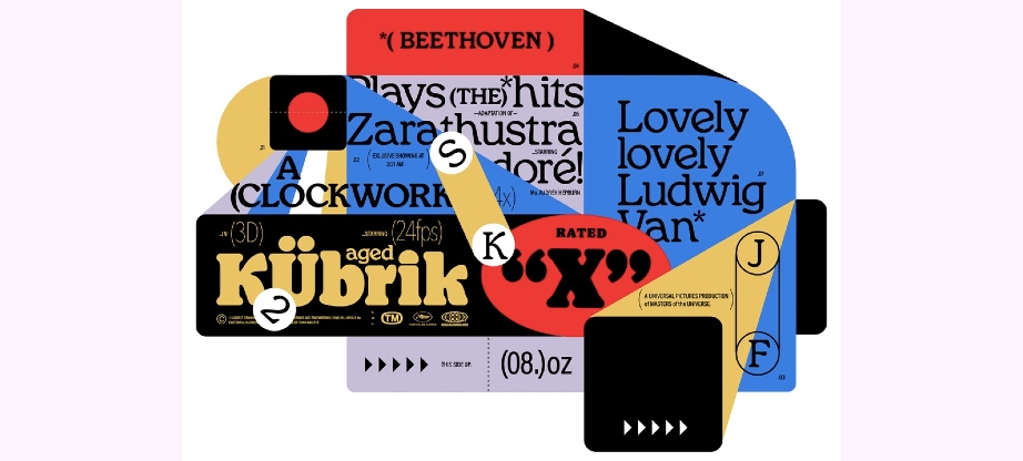
The graphic design trend for 2023 is to highlight typography. Custom typography and hand-drawn lettering are becoming increasingly popular as brands seek to create a unique and personalized visual identity. Additionally, minimalist and clean typography is still relevant and popular in modern design.
Bold and Distinctive Fonts
Bold and distinctive fonts are popular in the 2023 graphic design trends. Brands create a unique visual identity, and a bold font can help to achieve this. These fonts often have bold strokes, unique shapes, and eye-catching details.
In creative contexts, from logos and headlines to packaging and advertising, bold and unique fonts are usable. It’s crucial to make sure that a bold, recognizable font blends with the brand’s overall aesthetic and message before using it.
In addition to using pre-existing fonts, many brands are creating custom fonts or commissioning type designers to make unique fonts suited to their brands. It can help create a distinctive and recognizable visual identity and can help set the brand apart from competitors.
When using bold and distinctive fonts, consider readability and legibility. Some fonts may be visually hard to read, especially in smaller sizes or on backgrounds. It’s important to test the font in different sizes and contexts to ensure that it is easy to read and legible.
Hand-drawn Font Styles
Hand-drawn font styles are types of fonts that can help create a warm and inviting brand identity. Hand-drawn fonts can be used in a variety of contexts, from logos and headlines to packaging and advertising.
Different hand-drawn font designs exist, ranging from plain and straightforward to intricate and decorative. Some hand-drawn fonts may have a casual and playful feel, while others may be more elegant and refined. When using a hand-drawn font, ensure that it fits the overall brand message and design aesthetic.
One benefit of using a hand-drawn font is that it can create a sense of authenticity and craftsmanship. Hand-drawn fonts can help brands feel more approachable and personal that can make a connection with consumers. Hand-drawn fonts can also help brands stand out in a crowded market, as they are less used than pre-existing fonts.
It’s necessary to test the font in different sizes and contexts to ensure that it is easy to read and legible.
Minimalist Typography
This style focuses on using simple and clean typography to convey a message. Minimalist typography is characterized by a lack of embellishment or decorative elements and instead relies on the font itself to make an impact.
One benefit of using minimalist typography is that it can create a sense of sophistication and elegance. This style can help brands feel more modern and contemporary and can create a sense of simplicity and clarity. Minimalist typography can also be versatile, as it is used in contexts and easily combined with other design elements.
When using minimalist typography, choose a legible and easy-to-read, as the font itself is the main visual element. It’s also important to consider the overall design and message of the brand and ensure that the font complements these elements.
3. Illustrations
Illustrations are also an important trend in 2023 graphic design trends, as they can create a sense of personality and authenticity, help brands stand out in a crowded market, and be versatile. They should also be high quality and professional to create a sense of trust and credibility.
Vector Illustrations
Vector illustrations should be consistent with the brand message and design aesthetic, be high quality and professional, and be used to create a unique and effective visual identity. Designers can use design templates and logo maker tools to create impactful designs.
Photographic Collages
A photographic collage involves combining multiple images into a single visual composition. This technique is used in a variety of contexts, such as advertising, social media, and web design.
One benefit of using photographic collages is that they can create a sense of depth and visual interest. Collages are used to tell a story or creatively convey a brand message. This technique can be particularly effective when combined with bold and bright colors, as well as distinctive typography.
When creating photographic collages, ensure that the images are high-quality and professional. Use images that are consistent with the overall brand message and design aesthetic. Colleges should be visually balanced and easy to read, with a clear focal point.
3D Illustrations
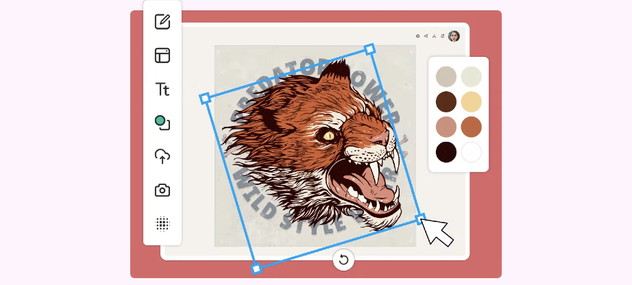
3D illustrations are expected to be a significant trend in the 2023 graphic design landscape. These illustrations can add depth and dimension to designs, making them more visually engaging and dynamic. This technique can be used in a variety of contexts, such as advertising, product design, t-shirt designs and web design. When using 3D illustrations, it’s important to ensure that they are consistent with the overall brand message and design aesthetic. These illustrations should be visually balanced, easy to read, and have a clear focal point. Designers can also experiment with lighting, textures, and color to enhance the overall impact of the illustration.
To keep up with graphic design trends, designers can stay up to date with industry news, participate in online communities, and continuously develop new skills and techniques using resources such as graphic design tutorials and online courses. Additionally, designers can incorporate 3D illustrations into their portfolios to showcase their skills and demonstrate their ability to stay ahead of the curve in design trends.
Image Source: Amelia Nurvita
4. Photography
Photography is a crucial element in graphic design and is expected to play an important role in the 2023 graphic design trends. High-quality and authentic photographs can help enhance the overall visual appeal of a design and make it more relatable to the audience. Additionally, custom photography can add a personal touch to a brand’s image, making it more memorable and recognizable.
Intermittent Photo Effects
In the 2023 graphic design trends, intermittent photo effects play a significant role, especially in digital marketing and social media campaigns. Using tools such as logo makers, design templates, and graphic creators, designers can easily incorporate intermittent photo effects into their designs to create a unique and attention-grabbing visual experience for their audience.
Designers can achieve intermittent photo effects by layering multiple images on top of one another, using different blending modes, and experimenting with opacity levels. Additionally, designers can add graphic elements, such as shapes and lines, to their photographs to create a rhythmic pattern within the image.
Stylized Photos
Stylized photos are another popular trend in photography for graphic design in 2023. Stylized photos are created by manipulating images to give them a distinct and unique look. Designers can use tools such as logo makers, design templates, and graphic creators to create stylized photos that fit their brand or message.
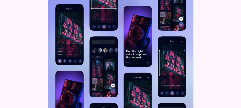
There are many ways to achieve a stylized photo effect, including adding filters, adjusting brightness and contrast, changing colors, and applying various effects such as blurs or textures. These techniques can be used to create a variety of styles, from vintage or retro looks to bold and vibrant color schemes.
To keep up with the 2023 graphic design trends in stylized photos, designers should experiment with different techniques and styles and consider the overall message and branding of their design when choosing their photo stylization approach. They can also look to industry leaders and social media influencers for inspiration and guidance and stay up-to-date with the latest photo editing software and tools.
By incorporating stylized photos into their designs, designers can create a unique and memorable visual experience for their audience and stand out in a crowded and competitive market.


