Five Common Photoshop Fails That Can Ruin Your Website Design
Photoshop is an incredible photo editing software, that had been incremental to designers and photographers over the past decade as we all come through knowing its importance. Photoshop is an innovation to the users which once in mind is thought can easily be expressed through a tool. If Photoshop fails can be avoided it’s truly a one-of-a-kind software.

The emphasis of Photoshop is that it allows users to work on their design, improve image quality, create eye-catching artwork and make more creative designs. The visual graphic world has never been the same in each step of its growth, with the tool uplifting its content by adding more features, more flexibility contributing designers to exploit their creative minds. The freedom of editing an image to bring to its perfection to the eyes could not be achieved without the help of this photo editing assistant.
In recent times, the popularity of this photo editing tool had been surprisingly incremental in all-around perspective as we speak of and alongside the bad Photoshop and epic Photoshop fails had increased too. It had created a skill set, that has given opportunities to many individuals, institutions, importantly adding a huge demand of photo editors or clipping path service providers in the market. The popularity of this tool is unprecedented, but are we really being able to put the best of it? Yes, we do encounter many bad Photoshop, funny pictures every now and then, but sometimes the picture could be a total distortion or a mishap of what we actually perceive – the ultimate Photoshop fails. The Photoshop experience is much as the old saying goes, ‘practice makes perfect but we do end up occurring some worst Photoshop. Well, no more to the epic Photoshop fails, no tantrums to bag if we are careful, we can avoid some of these common fails that many people do.
The following are the 5 common Photoshop fails you as a Photoshopper should always try to avoid
Photoshop Fails for Not Using Shortcuts
One can expect mistakes. Photoshop is a fully dedicated computer-based photo editing tool, with thousands of functions at its count, it becomes very important to designers to know some of its functionality by knowing the common shortcuts. Many fails are due to the lack of knowledge of those existing shortcuts.
Many designers are able to produce good work by spending a good amount of time on their job. A good designer is not only about how creative their gradients are or how well they have shaped the lines; it’s also about knowing how well they know the use of keyboard shortcuts.
It might be tedious work whilst using Photoshop for the first time but as you start fiddling with the keys, you will learn those key shortcuts that will start to grow in your muscle memory. In a long time, as you progress, you are more likely to secure these shortcuts resulting in a productive outcome. You will also notice that your work speed has gained more momentum than it was in the beginning. A great advantage of Photoshop is that you are entitled to create your own keyboard shortcuts according to your preference. Once you have mastered those shortcuts, you are less like to face those ‘Photoshop fails’ comments coming at you.
Common Shortcuts to Remember
- Ctrl + Shift + N: This allows you to create a new layer
- Ctrl + J: For creating a duplicate layer
- Alt+ Mouse Wheel: This lets you zoom in and out
- Ctrl + Alt + Z: This allows you to go one step back in history
- Combination “Ctrl + Shift + Z”: Lets you go one step forward
- Ctrl + O: For opening a new document
- B: “Brush Tool”
- Ctrl + Shift + E: This allows you to merge the selected layers
- Ctrl + Shift + I: Lets you invert selection
Photoshop Fails for Not Using Appropriate Layers or Folders
Photoshop fails with a very common mistake that is noticed among the new designers when they fail to create the desired number of layers in their work. For instance, creating a web is a tentative design job, in the beginning, the tool may save your time, but as the job progresses it becomes more complex, it then becomes very challenging to finish the job just for not having enough layers in the work.
Layers are very useful to photo editors. As a matter of fact, layers allow editing files with various modifications. We can also duplicate the image to extend part of the background or even remove certain parts of the image as needed. It saves heaps of time on editing projects without making any actual changes to the original document. The ‘multiply’ function on the other hand makes it easier to work several effects on the same layer and makes it possible to check how different colors affect the design.
Bad Photoshop for Not Using Grids/Guides

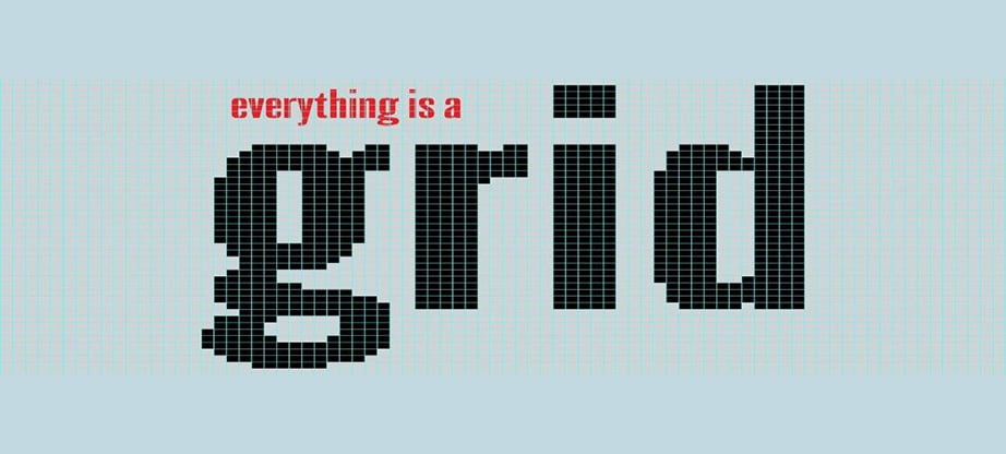
Another worth mentioning mistake is when users constantly align text to their respective images regularly. This ruins the image, as the final output results in a bad Photoshop remark about your webpage. The use of grids and guides makes a huge difference to the document space. It helps the designers in lining up their projects accordingly without making any mess. The advantage of the grids is that they can easily turn the file into a responsive website. An HTML developer can easily identify every part of the design inclusive of the body, headers size, footers of a good layout. Furthermore, grids and guides allow flexible image settings from pixels, inches, and centimeters as the design job suggests. That’s why it goes without saying Photoshop is a Web Designer’s Best Friend.
Fails in Mixing Multiple Fonts

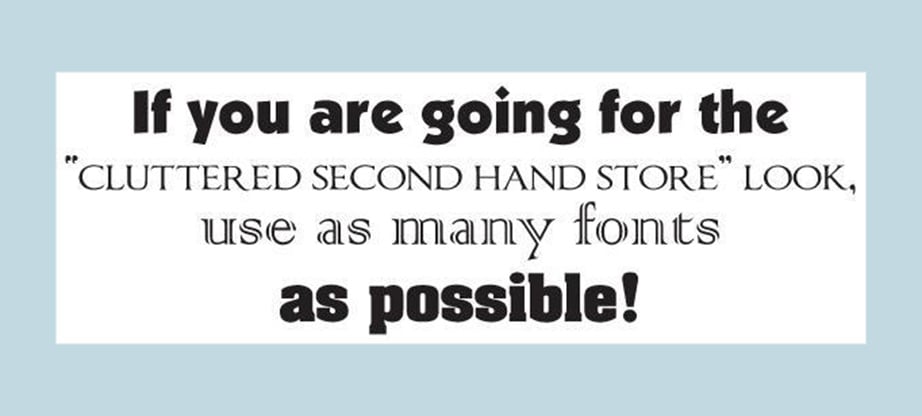
Another pitfall to add in is the usage of random and multiple fonts by Photoshop users. Every font has its own feature in relation to the work or job. This is very common when working on a flyer or on an ad or a banner. Usage of multiple typefaces can cause distractions that may deviate viewers against the product or a brand. However, it is better to use two typefaces separately one for the header and one for the body.
Filter Abuse
Photoshop users end up getting worse Photoshop reviews when they use the available coolest Photo filters haphazardly immediately after starting on. This is a grave mistake by many new Photoshop users. A great number of them often confuse their work to be more professional which not more than mere usage of multiple filters is. Ultimately it damages the image, and the final product looks ugly. It is true that sometimes the right image filtering may not exist but sometimes manually changing colors mark, saturation, the contrast could result in a better final product.
Summing up Photoshop Fails
Always remember to keep the design short, precise as the saying goes on “less is more”. If you happen to discover one of the mistakes mentioned above at your work, it’s time to change. Happy Photoshopping!

