Neuromarketing Web Design: 10 Ways to Connect With Visitors’ Brain
As the market is becoming more competitive with every passing day, marketers and advertisers are busy in finding what makes a consumer buy. This is where neuromarketing can help since it involves a formal study of the human brain’s responses to branding and advertising, and how messages can be tweaked based on the feedback bring forth even better responses. But neuromarketing can’t bring you miraculous results overnight. Rather, it involves a long-term process where you have to study how your consumers are responding to your messages and adjust your messages based on the feedback received.
When it comes to internet marketing – and more specifically, web design – you have to remember that everything you do can have a potential impact on your target consumers. From deciding on the placement of your logo or a design element to choosing specific colors or the web page layout, everything can influence how your visitors perceive your brand and take actions. By studying and understanding your target consumer’s sensory and cognitive responses, you can modify your web design to encourage visitors into taking the desired actions and boost conversion rates.
Reptilian Brain
According to the Triune Brain Theory of Dr. Paul D. McLean, there are three different layers that make up the human brain. The new brain is where the rational thinking emerges from; the middle-brain is at the core of all our emotion; while the reptilian brain is taken to be our decision maker and attention gatekeeper. From its inception, neuromarketing focuses on studying the brain to understand the behavior of consumers and their decision-making process.
McLean’s theory states that by focusing their efforts on the brain’s reptilian part, marketers can encourage consumers’ basic instincts and manipulate their decisions. In other words, if your landing page or web advertisement can attract the attention of your target consumer’s reptilian brain, you will have much better chances of guiding him/her to conversion.
There are four instinctual questions that every visitors coming to your website would ask. You should evaluate your web design based on how it answers these questions.
Is the environment familiar?
The primitive brain (also called the reptilian brain) is wired for efficiency, which makes it search for familiar patterns. So, when they encounter something that they can’t recognize easily, they will have an interrupted experience as their brain makes assessments for danger. So, rather than having web elements that trigger such interrupted experience, you have to focus on reassuring the customers by using videos or images of people similar to your target clientele or those with happy faces, use a language they speak, and have a consistent home page layout. All these will keep the primitive brain of your visitors at ease as they will feel browsing an environment they are familiar with.
Am I safe in this environment?
Facing some sudden or unexpected elements, or changes in the environment rattle the reptilian brain, which makes it forget everything else and focus solely on the element, which it perceives as a threat. This explains why having a neat, user-friendly navigation would contribute to as much as 60% of your online success.
When it comes to mobile sites, a clean and crisp navigation accounts for almost 80% of your success online. So, it’s wise to opt for a predictable layout and navigation that ensure the users won’t encounter any interrupted experience. Again, pop-ups are something that most users hate as they disrupt an expected experience. Yet, if you have to use them for compelling offers or to give the users an enriched experience, make sure they aren’t threatening to look at and the eyes are automatically attracted to them. By doing this, you will ensure the brain remembers them when it’s about to make a decision.
Can I see the danger? Is it close?
Since you use almost 50% of your brain to process visual stimuli, you can’t forget (or unsee) things once you have glanced at them. Since our inherent instinct to rely heavily on our visual sense to understand our world, it becomes important to have great visuals in your web design. Since the human brain perceives interrupted experience with danger, offering assurance via beautiful and positive visuals would help. Whether it’s the images of your products in use, your staff at work, or your office location – great visuals would instantaneously appeal to your consumers’ brain and make it easy to connect with them.
Should I act? Fight or flight?
To encourage a human brain to act, you need it to present some sense of urgency. Usually, we tend to act when we encounter a possibility of loss (a sale that’s going to end in an hour, a special offer that’s applicable just for the first 50 sign-ups etc) rather than when we are presented with a chance of gain. Also, we prefer the notion of something that we can get access to right now. So, every web page should ideally have a CTA (call-to-action) to encourage instantaneous action (which could be giving contact information, signing up for the newsletter etc). Since online visitors usually spend just a few seconds on a website before they lose interest and leave for another site, it’s important that your website showcases actionable elements often and early on to a visitor.
10 Ways to Connect With Visitors’ Brains
1. Use Elements Of Social Proof
As humans, our brains are wired to imitate others. It’s our natural inclination to act like others, which is what “conformity bias” is all about. To play on this bias, marketers use social proof by showing others have chosen the product or service that you are contemplating to buy. Social proof indicates legitimacy and makes any action except for buying from you an abnormal choice. Though the most effective social proof is customer testimonials, you may also use reviews and ratings, subscriber counts, media logos, badges etc to make your visitors feel reassured and comfortable. It’s no wonder why social proof makes not choosing your brand quite odd for visitors. Since using social proof is easy and effective, it’s the most commonly used neuromarketing aspect in web design.
2. Branding Using Logo
The Human brain processes advertising at a subconscious level. To play on this unconscious branding, you have to go on building awareness for your message once you have established brand momentum. According to the Baader-Meinhof Phenomenon, once people consciously recognize anything new (which could be an image, a word, or an idea), they start looking for it (subconsciously) in other things as well. This helps confirmation bias to set in, and people start finding that new thing more frequently. You can take advantage of it in your web design by ensuring your brand’s logo is seen more often – in email signatures, blog post images, social media posts and social media headers, landing pages etc. This will persuade customers to subconsciously see your logo in all other places where it’s present.
3. Choose Attractive Color Combinations
After their initial interaction with your offerings, most people just take about 90 seconds to make a decision. Almost 62% to 90% of such assessment is driven by colors. There are certain colors that evoke specific responses in most people. You will find many fast food restaurants (Wendy’s, McDonald’s etc) using yellow and red because the yellow evokes a sense of contentment and friendliness, while red makes people feel cozy and hungry. So, by using these two colors, the brand’s subconsciously persuade people to buy food. It’s important to note that the same color in different hues may bring out very different responses. So, you have to study color theory and choose the color theme of your web design based on what conversion goals your brand plans to achieve.
4. Gain Trust
Trust is the foundation on which you can build your business. From helping you get referrals to encouraging people to buy more and often, trust can be the key to strengthen and expand your business. But to gain the trust of your consumers, you have to first make them feel trusted. You can show your trust for them by including some simple yet effective techniques in your web design like offering a trial with minimal restriction, offering confidential information without making them sign an NDA, or establishing credit without an extensive screening procedure. Remember that by extending trust to your consumers, you will stand to benefit by gaining their trust in return.
5. Use Actionable Images
After a visitor comes to your site, you will just have 50 milliseconds to create an impression. Since the brain processes image almost 60,000 times quicker than text, using visual content in your web design can encourage positive engagement and faster action. For instance, since your visitors read your web content as they would with a book (top to bottom and from left to right), having images of people and using the direction of their gaze to bring your visitor’s’ attention to where you need them (say, a sign-up form or a newsletter subscription etc) can be an effective technique. Even when you use text to get your message across clearly, you should give equal emphasis to the colors, graphics, aesthetics, and organization of the visuals in the surroundings as they can elicit emotions in customers, which would make them act and thus help you create new leads.
6. Choose User-Friendly Website Layout
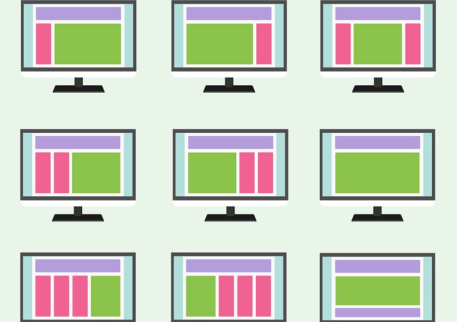
When choosing how you design your websites, using marketing psychology techniques for various aspects -from layouts and color schemes to font size and beyond can help. Neuromarketing studies have also found that websites that use testimonials, certifications and social widgets attract more customers than their counterparts that don’t. Another interesting fact is how traditionally vertical website layouts are more effective than the recent horizontal style ones because the former engages the brain (while reading from the top down) better, thus increasing the probability of viewers to continue scrolling. By designing your website based on these findings, you will stand a better chance of engaging your visitors.
7. Anchoring
The first piece of information your customer receives is highly important. It can be the foundation for any following decision making and set the mood for their purchasing behavior. According to neuroscientists, human brain works in peculiar ways when it makes a decision. Instead of assessing something by focusing on what its intrinsic worth is, we usually use its surrounding options to compare and arrive at what it’s worth. Neuromarketing suggests taking advantage of this “anchoring effect” as the brain gets “anchored” to the earliest piece of information and evaluates all subsequent information in the context of the first piece of information. Thus, when finalizing two identical priced hotel rooms, the human brain tends to favor the one which offers a free coffee rather than comparing the room qualities or any additional features. When offering deals or bundled packages on your website, you too can use this anchoring effect to make them work for you.
8. Use Scarcity
During the decision-making process, the human brain tends to underrate gains while assessing losses too highly. This is called the “loss aversion” bias where we become more anxious about losing something but don’t feel excited at the prospect of gaining something. Since the tendency to avert loss is very powerful, even usually courteous shoppers won’t mind trampling others to death during the holiday sales. Taking advantage of the scarcity effect is an easy neuromarketing technique to include in your web design. Your objective should be to indicate scarcity, create a sense of urgency and remind your visitors that they stand to lose by not becoming a lead or buying from you. Perhaps this explains why people tend to buy products or services with limited supply or one that’s flying off the shelves fast.
9. Give More, Ask Less
Though your business depends on a lot of getting people to visit your website and generate leads and conversions, you need to be as discreet as possible. Rather than spamming your visitors or irritating them with pop-ups, you should come across as someone who gives more and asks for less. Even if you have to use pop-ups, try to make them easy to close and as mobile-friendly as possible because your visitors are sure to appreciate this effort on your part. You should also try to find optimal ways to monetize your website rather than irritating your visitors and subscribers with a lot of promotional (and often, irrelevant) messages.
10. Reviews
Genuine, unedited customer reviews (both positive and negative) are usually more trusted by visitors than your own content. According to a study conducted by Moz, 67% of consumers arrive at a buying decision after reading online reviews. If your site doesn’t have reviews, almost 67% of your consumers will have lower trust in the performance and quality of your products, which is a substantial clientele to risk losing. If you thought showcasing only positive reviews or ones that have been screened and edited would help, beware as they may end up decreasing the trust of your visitors. Rather, have real rating and reviews from customers and even a few negative ones won’t hurt because even if they discourage some visitors from buying a particular product, they will have more trust in your website, knowing that you genuinely want to help them find the right product and aren’t afraid to share even the not-so-happy feedbacks and reviews of past customers.
Neuromarketing + Design: It Could Change the Way Your Users Think
Perhaps you already know that your choice of font weight, color and typeface can influence your readers’ comprehension and readability. But this isn’t just about color psychology. In fact, by blending neuromarketing techniques in your web design, you can actually change the way your visitors interact with your site. For instance, the research results of NYU’s Adam Alter and his team show how people prefer easy to understand things in comparison to the mind-boggling ones. This includes readability where basic serif fonts were found to make the participants fluent, versus the fancy ones that were taken to be disfluent. When it came to text color, black on white was found to make one feel fluent, while white on black was considered disfluent. So, by using the results of this study, you could examine if your fonts are making it difficult for your readers to understand your content or if changing the text fonts and background color of your forms could offer a better user experience and encourage better conversions. Rather than acting on guesswork, you can use marketing psychology to bring changes in your web design and then use A/B testing (split testing) to find which versions of your website perform better before taking a final call.
Conclusion
While some neuromarketing-driven web design techniques bring significant differences in consumer engagement and conversions, some may be subtle and bring only minute improvements which would be valuable only when your website attracts a considerable traffic. When creating web design, you should consider if the setting is brain-to-computer or brain-to-brain, and work accordingly to decide on your homepage layouts, copy and image placement as well as calls to action to entice customers and encourage them into taking action. After all, what we find pleasing and engaging in terms of user experience is all driven by neuromarketing. Since all your potential customers have brains, taking advantage of their own biases together with using insights into how human brain works would help your web design bring the desired results your way.


