Creative Design Thinking As A Cure to All Design Problems
We live in an era where design is just about as important as the functionality of a product. Let’s just take Apple as an example. Its products are great from a purely technical standpoint, but so are many others. What makes them stand out is their sleek and attractive design that further accentuates their technical abilities. To an outsider, being a designer might seem like an incredibly satisfying and stress-free job. Only the first part is true. Design is a field where there are plenty of stress and challenges to be found. Despite the fact that it largely revolves around one’s creative design thinking.
For instance, a lot of them have trouble with time management. When it comes to clients acknowledging how many hours of work it took to complete a single design. And when it comes to meeting deadlines. It is a problem because sometimes you just can’t force creativity. There is so much competition out there. So, designers are also struggling to find full-time employment, which is why 25% of them are self-employed.
Designer Pressure
As much as 60.8% of marketers will point out that design and visuals are integral to successful marketing. However, designers will often get frustrated with their clients. Especially if they are non-creatives since at times they feel like they have to defend their designs. Due to all of the issues above, designers are under a lot of pressure. It inevitably leads to creative burnout, especially if they have been in the business for a long time. All of a sudden, a blank canvas is no longer an opportunity, but an obstacle. Moreover, it is preventing them from doing something more interesting.
To avoid experiencing burnout, or rather to overcome it, designers have plenty of creative thinking tools at their disposal. They have been fuelling design and innovation since the beginning. Let’s take a look at some of them, along with some great examples.
How to Overcome Design Problems with Creative Design Thinking

Creative thinking is always confused with artistic professions, such as writing, painting, photography, music, and yes, even design. While all of those require a person to be creative, not all creative thinkers are artists.
According to Nathan Patterson, who works as a designer for Assignment Holic, being able to think creatively is simply being able to look at something in a new way. Some would also call this “thinking outside the box” or “lateral thinking”. In both design and innovation, creative thinking is sometimes the only way to come up with new ideas and concepts.
Creative Design Thinking Tools
With that in mind, here are some of the most common creative thinking tools and examples which demonstrate their effectiveness.
Brainstorming
Brainstorming is one of the most well-known methods for solving problems and coming up with fresh new ideas. Especially when it comes to creative design thinking. As you probably already know, it involves getting a group of people together in one room. Then they can make suggestions in a free-thinking environment which encourages everyone to draw associations and connections between different ideas.
Hopefully, the resulting brainstorming session will help them discover a new direction or a solution. Brainstorming can quickly turn into a mess if there aren’t any constraints. It is really so, according to Helen Stevens, one of the managers for Essaygeeks, whose company practices weekly brainstorming sessions.
Facilitating Creative Sessions
To facilitate the creative design thinking process and make your brainstorming sessions constructive, you need to do several things:
- Limit your sessions. Keep them under 60 minutes long. It should give you enough time to come up with something new, without it turning chaotic
- Present a target problem – begin by showing everyone involved the problem in question so that they stay on topic
- Allow just one person to speak at a time. While brainstorming is definitely a collaborative method, you don’t want people speaking over each other. Instead, you want to them have a dialogue and build on each other’s ideas
- Don’t be dismissive. Allow everyone to present their ideas, no matter how weird, crazy, or expensive they might seem. They may point you in the direction of something more feasible
- Quantity over quality. The goal is to get many creative design thinking ideas, and hope that that quantity will breed quality
Examples of Brainstorming
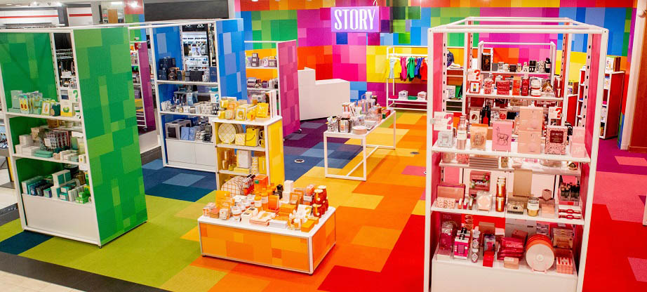
Let’s take a look at one the examples brainstorming was used as one of the creative design tools. Located in Manhattan, STORY is a 2,000-square feet store, and a brick-and-mortar one at that. It does things in real life most stores only do online. Their concept store incorporates all of the best elements of magazines, galleries, and online stores.
You may think that their store is just well-designed and nothing else. So, you would be surprised to find out that they get together to brainstorm ideas. Then they change the look and design of the store itself every four to eight weeks. They also change their merchandise, and all of the accompanying store elements to give it an entirely new look and feel.
It includes all of the best practices of creative design thinking. It also merges marketing, commerce, and customer experience, which can give large online stores a run for their money. All of that in a world where people are obsessed with online shopping. Ironically, their success has led to them being bought by Macy’s last year.
Surfing the Web
None of this brainstorming stuff will work much if you are working alone. Seeing as many designers work, they need to look into other ways for creative design thinking and ideas. Thanks to Google, designers have a vast ocean of resources, both in terms of tools and ideas.
However, discovering new tools and ideas online is easier said than done. As there are plenty of great resources which you may never reach. Whether it’s because they haven’t done their SEO or because their webpages aren’t responsive. As a result, Google buries them on the 50th page of search results, where nobody will ever find them.
Google provides you with the I’m Feeling Lucky button. You would be surprised at where it can take you. The downside is that it can take a long time for you to find something relevant to you as a designer.
What you need is something that is a bit more focused, but which is still random enough. Unfortunately, the best tool for that exact thing was StumbleUpon, which was shut down in 2018. Mostly because it failed to catch up with the responsive design trend.
Mix Vs. Google

Fortunately, there are still alternatives, such as Mix. If you are a StumbleUpon user, Mix will allow you to import all of your interests from the old platform. Mix also features a much better interface and has a user dashboard which is made up of your favorite links. However, unlike StumbleUpon, loading the entire page, Mix only shows the title of the page, a summary, and its featured image. In that aspect, it is somewhat similar to Pinterest, which is another great platform where designers can find inspiration.
Mind Mapping
Mind maps are hugely popular among designers, due to their visual nature. Presenting your ideas in a visual manner is certainly convenient, that is not the only advantage of using mind maps. They also allow you to develop one central idea. From it, other, more specific ideas will branch out in a nonlinear manner. That makes everything more easily digestible for our brains.
Now, mind maps can be used to break down complex concepts. They can explain a hierarchy inside a company as well. For the purpose of this article, we will focus on their use for creative design thinking.
Making the Most of Mind Maps
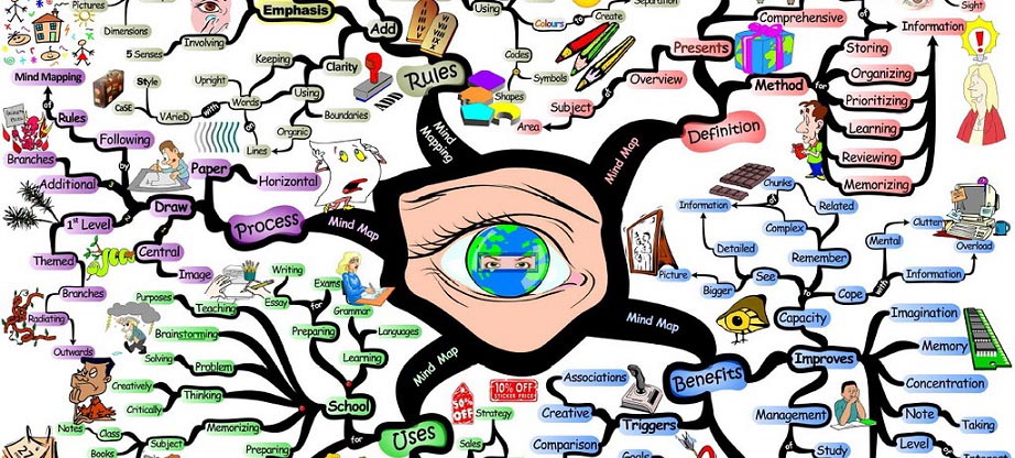
In order to make the most out your mind maps, you should do the following:
- Use words, short phrases, and images only. Putting down simple words instead of sentences will make things simpler. It will also enable you to write down your ideas faster and come up with more of them
- There are no bad ideas – as in the case of brainstorming, all ideas should be considered. Regardless of how strange or unoriginal your initial ideas may be, the goal is to flush them out. And to allow your brain to produce more, which may end up being more useful and relevant.
- Aim for multiple idea levels – you should have at least five different ideas stemming for your main topic. Also, when you have completed each of those, you want to have at least 4 levels of ideas. It will provide a tour with more breadth and diversity of ideas. If you stick just to your main topic, you will never past the stuff you already know
- Use a large surface. Whether you are using an actual physical board or a digital one inside an application, make sure that the space for your ideas is sufficient so that you don’t end up being restricted.
- There are plenty of mind map examples out there. They demonstrate how mapping should for creative design thinking be done. We will focus on the one below, which as a mind map on how mind maps are made. Although this particular mind map uses the same color for all of the branches. Preferably, the color should be different for each one. The author has used a different background color for each of the word groups, which helps with orientation.
Storytelling
Storytelling is usually something we associate with books, short stories, or movies, not design. However, there is a visual element to storytelling, regardless of the medium. When you are reading a thriller novel, your brain is creating a series of images which are helping those words written on the page come to life. In other words, you are imagining the stuff you are reading, which means that this type of storytelling is not without visuals.
And when it comes to movies, the cinematography is one of the most important elements of storytelling, especially when it comes to genres where visuals play a huge role, such as historic epics, horror movies, or sci-fi extravaganzas.
As far as the online world is concerned, infographics are probably the best example of a harmonious marriage between design and storytelling. In addition to being very entertaining, they are also very useful when it comes to presenting a large amount of statistical data, which would seem pretty dry and boring if presented in the form of an article or blog post.
Examples of Infographic
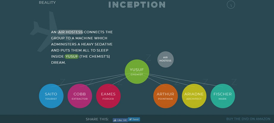
While we are on the subject of design, movies, and infographic, let’s a look at the interactive infographic designer for Inception, which is a movie directed by Christopher Nolan. Nolan, who has directed such movies as Memento, Insomnia, his Batman trilogy, as well as Interstellar, is known for making movies with complex plots, and Inception is no exception, it features a “dream inside a dream” concept, which can become a bit much once you get past the second level, and the movie itself has left many movies goers scratching their heads.
This infographic, however, guides you through the entire plot, and the simple, yet sleek visuals, only helps make the story clearer. Apart from the ending, which will make you question if it’s a dream or a reality, which was the filmmaker’s intent.
Collaboration
We are not just talking about collaborating with your colleagues, because that should be a given. We are talking about getting together with other designers, as well as other creative professionals, such as writers, filmmakers, musicians, or actors.
Not only will you be able to kick your creative design thinking into high gear by tossing ideas around with other creatives, but you will also expand your horizons and get a glimpse into the creative processes of others, which may help you come up with a fresh perspective on one of your future projects.
No Fear of Collaboration

And you shouldn’t be afraid to collaborate with people which seem to be on the opposite end of the spectrum. Music is full of such examples. Remember when Run DMC and Aerosmith did a re-recording of Aerosmith’s old hit “Walk This Way”? The single was a huge hit yet again, and not only did it help make Run DMC a household name, but it also helped Aerosmith revitalize their career and get some new fans. Also, their fusion of rock and rap would be a precursor to nu-metal, which ruled the charts in the early 2000s.
This just goes to show how some collaborations should not be dismissed, even if they don’t look good on paper. Another example of that is a collaboration between Zooey Deschanel and Tommy Hilfiger. Zooey Deschanel is known for her quirky and unusual style, which served as an inspiration for Tommy Hilfiger. This resulted in a chic, nautical-themed collection which had both the critics and the customers raving since they are also affordable. And while the red, navy and white color palette is 100% Hilfiger, pattern and materials immediately evoke Deschanel’s usual style. In this case, both parties got a chance to feature their own identities, but in the process, they created something that exceeded their own usual scope.
Sketching
Have you ever found yourself stuck inside yet another mind-numbing meeting? Now, we are willing to bet that nine times out of 10, you are probably doodling something on a piece of paper to pass the time. While this may have saved you for boredom, sketching is actually one of the most effective ways to come up with new design ideas. Also, you can use those sketches to create entertaining visual elements that will impress both your colleagues and your clients.
If you are not yet comfortable doing this, work on your sketches for a while. Limit the number of elements you are using, but focus on making them as good as possible. You can even save your sketches and doodles from before, and get back to them once your drawing skills are up to snuff in order to breathe some new life into them.
Examples of Successful Sketching
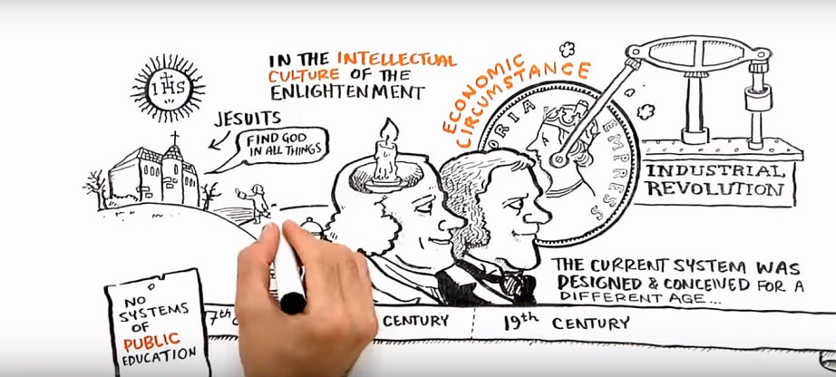
Before we get onto how design and sketches can help you with creative design thinking, let’s talk a bit about Sir Ken Robinson. Robinson, who is a world-renowned professor, author, speaker, and advisor on education, became popular after one of his TED talks. Apart from offering valuable advice, Sir Ken Robinson was an absolute riot, and he has the audience in stitches more than a dozen time during his relatively short speech. However, we are more interested in another one of his speeches, which has been turned into an animation.
In this speech, he gets a bit more technical, but through a series of brilliantly drawn sketches, the authors have managed to bring the subject closer to the viewer, which they might have dismissed otherwise, due to its complexity and breadth of data. One of the images that stand out is the humorous representation of smart people, which are shown as university professors, and non-smart people, which are shown as two guys carrying a heavy piano up the stairs, wishing they had listened more in school.
Reading Books
One of the consequences of the fast-paced lives is a chronic lack of time for just about anything. Especially, for reading books. We are always short on time and in a rush. So, we opt for shorter and less in-depth forms, such as blogs and articles. Or we avoid reading altogether and focus on watching videos and listening to podcasts. While there is value in each of those forms, there is no substitute for reading books. Especially those which will get your brain to start firing on all cylinders. That is why all those literary classic is so important.
But, seeing as you are designer, you should also make time to read some of the best books written on the subject of design. While you may feel like you have soaked up enough knowledge by looking at tutorials on YouTube, taking online courses, going to school, and working with diverse clients, there is always more to learn, and only books can provide you with the kind of solid foundation and detailed analysis of everything you have ever wanted to know on design.
The Must-Read List
One of the books you should definitely read is Eric Gill’s An Essay on Typography. Nowadays, typography is not just used to make the text more readable but is also a design element in itself. A lot of companies opt to design a logo which only features their name written in a custom font. As well as colors which reflect their existing visual identity. In this book, you will not just see a ton of examples inspiring to create some of your own fonts. You will also learn about the history of typography and understand why it is so valuable now.
Conclusion – Creative Design Thinking Tips
Getting stuck in a rut is something we all experience as designers. These examples show us that there are plenty of ways and tools we can rely on at all times, which will help us tap into your creative potential and get us to think outside the box. That way, we will almost never run out of ideas or ways to tap into them. Start implementing these creative design thinking tips today and take your design process to a whole new level, as well as your entire career. Good luck!

