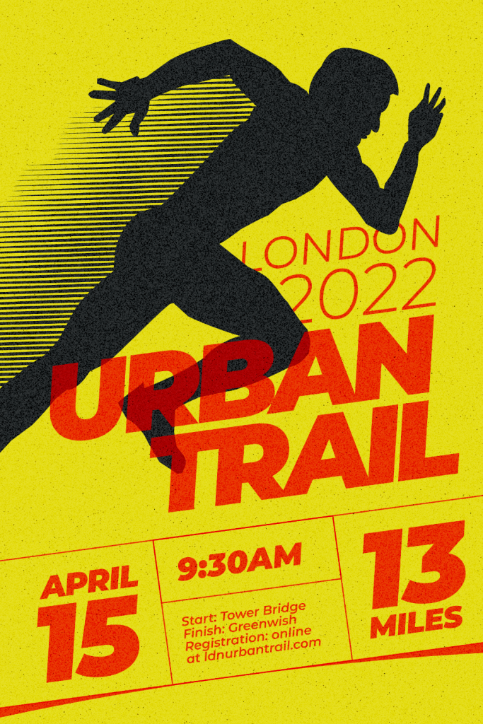
Create Unique Event Posters (Vintage Style)
While purchasing a pre-made event poster is one option, taking the time to design one that is unique to you and your event is another. Whether you’re looking for something vintage, humorous, eye-catching, or nostalgic, the internet has plenty of options. Create your designs simple and quick, whether you’re celebrating a birthday, having a concert, a wedding anniversary, or a Christmas party. You can personalize your event posters and create something unique with a straightforward design tool in a few simple steps. Ideally, you can do all of this in one place with little to no prior design experience. Making informative and attention-getting posters can be easy when using templates.
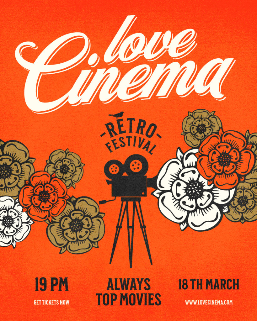
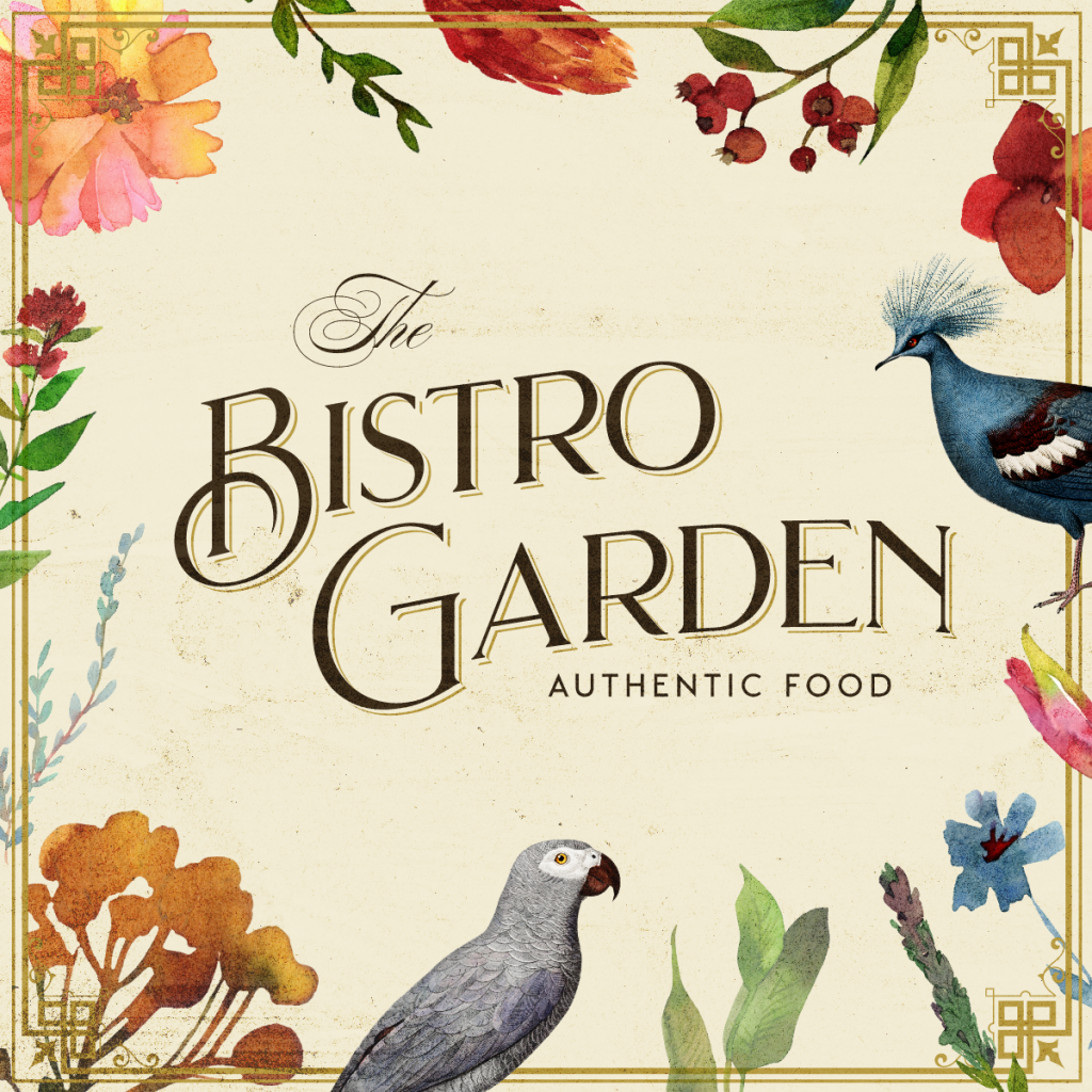
Even better if every element of the template generator is adjustable to specific ratios. We’ve compiled a list of vintage event poster designs from the design platform Kittl which can be easily adjusted for your event. Check out the gallery below.
How to Make Event Posters?
Select a Format
Log into your Kittl account and search for “Posters” near the search box. Alternatively, select “New project” to start from scratch and create a unique design. Once you are done simply choose a size you need them in, select between small the big posters, Instagram, or Facebook posts.
Choose a Template
Find inspiration for your needs by browsing the Kittl gallery of free, editable templates.
Personalize Your Poster
A template is nothing more than a model for generating ideas. Use the media library to add photos, objects, fonts, and more, or submit your original custom design elements.
Download and Spread the Word
Once you’re done, you can set a format (PNG, JPG, SVG, or PDF) and download them. You can also print your poster or share it directly from Kittl to announce your event online.
Take Inspiration from the Past – Borrow Characteristics of Historical Design Styles
Historical design trends, often grouped together under the label “vintage,” are a great source of inspiration. Art Deco (the 1920s), Art Nouveau, Bauhaus, and Victorian are just a few examples of certain styles you may be familiar with. Each has an individual appearance and personality.
If it’s suitable for your project, you can build designs that mimic these patterns for an authentic period look, or you can pick and choose components that inspire you, such as layout, shapes, colors, or type of style. Check out these stunning high-quality vintage templates developed by experienced designers that you can use for any occasion. Make them yours in a matter of minutes.
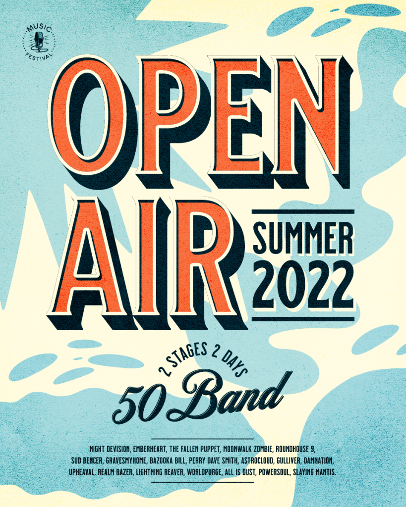
By Katja Renko
Experiment with Different Levels of Simplicity and Complexity
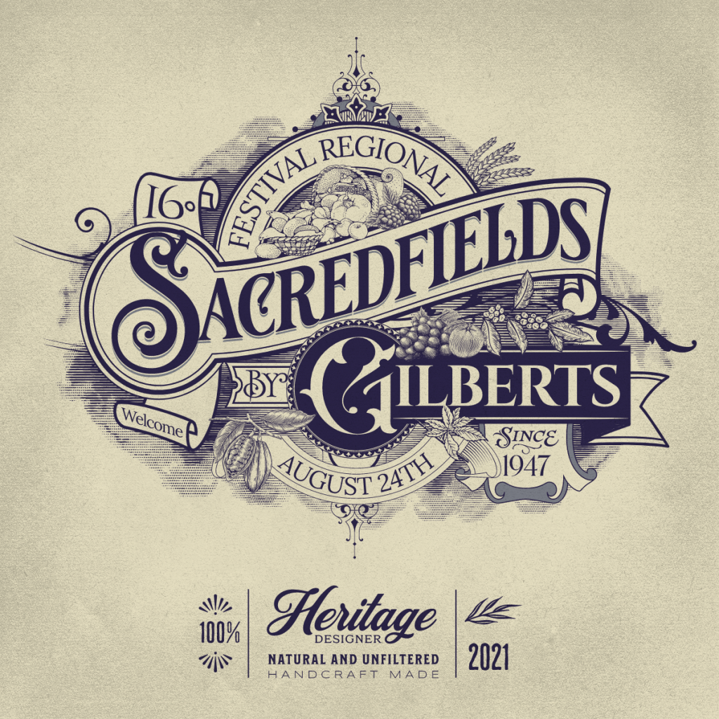
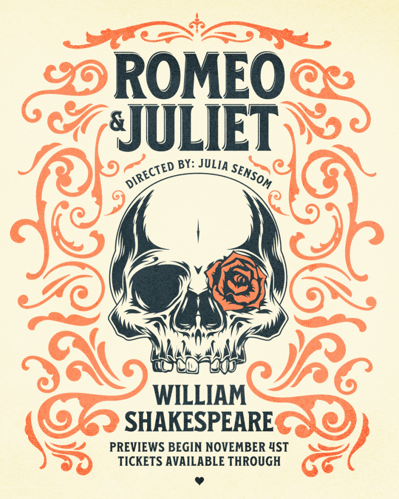
If you usually prefer minimalist designs, why not give a complex design a go. Contrary, push yourself to simplify if you’re passionate about decorations and ornaments. Getting out of your comfort zone as a designer can help you explore, and you might be amazed by what you can discover and achieve when you try something new. Here’s an example of two designers taking two completely different approaches to the same subject: one is straightforward and angular, with minimal detail, while the other is more sophisticated, with waving, detailed elements.
The typography within this illustration is simple, even though the illustration is detailed. This permits the two to work together and balance each other, preventing one from dominating the other.
Use Everyday Objects in Event Posters
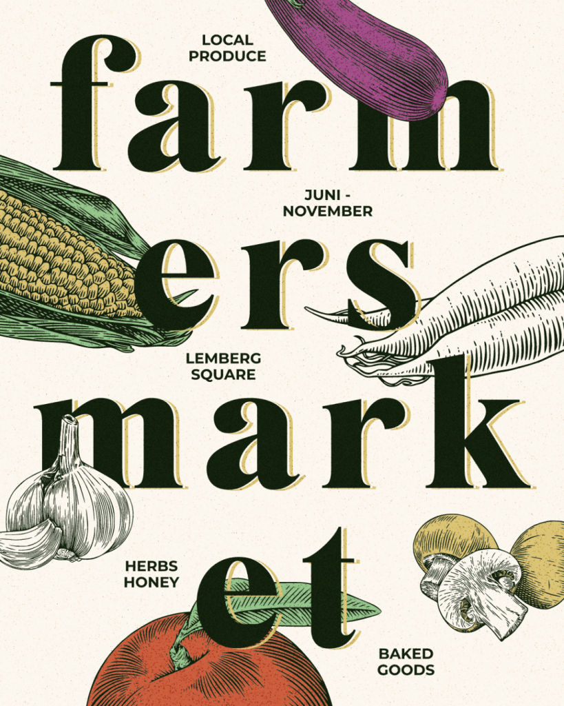
Do you find yourself repeating the same images in the very same ways? Use familiar materials in unexpected ways to get your creative juices flowing. Giving an unusual perspective to a familiar object can add extra interest and make for an eye-catching design. Let’s look at this example of a poster that accomplished precisely that.
In Katja Renko’s Farmer’s market poster, food was used to create a playful pattern. It’s bright, vibrant, and flavorful, which is a good indication of what this poster is all about.
Think About the Texture of Event Posters
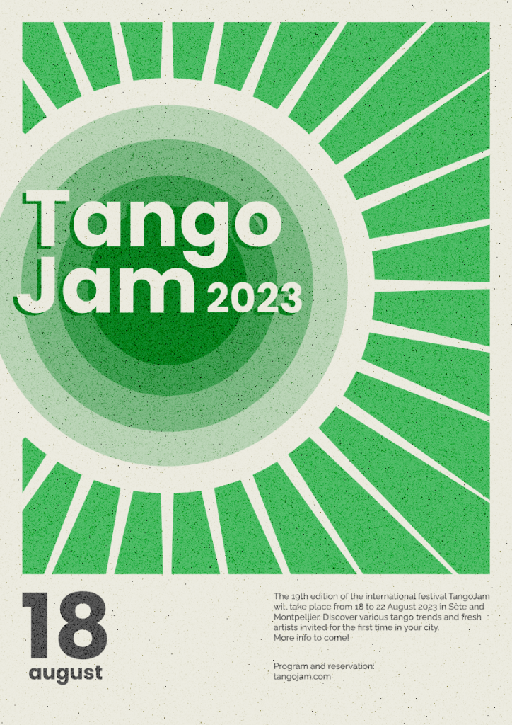
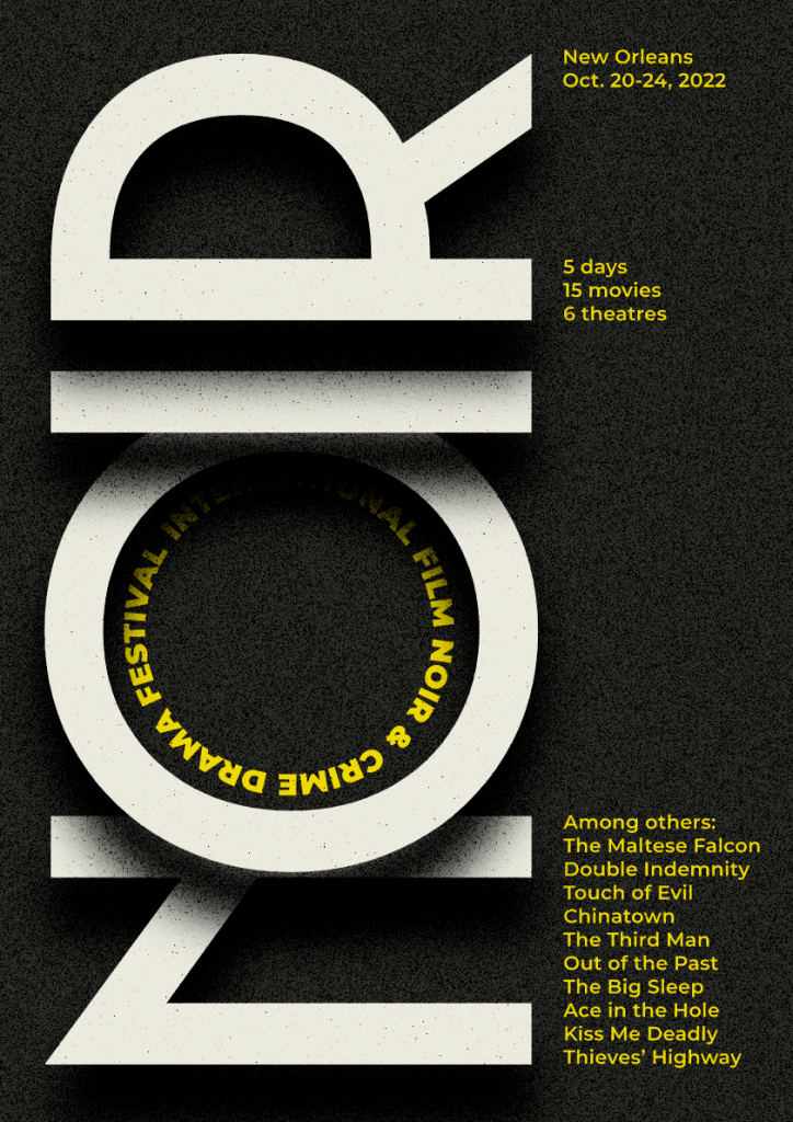
Incorporating a slight grain of texture onto your poster can help to make it stand out. It wouldn’t blend in as well with the background or have such a good balance with the artwork if there was a plain flat tone. It would have appeared out of place and unrelated to the advertisement. Look at this example:
By Manuel de Lignieres
Layering Isn’t Something to Have Fear of
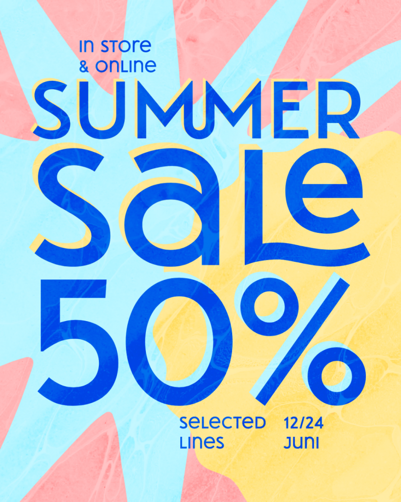
Layering typography components in your event posters is a terrific technique to give dimension as well as another layer of design. Miguel de Ligneres’ print poster is a great blend of typeface and shape. Check it out here.
Event Posters – Make Your Templates Unique
Design templates have a wide range of applications, such as getting the dimensions of a print design just right or saving time if you work on a regular project. However, if you use a completely created template that you found online and don’t make any modifications, be sure that an exact replica of your design is floating around somewhere. You don’t want that to happen.
So, while using a template and saving time, take a moment to pause and make it yours by modifying an existing poster template. Or take a different route and make your own poster template from scratch. Either way, Kittl can help you to get it done. It is a design platform and tool, created by designers for designers with the mission to inspire creativity and empower every person to create. Check it out for your perfect event poster template or other graphic design projects.


