Restaurant Website Design: 6 Mouthwatering Tips
Restaurants and cafes are those evergreen ways of building a solid and profitable business. People go to restaurants and cafes not just for food, they socialize with friends, conduct negotiations and just relax. Taking your restaurant business online is essential if you wish to establish a good promotion and awareness of your dining brand. So, you need a good restaurant website design for this.
Restaurant website allows your existing and potential customers getting the latest info about your menu peculiarities, interior style and various events you may host. Going online will help you to contact your audience any time a day and night, and your audience will be able making online orders and reservations.
Even if you already have a restaurant website you might be missing some key points in its design that can improve its performance, gain more traffic and make your business recognizable. Here are 6 tips that will help you with this.
1. Know Your Audience
It’s vital to know before even starting a business. Any business. If you don’t know who may need your products or services, you won’t be able to build a successful business. Start checking what organizations, business and institutions are located near you restaurant and what kind of audience you may attract.
If your cafe or restaurant is located near business centers and offices, you might expect business people to dine at your cafe and even host their meetings there. If there are some activity centers not far you should be ready to host health-obsessed people. Thus you should not only organize your menu to match your regular audience’s tastes. You should make your website focused on their needs.
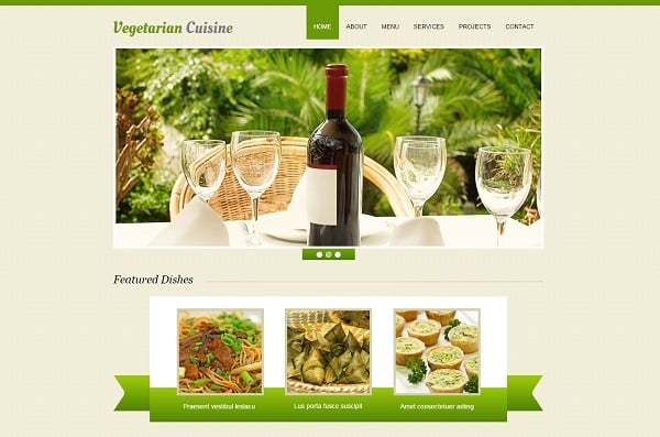
Website Template For Vegetarian Restaurant
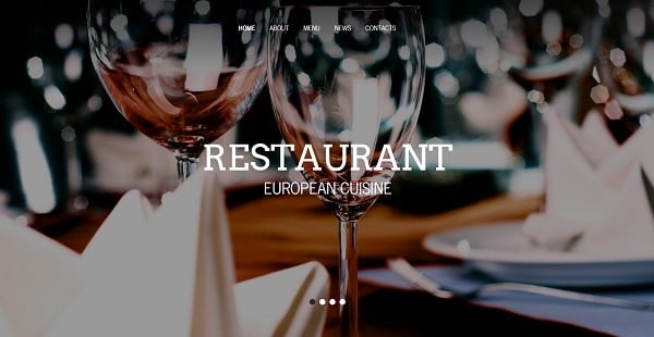
Sophisticated Website Template for Restaurant
The choice of target audience will impact almost everything on your website: its style, content, manner of presentation, contact form etc. Thus, if your business is focused on healthy food or even vegetarian cuisine, opt for minimalist design with fresh pastel tones and a lot of white. When your restaurant is oriented on business people, choose a sophisticated style that highlights an elegance and respectability of your place.
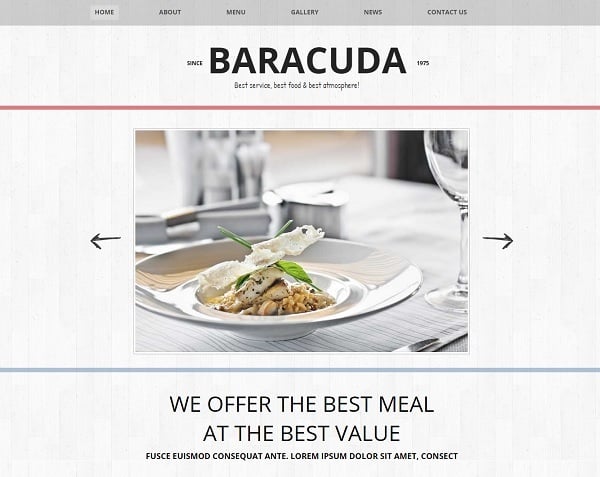
Minimalist Restaurant Website Design
2. Go Mobile
Having a cool-looking website is not enough today. If you wish to engage more people to your restaurant or cafe, you should make your website mobile-friendly. According to the latest surveys, over 80% of local searches are provided via mobile devices. Among those search queries, restaurants and other dining facilities are searched 23% of all browsing time.
In such conditions, any restaurant business has to get a responsive website that allows users to quickly find it on a city map. If you ignore the mobile trend – you lose a huge number of potential customers. Check out the one from responsive restaurant website templates for your food & dine business.
Responsive Restaurant Website Template
3. Choose High-Quality Photos
I tend to think that photos are the main content for restaurant websites. For now technology development doesn’t allow Internet users to explore products on the web with all five senses. We can only use our eyesight and hearing to get all the information about products on websites. Since no one can taste or smell food online, restaurant websites’ owners provide the best and the most tasty-looking photos of the dishes available in their places.
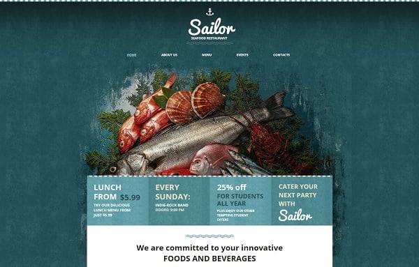
Restaurant Website Template in Marine Colors
Photos on restaurant and cafe websites are the main way to attract attention and make users want to visit a certain place. Try not to use stock images (despite they can also look tasty and appealing). The main problem with stock photos is that they can be used by unlimited number of websites. But the most annoying thing for users is that those photos doesn’t show how the dish will look like in reality, how it looks exactly in your restaurant. Foodies can be impressed by the look of a certain dish on the internet, but when they come to your cafe they might see a total opposite to what they saw on your website. This is frustrating and may even ruin your reputation.
Finding a skilled food photographer today is not a hard task. Just include into your budget food photographer’s services to make sure you will offer your users the best experience online and in a real life.
Ways of presenting food photos on a website:
- Background photos and slider. It’s one of the most up-to-date means of visual content presentation. Such large photos attract users but don’t distract them from other content;
- Hero images in header. This type of info presentation is another highly popular way of delivering visual data right to the user;
- Home Page slider. Despite this design element is often considered frustrating for users, it’s a good idea for restaurant websites. It allows presenting beautiful photos of food right in front of the users’ eyes as well as pushing various events, offers and daily specials;
- Photo Gallery. This ways is definitely the best one for showing all your food in a perfect light and make people want to try all of them right away.
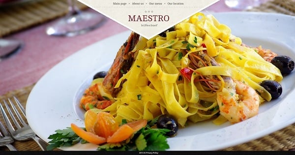
Restaurant Web Template with Fullscreen Background
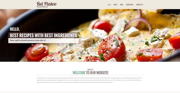
Website Template for Italian Restaurant
Galleries are often used for presenting a restaurant menu. It’s another vital part of the website, so let’s check out its characteristics in the next tip.
4. Display Your Menu
Make a separate page for showing your restaurant menu. It makes it easier to add or remove items from the list when you change something. You can also make several sub-categories like “Meat”, “Vegetarian”, “Salads”, “Desserts”, “Wine” etc. Thus you make it easier for your clients to find what they need.
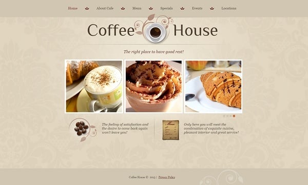
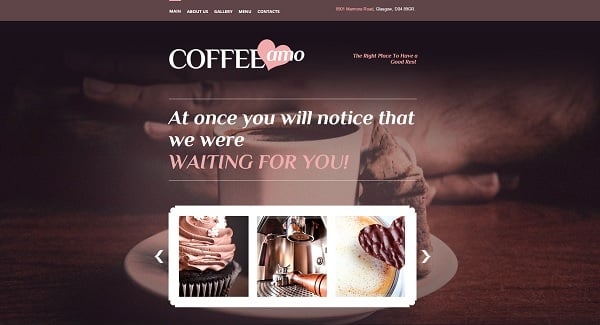
Cafe Website Template in Warm Tones
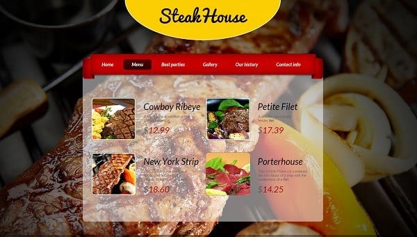
Web Template for Steak House
Sometimes owners offer downloading menu in a PDF format. It might be useful as an additional possibility. But don’t make a PDF file the only way of seeing your restaurant menu. Most people hate it when they can’t get all the info right on website without additional manipulations. Make info about your food and prices easily accessible and it will add a lot to the website UX.
5. Create a Cool Contact Page
The main function of the restaurant or cafe website is turning your virtual visitors into real customers. Thus, you should show that you are open to any kind of collaboration and accept various opinions. Push your visitors to leave feedback about your place as well as allow them asking you questions.
Chic Web Template for Cafe
Easy-to-use contact form shouldn’t include too many fields. Phone (and/or email), name and message fields are usually enough. If you don’t have your address and phone number on a Home Page (you better have), include them to your Contact Page. Make a phone number in a form of plain text so mobile devices users could call you right away. Don’t forget about map. It’s an absolute must-have for any website today as it helps mobile users to find you easily.
You can also add an online reservation form to your contact page (as well as add it to the Home Page). Thus you can boost your website UX and engage lots of new customers.
6. Get Social Network Presence
Establishing social media presence today is one of the best and fastest ways to make your brand recognizable, engage multiple customers and get tons of traffic to your website. Make social buttons and widgets on your website easily spotted. Learn how to include those elements into your website design to make them work for you.
Really useful and interesting content is easy to share. Offer your social followers a unique information they won’t find anywhere else. Share the latest news about your menu, staff members, events and special offers (e.g. Instagram is a great way of engaging with new customers and promoting new products). Make it really attractive and engaging for anyone.
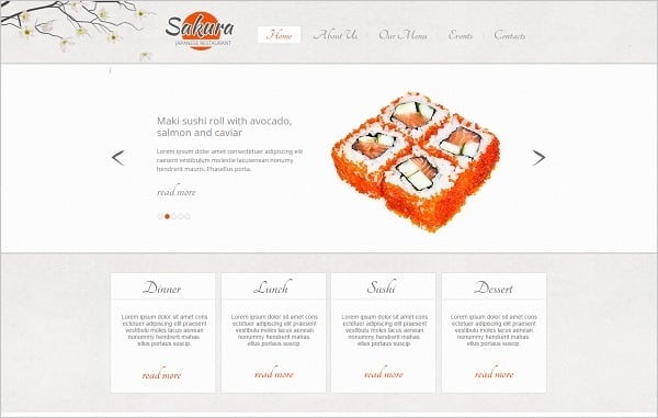
Japan Cuisine Restaurant Website Template
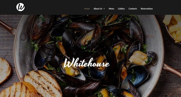
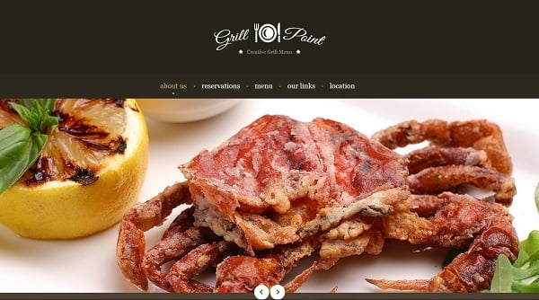
Dark-Toned Website Template
These tips will be good for beginner designers and for pros as well. Any cafe or restaurant owner who thinks of an easy solution for creating a website may get a web template from MotoCMS and customize it using these recommendations. It’s easier than you might think.


