

Conversion Optimization Design Elements: The Ultimate Guide

It’s no secret that a huge number of websites are meant for profit and business. Today companies that understand the importance of web promotion and social media services pay great attention to their websites and business pages. They add loads of useful content on their products and product-related topics but the main focus is on the conversion optimization of website pages, their overall design as well as functionality.
Conversion Optimization Elements in Web Design
Conversion-oriented design includes many elements that should be well thought-out to bring success. Such elements feature:
- Banners;
- Landing pages;
- Call-to-action elements (buttons, sign-up forms, text links).
Let’s review these elements and find out how to reveal their potential power for process of optimization for conversions.
Banners and Landing Pages
Banners may introduce all the characteristics of landing pages and other CTAs. It may be adverts from other companies or the owner’s promotion of the products and services within the website. Banners should present on a small area maximum of useful and catchy info to attract users and make them click the ad. thus banners feature bright colors, animations, nice but unobtrusive background and large call-to-action buttons or text links.
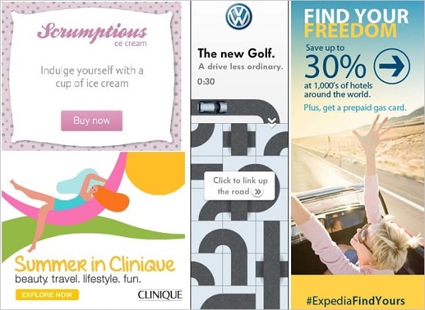
Banner ads: Scrumptious Co., Clinique, Volkswagen, Expedia.
Landing pages are the biggest element of conversion oriented designs and may include all the mentioned elements.
Landing pages are one the finest website design elements that help converting impressions and clicks into profit. It’s a separate page that is optimized for search engines or social media and contains info about your product or services along with a call-to-action blocks. These CTAs should lead a visitor directly to the products or make the user register and sign up for more details.
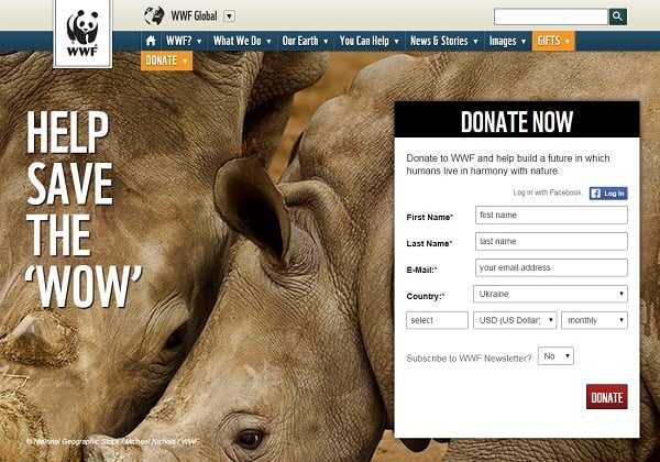
WWF
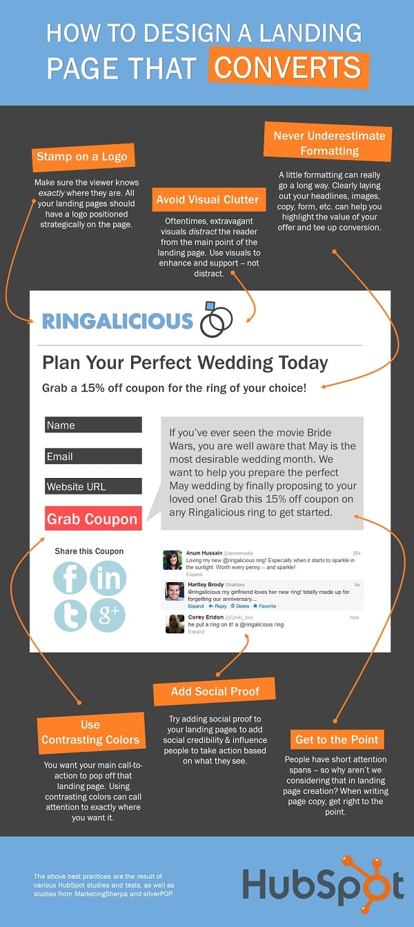
Successful landing page should be clear and simple, without unnecessary effects but bright and catchy enough to draw attention. Here is a short and useful infographic from HubSpot on creating a perfect Landing Page that raises conversions.
Well thought-out landing page may include almost all call-to-action elements. However, to avoid clutter and unnecessary repetitions landing pages may feature only buttons and sign-up forms.
Cool landing page may also include testimonials that prove the company’s reliability and establish its value for customers.
Call-to-Action Elements
Buttons are the most popular CTA elements that may be used on landing pages as well as on any other page of a website. They are prominent, fairly small and catchy. Text that featured on a button should unambiguously speak to a visitor and make him click, buy, add to cart or learn more about services.
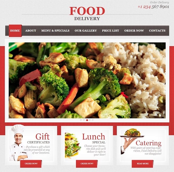
Template with Conversion Optimization Design Elements
Among the most frequently used types of CTA buttons are:
- Learn more (or Explore) button;
- Buy now and its versions (add to cart, add to bag);
- Sign up (or Register).
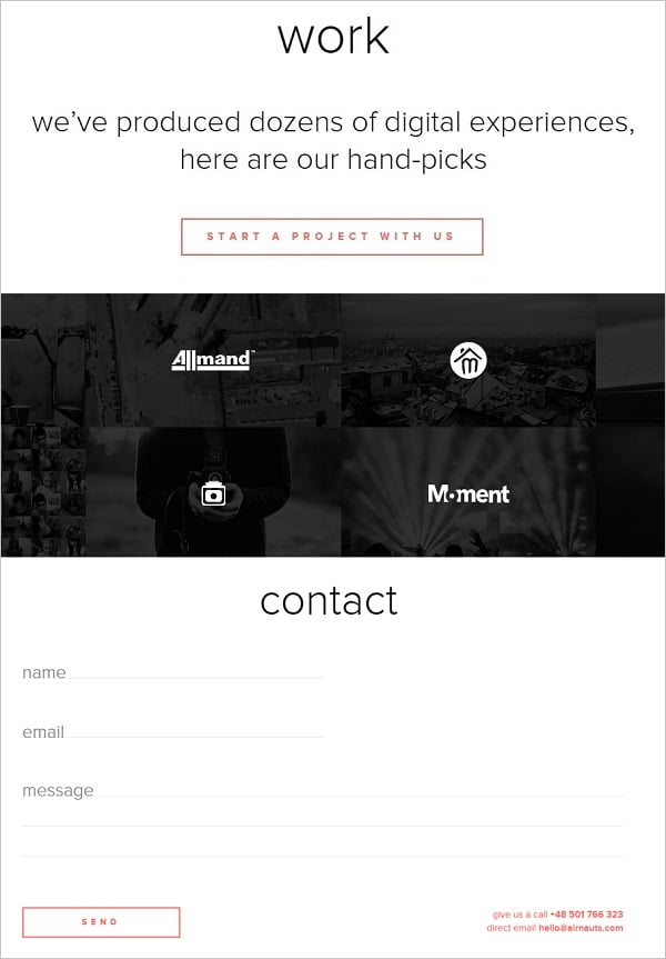
Sign-up or register forms usually make an addition to other CTAs. They may be featured to landing page or other pages but one of the most popular forms is a button that pushes a visitor to register to the website. By clicking that button user lands to the special page with register form fields. The example below features such button that redirects a visitor to a contact form that can also be discovered when the users scrolls down a bit more.
Airnautus
Sometimes buttons may be replaced with text links that feature traditional call-to-action text usually seen on buttons. Due to specific perception of links, such CTA element is not largely used and should be highlighted to become more prominent. Text links are mostly used for phone numbers and emails to make a visitor contact the manufacturer or service provider.
Text Link Conversion Optimization Template
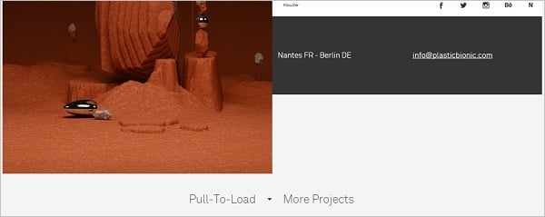
Text links may appear anywhere on the website. They are usually added to the text content and introduced to the text as its organic part. However, text link may be used on Landing pages, banners or even separately. The text link on an example below is used to push a visitor to discover more projects.
Plasticbionic
Psychology Behind Conversion-Oriented Design Elements
To create a perfect call-to-action element you should know what kind of users you wish to attract. There are a few types of customers that you can appeal to and your strategy should be based on their psychology. An infographic from HelpScout defines three types of buyers and there are 24% of them you need to pay maximum attention.
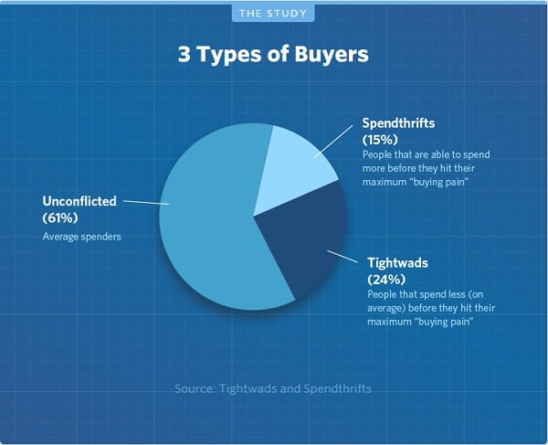
Those so-called tightwads are your potential customers but you won’t squeeze a penny of them without some psychological tricks. The easiest way is to make them feel the paying less for a big amount of products (services, benefits etc.). It’s said that getting a membership for about 480 bucks a year is less attractive than getting it for $40 a month.
However, you don’t have to forget about other two categories on a basis they are easier to draw to purchasing. You should pay attention to all types of customers. And don’t forget that making changes without testing may not bring any result.
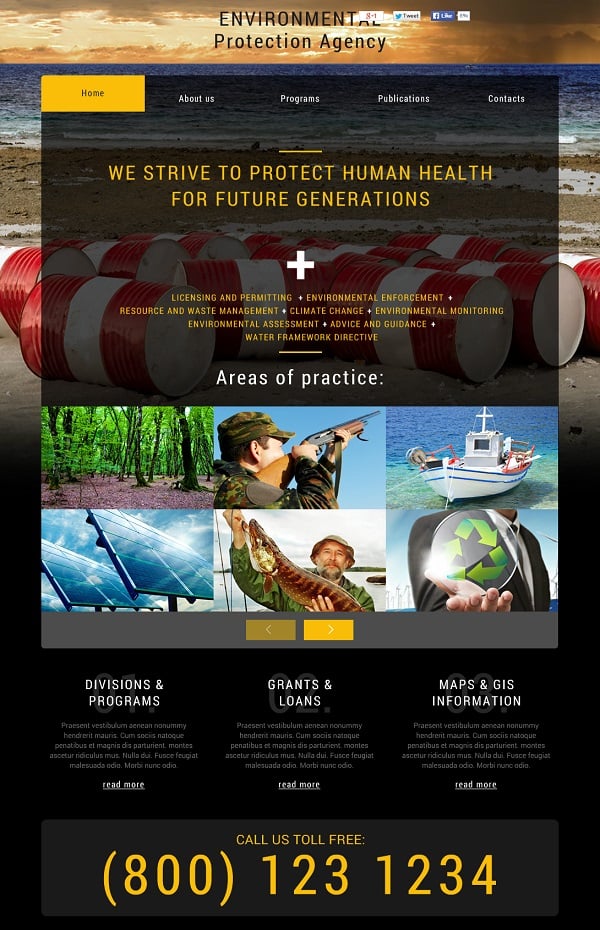
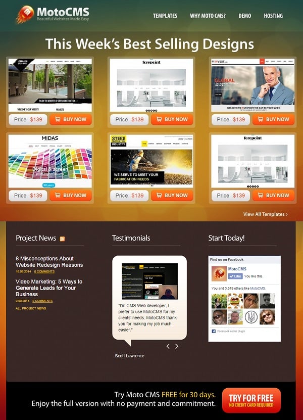
Among most important factors that work with any type of CTA is the company’s reputation that can be presented in a form of testimonials. Creating an image of respective and valuable company helps getting more visitors that may convert into loyal customers like on the example below.
MotoCMS
4 Tips to Make Your Call-to-Action Stand Out
Good call-to-actions as well as all conversion-oriented design elements should appeal to customers, making them want to purchase a product, sign-up for the project or order service.
The creation of a good CTA doesn’t ends with placing a button with text on a prominent place of the website page. It requires constant working and testing of the results. The following tips may concern any of the mentioned elements and help the business to convert visitors into buyers.
Color, Shape, Size
Choose color that looks appealing to customers and will definitely draw their attention to the button or text link. There are loads of studies that reveal the psychology of color and how it can impact conversions and brand awareness.
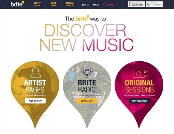
The main idea is choosing for a call-to-action element bright contrasting color that isn’t used for any other page element and will make the call-to-action feature stand out. Of course, that doesn’t mean you can pick up any vibrant tone without keeping in mind the overall page color scheme. Thus, the screenshot below depicts multi-colored buttons of photo backgrounds that highlights each element.
Brite Revolution
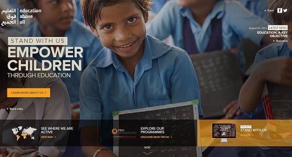
The example below depicts a number of call-to-action buttons where the most important buttons are set in bright yellow.
Education Above All
As for the shape, there is no strict rules. The best idea is using rectangular shapes to make the CTA look like traditional button to unambiguously identify the element as clickable. However, other shapes are welcomed, especially if they don’t ruin the overall layout being still noticeable and distinctive.
DSG
Size of the call-to-action button depends on the text on it and the number of such buttons you use on a page. To make the button stand out and highlight its importance you should make it large enough. If you use a couple of buttons on a page that differ in significance, the primary CTA button should be made larger comparable to the secondary one. But don’t make your buttons too large so visitors might miss the point.
Icons and Effects
Adding tiny icons to the button or applying cute hover effects provide double functionality: they define the element as clickable and draw the visitor’s attention to it making it more prominent. There was noticed that simple addition of a small icon increases conversions slightly. Not the biggest factor, it still works though. You can use those icons and arrows within the button or place them next to the CTA element to highlight it.
Vacation Quality

Placement and Number of CTAs
Position your call-to-action in the prominent part of the page. Take care of arranging the CTA within the natural eye path of the users through the page. The Golden Ratio and the Rule of Thirds principles may help you in determining that path and choosing the most appropriate place for the CTA.
If your page rely on heavy scrolling you may think of repeating a call-to-action several times as a reminder. However, try not to use various call-to-actions within one page. It may distract visitor and make them leave the website.
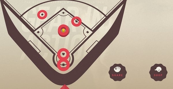
Lander
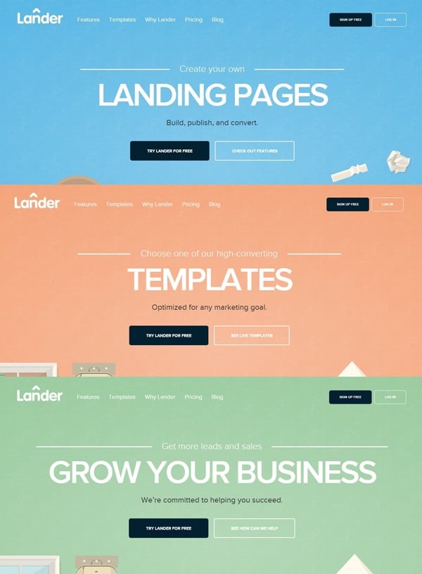
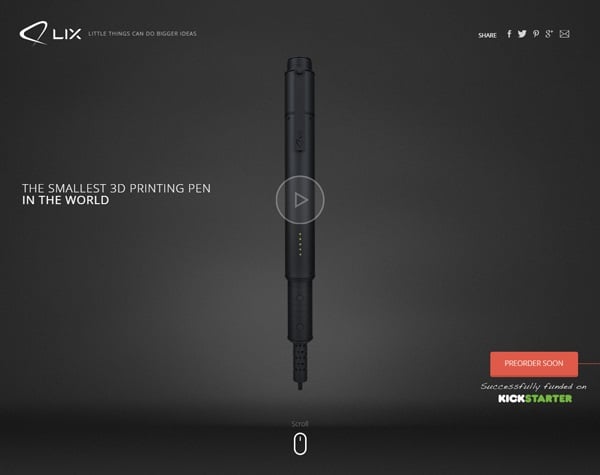
It’s a great idea to make use of white space around the call-to-action element. It also works as a highlighter for the CTA and makes the page look less crammed. Thus, on the screenshot below the button of bright orange is placed on a distance from other elements that makes this button stand out.
Lixpen
Message
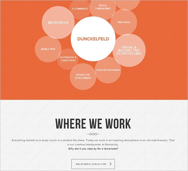
The last but not the least important factor. CTA includes text message whether it’s a button or a text link. First, you should inspect the element critically if it does have a text that calls a visitor to any action. Sometimes people think that introducing a product (service, membership) and adding a button with a product title is enough to make a visitor push that button. In fact, we should give, say, clear instructions of what we wish our visitors to do to get benefits from our services or products. “Free Trial” button doesn’t make a call-to-action unlike a “Get Free Trial” one. The screenshot below shows such “bad” example where call-to-action button doesn’t actually features this “call”.
Dunkelfeld
Make sure your text meets the following requirements:
- The text really “calls” for a certain action;
- The language is clear and simple without any misconceptions;
- The font for the text is large and perfectly readable. You may use bold type or caps for the text or its part;
- It’s good to encourage visitors to act immediately by using such markers as “now”, “fast”, “ends soon” etc.
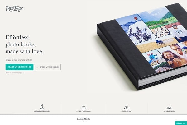
Here are a few examples o good call-to-action texts that create wish and urgency to try a product.
Montage Book
Template with Conversion Optimization Text
You may also create specific (so-called “dynamic”) CTAs that are targeted to certain groups of buyers and change them from time to time.
Test your design elements before applying them to the page or making any changes to the text, look and design. It may save you from disappointment when after introducing a new CTA you will notice fall in conversions. testing may show what specific text, color or placement brings more conversions and what may increase them.